October 7, 2009
Cell Phone Usage
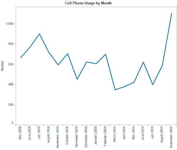
I received my cell phone bill from AT&T today and noticed that there are usage reports on the site. I typically don't look at these because I really don't care about my usage, but for some reason I decided to look at them.Here is how AT&T presents the data:
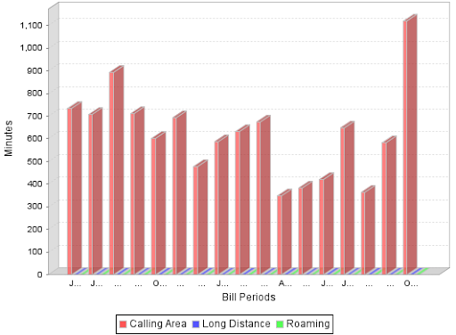
Icky, icky! Where are the dates? I can't tell the difference between some of the bars. Why are long distance and roaming included? You'd never be able to see them anyway. Why not use a simple line graph?
Come on AT&T, get your act together. Although I suspect these were created by a developer that only knows how to use the default graphs in Excel and thought "Oh, I can make these so pretty with the 3D bar charts."
Why the big spike in September? Conference calls...boooooo!
Subscribe to:
Post Comments
(
Atom
)


There dreaded 3D chart. The line on time series shows the trend much more clearly.
ReplyDelete