December 22, 2011
Using a non-zero-based axis: I don’t understand why “experts” can’t get it right
Nielsen is widely regarded as providing exception analysis of consumer data. In fact, many of the best analysts I work with spent many years at Nielsen and they have been very interested in learning data visualization best practices because they now understand the benefits.
I agree that Nielsen’s insights are often fantastic, yet I don’t understand why they can’t present their analysis more appropriately. I guess my larger concern is that when a company with the influence on analysts like Nielsen has presents data visualization, even simple ones, so poorly, it make the abuse more and more pervasive. I’m seriously considering send a link to this post to the author of the presentations I’m about to review.
I received two annual reports the other day, both authored by a high-level employee who was supplemented by many other resources, so I can’t lay the blame on any one person, but more on Nielsen as a whole. Here is a summary of the charts they presented:
Presentation #1
Zero-based axis = 6
Missing or non-zero-based axis = 88
Pie chart with no color to differentiate the slices = 2
Charts well done = 6/96 = 6.3%
Presentation #2
Zero-based axis = 37
Missing or non-zero-based axis = 36
Smoothed line charts = 7
Charts well done = 37/80 = 46.3%
Hopefully this means someone told them presentation #1 had a lot of chart junk and they made an effort to improve presentation #2, but I doubt that’s actually the case. It’s easy to see that most of the charts were created in Excel, which will automatically set the axis to start somewhere other than zero if the numbers in the chart are large. I don’t know the specific business rules that Excel uses, but they should be changed.
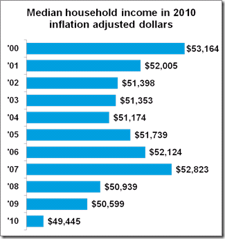
Here is a representative example of the charts they created which did not have a zero-based axis. I’m holding out hope that this wasn’t done to intentionally deceive the reader, but to emphasize the subtle differences between the data points.

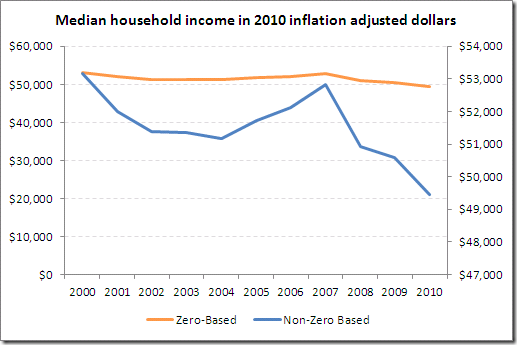
I recreated the chart as a dual-axis chart with the primary axis starting at zero and the secondary axis set to Excel’s default. Also note that I created a line chart since this is time-based series data, which typically means you’re wanting to see the overall pattern.
Clearly these imply a very different story.

Ok, we see what’s wrong, but how could Nielsen have presented the data more effectively? You have two primary options.
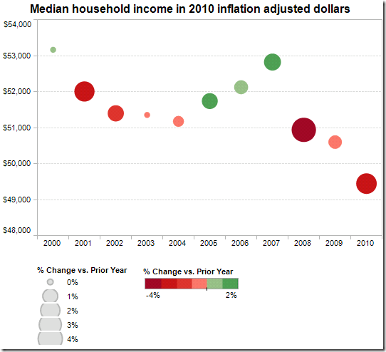
Dot plot
- You can replace bar charts with dot plots so that the sequence over time is de-emphasized
- Dot plots don’t require a zero-based scale
- Dot plots force the reader to refer to the scale before comparing two values
- Sizing and coloring the bubbles by change over prior year would speed up the reader’s analysis of variances between variables

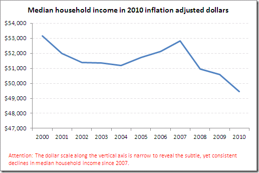
Non-zero-based line chart with special alerts
This is the most effective method if you insist on NOT using a zero-based scale. Stephen Few sums it up best in Show Me the Numbers (page 169):
You should generally avoid starting your graph with a value greater than zero, but when you need to provide a close look at small differences between large variables, it is appropriate to do so. Make sure you alert your readers that the graph does not give an accurate visual representation of the values so that your readers can adjust their interpretation of the data accordingly.

Nielsen can learn a few lesson by reading some of the great data visualization books by Few and Tufte, or they could hire resources that know what they’re doing and allow those resources the freedom to make the best practices viral. The alternative isn’t good for any of us.


i read your blog...it's fantastic...
ReplyDeleteBusiness Rules Analysis
Thank you for the kind words Kuldeep and thank you for following this blog.
ReplyDeleteAndy
Thank you for the kind words Kuldeep and thank you for following this blog.
ReplyDeleteAndy
How about a percent difference from first? as another option?
ReplyDeleteThis is what people regularly dont understand.
ReplyDeleteIf you leave the zero-base and do a non-zero linechart you CHANGE THE DATA.
Now it is a viz of the differences between the values, not the actual values whatever the scale says.
This may or may not be the right data to show. But it is what you do.
Barcharts that are non-zero are just plain wrong.. false.