February 20, 2012
How to Create a Two-Panel Column Chart in Tableau (and save lots of time compared to Excel)
I love Jon Peltier’s Tech Blog. He always has great tips for getting things done in Excel and his recent post “Easy Two-Panel Column Chart in Excel” is no exception. In this post Jon walks you through how to create this chart in Excel:
Seems pretty straight forward, right? Well not exactly. I wouldn’t exactly call this technique easy. In Jon’s post, I quickly counted about 13 steps (I think there are more; I lost count as I recreated the chart), but there are many clicks for each of these steps. It took me a bit over five minutes to create it the first time, but this included flipping back and forth between Excel and the instructions. I suspect it would take two minutes or less once you use this technique a few times. Again, let me emphasize that this is a great technique for Excel.
One big drawback for this technique though is that you are forced to hard code the scales. What happens if your data changes? You’d need to go back into each axis and reset them. Kind of a pain if you ask me. I’m sure I’d forget at some point too.
Also, I don’t like how the axis scales are not on the same side of the chart.
How many clicks it would take to create the same chart in Tableau? Step-by-step, here are the instructions (with click counts in parentheses):
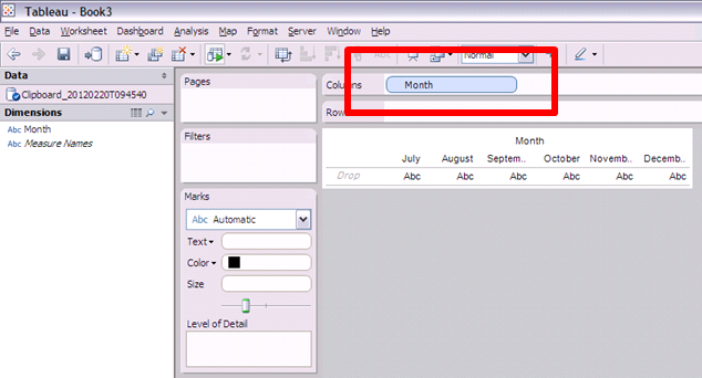
1. Drag the Month dimension onto the Column shelf (1 click)
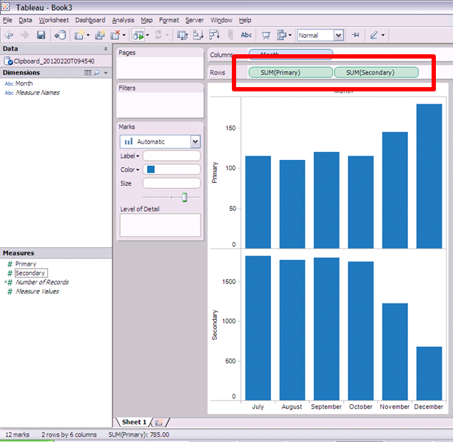
2. Hold the CTRL key and choose both the Primary and Secondary measures, then drag them onto the Rows shelf (3 clicks)
Two steps/Four clicks and we’re already 95% of the way done.
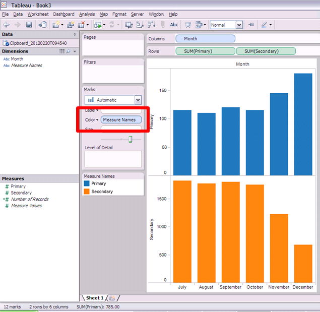
3. Drag the Measure Names dimension onto the Color shelf (1 click)
That’s it! Five clicks and we’ve created a two-panel column chart in Tableau. I timed myself and it took five seconds to create this chart. Of course, you need to spend the money on a copy of Tableau.
In summary, let’s assume:
- It takes two minutes to get the chart exactly as you want it in Excel (but you still have to fix the scales every time you change the data)
- It take 30 seconds on Tableau (though I can’t see how it could take that long and you DON”T need to update the scales each time)
- This gives you a 75% time reduction in creating just this one chart
Think about all of the time you would save if you did EVERY chart in Tableau. This makes the ROI story for Tableau pretty simple if you ask me.


You aren't quite reproducing the Excel chart. What if the opposing axes are required? Is this possible in Tableau?
ReplyDeleteTim,
ReplyDeleteyes it is. Drag SUM(Secondary) to the right axis of the existing bar chart of Secondary and format the left axis to show no header and no tick marks. Six additional mouse clicks necessary.
Hi Andy -
ReplyDeleteThanks for the plug. As you know, I write tutorials for people who only have access to Excel. And sometimes "easy" procedures in Excel take a lot of steps. But it's better than nothing.
In my follow-up to your comment on my original post, I described how to permit automatic axis scaling in Excel. It's an "easy" protocol that requires only a couple extra dummy series and a handful of steps. Not perfect, but adequate.
@Tim, I didn't recreate the Excel chart exactly intentionally. There should be no reason to need to have the scales on opposite sides. It does not add any value and would likely only cause confusion for the readers.
ReplyDelete@Robert, thanks for beating me to the punch. I was going to create it, but my laptop went to the IT repair shop at work.
@Jon, I saw your comments on your blog...great discussion. You definitely make the work easier for people in Excel and your technique is clearly the way to go if Excel is the tool you have at hand. I'm well aware of the bureaucracy that occurs when you try to bring in new software in a culture resistant to change.
But you can create a 3D pie chart in Excel in just 3 clicks. How many clicks do you need to do that in Tableau ;-)
ReplyDeleteGood one! BTW, you can create 3D pie charts in Tableau.
ReplyDeleteAndy Cotgreave wrote a funny blog post about it.
http://www.thedatastudio.co.uk/blog/the-data-studio-blog/andy-cotgreave/3d-pie-charts-in-tableau
How do you hide the label on the y-axis, but leave the numbers? I have seen this on several charts, but cannot figure out how to hide just the label and not the whole header.
ReplyDeleteYou need to right-click on the axis, choose Edit, then simply delete the name.
ReplyDelete