July 31, 2012
Tableau Tip: Dynamic axis selections with parameters in less than five minutes
Here’s the situation: You have multiple measures that you want to view across time, but you don’t want to see all of the measures at the same time. Instead you want the user to be able to pick the measure to view.
Parameters to the rescue!
Andy Cotgreave blogged about user built views in his Data Studio days. In this blog post I will provide the step-by-step directions. The charts types you can create with the technique are seemingly endless, but I’ll go through a simple scenario.
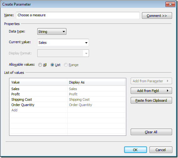
Step 1 – Right-click anywhere in the Measures or Dimensions windows and choose Create Parameter. Create a parameter named “Choose a measure” with the settings below. Note that I am giving this a name that will instruction the user as to what to do.
Step 2 – Find the parameter you just created in the Parameters window. Right-click on it and choose “Create Calculated Field”.
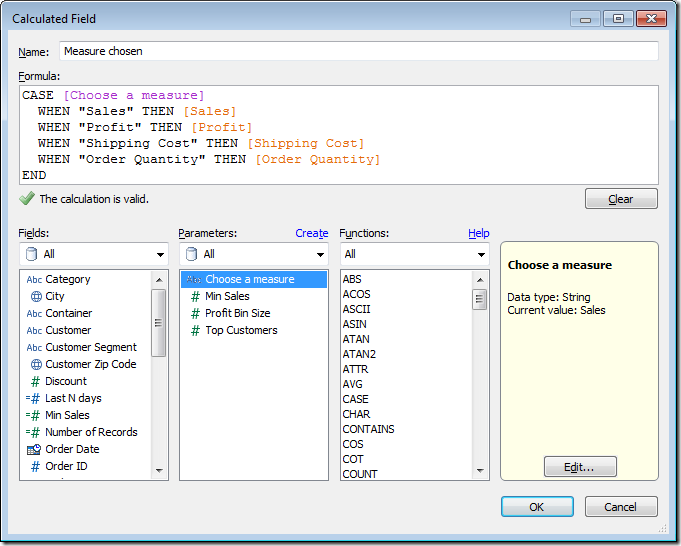
Step 3 – Use a CASE statement to build the calculated field. This field is telling Tableau what measure to use based on the value chosen in the “Choose a measure” parameter.
Step 4 – Add Order Date to the column shelf and your new “Measure chosen” measure to the row shelf. For this example, I’ve expanded the Order Date field to Quarter.
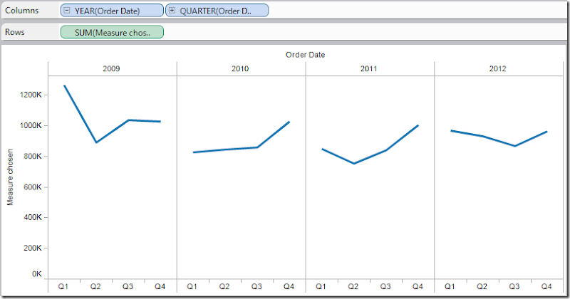
Notice how the y-axis is labeled “Measure chosen”. We’ll clean that up in a bit.
Step 5 – Right-click on your “Choose a measure” parameter in the Parameter window and choose “Show Parameter Control”. It should appear on the upper-right of the window.
Make different selections in the parameter control and notice how the y-axis and the chart change dynamically.
Step 6 – Drag the “Choose a measure” parameter to the row shelf. Again, make different selections in the parameter control and watch the label change.
We’re almost done. Just a bit of formatting remains.
Step 7 – Clean up the chart.
- Right-click on the field that shows the “Choose a measure” value and select “Rotate Label”
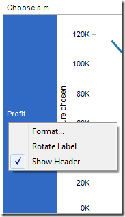
- Right-click on the row label and choose “Hide Labels for Rows”.

- Double-click on the “Measure Chosen” axis to bring up the Edit Axis window. Delete the title.
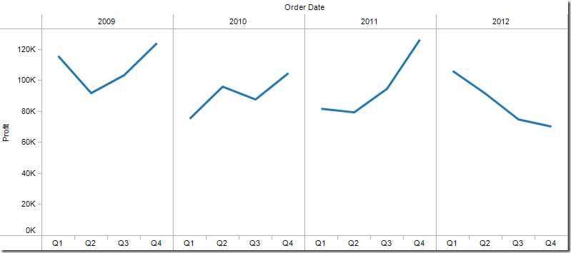
That’s it. You’re final viz should look like this:
If you’re like me, once you saw this technique, you began thinking of all of the possible uses. Play around with lots of different use cases. Try scatter plots, dual-axis charts, bubble charts, etc. You can control ANY of the shelves using parameters. Imagine the guided analysis you can provide your users and the exploration they’ll be able to do on their own. It’s almost like creating a pivot table for them.
If you want a slightly more complex version, I created a scatterplot of NBA franchise values that allows you pick the x-axis, y-axis and size, all with parameters.
Parameters are quite powerful. Leverage them!
Download the sample workbook here.


Thanks for a great tip! I'm using this to display parameter selected axis labels to a scatterplot. Any suggestions on getting the horizontal axis label (on the col shelf) to appear on the bottom of the chart area rather than the top?
ReplyDeleteIf I'm understanding your question correctly, you have two parameters: one for the column and one for the row. You then placed the Parameter on the column and row shelves as discrete dimensions. You then have the Column header at the top of the scatter plot, but you want it at the bottom. Correct?
DeleteIf so, then you can't control that because discrete pills always come before continuous pills in Tableau. An option to get around this would be to put the scatter plot on a dashboard and have two additional worksheets: one below and one to the left. You could float these and only show the title, which would be the parameter value. Does that make sense?
This was exactly the solution I was looking for, since I already had steps 1-5 and the static axis label was driving me nuts! I initially got hung up on step 6, because my parameter was based on numeric values instead of a string. That created a duplicate chart when I dragged the parameter to the row shelf, but even if it had worked it would have listed the numbers instead of the descriptions in the axis title. Once I fixed that it worked perfectly. Many thanks for posting!!
ReplyDeleteI use this technique a lot, but there is one thing that I'd love to see that I don't believe we can easily do as yet...
ReplyDeleteLet's say we choose 3 metrics - Mail Volume, Spend, and Response Rate as part of our parameter metrics. That means we now have a regular number, a dollar value, and a percentage as part of our available measures. After building the case statement and building a chart similar to the one you've shown in this post, the best thing we can do to show the correct values (sans label of $ or %) on the y-axis is using the "automatic" number formatting option for the 'Measure chosen' measure. I know Tableau has made it much easier to add the label on the chart itself with the Label mark after v8.0, but what about the actual y-axis value? Is there any way to dynamically update the measure value's axis label to reflect it's true number format? Thanks!
David, the best solution I can think of is to have three separate charts and put them in a container. You then need to create a calculated field that determines which chart should be shown based on the option picked in the parameter. I demoed this at #DATA14 and will blog the solutions soon.
DeleteHi Andy, can you post the link to the blog where you discussed this solution? Thanks.
ReplyDeleteHey Alex. Just realized that we pulled this trick from our presentation. I'll create a separate blog post for it. Thanks for the reminder!
DeleteHi Andy, I don't mean to be pushy but I have a project on hold for this and the client is getting inpatient. Can you post that solution asap, please?
ReplyDeleteThanks a lot!
Alex/Dave, I posted the step-by-step instructions plus a video recording in a new blog post. http://vizwiz.blogspot.com/2014/11/conditional-axis-formatting.html
DeleteI need to toggle the Line graph (From Combination of Bar and Line in single Graph) ON/Off using a Checkbox. How can i do this?
ReplyDeleteCreate a True/False filter and use that to turn it on/off.
Deletehi Andy i need to chane the y axis legand, we using as one dual axis and one more sheet adding in like same sheet how to change the legand
ReplyDeleteone % then another one Dollers ,then another one normal numbers,we change the paramers and will change the view in one sheet
ReplyDeleteHi! thanks for this information it was very helpful. Would like to know if together with changing the measure of one of the axis it can change another mark? In this case I have a scatter plot chart with one of the axis dynamic. My idea is than together with changing the axis measure (for example between profit and revenue) also change the sizes of the circles (if using sales the size is ∆ sales, if using revenue the size is ∆ Revenue)
ReplyDeleteSure just create another calculated field that returns the value you want based on the parameter.
DeleteThis comment has been removed by the author.
DeleteGive it a shot yourself before I tell you how to do it. You'll learn more that way.
DeleteDone!! thanks so much!
ReplyDeleteThanks a lot for this wonderful option in tableau that you made us know.
ReplyDeleteI am just tring to do as you you did but in the calculation field its shows the error that "Cannot mix aggregated and non- aggregated comparisons or result in CASE expression"
ReplyDeleteThat means that one or more of the field you are using is an aggregate. They have to either all be aggregate or not.
Delete