January 12, 2013
Creating Stream Graphs in Tableau 8 in 6 simple steps (it works in Tableau 7 too, but doesn’t look as cool)
Today I attended Andy Kirk’s “Introduction to Data Visualisation” course, learning a lot about data visualization and constructing stories with data. One of the topics Andy covers is “Establishing editorial focus with your subject matter”. During this section Andy showed the now famous stream graph created by the New York Times which visualized box office receipts from 1986-2008.
So at the next break I thought “Hmm…I wonder if I can build a stream graph in Tableau 8” and about 3 minutes later I had the basics built.
First, you should know that Wikipedia defines a stream graph as “a type of stacked area graph which is displaced around a central axis, resulting in a flowing, organic shape.” The NYT graph has nice smooth curves from one point to the next, however Tableau doesn’t support smoothed lines. Bearing this in mind, let me present you with my first stream graph.
There are two particularly nice new features of Tableau 8. The experience is better in Desktop (or Public) than Server, so if you have the beta, download this workbook and you’ll see what I mean.
- Try out the zoom controls. When you lasso zoom, there’s a really smooth transition.
- In Desktop, as you scroll your mouse across the chart, you see dots at the top and bottom of the band for the color you’re over for that day. It’s super fast and gives you a quicker sense of the height of the color. Really well done Tableau!

You might be asking how I did this. It actually is simpler than you might think. Here’s how you would create a stream graph of Sales based on Order Priority.
Step 1 – Drag Order Date to the Columns shelf, right click on it, and choose Exact Date.
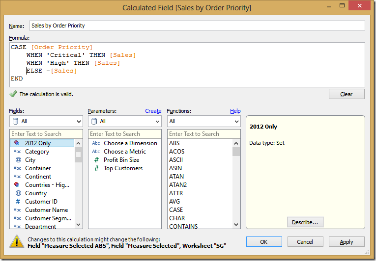
Step 2 – Create a calculated field that determines which Order Priorities go up and which go down.
The trick here is to put a negative in front of sales for some of the Order Priorities.
Step 3 – Drag your new calculated field to the Rows shelf.
Step 4 – Drag Order Priority onto the color shelf (and change the colors if you want…I used the Color Blind palette).
Step 5 – Change the Mark Type to Area
You should now have something like this, which technically is a stream graph and we’re done.
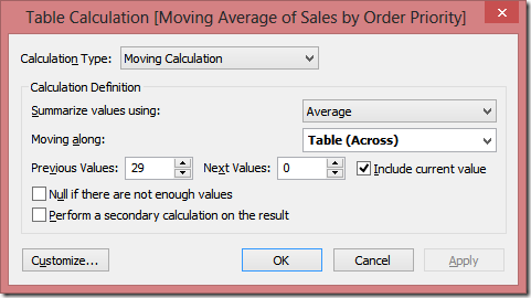
I don’t like the look of this though. It’s way too jagged and I’d like to smooth it out a bit. Moving averages are useful with time-series data to smooth out short-term fluctuations (Wikipedia). A 30-day moving average calculation should do the trick since this is four years worth of data. A 7-day moving average when there’s a shorter time period (like one year or less) works well, or whatever makes sense for your data.
Step 6 – Right click on the Sales by Order Priority pill on the Rows Shelf and choose Add Calculated field.
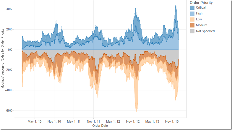
And you’re done. You should now have a stream graph that looks like this:
For my version above, I did a few more things:
- Lots of formatting and cleanup
- Played around with the colors to get them the way I wanted (blues on top, oranges below)
- Created two parameters that allow the user to pick (1) dimensions to slice the data by and (2) measures to analyze.
- Added a time slicer
- Put it all on a dashboard, added some annotations, etc.
I’ve yet to convince myself where I’d use these in a business context, but at least I now know how to build them. How would you use them?


Neat, thanks for sharing this technique!
ReplyDeleteI work with a lot of survey data and can see an immediate application to create a time-series version of the Net Stacked Distribution chart:
http://www.organizationview.com/net-stacked-distribution-a-better-way-to-visualize-likert-data
You could compare "Strongly agree" responses against "Strongly disagree" responses over time to see spikes or dips in customer satisfaction (or whatever KPIs you track with your survey).
Great idea Matt! And I really like what you did with the Likert scales.
DeleteOh, I can't take credit... That's the compilation of great work from Andy Cotgreave, Joe Mako, Steve Wexler and others. I just get to use it!
DeleteHi Andy,
ReplyDeleteFirst of all thank you for sharing your work! I have learned a lot from your public workbooks!
It seems like your chart stacks the values on top of each other whereas the reference chart from NYT doesn't.....is there a way to unstack your area chart?
Thank you!
DUXZ, to turn off stacking, go to the Analysis menu, then choose to turn off stack marks.
Delete