January 11, 2015
What If Premier League Standings Were Based on Points per Goal?
Aston Villa
,
English Premier League
,
football
,
goals
,
highlight
,
interactive
,
points
,
points per goal
,
Premier League
,
rank
,
scatter plot
,
slopegraph
,
soccer
,
standings
,
table
,
tableau
No comments
This week on the Football Ramble podcast (listen here), they talked about a very strange stat they have been observing this Premier League season:


From there, I wanted to understand the difference between Villa's actual place in the EPL table and their place in the fictitious points per goal table. For this view, I created a slopegraph, which I first wrote about creating in Tableau here.
If you're unfamiliar with slopegraphs, Andrew Wheeler summarizes them well in his paper "A Critique of Slopegraphs":
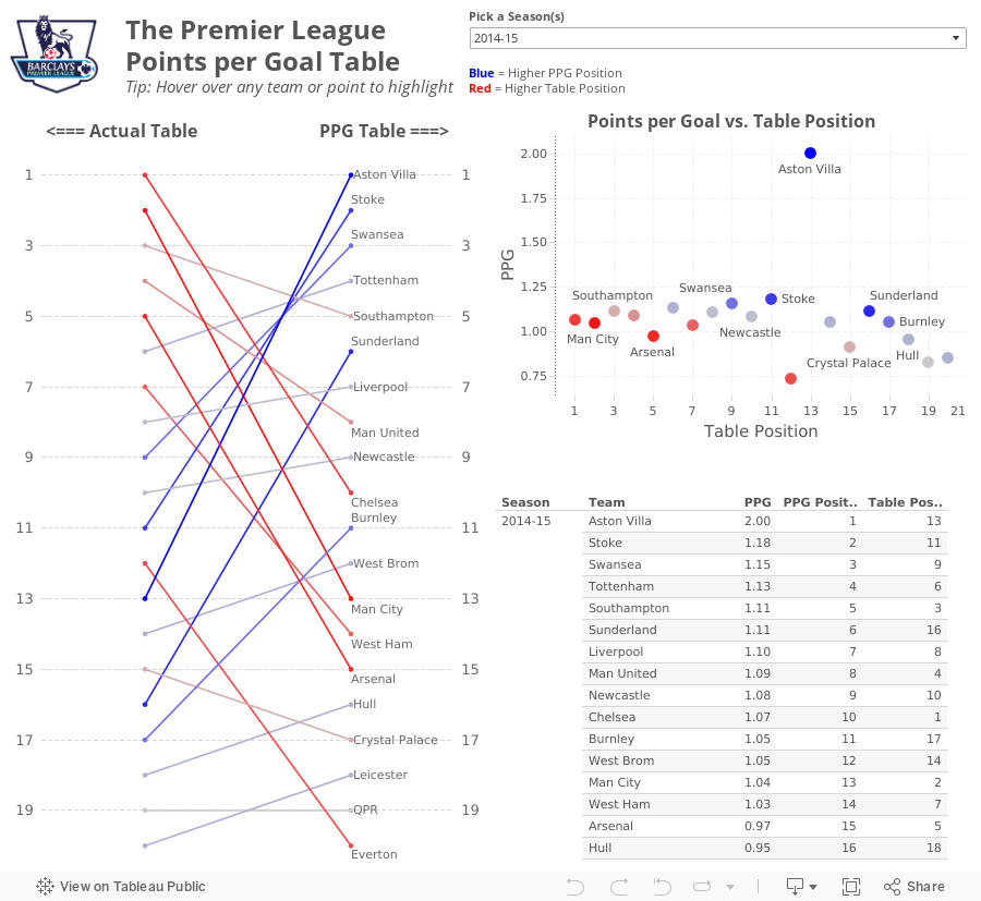
So far in the 2014-15 season, Aston Villa has the highest points per goal of any Premier League team in the last 10 seasons.This was quite intriguing to me, so this morning while I was enjoying a cup of coffee at Tully's I went to ESPNFC.com and downloaded the standings for the last 10 years. I added two columns to this dataset, which you can download here.
- Points per Goal (PPG)
- PPG Position (i.e., a rank of each team based on PPG)
I turned to Tableau to do a quick analysis. My first way of looking at the data was as a scatter plot. I wanted to see just how much of an outlier Aston Villa has been this season.


From there, I wanted to understand the difference between Villa's actual place in the EPL table and their place in the fictitious points per goal table. For this view, I created a slopegraph, which I first wrote about creating in Tableau here.
If you're unfamiliar with slopegraphs, Andrew Wheeler summarizes them well in his paper "A Critique of Slopegraphs":
Slopegraphs show values for two numeric variables by line segments for each observation by connecting points on two parallel axes. They are frequently recommended for visualizing the changes in ranked data (Bertin, 2011; Tufte, 2001).I put all of the pieces together in this simple dashboard, which you can download here. Do you notice anything else interesting or unusual?
Subscribe to:
Post Comments
(
Atom
)


No comments
Post a Comment