April 13, 2020
#MakeoverMonday: Messi vs. Ronaldo - Who Took the Fewest Minutes to Score?
barcelona
,
football
,
gantt
,
La Liga
,
Makeover Monday
,
messi
,
real madrid
,
ronaldo
,
soccer
No comments
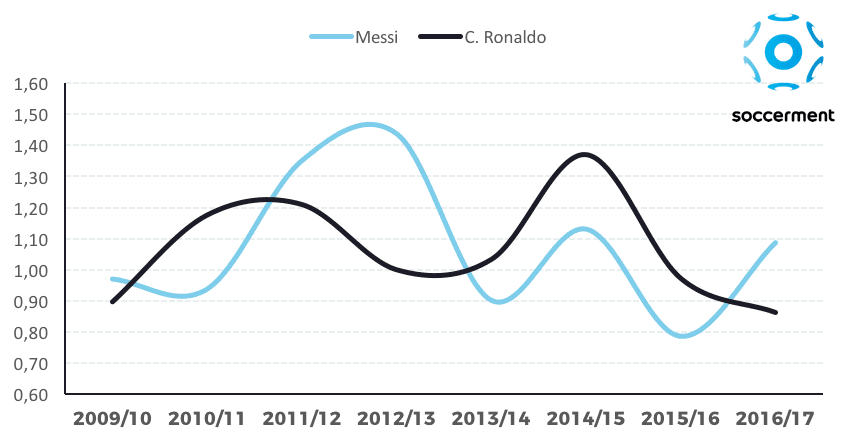
What could be improved?
- Curvy lines don't help you see the exact points of the data. When curved lines are drawn, they render to smooth out the lines, therefore misleading the location of the data along the axis.
- Does the data represent each season or matches within a season? Given that I haven't looked at the data yet, the curved lines make me think the latter.
- Is there a missing title?
- What does the y-axis represent?
- It looks like the data might be goals per match, but that would be misleading since they might have substitute appearances? Would goals per minute normalize the data better?
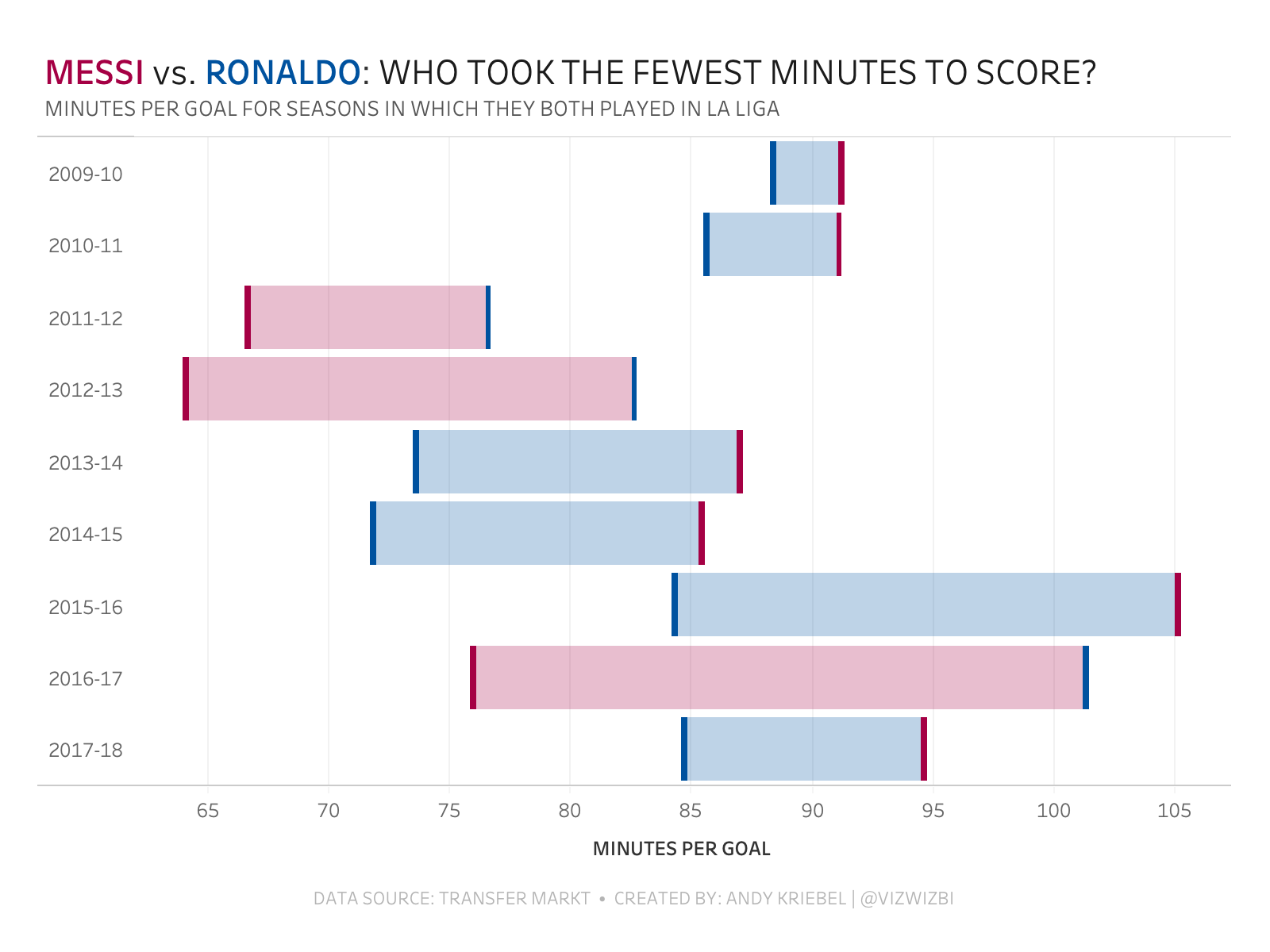
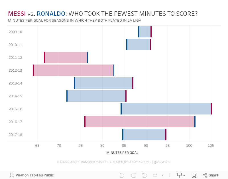
For my alternative, I decided to see who scored goals more often based on the number of minutes played, in other words, how often do they score? Then I wanted to know, season by season, who was better based on that stat.
Subscribe to:
Post Comments
(
Atom
)


No comments
Post a Comment