February 4, 2011
Mr. Nielsen, a simple bar chart is so much better!
Another fantastic article from Nielsen, tainted by a pie chart. Want to Increase Store Traffic, Loyalty and Growth? Re-Think the Center Store
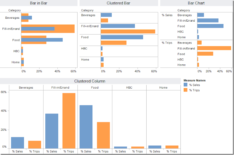
The purpose of Nielsen’s pie charts is to compare the % of total trips to the % of total sales. But there’s no way to do it effectively or quickly if your eyes are having to constantly scan back and forth in an attempt to compare their sizes.
Any of the bar/column charts below is a considerable improvement over the pie charts. My favorite of the options below is the bar-in-bar chart. You can quickly see that fill-in/errand trips are the most frequent, but food trips dominate sales. Which is your favorite?
Subscribe to:
Post Comments
(
Atom
)


Wow, truly another poor choice of chart type. Much of the data from Nielsen research is great. I too wish the designer of the reports had basic charting skills.
ReplyDeleteI need to reach out to them. Enough is enough.
David,
ReplyDeleteLet me know if you find out who to contact and I'll do the same. Like you said, their research is fantastic and it's a shame that they run the presentation at times.
Andy
Andy,
ReplyDeleteyou think only about bar charts so I am not surprised :)
Pie charts aren't so problematic here, there are not so many shares, I don't have so many problems with understanding the charts.
Somebody doesn't like Nielsen :)
Your bar in bar is nice