August 29, 2023
How to Compare YTD, QTD, MTD, WTD & Daily Sales in Tableau

August 23, 2023
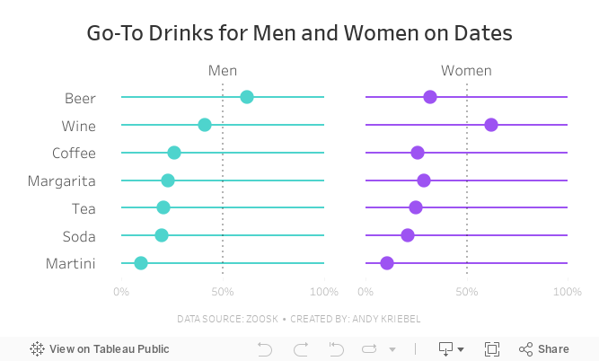
#MakeoverMonday Week 34 - Go-To Drinks for Men and Women on Dates

Join me for live analysis of Zoosk's recent survey, covering 8,793 members' dating drink preferences!
In this livestream, I'll break down the responses across 7 different drink types, comparing the preferences between men and women.
Is there a gender divide when it comes to what people choose to drink on dates?
I'll explore this question and more.
August 22, 2023
From Boring PowerPoint to Dynamic Tableau with Microsoft Web Viewer

August 15, 2023
An 8-Chart Guide to Dashed Lines in Tableau

In this tip learn when to use of dashed lines. Through this video, I'll walk you through 8 distinct examples, demonstrating the effectiveness and clarity that dashed lines can bring to your data representation:
- Line Chart with Dashed Elements: Understand the basics of creating dashed lines.
- Multiple Lines Differentiation: Explore how to distinguish multiple measures using varied dashed patterns.
- Line/Area Chart Combination: Integrate dashed lines with filled areas.
- Comparison to a Moving Average: Learn how dashed lines can contrast raw data against its moving average, helping in trend analysis.
- Current Year vs. Prior Year: Used dashed lines to make year-on-year comparisons.
- Combination Chart: Combine several chart types, using dashes to maintain clarity.
- Barbell Chart Analysis: Learn how dashes can link data points in a barbell chart, highlighting change and consistency.
- Forecast vs. Actuals: Create a forecast with dashed lines.
August 8, 2023
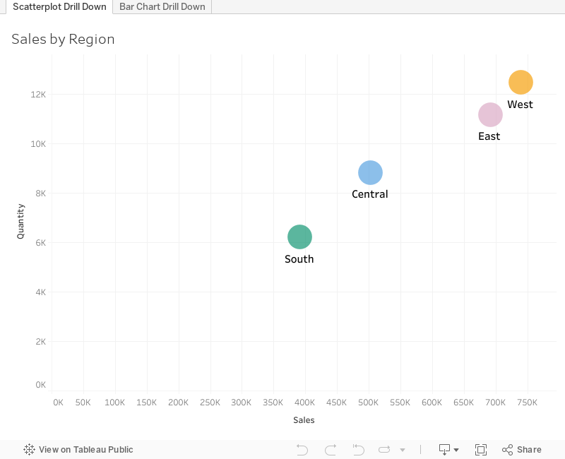
How to Master the 3-Level Drill Down in Tableau (with Dynamic Zone Visibility)

Welcome to my guide on mastering the 3-Level Drill Down in Tableau!
In this tutorial, I show you step-by-step how to make the most of using dynamic zone visibility to create this functionality. We'll go through both scatter plot drill downs from Region → State → Postal code and then replicate that as a bar chart.
You can easily make this a map drill down by changing the chart type. That's it!
🔍 What you'll learn in this video:
1. The basics of drill down functionality in Tableau
2. Hands-on demonstrations, tips, and best practices
3. How to interact with the data
💡 Why is this important?
Drill down capabilities allow analysts to explore data from a broad overview down to granular details. By mastering the 3-level drill down, you can uncover hidden patterns, insights, and trends that might be overlooked in higher-level analyses.
📌 Prerequisites:
A basic understanding of Tableau's interface and primary functions will be helpful, but beginners will be able to follow along as well!
If you are following along, be sure to pause the video along the way as you repeat the steps.
August 7, 2023
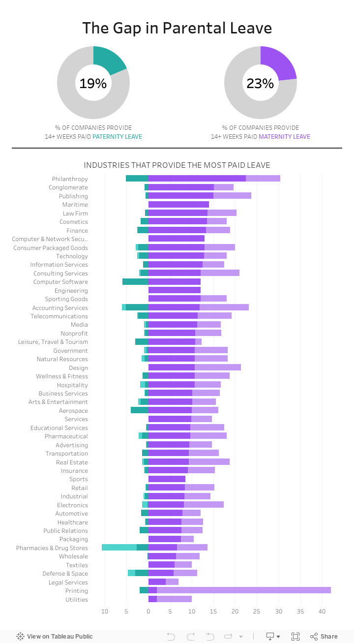
#MakeoverMonday Week 32 - The Gap in Parental Leave

The gap in parental leave is extremely wide across all industries in America.
How do only 23% of women get 14+ weeks of maternity leave? Why isn't progress being made to help dads take a more active role?
Check out the livestream recording and interactive viz below.
August 1, 2023
How to Use ANY Tableau Public Dashboard as a Template for FREE!

Have you ever spotted a great dashboard on Tableau Public and wished you could repurpose it for your own data?
Look no further! 🌟
In this video, I'll guide you through the easy steps of using dashboards on Tableau Public as templates.
From downloading the workbook to swapping out the data and troubleshooting errors, learn how to quickly create dashboards in minutes.
Note: Ensure that you're respectful of original creators' work and provide appropriate credits or mentions when using their dashboards.
Get the data and python code to create your own mock data here - Link
Priya Padham's dashboard - Link | My dashboard - Link


