October 27, 2022
Which chart type should you use?
I get asked quite often how I know which chart to choose and when. There are lot of times now when I don't really think about it, but that because of my experience. When I started, I had no idea which chart would work best for my data.
To make it easier for you to choose the right chart type, here's a list of resources I use when I need to know which chart to use and when.
Financial Times Visual Vocabulary
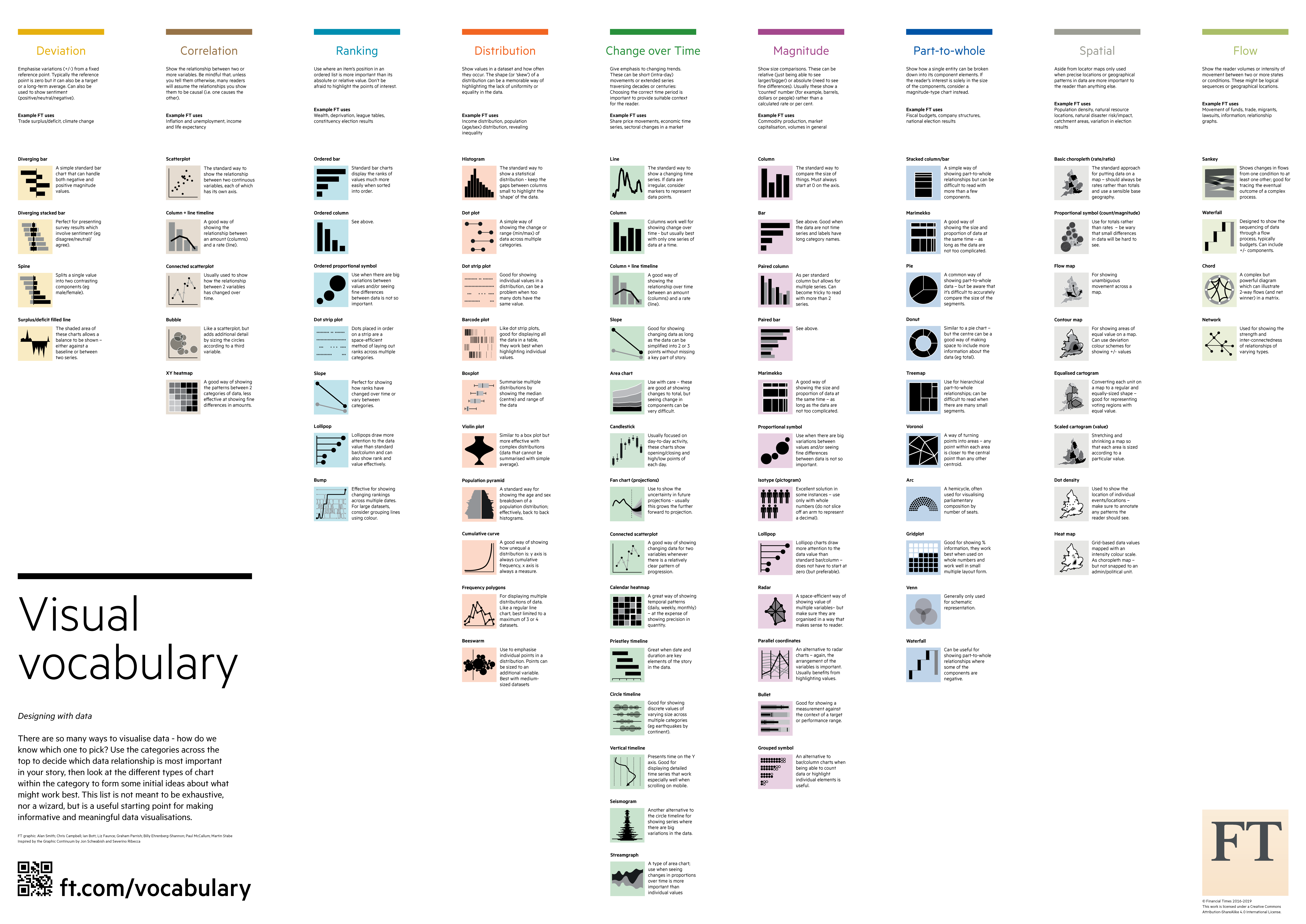
Chart.Guide Chart Chooser
The Data Visualisation Catalogue
The Tableau Chart Catalog
The Data Viz Project

The Visualization Universe
October 25, 2022
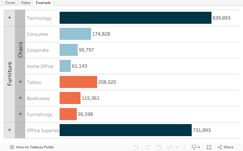
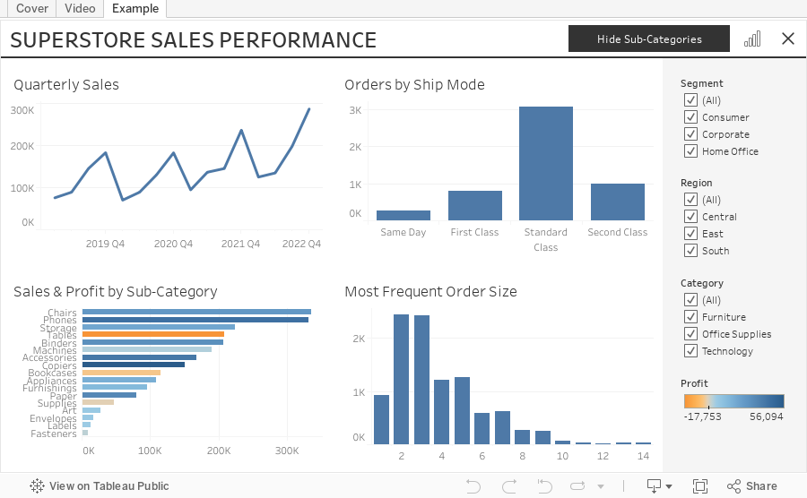
How to Create a 3 Level Drill Down in Tableau
I've showed you in several videos and WatchMeViz live streams how to create a 2 level drill down. And naturally the follow up question is always, how can I go one level deeper? This tip has exactly what you're looking for. I show you how to create a 3 level drill down in Tableau.
This example shows you how to drill down from Category to Sub-Category to Segment. All you need to do for your situation is replace the dimensions I'm using with yours. This will work with any combination of 3 dimensions.
Check out the interactive version below the video.
This type is inspired by this example from Lindsey Poulter - https://public.tableau.com/app/profile/lindsey.poulter8872/viz/SetActionDrilldown/ChooseaMetric
October 24, 2022
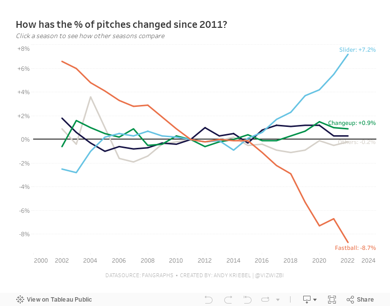
#MakeoverMonday Week 43 - How have Major League Baseball Pitch Types Changed?

This week's data set was pretty simple. We had 21 baseball seasons and a column for each pitch type. Pivoting the metrics made it much easier to work with for me as I could then split the view by pitch type.
During #WatchMeViz (below), I create a trellis view, showed how to create groups, sets, set actions, sparklines, LODs, custom number formatting, creating a mobile view, and more.
Thank you for tuning in. Here's the video and below is my visualization.
October 17, 2022
#MakeoverMonday 2022 Week 42 - Food & Drug Administration Inspections in America

Having looked at the original visualization this week (here), it was pretty clear to me that the creators desired to create a KPI style dashboard. In a way it's good that I picked up on it that way. However, it wasn't designed particularly uclarly well to communicate most efficiently.
I decided during Watch Me Viz that I would stick with their idea of a KPI dashboard, but design it in a way that I thought would be easier to understand.
As per normal, it took way too long to faff about with the formatting. I made a couple of small changes after I finished the live stream. Click on the image below the video to check it out. Leave a comment on the video on YouTube if you have any questions. (Comments aren't appearing on the blog for some reason).
Have a wonderful week!
October 14, 2022
How to Use Show/Hide Buttons in Tableau Dashboards
Show/Hide buttons in Tableau allow you to do just that, show or hide containers, worksheets, blanks, text, legends, even the title. You can now hide ANY object on a dashboard.
One of my favorite use case is adding a show/hide buttons for a filters container. This helps you hide all of the filters at once and increase the space for your charts.
Keep in mind that it's a good idea to name every object in your dashboards in the Layout section so they are easier to identify when creating the buttons.
October 11, 2022
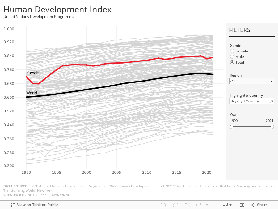
#MakeoverMonday 2022 Week 41 - UNDP Human Development Index

From UNDP:
The Human Development Index (HDI) is a summary measure of average achievement in key dimensions of human development: a long and healthy life, being knowledgeable and have a decent standard of living. The HDI is the geometric mean of normalized indices for each of the three dimensions.
This week, I really liked the original visualization, so during #WatchMeViz, I spend the time recreating the visual. I got most of the way there in an hour and finished it off in the evening. The questions on the live stream are super helpful...thank you!
A couple things I learned:
- Hover action interactivity is very, very slow in Tableau. I ended up changing it to a select action.
- Labeling is overly complicated.
- Tables in a tooltip can look really good. And they are very responsive.
October 5, 2022
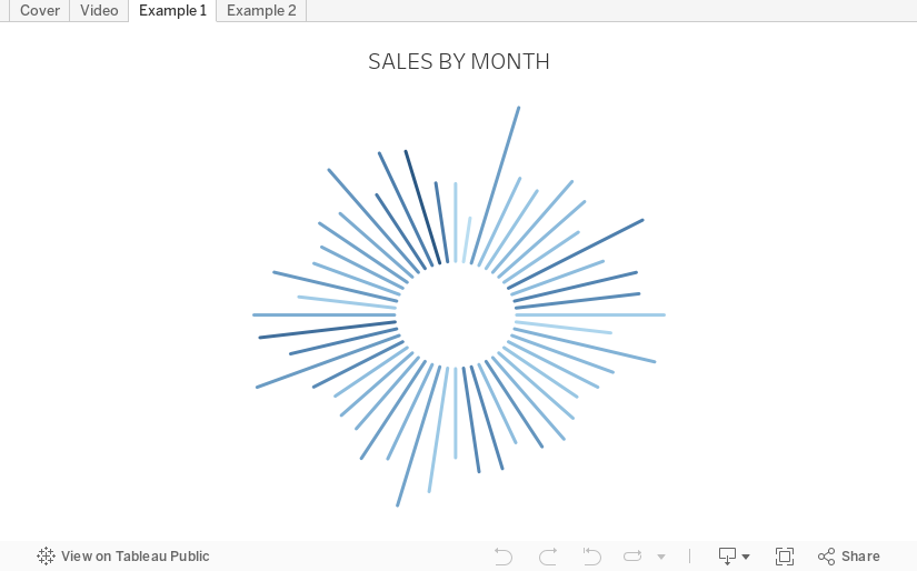
How to Create a Starburst Chart
Starburst charts, sometimes called sunburst charts or circular timelines, are one method of displaying data over time. They may look cool, but they aren't exactly easy to understand. If you are going to use them, I'd advise you to check with your audience first to ensure they understand how to read them.
In this video, I take you through how to build a single starburst as well as a series of starburst charts as small multiples or trellis chart.
All of the calculations are in the description for the video here. You can download the workbook below.
October 3, 2022
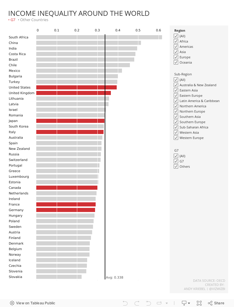
#MakeoverMonday 2022 Week 40 - Income Inequality Around the World