January 3, 2023
#MakeoverMonday 2023 Week 1 - The Change in Greenhouse Gases in the Atmosphere

2023 is here and #MakeoverMonday will be here the entire you to help you continue to learn and improve. Come on the journey with us each week. Build your portfolio. Showcase your skills. You just might get that job you've been seeking. It's happened, a lot, by participating every week.
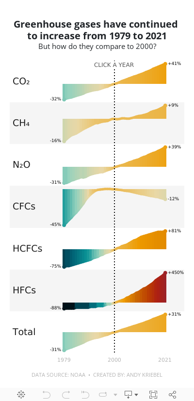
For week 1, we were analyzing greenhouse gases in the atmosphere from 1979-2021. The original visualization is quite simple.

We have CO2 and total gases on the left axis and the variance to 1990 on the right. Overall, the chart is pretty easy to read, with the exception of knowing that the red line is always compared to the 1990 value. That definitely needs to be more clear. It's also missing a title, so without the website it is posted on, you wouldn't necessarily know what it's about.
For my viz, I started by reproducing the original, but it doesn't look as good because the data we have starts at 1979. So you miss the big upward curve. From there, I focused primarily on making good looking sparklines that show comparisons with a parameter action. I also showed how to create an "area chart" with multiple colors. I'm going to create a tip video for it; I like how it turned out.
Here's the livestream and below is the visualization for you to interact with. The viz does not render properly on Tableau Public, but hopefully you get the idea.
I hope you continue to join me throughout the year so that we can learn together.
Have a wonderful 2023!
October 17, 2022
#MakeoverMonday 2022 Week 42 - Food & Drug Administration Inspections in America

Having looked at the original visualization this week (here), it was pretty clear to me that the creators desired to create a KPI style dashboard. In a way it's good that I picked up on it that way. However, it wasn't designed particularly uclarly well to communicate most efficiently.
I decided during Watch Me Viz that I would stick with their idea of a KPI dashboard, but design it in a way that I thought would be easier to understand.
As per normal, it took way too long to faff about with the formatting. I made a couple of small changes after I finished the live stream. Click on the image below the video to check it out. Leave a comment on the video on YouTube if you have any questions. (Comments aren't appearing on the blog for some reason).
Have a wonderful week!
November 16, 2020
Visualizing a Profit & Loss Statement with KPI Cards
Data HAS to be consumed quickly to be understood and to make quick decisions. A "typical" profit and loss statement is on a spreadsheet. However, spreadsheets are notorious for (1) errors and (2) being very difficult to spot areas of concern.
That's where dashboards come into play. Back in July 2017 I proposed a new way to visualize a Profit & Loss Statement (P&L). The dashboard has been very well received and put into practice at many organizations. They've reported back to me how useful it has been.
But then I got thinking about an even easier way to visualize the data. I felt like the previous version was a bit chart heavy. So, while I've been creating templates for other areas of a business (HR, Social Media, Customer Service), I decided to also focus on a new version of a P&L statement with KPIs. This dashboard is based on a Finance Dashboard example from Excel Dashboard School.
You can download the data I used to build this template here. Click on the image below to interact with and download the workbook.






