March 31, 2022
#B2VB 2022/W3 - Olympic Medal Tracker

If you're not participating in the Back to Viz Basics community project yet, you should be. It's all about creating effective, simple charts, which is exactly what you need to be able to do before you build anything fancy. This will definitely help you master data visualization best practices.
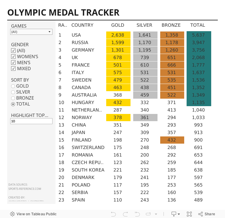
For week 3, the objective was to build a text table of Olympic medal counts. Sounds simple, but unfortunately, building good looking tables isn't one of Tableau's strengths.
I also started the #WatchMeViz livestreams again. You can find all of them on this playlist. Thank you to those that attended live and asked good questions and left thoughtful comments. Below is the livestream as well as my final viz.
Until next week...
March 29, 2022
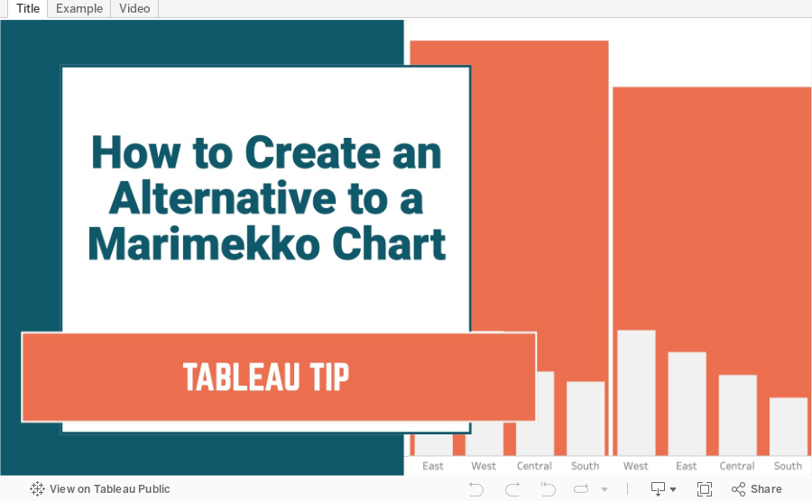
How to Create an Alternative to a Merimekko Chart
A Merimekko Chart, also known as a variable width bar chart, is useful for comparing both high-level data and low-level data in the same chart. However, since we have size variables for both the width of the bars AND the height of the bars, comparing different segments of the chart is more challenging than it needs to be. Read more about the problems with Merimekko charts here.
In this example, I show you how to make an alternative to a traditional Merimekko Chart. I show you how to compare both category sales and regions sales within each category at the same time.
This can be easily replicated by simply swapping out the dimensions and updating one LOD calculation. Alternatively, you could use two parameters to allow the user to pick both the high-level and low-level dimensions and a third parameter for the measure to compare.
March 22, 2022
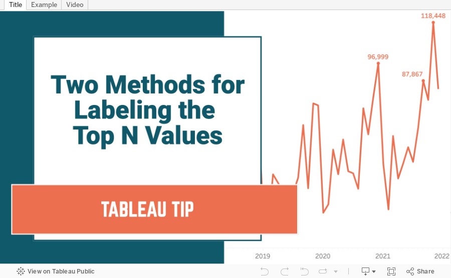
Two Methods for Labeling the Top N Values in a Chart
In this tip I show you how to use the INDEX and RANK functions to label the top N values in a chart. I also explain the difference in how they work, and how the RANK function is simpler to configure.
March 11, 2022
How to Include Multiple Dimensions on the Color Shelf
- You can have more than two dimensions on the color shelf. Simply repeat the steps for adding a second color.
- This only works for dimensions, as I show in the video.
- You do not have to use Sets for this to work; I used that in my example for simplicity.
March 1, 2022
How to Create a Dual Axis Chart with One Dimension and One Measure
This tip comes from a comment from a viewer. They wanted to know how they could build a dual-axis chart based on a single dimension (e.g., Order Date) and a single measure (e.g., Sales). In this tip I show you how to compare the monthly sales for the current year (as a line) to the prior year (as a bar).


