February 26, 2019
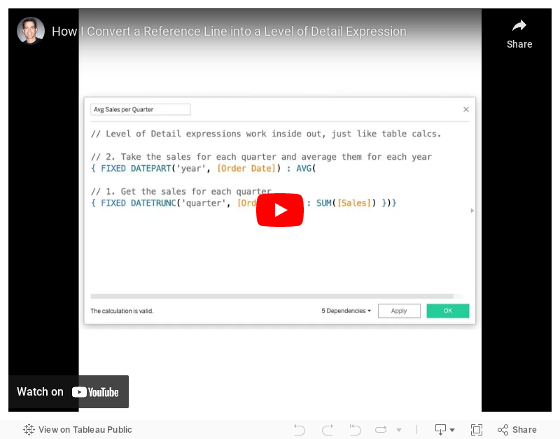
Tableau Tip Tuesday: How to Convert a Reference Line into a Level of Detail Expression
This week's tip builds upon my tip from two weeks ago: How to Convert a Reference Line into a Table Calculation. In this tip, instead of using table calcs, I'll show you how to convert a reference line into a LOD.Enjoy!

February 25, 2019
Makeover Monday: The Economic Value of the Bicycle Industry in the UK
bicycles
,
cycling
,
Makeover Monday
,
sqw
,
UK
,
united kingdom
No comments

Here's the original chart:

What works well?
- Using a line chart for representing data over time
- Minimal use of color
- Y-axis is properly labeled
- Including the sources
What could be improved?
- The x-axis label is completely wrong.
- The title needs to be more specific. As a standalone chart, we have no idea if this is about a country, a store, whatever.
- Don't include all of the axis ticks between each of the quarters.
- Remove the diamonds as markers for each point.
- Change the units of measure on the y-axis to thousands.
My goals
- Create something that's easy to understand.
- Stick with the minimal use of color.
- See if the change between periods is important. If so, what is changing and why?
- Is there seasonality? If so, how is that seasonality changing?
- Consider other metrics, like value added per bike. How does that change through time? What do the changes mean?
With those goals in mind, here is my Makeover Monday week 9 2019. I made value added per bike the primary focus of my viz to help explain that the downturn in the cycling industry is due to volume, not value added per bike.
February 22, 2019
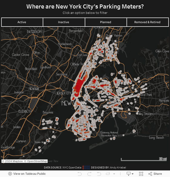
Where are New York's Parking Meters?
density
,
map
,
Mapbox
,
new york city
,
open data
,
parking
No comments

Their map is impossible to read with some many big dots overlapping each other. This also makes it hard to see the concentration of parking meters. My assumption going in was that you'd see way more in Manhattan.
All I really did was create a map, plot each point, and change the mark type to Density. From there it was formatting:
- Using a custom mapbox map, which I customized based on the mapbox template Metropolis.
- Play around with lots of colors, then intensity and opacity of each of those colors, before settling on a choice.
I probably could have done this process for days and days without ever finding a "perfect" solution for the formatting, so I decided it's good enough and wanted to get it published. Enjoy!
February 20, 2019
Improving Upon Strava Activity Summaries: RIDE IT London Osterley Sportive
A few weeks ago, I voluntold Luke Stoughton (Head of Data School Recruitment and good friend of mine) to join me for a 52 mile cycling sportive hosted by Evans, a UK-based chain of cycling shops. Now, there's one thing to keep in mind...Luke had only ridden up to about 20 miles on a single ride. He WAS NOT happy with me, but he went anyway.Coach Carl joined us as well, so I met him at a train station on the way and we rode the rest of the way to the start at Osterley House, an incredibly beautiful National Trust park and house. We met Luke there and headed off on our trek, stopping at two feed stops (I ate about eight pieces of cake at the second), peddling up three steep hills (they weren't that bad, but Luke hated it and threatened me), before looping back to the start and hitting the pub for a couple well deserved refreshments.
Along the way, I was thinking about how I could visualize the data. Strava does a decent job (see my ride here) and I thought I'd use that as a basis for my viz. My goals:
- Use a Mapbox map background as similar as I could to the Strava map (which is proprietary).
- Use the Strava colors (I found the hex codes in their brand guidelines and added them to my preferences file).
- Prep the data in Alteryx. There is a web data connector, but I like being able to create my own row level calculations and extract only the data I'm interested in. Plus it gives me an excuse to practice Alteryx more.
- I like how the elevation timeline, but for me it's lacking context by not including speed. I decided to keep its wide and short style while creating a dual-axis chart to overlay speed on top of the elevation.
- I included key moments as viz in tooltips. Hover over the gold ribbon (fastest speed) to see a picture of Luke and Carl speeding down the hill. That was fun! You can also see a selfie of us at the end.
- Include interactivity like Strava. Basically link the map to the chart and vice versa.
- Include speed and elevation on each point.
- Everyone loves a good BAN! FYI, Strava calculations elevation climb differently.
This isn't anything complicated and I think it's a viz that provides ever so slightly more context than Strava. Click on the image below for the interactive version.

February 18, 2019
Makeover Monday: Which States have invested the most per home in wind energy?


What works well?
- The States are sorted from most installed capacity to least.
- The title clearly indicates what the chart is about.
What could be improved?
- The log scale is misleading.
- The colors are double encoding the data.
- The windmill symbols are chart junk.
- The labels for the Stated get smaller and smaller, to the point where you can hardly read them.
- The investment labels are not consistently formatted, they are aligned on an angle, then vertically, and they get smaller and smaller.
What I did
- Since this is a simple data set, I wanted to use a tool other than Tableau. I find this useful so that I can speak about other tools from an educated perspective.
- Create a simple viz
- Look at the relationship between installed capacity and development
- Consider metrics that normalize the data
February 13, 2019
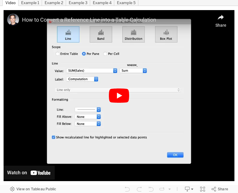
Tableau Tip Tuesday: How to Convert a Reference Line into a Table Calculation

February 12, 2019
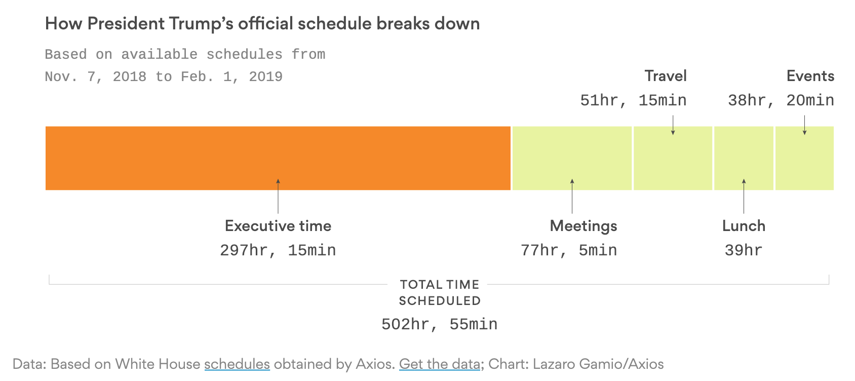
Makeover Monday: When did President Trump spend the most Executive Time?
I've already written about what works and what doesn't about the original visualization (read it here) and since the two current The Data School cohorts had to create a Makeover Monday viz in an hour, I thought I should do the same.I wanted to create a calendar view that only show the Executive Time. It's easy enough to filter to just that data, however, there are days when there was no executive time, which led to holes in the calendar. To overcome this, I created an Excel spreadsheet with every day from 1 December 2018 through 31 January 2019, then I joined the two data sets, ensuring that my Excel spreadsheet was the primary data source so that all dates would be in the data set (in other words, NOT an inner join).
From there, creating the calendar was simple, adding the color was simple. I spent most of my time fiddling with the formatting.
Click on the image below for the interactive version.

February 11, 2019
Makeover Monday: How President Trump Spends His Executive Time

- Trump usually spends the first 5 hours of the day in Executive Time.
- He spends his mornings in the residence, watching TV, reading the papers, and responding to what he sees and reads by phoning aides, members of Congress, friends, administration officials and informal advisers.
- Trump doesn't take an intelligence briefing until 11am or 11:30am, and they only last 30 minutes.
The list, sadly, goes on. The viz they posted that we're making over this week is this simple stacked bar chart.
What works well?
- Using a color that stands out over the others to highlight executive time
- The title tells me what the viz is about.
- The subtitle provides context as to the amount of data that the chart summarizes.
- Simple labeling
- Including the total time at the bottom and stretching the lines to the ends of the stacked bar chart
What could be improved?
- It's hard to compare the executive time to all other time. A percentage would be helpful.
- Would the stacked chart be better as a horizontal bar chart with two rows?
What I did
- I wanted to look at the frequency of executive time by hour of day and day of week. Does Trump spend the same amount of executive time each day?
RESULT: The first couple heatmaps looked terrible, but visualizing by weekday looks ok. - Do big numbers help tell the story in the data?
RESULT: Yes, they help summarize the data well, but didn't help my end product. - Are there any trends in the data? That is, is executive time increasing or decreasing? Or has it been consistent?
RESULT: The trends are not very useful.
In the end, I thought visualizing the data as stacked bar charts by weekday looked the best. I built quite a few charts that turned out completely useless. However, there comes a point when something is good enough. That's where I ended up. Click on the image below for the interactive version.
February 6, 2019
Hospital Closures in Rural America
Today is my first time participating in Lindsay Betzendahl's great collaboration project #ProjectHealthViz. She first told me about back at TC and I told her I would participate when time permitted. So here I am, participating for the first time.The data set Lindsay posted was about hospital closures in rural parts of America. My mind immediately went to poverty in the South (I wasn't too far off), access to medical care, and the cost of healthcare.
After exploring the data and getting feedback from Lindsay, I settled on a simple story that answers few simple questions:
- How many hospitals have closed?
- How many beds are no longer available?
- How many people are impacted (I added data from the US Census)?
- How many hospital bed days have been lost?
In the end, this is a pretty simple viz that I hope communicates the message well. In my opinion, access to healthcare should be a right, not a privilege. Click on the image for the interactive version.

February 3, 2019
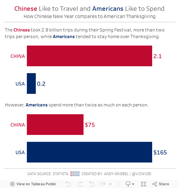
Makeover Monday: How Chinese New Year Compares With Thanksgiving


What works well?
- Good title and subtitle
- Using colors that are easy to distinguish from each other
- Including the numbers to give the circles context
What could be improved?
- Comparing circles is very difficult; what are we to compare? The size? The diameter? Either way, it's very difficult.
- Remove the background image
- Make the numbers comparable. China's population with way bigger than the US. Converting them to per capita would make for better comparisons.
What did I do
- Transposed the data so that I had a column for each measure
- Create per capita calculations for each measure
- The trips and spending data looked like the most interesting, do I discarded the viewership data since that really has nothing to do with the other data.
- Changed the circles to simple bar charts
- Made the titles of the charts state the message of the chart
Subscribe to:
Posts
(
Atom
)


