Showing posts with label statista. Show all posts
June 8, 2020
#MakeoverMonday Week 23 - Frequency of Meat-Free Consumption by Brits in 2019
highlight
,
level of detail
,
Makeover Monday
,
meat
,
parameter
,
statista
,
UK
,
united kingdom
,
vegan
,
vegetarian
No comments
Week 23 was a pretty straight forward data set. It focuses on the frequency with which Brits of different diet types have consumed meat-free foods. Somehow meat-eaters have NEVER eaten meat-free food. No fruits or veggies? Ever?
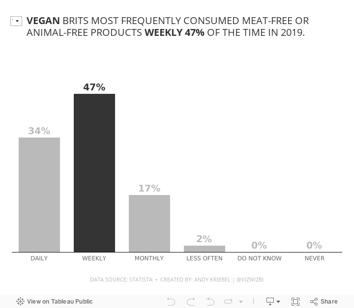

And what about the vegans? This data says they most frequently eat meat-free food weekly. Huh? They're vegan; they eat meat-free food every meal.
I'm skeptical of this data. Anyway, here's my viz.
February 3, 2019
Makeover Monday: How Chinese New Year Compares With Thanksgiving


What works well?
- Good title and subtitle
- Using colors that are easy to distinguish from each other
- Including the numbers to give the circles context
What could be improved?
- Comparing circles is very difficult; what are we to compare? The size? The diameter? Either way, it's very difficult.
- Remove the background image
- Make the numbers comparable. China's population with way bigger than the US. Converting them to per capita would make for better comparisons.
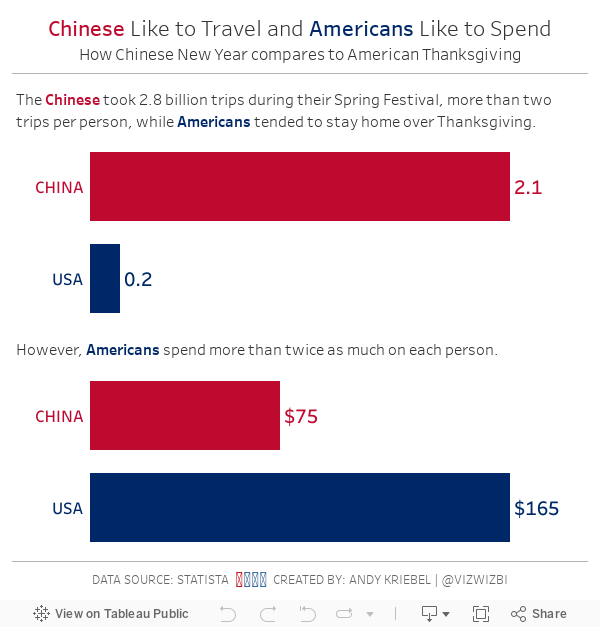
What did I do
- Transposed the data so that I had a column for each measure
- Create per capita calculations for each measure
- The trips and spending data looked like the most interesting, do I discarded the viewership data since that really has nothing to do with the other data.
- Changed the circles to simple bar charts
- Made the titles of the charts state the message of the chart
November 26, 2018
Makeover Monday: The Cost of a Night Out
bump chart
,
cost
,
food
,
Makeover Monday
,
rank
,
stacked bar chart
,
statista
No comments


What works well?
- Choosing a topic that is relatable
- Good title and subtitle
- Sorting the bars from most expensive to least expensive
- Using colors that are easy to distinguish
- Including the labels on the ends to the bars
What could be improved?
- Lose the icons on the lower right
- Remove the gridlines and axis labels (they're not necessary if the ends of the bars are labeled)
- Remove the flags next to each city; First they add no value. Second, the data is about cities not countries.
- The title is a bit misleading; this is only a selection of cities.
- Using a stacked bar chart makes comparisons across the items difficult; maybe if this was interactive and you could choose the item to sort by, it would work better.
What I did
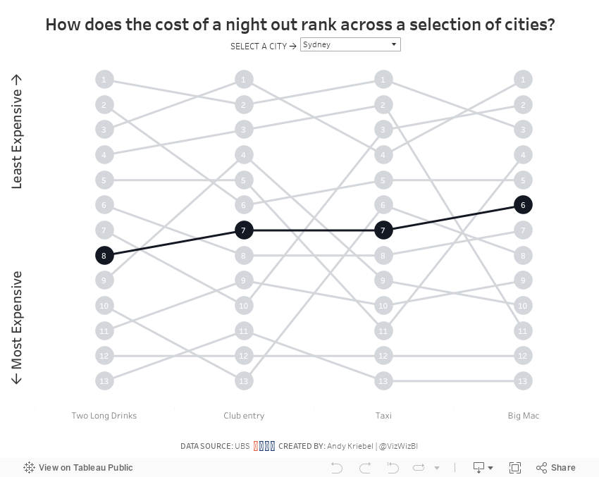
- I wanted to make the comparisons easier, so I chose to create a bump chart.
- I added a highlight selector so the user can focus on a single city, yet keep the others in the view for context.
- I sorted the values from least expensing (top) to most expensive (bottom).
With that, here's my Makeover Monday week 48.
December 24, 2017
Makeover Monday: Americans Favor Fake Christmas Trees More and More
Here's my challenge for everyone that participates...Get one new person to participate. That's it! Simple! Do it! Everyone will benefit.
For week 52, Eva chose a simple viz from Statista about real vs. fake Christmas tree purchases by Americans. We switched to fake about eight or nine years ago and haven't regretted it one bit. Every year we think about that one tree we have saved.

What works well?
- Nice interactivity on the tooltips
- Colors are easy to distinguish
- The tops of the stacked bars allow you to see the overall trend of all tree purchases
What could be improved?
- Including all of the labels on the bar is distracting
- Remove the shadows from the text
- Use colors that are associated better with trees (like green)
- Use a more impactful title and the wrapping is sloppy
- Use a smaller footer that won't take up way so much space
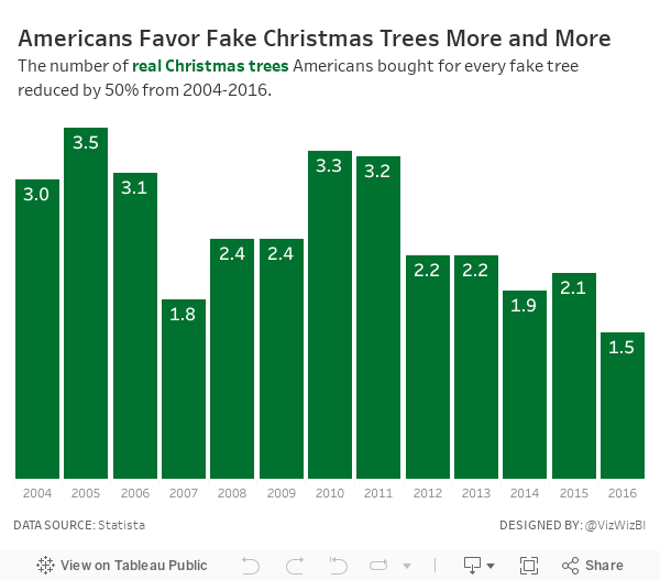
My Goals
- Complete something quick; it's Christmas Eve after all
- Find something interesting in the data
- Use Christmasy colors
- Use a title that tells the user what they're seeing
With those goals in mind, here is my last Makeover Monday for 2017. See you next year!
Subscribe to:
Posts
(
Atom
)






