January 26, 2021
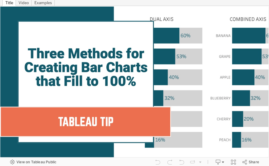
Three Methods for Creating Bar Charts that Fill to 100%

January 25, 2021
#MakeoverMonday Week 4 - Coal Production in India

- Watch Me Viz - https://youtu.be/ur3Vhs7Ceck (also below)
- Tableau Workbook - http://bit.ly/MM2021W4

What could be improved?
- There's no title.
- The District names are way too small. My old eyes can't read it.
- I don't understand the sorting. I would pick one of the metrics to sort by.
- The comparisons need to be more clear, if that is the intent.
Watch Me Viz
Final Dashboard (click to interact)
January 19, 2021
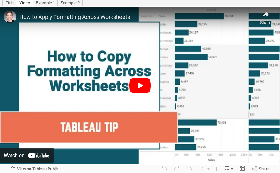
How to Apply Formatting Across Worksheets

January 18, 2021
#MakeoverMonday Week 3 - The World is Getting Warmer

This week's viz to makeover reminded me of a very similar (almost exactly the same) data set that we used for Makeover Monday in 2016. Here's the original viz:

Honestly, it's absolutely fantastic. It's one of the best examples of scrollytelling I've every seen. Check out the original here.
Since I had explored this data set before, I know pretty quickly what I wanted to do. During Watch Me Viz, I went ahead through many iterations of working with time series data; they're all available in the workbook. Watch the video here (or below).
Here's my final viz. Each dot represents a month and the line represents at 10-year moving average. Each mark is compared to the 1951-1980 median. Click on the image to view the viz on Tableau Public.
January 13, 2021
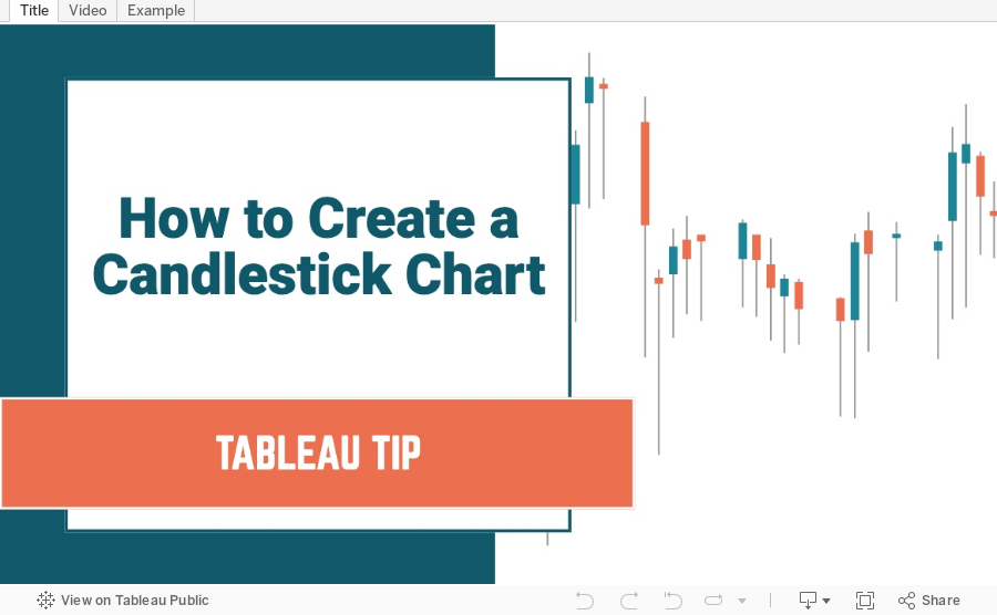
How to Create a Candlestick Chart

What is a Candlestick Chart?
A candlestick chart is a style of financial chart used to describe price movements of a security, derivative, or currency. Each "candlestick" typically shows one day, thus a one-month chart may show the 20 trading days as 20 candlesticks. Candlestick charts can also be built using intervals shorter or longer than one day.It is similar to a bar chart in that each candlestick represents all four important pieces of information for that day: open and close in the thick body; high and low in the “candle wick”. Being densely packed with information, it tends to represent trading patterns over short periods of time, often a few days or a few trading sessions.~ Source: Wikipedia
In this tutorial, I show you how to build a candlestick chart in Tableau. They are built as Gantt charts with a couple of simple calculations. Follow along by downloading the data set here.
January 11, 2021
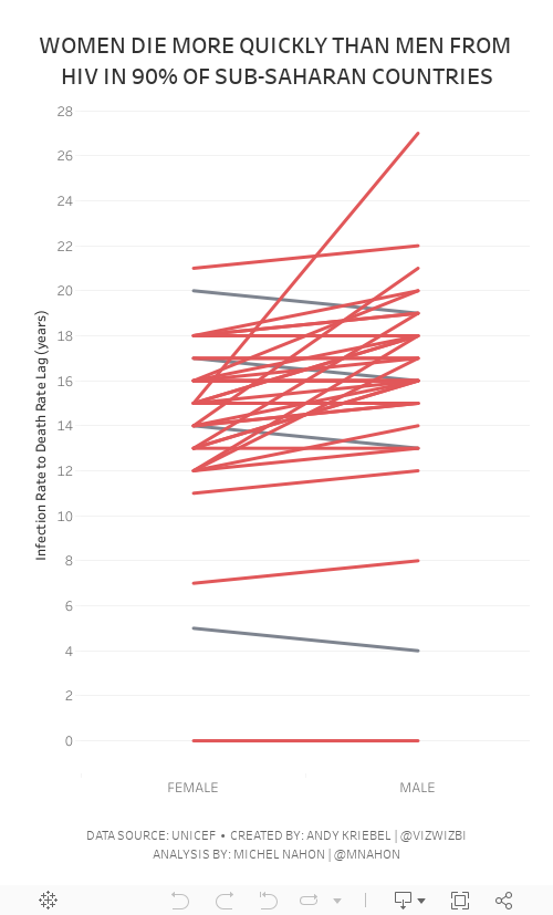
#MakeoverMonday Week 2 - Women Die More Quickly Than Men From HIV Infection

I must admit that I REALLY struggled with this data set. I could have easily just compared males vs. females by country and year, but it seems we've been doing that over and over again. I looked to explore the data and thought a connected scatterplot would look nice, but it didn't.
Fortunately Michel Mahon proposed looking at the lag between the year of HIV infection rate and death. Morbid yet interesting analysis. It took me a while to get the calcs working; I'd recommend you build your view as a table to verify the calcs when you're not sure if they're correct. In the end, thanks to Michel's suggestion, I created a slope graph that compares the lag in years for both men and women.
As the documentation suggested, women die more quickly than men.
Below are both my visualization and the Watch Me Viz session on YouTube. Thanks for tuning in!
January 3, 2021
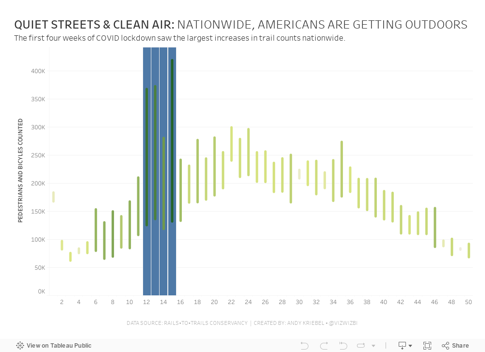
#MakeoverMonday Week 1: Quiet Streets & Clean Air - Americans Are Getting Outdoors

Back in March 2020 when COVID lockdown started in the UK, the streets were amazingly empty, the air got fresher and I saw more and more people outside. You could hear birds chirping on streets you never would have before. And we could ride our bikes right down the middle of the road since there were no cars. The lack of cars was glorious! (COVID isn't of course).
For 2021, #MakeoverMonday gets started with a simple graphic that compares pedestrian and bicycle counter stats for 2019 and 2020 at 31 counters across America. The data is collected by the Rails to Trails Conservancy, and you can learn more about the data here.
ORIGINAL VISUALIZATION

WHAT WORKS WELL?
- A line chart is a good choice for time series data.
- The colors are easy to distinguish.
- The grid lines help guide the eye across the view.
WHAT COULD BE IMPROVED?
- Include a more impactful or descriptive title. What is it about?
- Why are thee weeks missing on the x-axis yet the lines go the full year (or appear to)?
- The lines could be labeled directly so that you don't have to refer to the color legend to know which lines represents which year.
MY MAKEOVER