August 29, 2018
Tableau Tip: How to Create Rounded Bar Charts
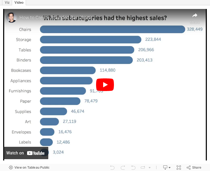
I've used rounded bar charts a few Makeover Mondays. I received an email from a reader yesterday about how to create them, so I decided to make a video in case anyone else has the same question going forward.The end goal is a chart that looks like this:

You can download the workbook by clicking on the download link on the toolbar below the video.
August 27, 2018
Makeover Monday: Which body parts are we attaching computers to?
bar chart
,
cost
,
fitness
,
Makeover Monday
,
price
,
quartz
,
tracking
,
watch
No comments


What works well?
- The simple ranked bar chart is easy to understand.
- Including the sources in the footer
- Including labels on the ends of the bars
- Choosing an easy to read font
- Simple title
What could be improved?
- I'm not so sure about the color choice. I feel like it's shouting at me too much.
- Remove the tick marks next to each body part. The label is already next to the bar, so the tick is unnecessary.
- What are the bars measuring? Is it the number of devices per person? The average price? This should be made more clear.
What I did
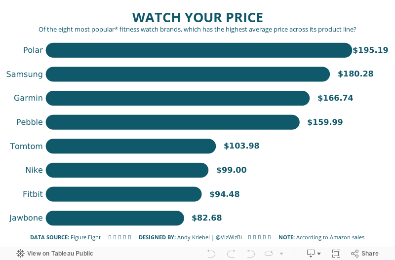
- Since I'm an avid runner that has gone through multiple devices and brands, I wanted to focus on the most popular watch brands.
- The number of devices didn't help because each company has a different amount of diversity in their product line.
- When I'm looking for a new watch, I start shopping by price since I know my budget. For this makeover, I focused on average price.
- I liked the idea of the original bar chart, so I created a bar chart.
- I sent the viz to Eva because I was struggling with the title and she sent me back the headline WATCH THE PRICE.
With that, here's my Makeover Monday week 35.
August 24, 2018
Makeover Monday: Africa's Deadliest Armed Conflicts - Density Map vs. Heat Maps
ACLED
,
Africa
,
Alteryx
,
armed conflict
,
density
,
heat map
,
Makeover Monday
,
map
,
violence
,
workflow
No comments


The workflow is simple and I'm sure there's a more elegant want to create it. The guts of the workflow:
- Create spatial points from the latitude and longitude of each record.
- Convert the spatial points into a heat map by grouping the points into grids.
- Union the four streams back together.
- Export the data as a shapefile.
The reason I have four streams in the workflow is because I didn't see a way of doing a grouping by the event type within the heatmap tool.
The Alteryx heatmaps are easy to adjust; I played with the grid size and maximum distance a few times until I got something close to Tableau's density maps (without fiddling with the settings endlessly). I settled on a grid of 33 miles and a max size of 75 miles.
I also chose to create the shapes as donuts so that they wouldn't stack on top of each other. Here's the result:
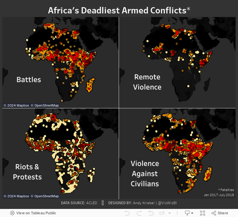
Density Maps vs. Heat Maps
Let's start by looking at the difference between the density map and the heat map.

Here are some of the differences I have noted:
- Density maps in Tableau are completely dependent upon the number of marks in the view. The more accurate you want the density, the more marks you need to include. That's 9229 marks in this case.
- Since the heat maps Alteryx generates are shapefiles, they will render much faster as there are only 28 marks.
- The Alteryx heat maps clearly encompass all points, meaning you can see EVERYWHERE that there was an incident.
- Tableau's density maps hide the outliers.
- You can't have highlight actions on a density map as there no dimension categorizing the heat.
- The density maps looks much cleaner than the heat maps.
I like both version and they both have their benefits. The point of me doing this, though, was to improve my skills. The only way I'll get really good at Alteryx is to use it more. Focused time helps me develop. Removing distractions like social media (those things that don't help you learn) are a good way to free up wasted time. Make time to learn and you'll rarely regret it.
August 19, 2018
Makeover Monday: Africa's Deadliest Armed Conflicts
ACLED
,
Africa
,
armed conflict
,
density
,
Makeover Monday
,
map
,
violence
No comments

What works well?
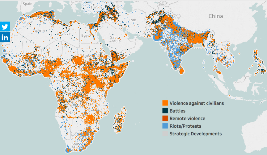
- The map is zoomed into the areas that are the focus of the data.
- The color palette has enough variation to distinguish between the type of violence.
- Putting every incident on the map helps show the volume of conflicts.
What could be improved?
- Because the dots are overlapping and there's no transparency, you can't see what is behind each dot. Are there battles behind the violence against citizens? I have no idea from this chart.
- Some of the dots look like they are sized differently. Why?
- There's no title.
- The data source isn't referenced.
- While the color palette give a good range, I'm not sold on the color choices. These are all bad topics, but the blue could come across as not bad.
- Have fatalities been accounted for?
What I did
- I like the idea of a map for this data set, but I think a density map will work much better. As this is now only in beta, I can only post an image. I'll post the interactive version once Tableau 10.3 comes out.
- I wanted to understand where the deadliest conflicts occur, so I create a metric for fatalities per incident.
- The density is colored by this metric.
- I separated out the types of violence to address the issue of overlapping.
With that, here's my Makeover Monday week 34 about Africa's deadliest armed conflicts.
August 16, 2018
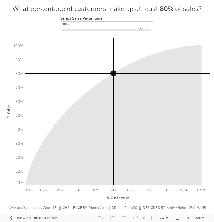
Workout Wednesday: How many customers make up XX% of sales?
On yesterday's Makeover Monday Viz Review, guest host Ann Jackson gave me a bit of grief for not participating in too many Workout Wednesday's this year. I've taken on her challenge and this week I've complete week 33. This week was a community challenge from Donna Coles, who has completed every WW since it started in January 2017.Find all of the details of the challenge here. The only requirement I chose to ignore was the dashboard size. I created it 700x700 instead of 800x800 because it fit on my screen nicely.
Some hints for this challenge:
- You'll need to know your table calcs.
- This video will be helpful in creating the Pareto chart.
- You'll need extra calculations for the tooltip and the lines and the dot.
That's all I'm going to give you; the rest you need to figure out on your own. Good luck!

August 14, 2018
The Greatest Tableau Tip EVER: Exporting Made Simple!
csv
,
dashboard
,
export
,
image
,
Marc Rueter
,
tableau
,
tips
,
URL
147 comments

UPDATE: 14 August 2018
Version 2018.2 of Tableau introduced Dashboard Extensions. To make exporting data from dashboards as easy as possible, The Information Lab CTO and Zen Master Hall of Famer Craig Bloodworth created the Export All extension. What does this do?
If you have at least version Tableau 2018.2, then I'd highly recommend the use of this extensions versus the technique outlined below.No matter how much you try to convince them, there will always be some users who want to reduce your beautiful Tableau charts to a table of numbers in Excel. So if they're going to do it anyway, you may as well give them a simple, controlled way, generating one Excel workbook and not a bunch of CSVs. With the Export All extension for Tableau Server you can place a simple button onto your dashboard, choose which sheets & columns are exported, and with one click your users can download a clean & tidy Excel workbook.

We’ve all heard this question before: How can I export a CSV in Tableau? To be honest, it’s quite the pain and way more difficult than it should be. There have always been a few options.
- Users can click on a specific sheet on a dashboard and then export that via the tiny button on the toolbar, but that has a few of its own problems: (1) You may not want to show the toolbar therefore making the export impossible, (2) People have to be trained to know exactly where to click to get it just right, and (3) You have no control over the output of the CSV.
- You can export a CSV using Tabcmd, but that’s not useful for the average dashboard consumer.
- You can add .csv to the end of the URL like http://[Tableau Server Location]/views/[Workbook Name]/[View Name].csv. But again, you never know what that output is going to look like.
Yesterday I learned an incredibly valuable trick that would make option 3 (adding .csv to the URL) export exactly the CSV you want. Let’s look at an example.
On this dashboard, notice how I added an Image object (I used an Excel icon) on the dashboard. I’ve floated it to the upper right and made it small. All the user has to do is click on that icon and they get a nice CSV. Go ahead, try it!
Did you try it? If you did, and you opened the CSV, you may have noticed this looks remarkably like the data that you would hope to get if you exported the data for the line chart. But I didn’t export the line chart at all. Here’s the trick.
- Add the image icon on the dashboard and place it wherever you like.
- Add a URL link to the image. In the dashboard above, the URL is http://public.tableausoftware.com/views/ExporttoCSV/Dashboard.csv?:showVizHome=no.
This is where the magic sauce happens. When you add .csv to the end of a Tableau URL, Tableau will export the first sheet on the dashboard alphabetically. Yes, it’s that simple! And it’s totally undocumented. Special thanks to the one and only Tableau Jedi Mark Rueter for this tip! But note that Tableau orders upper case before lower case. - What I did was float a sheet named AExport onto the dashboard. I changed the height to 1 and made everything white and transparent and chose Fit Entire View so that it would be inconspicuous. I had to name it with a capital A so that it would be the first sheet alphabetically on the dashboard.
The AExport worksheet started off like this:
Basically, you can put anything you want on this sheet. I then changed the transparency to 0% on the Color shelf, changed the default worksheet color to white, removed the row banding and removed the row and column dividers. The worksheet now looks like this:


- Create a worksheet that you want to export.
- Remove all of the formatting to make it look invisible.
- Be sure to give it a name that makes it first alphabetically on the dashboard.
- Place the worksheet on the dashboard, float it, make it fit the entire view, make it really small, move it somewhere inconspicuous.
- Add an image onto the dashboard, float it and add a URL to it that is the URL for the dashboard with .csv on the end.
This is a game changer!! Download the sample workbook here.
August 13, 2018
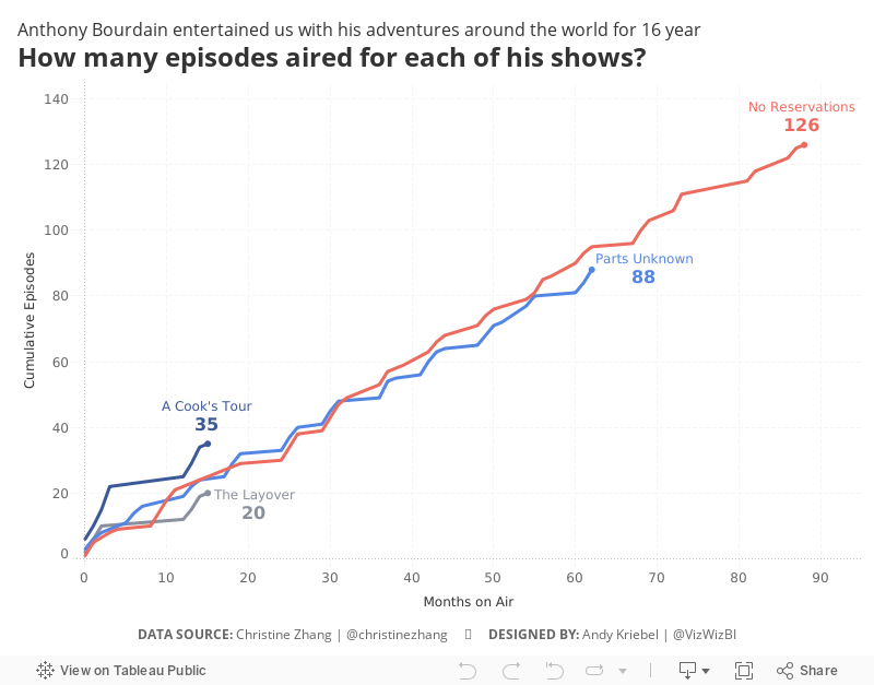
Makeover Monday: How many episodes aired for each of Anthony Bourdain's shows?
Anthony Bourdain
,
Christine Zhang
,
documentary
,
line chart
,
Makeover Monday
,
reality tv
,
television
,
Travel Channel
,
TV
No comments

To celebrate his life, for Makeover Monday week 33, we're looking at data about all of his TV programs. The visualization to makeover comes to us from Christine Zhang:
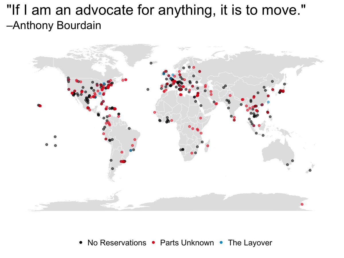
What works well?
- The map makes the geographical breadth easy to understand.
- The colors are easy to distinguish.
- Using dots gives each location equal representation.
What could be improved?
- Filtering would be good.
- Locations with multiple episodes are not apparent.
- The title doesn't really explain what the viz is about.
What I did
- Focused on the frequencies of the shows as I'm not totally familiar with all of them
- Made the map information supplementary through the tooltip
- Use a title that explains what the viz is about
Special thank you to Christine Zhang for this week's data set.
August 9, 2018
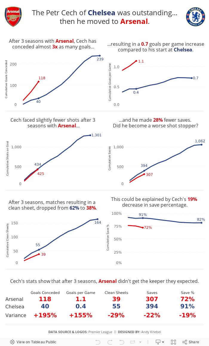
The Petr Cech of Chelsea was outstanding...then he moved to Arsenal
arsenal
,
Arsene Wenger
,
Chelsea
,
English Premier League
,
football
,
goalkeeper
,
infographic
,
petr cech
,
soccer
,
stats
,
storytelling
No comments
Arsenal signed goalkeeper Bern Leno in the offseason. Rumors have been swirling about when, not if, he'll takeover as their top choice keeper. Three summers ago, Arsenal signed Petr Cech away from Chelsea, and with that signing, Arsenal had hoped to sure up their defense.In an Arsenalesque sense of optimism, Arsene Wenger thought bringing in a great goalkeeper would solve their defensive woes. Many fans, however, knew that the real problems were in front of the goalkeeper. Without a solid defense, a goalkeeper cannot be effective.
This led me to thinking about how Cech's first three seasons compared to his first three seasons with Chelsea, when he was widely considered one of the best goalkeepers in the World. The data shows that Arsenal more or less ruined him. Or did Chelsea's stellar defense make him better than he really is?

History of the Premier League Table
england
,
English Premier League
,
ESPN
,
football
,
highlight
,
line chart
,
rank
,
soccer
,
stepped lines
No comments
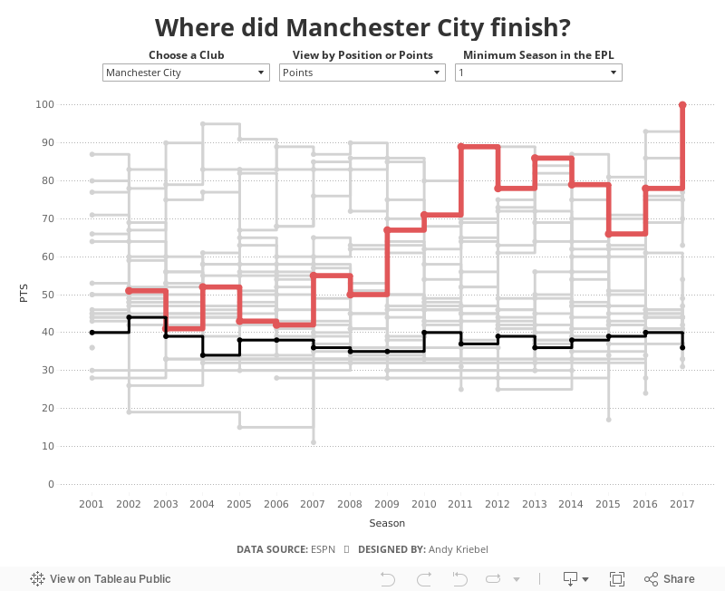
The 2018-19 Premier League season kicks off tomorrow night with an enticing match between Manchester United and Leicester City. This reminded me about a viz I had created at the end of the last season as a way of practicing stepped lines in Tableau.When I originally created this, I had to use table calcs to get the stepped lines to work, which can get complicated and is very time consuming. Now with stepped lines, it merely a matter of changing the lines type.
I decided to add in a couple of user options:
- Which team do you want to highlight?
- How do you want to compare the teams? By total points for the season of the final position in the table?
- Not all teams have been in the EPL for all 17 years, so I provided an option to filter down to just the teams that have been in the EPL for the user specified number of years.
And here's the viz for you to explore. Enjoy!

August 7, 2018
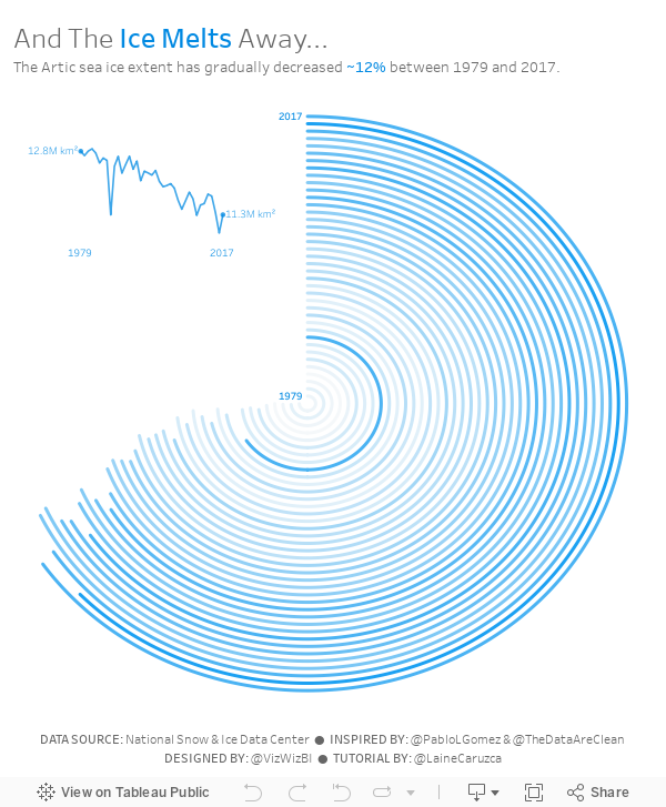
Makeover Monday: And The Ice Melts Away (as a Radial Chart)
arctic sea ice
,
Arpit Arora
,
data prep
,
flow
,
Laine Caruzca
,
Makeover Monday
,
Pablo Gomez
,
radial chart
,
Tableau Prep
,
workflow
No comments

I'd never built a radial chart from scratch before, so I was excited to learn to build a second new chart type today. In Laine's tutorial, she used the Custom SQL option that's available in the Legacy data connector in Tableau for Windows. However, there's no custom sql option on a Mac, so I decided to create the data structure using Tableau Prep.
 |
| Download the Flow here |
This is a pretty straightforward workflow. You split the data into parts to create the start and end points, then union them back together, along with some cleanup along the way.
Laine provided all of the details of the table calcs and the bin needed to create the curves, so I follow her steps using the Arctic Sea Ice Extent data from Makeover Monday week 15. That worked rather perfectly!
From there it was on to the polish. I love Pablo Gomez's style, so I used this radial chart viz of his as inspiration for the overall design, and then I used the wording from Arpit Arora's Makeover Monday viz about the same topic to help frame the messaging.
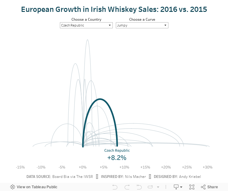
Makeover Monday: Jumpy Curvy European Irish Whiskey Sales
BordBia
,
curve plot
,
europe
,
Information Lab
,
ireland
,
irish
,
jump plot
,
Makeover Monday
,
Nils Macher
,
sales
,
The IWSR
,
whiskey
No comments

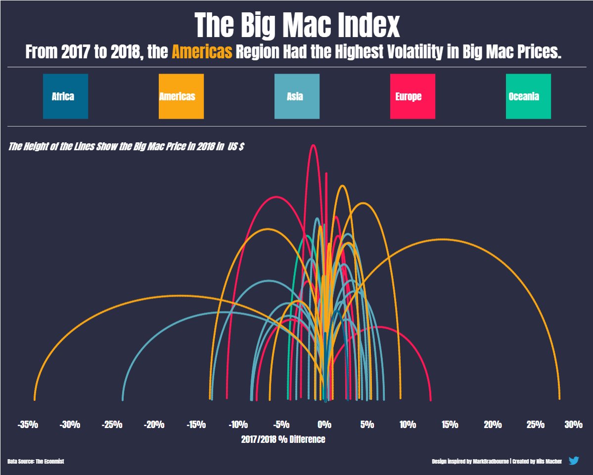 |
| Nils' viz inspired by Mark Bradbourne |
Today, Nils taught us how he shaped the data and built the viz, then we each took a Makeover Monday data set and applied what we learned. I chose to use the Irish Whiskey sales data from week 11.
I started by shaping the data in Alteryx via these steps in my workflow:

I then created a jump plot similar to Nils and also found a curvy plot interesting too, so I decided to include both via a parameter. Another fun day of learning! Never stop!
Subscribe to:
Posts
(
Atom
)


