September 12, 2023
#MakeoverMonday Week 37 - First time home buyers in the UK are being shut out of the market

August 9, 2018
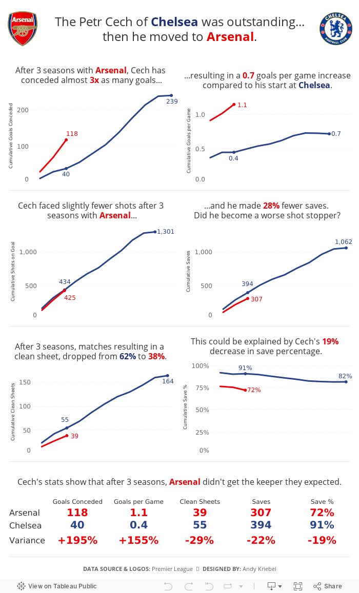
The Petr Cech of Chelsea was outstanding...then he moved to Arsenal
In an Arsenalesque sense of optimism, Arsene Wenger thought bringing in a great goalkeeper would solve their defensive woes. Many fans, however, knew that the real problems were in front of the goalkeeper. Without a solid defense, a goalkeeper cannot be effective.
This led me to thinking about how Cech's first three seasons compared to his first three seasons with Chelsea, when he was widely considered one of the best goalkeepers in the World. The data shows that Arsenal more or less ruined him. Or did Chelsea's stellar defense make him better than he really is?

February 19, 2017
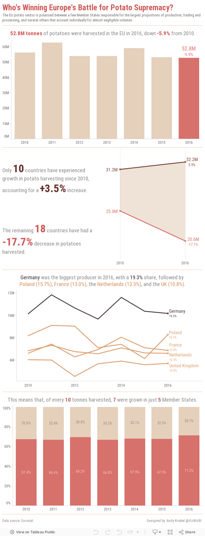
Makeover Monday: Who's Winning Europe's Battle for Potato Supremacy?
This week, we looked at the EU potato sector. Seriously! We're creating vizzes about potato production. The original website has things kind of all over the place. First there's this table:

Then there are a few donuts chart, most of them look more or less like this one:

They also included a few bars charts and a line chart. All in all, it's quite colorful.
What works well?
- Donut charts are sorted
- Tables are good for looking up specific values
- Line chart provides context by comparing to an index of 100 to make yearly change easier to understand
- Inconsistent colors
- Hard to identify the "story" in the data; The story is buried in the article.
- Pretty busy overall; too much going on
- Tables are terrible for finding insight in the data
January 3, 2017
Makeover Monday: Australia’s Income Gender Gap

2017 is here and with it another 52 weeks of Makeover Monday. ICYMI, this year Eva Murray is joining me on the project. We’ll be rotating each week, which I’m looking forward to as it’ll help challenge me more.
For week 1, we’re reviewing this article from Women’s Agenda about the massive pay gap that exists in Australia’s 50 highest paying jobs. Interestingly, we’re not making over a chart this week; instead it’s two ordered lists.

What works well?
- An ordered list is great for showing ranking
- Splitting the lists between men and women makes it easy to see which jobs pay them most for each gender
What doesn’t work well?
- It’s basically impossible to compare men and women in the same jobs, which was the whole purpose of the article.
- Within a gender, you have to do the math in your head to compare jobs. A simple bar chart, would make it to compare at a glance.
- There’s no “story” to the data. What’s the call to action?
- The lists only show the top 50 for each gender distinctly, making it really hard to find an overlap in the lists.
- There’s no sense for the “overall” gender pay gap when limiting the list.
For my version, I started with a Google image search to get some inspiration. I pulled various parts and pieces from different infographics that resonated with me to put together this infographic. I had a few objectives:
- Use an impactful title
- Break the infographic into several parts by adding divider lines
- Start with a high-level summary of the gender gap for all jobs in the data set and just the top 50 jobs
- Quantify the pay gap for the reader to improve the context
- Show the wage gap in the top 50 jobs via a slope chart and highlight the jobs when women earn more than men (sadly only 2 jobs)
- Create a mobile version that allows for scrolling through the story
With these goals in mind, here’s my first Makeover Monday of 2017.






