September 26, 2022
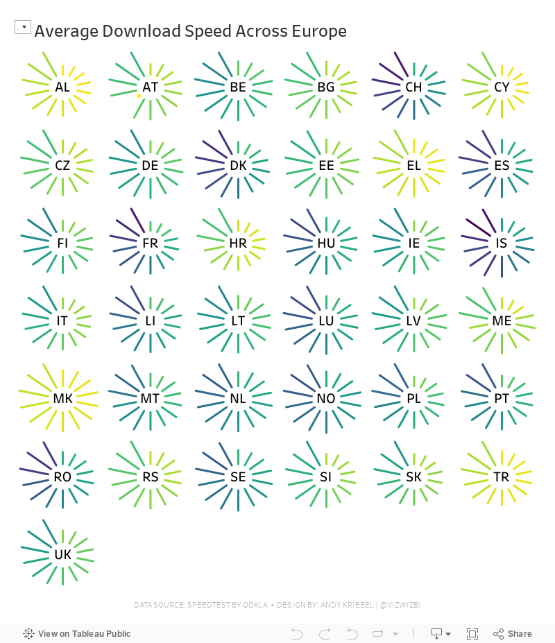
#MakeoverMonday Week 39 - Average Internet Speeds Across Europe

My goal this week was to correct my failures from last week, so I focused almost exclusively on building the starburst/sunburst chart. As promised to the viewers, I will also record a separate tip video for how to build them.
Here's the WatchMeViz and the viz is below that.
March 1, 2021
#MakeoverMonday Week 9 - Seats Held by Women in National Parliaments in the EU


- Clear title
- Line chart is a good choice for a time series
- There are too many colors.
- What's the focus?
- The legend takes up a lot of space.
- The chart ratio is too flat.
- Overall, it's confusing and harder than necessary to find patterns.

February 1, 2021
#MakeoverMonday Week 5 - Renewables vs Fossil Fuels in Europe

ORIGINAL CHART

WHAT WORKS WELL?
- The colors are perfect for the topic.
- I like the labels on the ends of the lines.
- The tooltips are very responsive and color-coded to match the line.
- The title and subtitle are informative and give good context.
- The slightly lighter shading of the axes labels make the chart stand out more.
WHAT COULD BE IMPROVED?
- Make the dashed lines solid.
- Format the percentages in the tooltip to one decimal place.
MY VERSION
November 9, 2020
#MakeoverMonday Week 45 - Global Share of Nintendo Switch Software & Hardware Sales
For #MakeoverMonday week 45, we were analyzing the software and hardware units sold across several regions, as defined by Nintendo itself. The data was pretty simple. I started by doing some basic data prep to simplify the names of the fields and to pivot the data to make it easier to compare the years.
In this video, I will first review the initial visualization and talk about what works and what does. I then iterate through several methods for visualizing the data, hoping to find one that works well with this data set. With feedback from the viewers, I was able to create a bar chart that compares the percentage of global units sold of software vs. hardware for Nintendo.
I showed several methods for visualizing the data:
- Line charts (several versions)
- Stacked bar chart
- Side-by-Side Bar
- Tables
- Scatter plot
- Connected scatterplot
Resources:
- Data Set - https://data.world/makeovermonday/2020w45-dedicated-video-game-sales-units
- Final visualization - https://bit.ly/MM2020W45
- Tableau Color Palette Generator - https://color.tableaumagic.com/
- Colors from Image Tool - https://html-color-codes.info/colors-from-image/
- ASCII character reference - https://jrgraphix.net/r/Unicode/27F0-27FF

September 21, 2020
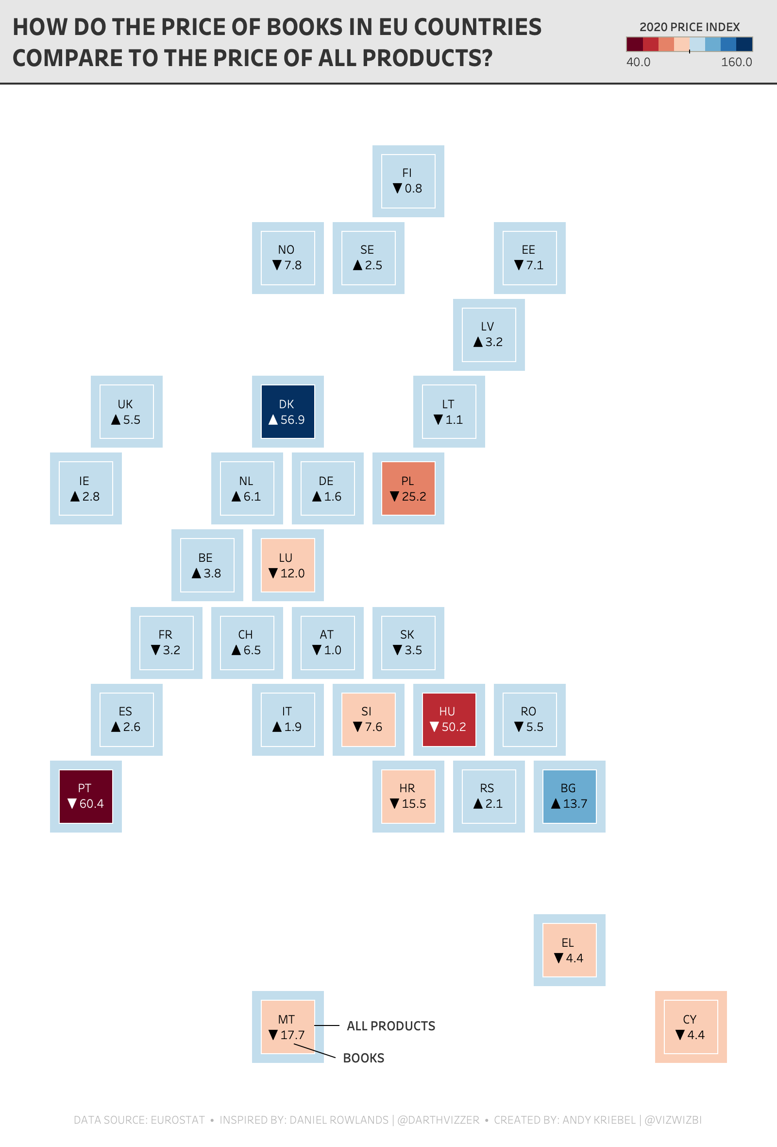
Watch Me Viz - #MakeoverMonday 2020 Week 38 - Pick Up A Book And Read
- Geometrics shapes (for the default number formatting) - LINK
- FIXED Level of Detail Expressions in a Plain English Sentence - LINK
- TABLE CALCULATIONS in a Plain English Sentence - LINK
- Shading between two lines - LINK
- Daniel Rowlands - TWITTER
- Daniel Rowlands (EU hex map template) - LINK
December 22, 2019
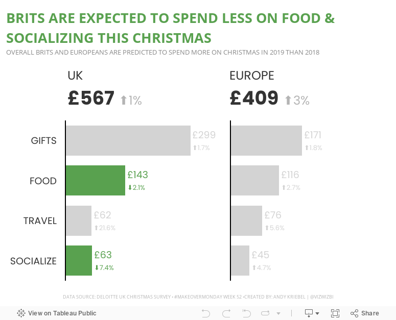
#MakeoverMonday: How much are Brits & Europeans expected to spend on Christmas?

This week, Eva picked Christmas-themed data...a simple survey from Deloitte about expected Christmas spending and the UK and Europe.

What works well?
- It a simple table that is easy to understand without doing much thinking.
- My eyes were immediately drawn to the two red declining arrows, which makes it seem to be the focus on the visualization.
- The table is neatly organized from highest to lowest spending categories.
- Everything is clearly labeled.
- The highlight box on the right provides a nice summary.
What could be improved?
- Remove the shading from 2018
- Removed the shading from the background of the Total cell
- Align the text labels either left of right, but not center
- Remove the borders between the rows, but keep them to separate the headers and totals from the rest of the table
- Change the font color of the categories to black; green could give the impression that they are increasing
- Align the arrows on the second table with the rows they correspond to
- Why is spending less red? I would think spending less is good

July 8, 2019
#MakeoverMonday: Asylum Applications in the EU

This week's topic relates to asylum seekers in the EU.
 |
| Source: European Asylum Support Office |
What works well?
- Map allows for exploratory analysis
- Using a time series for the years
- Informative tooltips
- Single continuous color scale for the pending cases
- The time series overall clearly show the growing trends.
- The filled map makes it hard to find smaller countries and to compare them with larger countries.
- The diverging color scale of the dots on the map imply that once you get 50%, that means things are good. Is that true?
- There's no indication of what the size of the dots represent.
- There are too many colors fighting for attention.
- The stacked bar charts are good for showing the overall trend, but the patterns for the individual colors are hard to determine.
- Most applications for asylum were lodged in Germany, France, Greece, Italy and Spain.
- Citizens of Syria, Afghanistan, Iraq, Pakistan and Nigeria lodged the most applications.
- Only five out of the 20 most common citizenships of asylum applicants in 2018 applied in increasing numbers compared to the previous year: Iranian, Turkish, Venezuelan, Georgian and Colombian nationals.
Click on the image to view the viz on Tableau Public.
June 23, 2019
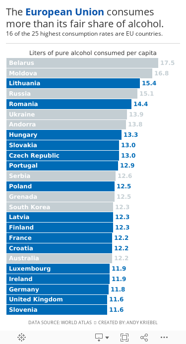
#MakeoverMonday: The European Union consumes more than its fair share of alcohol

.png) |
| Source: World Atlas |
What works well?
- Clear title
- Countries are listed in decsending order
- Simple color for the bar chart
- Labeling the axis
- The axis is truncated; this is a big no-no for a bar chart.
- The labels for the countries don't need to be rotated on a diagonal.
- A bar chart is the easiest way to communicate, so I've kept that.
- I rotated the bars to make them horizontal.
- I save space by labeling the inside of the bars with the country name.
- I labeled the ends of the bars so that I wouldn't need an axis.
- I highlighted the EU countries, since I found that an interesting piece of the analysis.
- I created the viz as a mobile size, since I thought this was as good of an opportunity as any to practice mobile design.
January 27, 2019
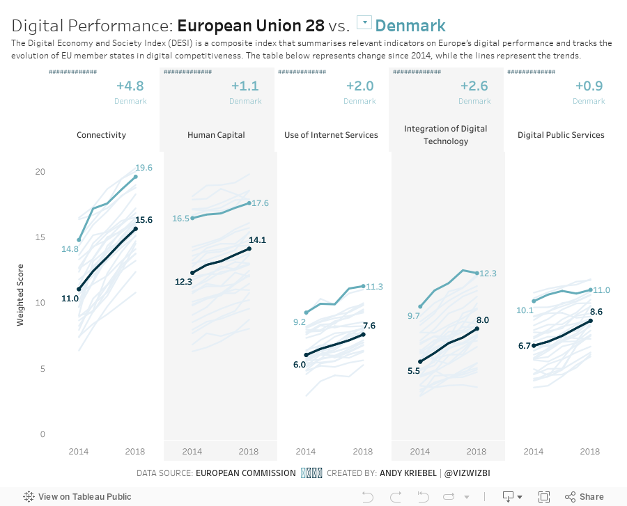
Makeover Monday: The Digital Economy and Society Index


What works well?
- The countries are sorted from best to worst.
- The scale and gridlines help guide the eye across the view.
- Using the country abbreviations so they are easier to read.
What could be improved?
- The title could include a subtitle to explain the DESI.
- Stacked bars are hard to compare across countries as they are influenced by the bars below them.
- The colors are too bright; everything is competing for attention.
- The legend does not need the numbers before each indicator.
What I did
- Added a subtitle to explain the DESI
- Split the indicators apart so they are easier to compare across countries
- Include a parameter to allow the user to select a country and have it highlighted
- Made the line representing the EU black so that it's in context for comparison
- Simplified the colors
- Added BANs to show the change vs. 2014 for the chosen country and for the EU (for context)
- Shaded every other column to guide the eye down the viz
September 17, 2018
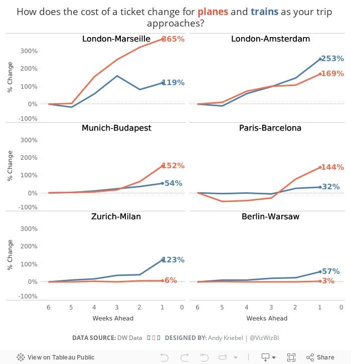
Makeover Monday: How does the cost of a ticket change as your trip approaches?


What works well?
- Simple title and subtitle that explain what the viz is about
- Line colors are easy to distinguish
- Good small multiples layout
- Reversing the time scale so that the larger number is to the last since it represents more days in the past
- Making the obvious
- Sorting the routes by distance
What could be improved?
- Reduce the font size for additional information like the footnote and the source
- Move the subtitle closer to the title and add space between the subtitle and the first chart
- Label the ends of the lines
What I did
August 7, 2018
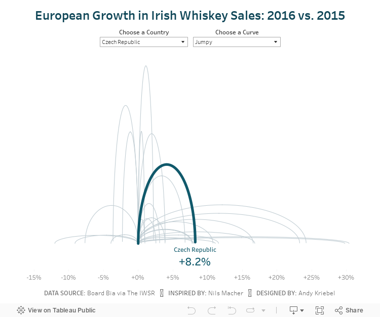
Makeover Monday: Jumpy Curvy European Irish Whiskey Sales

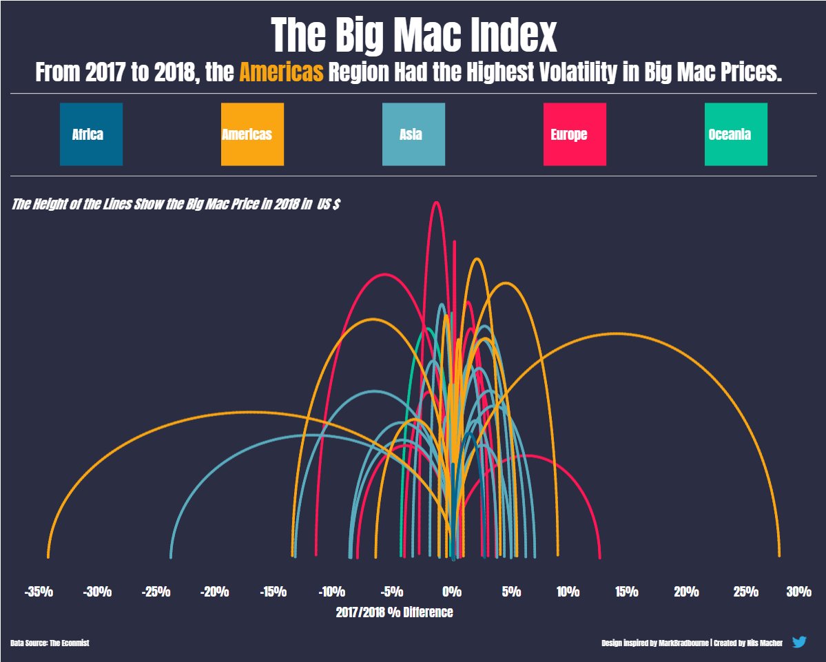 |
| Nils' viz inspired by Mark Bradbourne |
Today, Nils taught us how he shaped the data and built the viz, then we each took a Makeover Monday data set and applied what we learned. I chose to use the Irish Whiskey sales data from week 11.
I started by shaping the data in Alteryx via these steps in my workflow:

I then created a jump plot similar to Nils and also found a curvy plot interesting too, so I decided to include both via a parameter. Another fun day of learning! Never stop!
May 14, 2018
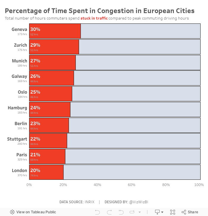
Makeover Monday: Which European commuters spend the most time in traffic jams?


What works well?
- Bars are ranked in descending order
- Simple, clear title
- Axis title tells us what the bars represent
- Nice tooltips
- Footnotes that qualify the data
What could be improved?
- The alternating bar colors add no meaning.
- The title has a weird shape to it.
My Goals
- Change the metric to percent of time spend in congestion during peak hours, which required me to go to the source to get the additional data.
- I took inspiration from Eva's viz, but wanted to show the congestion as a percentage rather than a raw number. I feel this gives move context to the numbers and lets the audience know their likelihood of being stuck in traffic in these cities.
- Create the viz as a single worksheet.
February 19, 2017
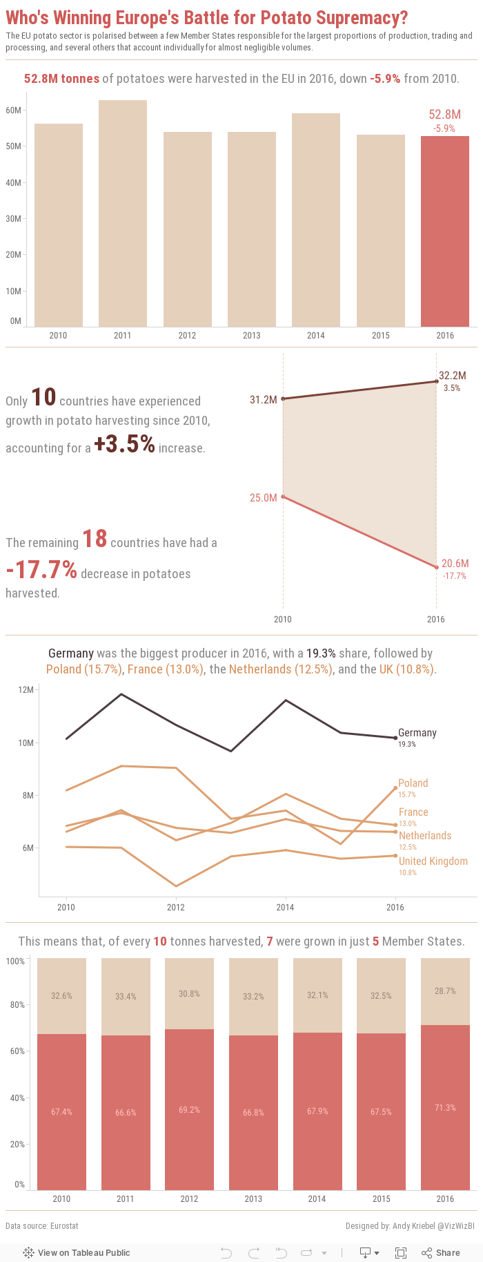
Makeover Monday: Who's Winning Europe's Battle for Potato Supremacy?
This week, we looked at the EU potato sector. Seriously! We're creating vizzes about potato production. The original website has things kind of all over the place. First there's this table:

Then there are a few donuts chart, most of them look more or less like this one:

They also included a few bars charts and a line chart. All in all, it's quite colorful.
What works well?
- Donut charts are sorted
- Tables are good for looking up specific values
- Line chart provides context by comparing to an index of 100 to make yearly change easier to understand
- Inconsistent colors
- Hard to identify the "story" in the data; The story is buried in the article.
- Pretty busy overall; too much going on
- Tables are terrible for finding insight in the data