October 31, 2016
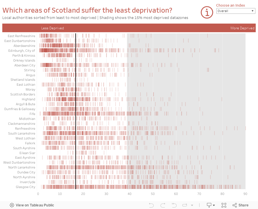
Makeover Monday: Which areas of Scotland suffer the least deprivation?


What works well?
- Nice headers to help you know what is good and what is bad
- Alphabetical sort makes it easy to find a specific local authority
- Shading of the lowest 15% provides nice context
- Bar code representation makes spotting concentrations really easy
- Unless you read the accompanying website, you can't really make sense of the chart on its own as there is now scale and no explanation of how to read it.
- There's no way to rank the local authorities from best to worst (or vice versa).
- Interactivity would help with know which datazones are which
- None of the other ranking metrics are included; this only covers the overall rank


October 28, 2016
Viz Makeunder - Clinton vs. Trump: The State Battlegrounds

Today, let's take a look at this election viz from Rob Radburn.

What doesn't work for me?
- It's a time series visualisation, yet it's vertical. I prefer time series to be horizontal.
- I don't care for the grey background.
- Black text on the dark grey is hard to read
- Don't need the labels on both side of both axes
- Gridlines should be for the measure not the time series
- Too many filters

October 27, 2016
America's Biggest Bandwidth Hogs: A Makeover of a Makeover


What doesn't work?
- Too many colors
- The slices aren't sorted
- The largest slice should start at 12 o'clock and then go in descending order around the clock
- What's the purpose of the inside ring?
- Needs a better, more focused title

Viz Remake: NASA’s Global Land-Temperature Index

This past week I saw this tweet from Elon Musk:
This led me to have a look at the data visualisations on NASA’s website, in particular, their viz of the global land-temperature index which reminded me a lot of all of the great work we saw for Makeover Monday week 20 - Global Warming is Spiraling Out of Control.

There’s so much to like about this visualisation. It has a great summary on the left with a massive number that is the centre piece of their story. Their intentional design of making the large number the focus make the line chart supplementary. The line chart is clear and simple, the legend is out of the way and the beacon on the end captures your attention.
The data is available right there below the viz so I downloaded it so that I could reproduce this in Tableau. I often attempt to recreate visualisations I like as a way to learn and practice. Because in the end, the only way to get better is to practice…A LOT!
I was able to reproduce everything bar the blinking dot on the end of the line. I also chose to fill in the circles on the grey line because I don’t care for the open circles. Lastly, I added a + to the beginning of the large callout number. I think that helps provide a quicker understanding of what the number means.
 |
| Click on the image to download and interact |
October 26, 2016
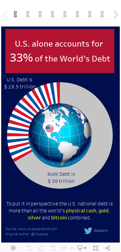
US Debt: A Makeover of a Makeover

Part of the discussion yesterday was about critiquing work others have submitted. I've shied away from this because I don't want to discourage anyone from participating. Fortunately, Santosh Patil has agreed to let me give his week 43 submission on US Debt a makeover. thanks Santosh!
Let's first look at his work:

For this makeover, I'm only going to focus on what doesn't work:
- Does it need a dark blue background? This makes some of the text hard to read.
- What are the candy stripes for on the donut chart? What value do they add other than decoration?
- What's the purpose of the globe in the middle other than decoration? What purpose does it serve?
- Overall, there's just too much going on for me, for what is essentially two data points.
October 24, 2016
Makeover Monday: How big is America's debt?


What works well?
- The author is at least making an attempt, though a poor one, at putting the US debt into context.
- Overall, the infographic is visually pleasing.
- The author uses green for the US in the pie chart, but black everywhere else. This should be consistent as it could lead to confusing the two.
- The pie chart is 3D and appears to have an extra little white slice that doesn't mean anything.
- All of the comparisons except the S&P 500 seem to be a real stretch.


October 21, 2016
Fix It Friday: Ten Alternatives Methods for Presenting Alcohol Consumption in OECD Countries

Interesting @OECD chart on alcohol consumption. By country & trend. E.g Austrians drink twice as much as Italians pic.twitter.com/OOGYJ3BpAq— Paul Kirby (@paul1kirby) October 19, 2016
You might think "It's just a chart Andy, relax!" True. It's a chart. It's not changing the world or anything. There are several things that have me a bit upset:
- Paul Kirby calls the chart "interesting" and maybe the CONTENT is interesting, but the chart is terrible.
- He says "Austrians drink twice as much as Italians", a fact that is simply not true. They drink 61% more than Italians. You can't just spout facts like that.
- Paul is visiting professor at the London School of Economics. I can only assume that his students follow him on Twitter. When he tweets things like this, his student will assume that this is how charts should be made, which only proliferates the number of poor charts we'll continue to see.
- It's too dark overall. The dark red bars and dark bottles are hard to see against the blue background.
- The flags are unnecessary. What value do they add?
- The bottles are cute, but unnecessary decoration.
- The legend is in reverse order.
- Do the bottle extend beyond the bars or do they start from the same baseline?
- It has a weak title. What's the story?


October 19, 2016
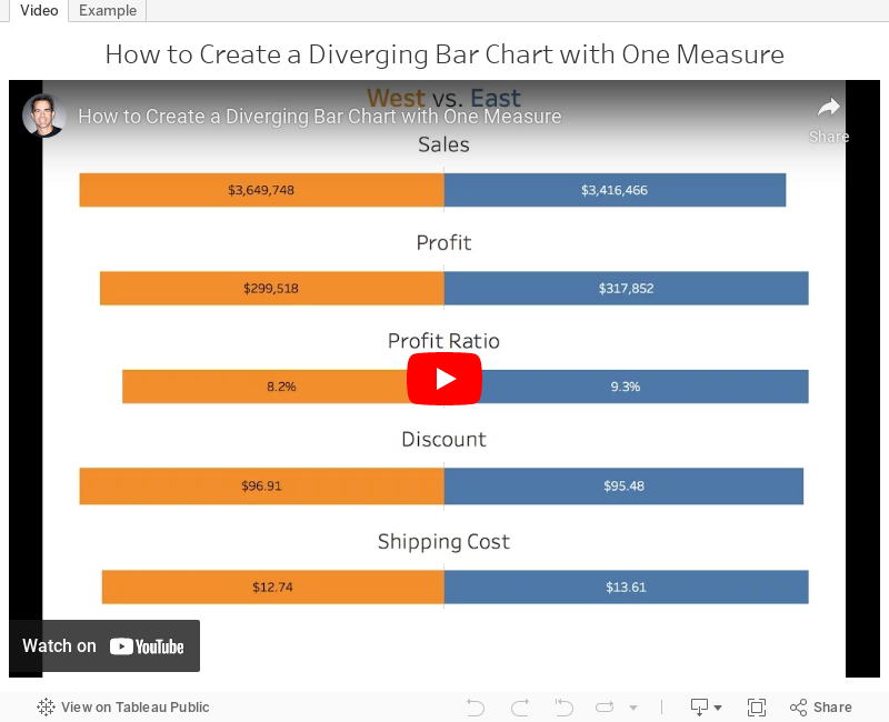
Tableau Tip Tuesday: How to Create a Diverging Bar Chart with One Measure

With a cheeky use of the INDEX table calculation, this was quite straightforward. In the video below, you'll see that the middle of the charts aren't lined up. I fixed this by using the INDEX calc again. You can download the workbook to see how I got it to work.
October 17, 2016
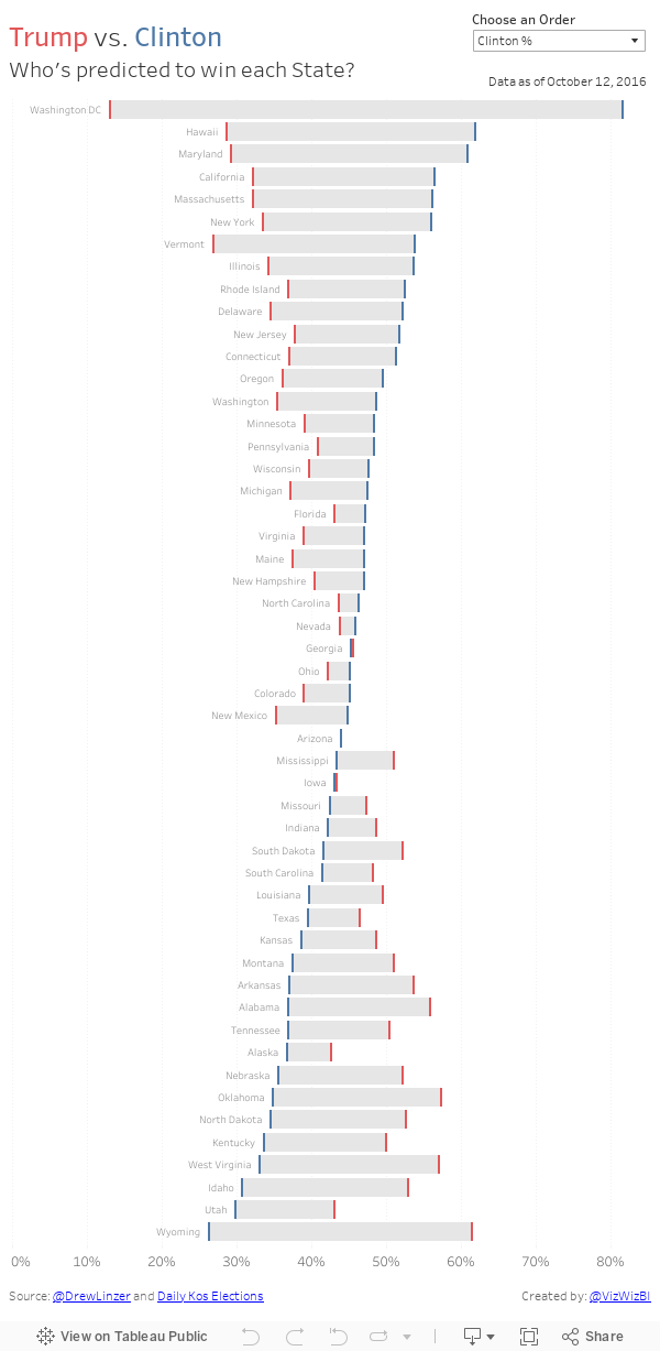
Makeover Monday: A State by State Look at Trump vs. Clinton

I think this view helps show much better than my last version that gap between Clinton and Trump. I also included a sorting option so you can look at it from different perspectives.
October 16, 2016
Makeover Monday - Trump vs. Clinton: A Race for the Presidency

Given that we're nearing the end of the election cycle (thank god!), we thought it would be a good time to see how the races are stacking up. First, let's look at the viz from Daily Kos:

What works well?
- The interactivity is amazing!
- Nice summary on the left
- The dots for the polls add nice context
- Simple and easy to understand
- Great overall design
- Great use of color
- I wish the most recent results would stay on the line chart as I hover over another date. Yes, I know they are on the left, but then my eyes have to move back and forth.
- I added a reference line on each state at 50% to help show if one of the candidates has more than half the vote.
- I included bar charts in the tooltips.
October 14, 2016
Join us at #RunData16!


For the past few Tableau Conferences, members of the Tableau Community have come together for some early morning running. Last year, as you can see above, we had an incredible turnout and we expect this year to be much more of the same.
Details:
- When: 5:30am Mon, Tue, Wed
- Where: Four Seasons
- Distances: 5K and 10K (easy enough to make longer or shorter if you'd like)


- Run leaders: Eva Murray, Paul Chapman, Me
- More info on Strava
Yes, a 5:30am start time is early, but in our experience, you HAVE TO start this early if you want time to make the keynotes. Running people are a weird bunch anyway, so 5:30 is never too early for us!
The run leaders will have high visibility bibs and torches for everyone's safety. If you have lights, bring them along. I've run these routes many times and it's a beautiful trail along the river. There are always tons of runners out and about.
NOTE: You may see a meetup list on the conference website, but it doesn't start until 6:30. If you go to that one, you have very, very little chance of making the keynotes. Plus, most of the runners will be at our run. And we'll be done before they even start!
Tableau has informed us that they will not be supporting us this year. However, keep up with the #RunData16 hashtag on Twitter for all of the latest information. See you in Austin!
October 11, 2016
Tableau Tip Tuesday: How to Limit the Number of Marks in a View

In this week’s tip, I show you how to limit the number of marks that are displayed in a visualisation. The example I show will help prevent your users from creating line charts with too many different lines.
October 9, 2016
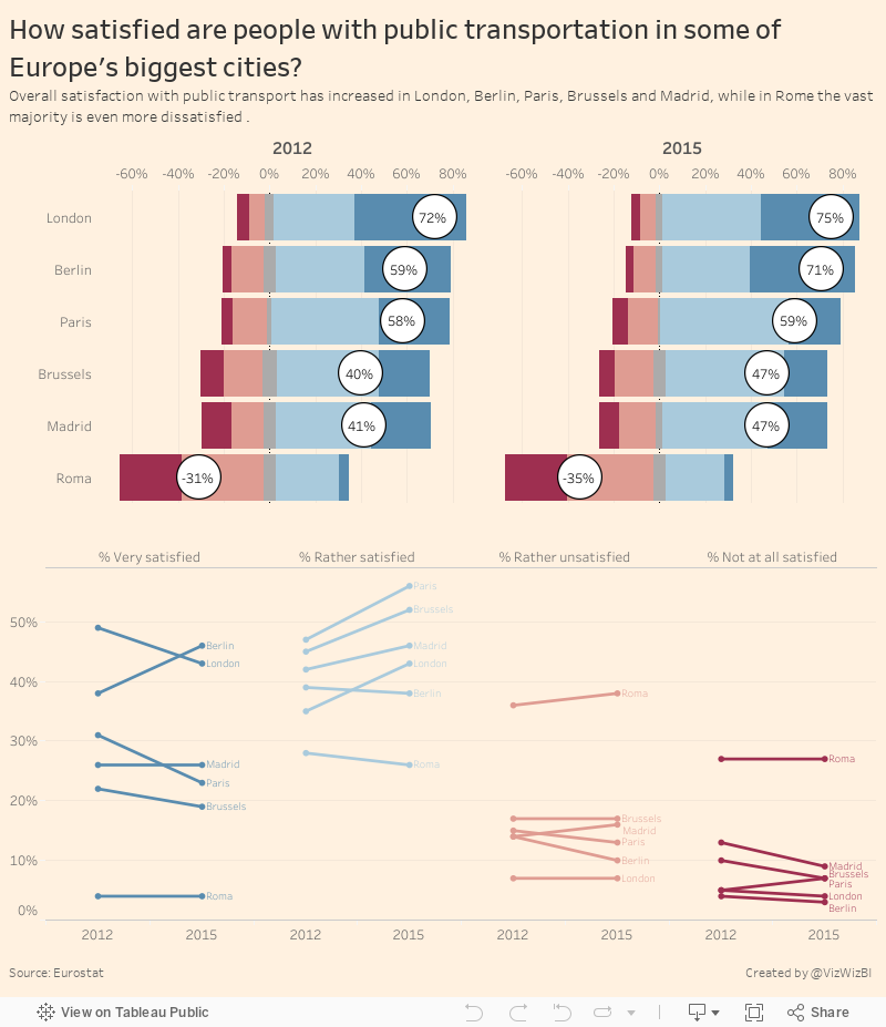
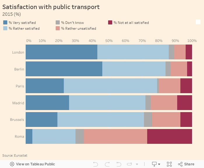
Makeover Monday: How satisfied are people with public transportation in some of Europe's biggest cities?

I first saw this survey in print at Gatwick airport on my way to Prague, then it appeared in feedly. I know from speaking to John Burn-Murdoch that the print and online graphics standards are different. The print version I actually found easier to understand because it used blue for negative sentiment.
What works well?
- Clear sorting by very satisfied
- Sticks to their color guidelines
- Simple title
- Use different colours for the negative and positive sentiment
- Add an overall score (like net promoter score)
- Include 2012 for comparison so that you can see which of these cities improved
- Add a more descriptive title so it's even more clear what the audience is looking at
- Steve Wexler's post about Likert scales and Net Promoter Scores
- This Github page that has the official FT colors
- This knowledge base article for including barcharts in tooltips
Next, I included 2012 and labeled the bars where they fit.
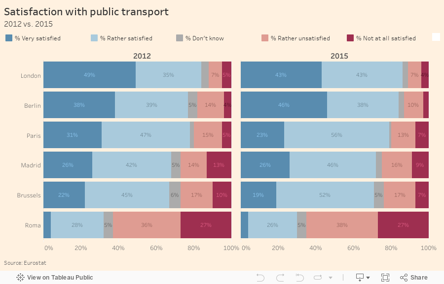
I don't particularly like the labels on the bars, so I've removed them from the final version. I also changed the bars to a Likert scale, which moves the negative to the left and positive to the right, and helps shows the discrepancy better. I also included the net promoter score.
Last, I added a slope graph to help show the change and included a more descriptive title and subtitle. You can click on any bar and it'll highlight in both places.