February 12, 2019
Makeover Monday: When did President Trump spend the most Executive Time?
I wanted to create a calendar view that only show the Executive Time. It's easy enough to filter to just that data, however, there are days when there was no executive time, which led to holes in the calendar. To overcome this, I created an Excel spreadsheet with every day from 1 December 2018 through 31 January 2019, then I joined the two data sets, ensuring that my Excel spreadsheet was the primary data source so that all dates would be in the data set (in other words, NOT an inner join).
From there, creating the calendar was simple, adding the color was simple. I spent most of my time fiddling with the formatting.
Click on the image below for the interactive version.

February 11, 2019
Makeover Monday: How President Trump Spends His Executive Time

- Trump usually spends the first 5 hours of the day in Executive Time.
- He spends his mornings in the residence, watching TV, reading the papers, and responding to what he sees and reads by phoning aides, members of Congress, friends, administration officials and informal advisers.
- Trump doesn't take an intelligence briefing until 11am or 11:30am, and they only last 30 minutes.
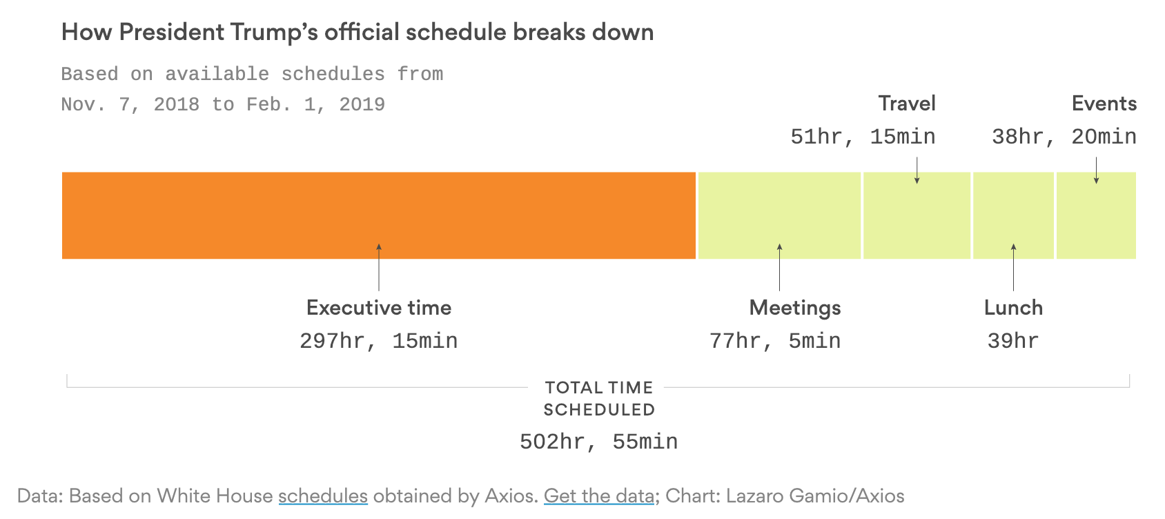
What works well?
- Using a color that stands out over the others to highlight executive time
- The title tells me what the viz is about.
- The subtitle provides context as to the amount of data that the chart summarizes.
- Simple labeling
- Including the total time at the bottom and stretching the lines to the ends of the stacked bar chart
What could be improved?
- It's hard to compare the executive time to all other time. A percentage would be helpful.
- Would the stacked chart be better as a horizontal bar chart with two rows?
What I did
- I wanted to look at the frequency of executive time by hour of day and day of week. Does Trump spend the same amount of executive time each day?
RESULT: The first couple heatmaps looked terrible, but visualizing by weekday looks ok. - Do big numbers help tell the story in the data?
RESULT: Yes, they help summarize the data well, but didn't help my end product. - Are there any trends in the data? That is, is executive time increasing or decreasing? Or has it been consistent?
RESULT: The trends are not very useful.
July 19, 2017
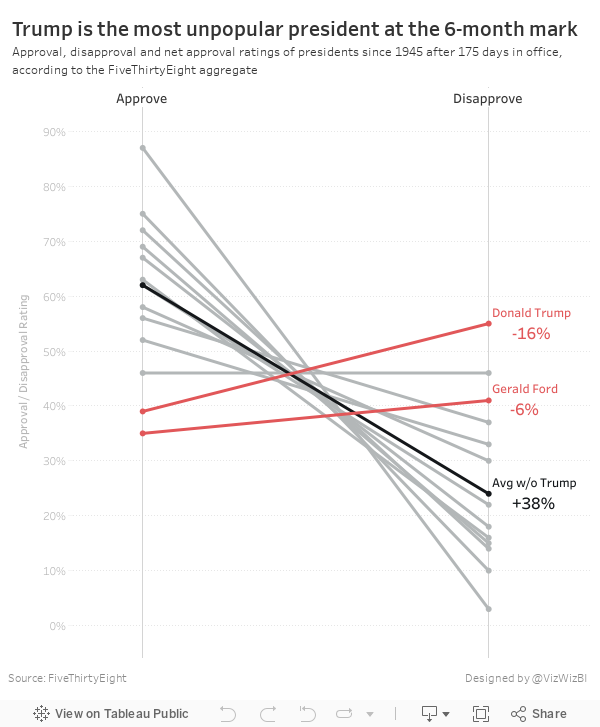
Trump is Historically Unpopular

The table is ok in that it lists the presidents in descending order by net approval rating. However, I thought a visual display would be more effective. I used Google Sheets to import the table and quickly connected it to Tableau and built a slope graph to more effectively display the data.
It only took about 15 minutes to build this, so I'm surprised FiveThirtyEight didn't include a visual. I wonder what their reasoning is for including a chart vs. a table. What do you think? Which view works better for you?
January 16, 2017
Makeover Monday: The Tweeting Habits of President-Elect Trump

On January 20th, we’ll have a new President of the United States. With Inauguration Day just a few days away, it seemed appropriate to look at the tweet of President-Elect Trump for Makeover Monday week 3. BuzzFeed News analyzed all the accounts Donald Trump retweeted during his presidential campaign and created this visualisation to accompany it (Note: The visualisation was trimmed for this blog) -

What works well?
- The bubbles are ordered from largest to smallest from left to right in a Z-pattern making it pretty simple who he tweets the most.
- Colouring inactive accounts so they are easier to identify
What could be improved?
- Bubble charts are notoriously hard to use for comparison; a simple bar chart would be so much easier to read.
- The viz lacks insight or a story.
- The article has some in-depth writing; would have been great to include that in the visualisation.
I must admit that I struggled a bit this week. I was trying too many charts and had trouble focusing my story. On top of that, I messed up the TDE that I created for everyone. Note that when you use the DATEPARSE function hh means hour in am/pm (1~12) whilst HH means hour in day (0~23). I had used hh initially which made it look like Trump takes lunch off from Twitter.
I really liked Eva’s idea of using the Montserrat font that’s on Trump’s website, so I’ve knicked that idea. I also wanted to stick to Twitter’s official color palette and try as much as possible to quantify and simplify the amount of tweets that Trump produces. With these in mind, here’s my Makeover Monday week 3 visualisation:
October 17, 2016
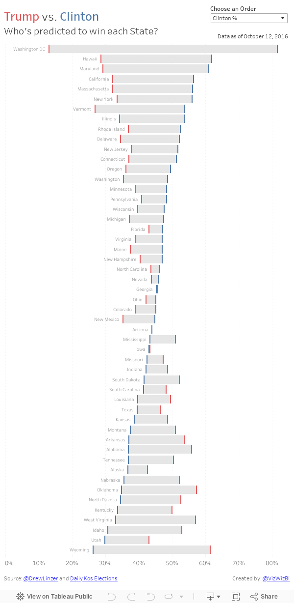
Makeover Monday: A State by State Look at Trump vs. Clinton

I think this view helps show much better than my last version that gap between Clinton and Trump. I also included a sorting option so you can look at it from different perspectives.
October 16, 2016
Makeover Monday - Trump vs. Clinton: A Race for the Presidency

Given that we're nearing the end of the election cycle (thank god!), we thought it would be a good time to see how the races are stacking up. First, let's look at the viz from Daily Kos:

What works well?
- The interactivity is amazing!
- Nice summary on the left
- The dots for the polls add nice context
- Simple and easy to understand
- Great overall design
- Great use of color
- I wish the most recent results would stay on the line chart as I hover over another date. Yes, I know they are on the left, but then my eyes have to move back and forth.
- I added a reference line on each state at 50% to help show if one of the candidates has more than half the vote.
- I included bar charts in the tooltips.
August 24, 2016
Clinton vs. Trump: The Battle for the Presidency

It’s election time, so time for an election viz. You will notice this is very similar to the RealClearPolitics version the difference being that I am calculating the 2-week average of all polls in their data set.
This little project also provided me a chance to try out the new Google Sheets connector in Tableau 10 and allow the extract to refresh on Tableau Public. In addition, I learned how to scrape a table from the web in a Google Sheet via this blog post, which should (if I did it right) update automatically.
This was also another chance for me to test out the Device Designer that came with Tableau 10. Enjoy!






