July 14, 2026
The Frequency Matrix: A Tableau Technique You're Missing

What if the data you already have could reveal something you've never seen before? It can, and it starts with a technique most Tableau analysts have never tried: the frequency matrix.
In this full keynote from Appalachian State University's Analytics Day, Andy Kriebel (Tableau Hall of Fame Visionary and founder of Next Level Tableau) builds a frequency matrix from scratch, then shows the same underlying data six different ways: Sankey diagrams, tree diagrams, network diagrams, geographic flow maps, box plots, and slope graphs.
You'll walk away with a technique you can take straight back to your own data, whether you're working with enrollment numbers, customer flow, product usage, or anything else where you need to compare two categories at once.
What's covered:
- What a frequency matrix is and how to read one
- Building a frequency matrix step by step in Tableau
- Using calculated fields to highlight the most common and highest-performing combinations
- Visualizing the same relationship with Sankey diagrams, tree diagrams, and network diagrams
- Mapping geographic flow with Make Point and Make Line
- Guiding principles for building dashboards stakeholders actually use
- Live Q&A on accessibility, color palettes, and chart governance
Want more? Grab my free 30-Day Tableau Skill-Building Accelerator: nextleveltableau.com/accelerator
Download the workbook and data here:
https://nlt.kit.com/frequency-matrix
April 10, 2024
11 Ways to Compare Two Measures
I don't believe in complexity in data visualization. I stick with simple charts when you needs to compare measures to add context.
Tableau workbook here.
September 5, 2023
60 Unique Ways to Visualize Time in Tableau

September 4, 2023
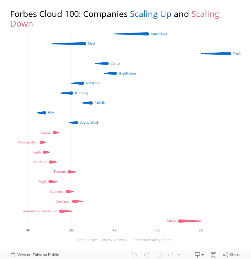
28 Charts in 60 Minutes - Forbes Cloud 100: Companies Scaling Up and Scaling Down

How many people power the Forbes Cloud 100? Is there a correlation between company rank and employee size? Have they expanded or contracted.
Learn how to build 28 charts in 60 minutes that compare two years.
August 23, 2023
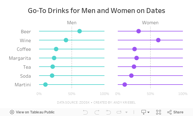
#MakeoverMonday Week 34 - Go-To Drinks for Men and Women on Dates

Join me for live analysis of Zoosk's recent survey, covering 8,793 members' dating drink preferences!
In this livestream, I'll break down the responses across 7 different drink types, comparing the preferences between men and women.
Is there a gender divide when it comes to what people choose to drink on dates?
I'll explore this question and more.
July 11, 2023
#MakeoverMonday 2023 Week 28 - Global Passport Rankings

- Grouped bar chart
- Bar in bar chart
- Grouped bar chart with a gantt bar for the difference
- Diverging bar chart
- Histogram
- Butterfly chart
- Barbell chart
- Scatter plot
- Slope graph
- Trellis chart
- Jittered bar chart
November 1, 2022
#MakeoverMonday Week 44 - Fundraising vs. Spending by Members of the 117th Congress

The midterm elections in the US are next week. If you're able to vote, please do. Democracy is at stake.
This week's data was about fundraising, spending and debt by people currently in Congress. If you missed #WatchMeViz, I showed 16 different ways to visualize this data set. Hopefully they give you a bit of inspiration for creating your own.
Catch up with the show below. In the end, I went with a bar chart that compares funds raised vs. spent by State. I also have a gantt bar to show the difference between the two. I have a tutorial of that chart here.
Below this video is an image of the dashboard I created. Click on it to see the interactive version on Tableau Public.
June 7, 2021
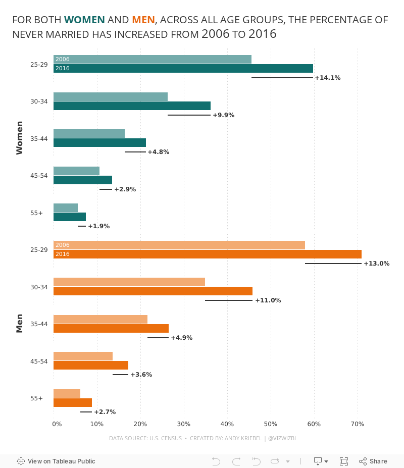
#MakeoverMonday 2021 Week 23: The Percentage of Never Married is on the Rise

- Final Viz (and below)
- Preferences file (all of my custom color palettes)
- How to Create a Combination Bar Chart & Candlestick Chart
May 24, 2021
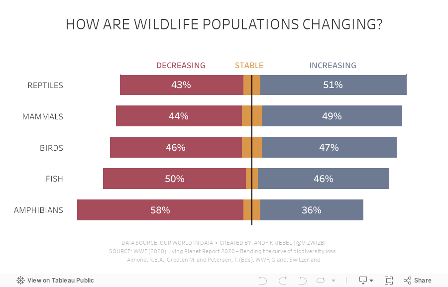
#MakeoverMonday 2021 Week 21 - How are wildlife populations changing?

May 3, 2021
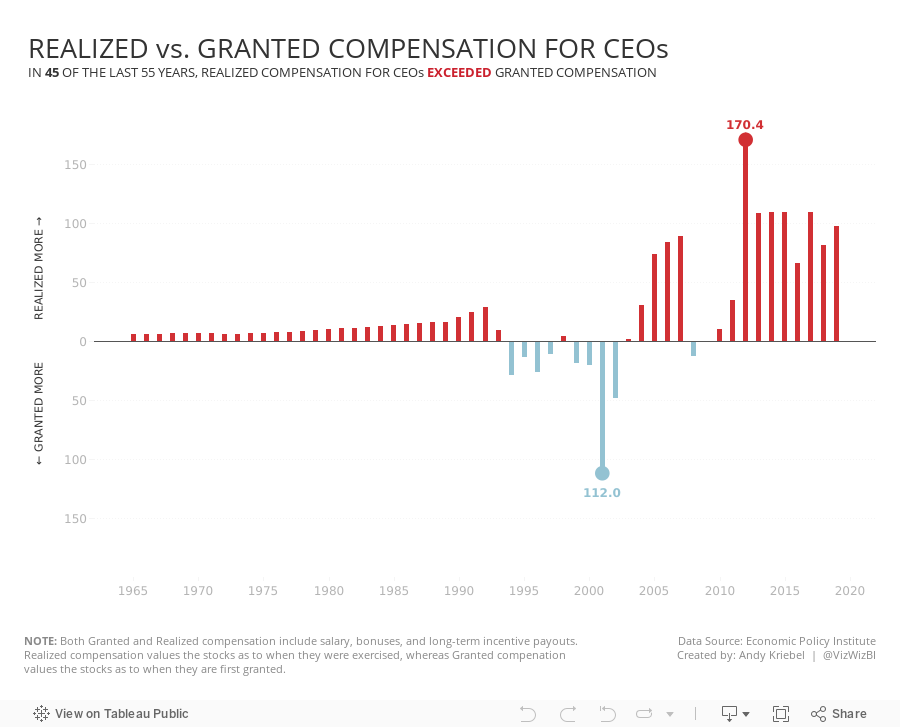
#MakeoverMonday 2021 Week 18 - Realized vs. Granted Compensation for CEOs

- Line Chart
- Stepped Lines
- Variance to baseline
- Win/Loss chart
- Comet Chart
- Gantt Chart
- Bar chart w/ reference line
- Connected scatter plot
- Slope Graph
- Circle Timeline
- Heatmap
- Data Set - https://data.world/makeovermonday/2021w18
- Chart chooser - https://datavizproject.com/
February 16, 2021
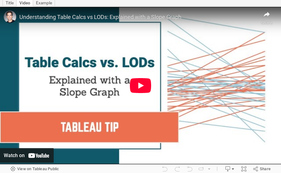
Understanding Table Calcs vs LODs: Explained with a Slope Graph

January 11, 2021
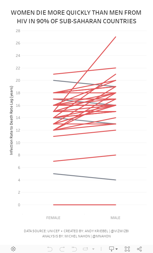
#MakeoverMonday Week 2 - Women Die More Quickly Than Men From HIV Infection

I must admit that I REALLY struggled with this data set. I could have easily just compared males vs. females by country and year, but it seems we've been doing that over and over again. I looked to explore the data and thought a connected scatterplot would look nice, but it didn't.
Fortunately Michel Mahon proposed looking at the lag between the year of HIV infection rate and death. Morbid yet interesting analysis. It took me a while to get the calcs working; I'd recommend you build your view as a table to verify the calcs when you're not sure if they're correct. In the end, thanks to Michel's suggestion, I created a slope graph that compares the lag in years for both men and women.
As the documentation suggested, women die more quickly than men.
Below are both my visualization and the Watch Me Viz session on YouTube. Thanks for tuning in!
October 26, 2020
#MakeoverMonday 2020 Week 43 - #WatchMeViz - Apparel Exports to the U.S.
For #MakeoverMonday week 43 we analyzed data about apparel exports to the US during the Coronavirus pandemic. In this session of #WatchMeViz, I showed 28 different ways to visualize time series data (there are way more) before we all settled on a viz that's basically the same as the original and looks nicer.
Subscribe to my YouTube channel here to get all of my latest Tableau Tips and notifications for upcoming live streams.
Show Notes / References:
- Data Set - https://data.world/makeovermonday/2020w43-apparel-exports-to-us
- Tableau Reference Guide (incredible repository of thousands of Tableau tips) by Jeffrey Shaffer - http://www.tableaureferenceguide.com/
- How to Shade Between Two Lines with Polygons by Rody Zakovich - http://www.datatableauandme.com/2017/08/how-to-shade-between-2-lines-in-tableau.html
- Title Capitalization - https://capitalizemytitle.com/

September 28, 2020
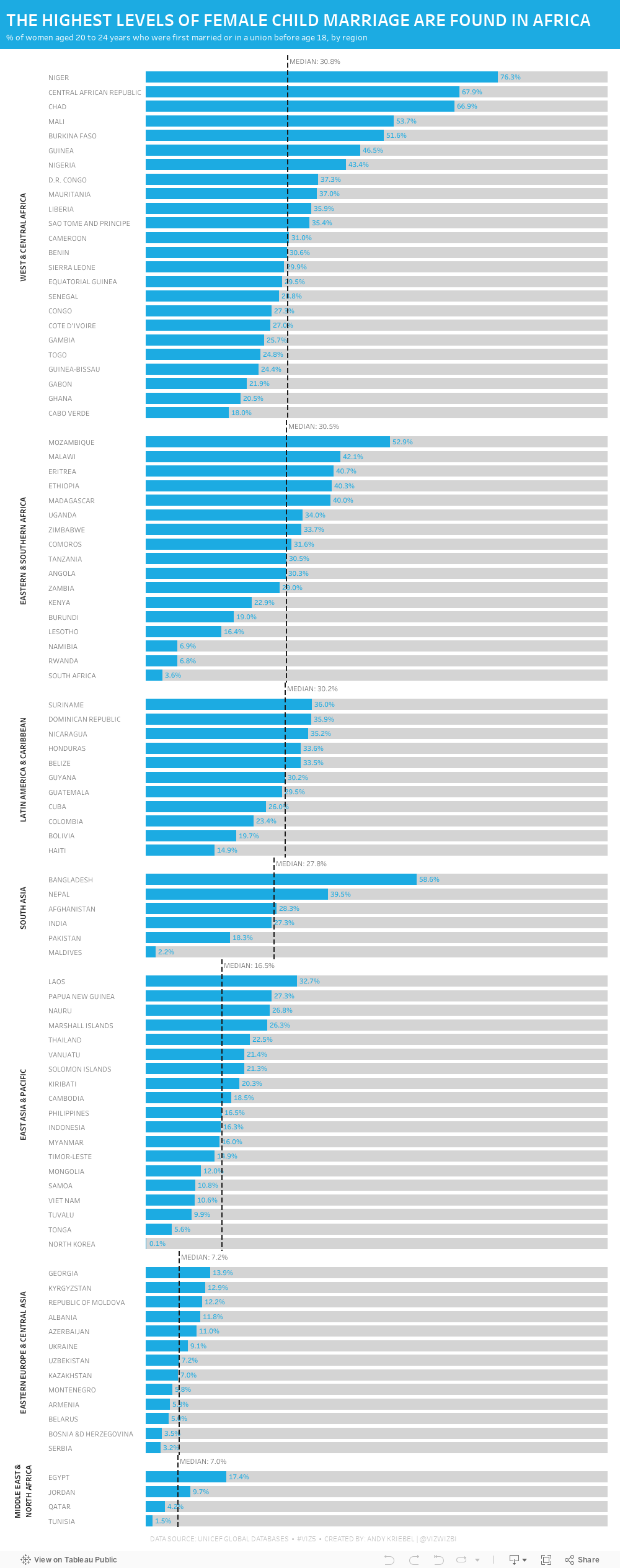
#MakeoverMonday 2020 Week 39 - Child Marriage Around the World
Week 39 brought another #Viz5 topic, this time it was about children that are now 20-24 who were married under the age of 18. Child marriage is, of course, horrific and it's a violation of human rights. Unicef has done an excellent job of recapping all of the issues and why these marriages happen on their website here.
As I've mentioned before, I ALWAYS find these Viz5 data sets tought. I'm not sure why; perhaps I have a mental block on them now. This week the data set was three columns: country, female %, and male %. That can't be too tough...right?
Well, I sure made it tough. First, I joined the data to regional mappings from Unicef so that I could possibly look at the data at the regional level; I decided to use medians for each region in the end. Then I went into Tableau and built a bunch of charts to explore the data. I used chart guides to help me think through options and none of them seemed to make any particularly interesting insights pop out.
After about two hours of nothing, I got the idea of simply looking at the % of females that were married under the age of 18. I ended up with a simple bar chart, which turned out to not be too far from the first chart I created a few minutes in.
Here's the #WatchMeViz video and below is the visualization. Thanks to those that watched live and contributed ideas along the way!! It really helps knowing others are there encouraging me.

August 7, 2017
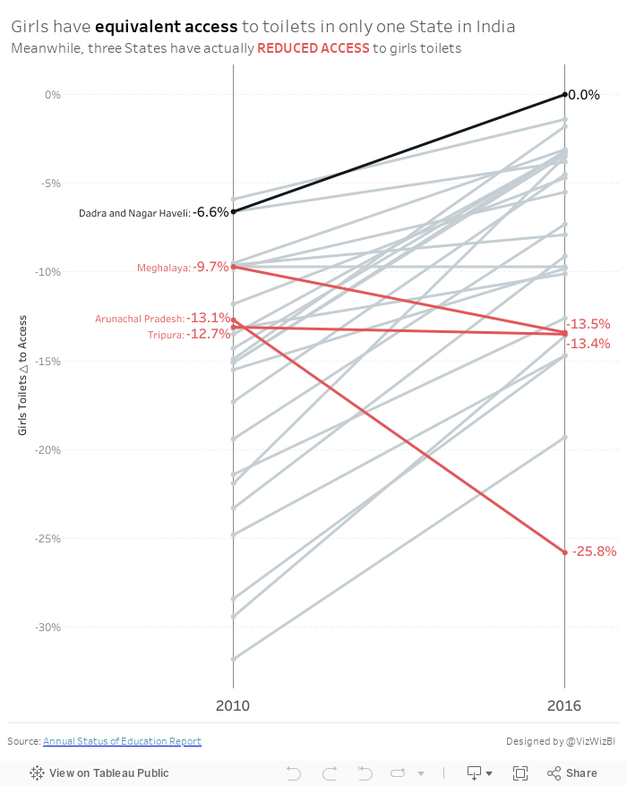
Makeover Monday: How has access to toilets changed for girls in India?
Let's have a look at the original:

What works well?
- The filled map helps you easily identify which States fall into which categories.
- The colors work well together.
What could be improved?
- The title doesn't make sense. What does access over sanitation mean?
- Sanitation is spelled wrong in the title.
- The legend is cut off.
- Making comparisons across the maps is nearly impossible.
- Making comparisons across years IS impossible.
- There's a lack of explanation as to what the data means.
- There's a lack of insight.
- Labelling each State makes the maps look very cluttered.
- There's no call to action.
My Goals
- Provide insight as to which States have gotten better
- Use a more meaningful metric rather than separating the two metrics
- Simplify and declutter the visualisation
- Highlight what's important
- Emphasize the inequality of access to toilets for girls
With those goals in mind, here's my Makeover Monday week 32.
July 19, 2017
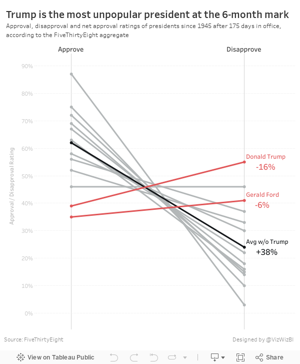
Trump is Historically Unpopular

The table is ok in that it lists the presidents in descending order by net approval rating. However, I thought a visual display would be more effective. I used Google Sheets to import the table and quickly connected it to Tableau and built a slope graph to more effectively display the data.
It only took about 15 minutes to build this, so I'm surprised FiveThirtyEight didn't include a visual. I wonder what their reasoning is for including a chart vs. a table. What do you think? Which view works better for you?
June 28, 2017
Workout Wednesday: UK General Election Slopey Trellis Chart
Fortunately, I have my trellis chart calcs safely saved in my notes, so I didn't have to Google those. The tricky bit for me was the sorting. I'm not going to spoil how I did it for you, but you can download my workbook to see how I did it. As usual, Emma and I took very different approaches for the calculations required for the sorting. She used LODs for all of her calcs, I only used one. They both work though! It all depends on how your brain works I suppose.
The data prep parts were pretty straight forward (thank you Emma for alerting us to the need to do this). Emma loves little tricks in the formatting, but I didn't see any this week.
One thing I did different was to provide a "buffer" for the year labels. I place them 10% above the highest value so that they don't overlap the slope chart lines. Emma's year labels sometimes overlap with the slope chart lines. Just a personal preference for me.
Great fun Emma! Thanks! Took me about 90 minutes including this blog post on the train from Frankfurt to Hamburg. Great use of my time! #AlwaysLearning
Click on the image for the interactive version and to download.
May 16, 2017
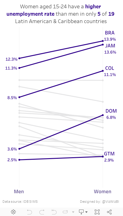
Makeover Monday: Female vs Male Youth Employment in Latin America & Caribbean Countries
Today, I had a few spare minutes and knew that Eva really wanted me to create something with the full data set she created for #VizForSocialGood. Also, I was really surprised at the remarkably few slope graphs this week. This is a great data set for slope graphs, whose main purpose is comparing two points.
So, here is my second Makeover Monday this week. Special thanks to Eva for feedback on my iterations. In this viz, I wanted to compare the unemployment percentage for 15-24 year olds by country. Perfect use case for a slope graph...and my 500th Tableau Public viz!! I wonder who has more??
February 19, 2017
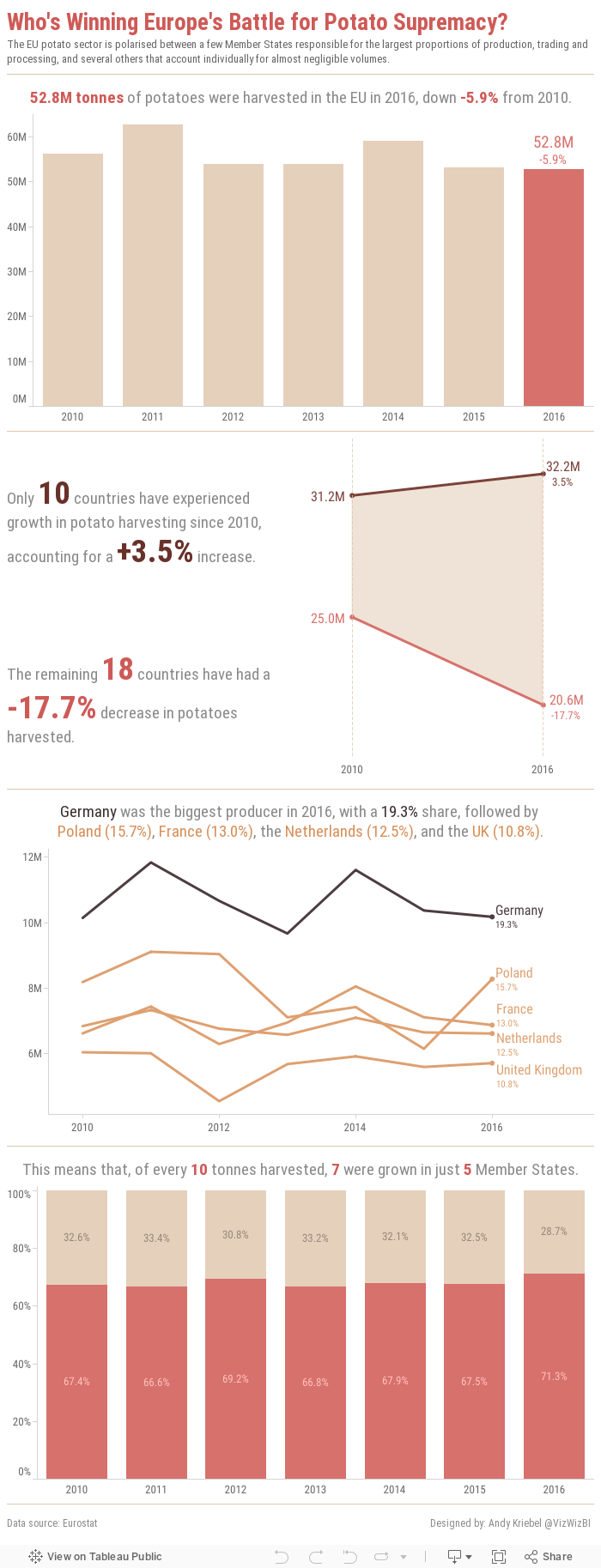
Makeover Monday: Who's Winning Europe's Battle for Potato Supremacy?
This week, we looked at the EU potato sector. Seriously! We're creating vizzes about potato production. The original website has things kind of all over the place. First there's this table:

Then there are a few donuts chart, most of them look more or less like this one:

They also included a few bars charts and a line chart. All in all, it's quite colorful.
What works well?
- Donut charts are sorted
- Tables are good for looking up specific values
- Line chart provides context by comparing to an index of 100 to make yearly change easier to understand
- Inconsistent colors
- Hard to identify the "story" in the data; The story is buried in the article.
- Pretty busy overall; too much going on
- Tables are terrible for finding insight in the data