April 9, 2024
How to Create a Floating Bar Chart in Tableau
A floating bar chart is similar to a Gantt chart, except it shows the range of two data points instead of two dates.
September 2, 2022
5 Most Common Date Functions in Tableau
In this tip, I take you through the 5 most common date functions in Tableau:
- DATEPART
- DATENAME
- DATETRUNC
- DATEADD
- DATEDIFF
By the end of this video you will understand when to use them to meet your use case. Click here for the cheat sheet I created for these date calculations.
August 17, 2022
Analyzing Seasonality with Cycle Plots
April 19, 2022
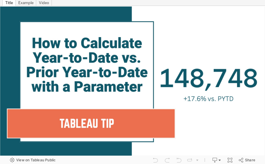
How to Calculate YTD vs. Prior YTD Based on a Selected Date
August 9, 2021
#MakeoverMonday 2021 Week 32 - Mortality Rates in England and Wales

I couldn't find too much to do with this week's data set, so I ended up with some simple BANs and line charts that take the original and reorganize them a bit to make them more clear.
Resources:
- Data set - https://data.world/makeovermonday/2021w32
- Chart Guide - https://chart.guide/
- Final Viz - https://bit.ly/mm2021w32
February 16, 2021
Understanding Table Calcs vs LODs: Explained with a Slope Graph


November 24, 2020
How to Create a Combination Bar Chart & Candlestick Chart

In a recent Makeover Monday #WatchMeViz, I showed how to create a bar chart to compare two measures and then add a candlestick chart as well to show the difference between the two measures. It's actually quite simple; it requires some knowledge of:
- How Measure Names and Measure Values work together
- How to create a combined axis chart
- How to create a dual axis chart
- How to create a Gantt chart

November 2, 2020
#MakeoverMonday Week 44 - Where do women have more access to the internet and mobile phones than men?
#MakeoverMonday week 44 is another #Viz5 initiative. The topic this week is access to the internet and mobile phones by gender and country.
First, sorry about the video cutting out at the very end. My mistake.
In this video, I first review the initial visualization and talk about what works and what does. In the end, I went with a quadrant chart, which is a scatter plot with broken up into four quadrants. The viz focuses on only two of the quadrants to highlight the significant difference in the number of countries where women have more access to men for both technologies vs. the opposite.
I showed several methods for visualizing the data:
- Side-by-Side Bar
- Bar in bar
- Bar Graph vs. Reference Line
- Barbell
- Peas in a pod
- Floating bar chart
- Slope graph (terrible choice)
- Ranked slope graph (even worse choice)
- Histograms
- Box plot
- Scatter plot
Resources:
- Final workbook - LINK
- Data set - https://data.world/makeovermonday/2020w44
- Country and region information (Be careful joining this as some country names don't match. You'll want to using data blending and alias the country names to match.) - https://data.world/vizwiz/country-region-codes
- Chart Guide - https://chart.guide/
- Interactive chart chooser - https://depictdatastudio.com/charts/

April 1, 2018
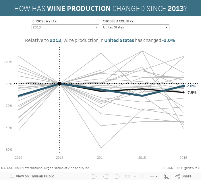
Makeover Monday: World Wine Production

What works well?
- It's a simple line chart, which makes it easy to understand.
- The red line stands out well against the white background without being too bright.
- The units on the axis are labeled.
- The title tells is what the line represents.
What could be improved?
- The subtitle could be moved to a caption below the image.
- The axis has a strange scale. Why does it start at 180?
- Adding the drop lines makes it look like the length of those lines is important, but if you compare the length of the lines, then that could be misleading due to the axis starting at 180. I'd remove those lines.
- The year labels are diagonal.
- Each year doesn't need a label.
- Why doesn't the source document contain data for all of the years?
My Goals
- It's Easter and I have basically no time to work on this, so do something quick.
- Mimic what we created for Workout Wednesday week 33.
- Focus on the relative change from a chosen period instead of the absolute change. For me, this is more meaningful if you want to see how much a country has changed and it normalizes all of the countries.
March 28, 2018
Workout Wednesday: Color and Ordering
I had done something like this previously for the color. What tripped me up was the sorting calculation. It's not overly complicated. The only hint I'll provide is that you can't sort the subcategory by this calculation. Click on the image below for the interactive version.
June 13, 2017
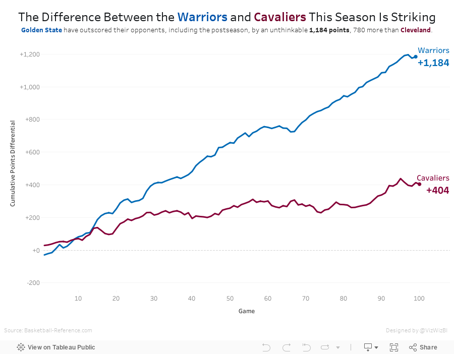
The Difference Between the Warriors and Cavaliers This Season Is Striking
Since the Warriors won the NBA title last night, I've updated the viz with the latest data. Simple, fun, effective visualisation. And the Warriors are pretty damn good!
April 3, 2017
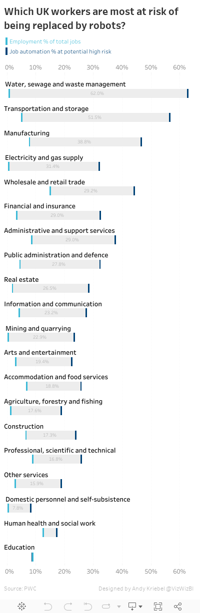
Makeover Monday: Which UK workers are most at risk of being replaced by robots?
This week, she chose this viz from The Guardian about the jobs that are most likely to be replaced by automation:

What works well?
- The overall design is super simple to understand.
- The gaps are evident by using distinct colors for the two categories.
- Including references to the data source
- Clean fonts
- Grey background bars help make the blue lines pop
- Axis labels only include the % sign on zero
- Sorting is easy to understand even though it isn't stated
- Long scrolling view suits this design
- Grey background bars don't need to extend the entire width. They would help accentuate the difference if they only extended between the two blue bars.
- Why are some of the jobs in bold?
- The title is way too long.
- Is there a better way to make the gap easier to interpret?
November 28, 2016
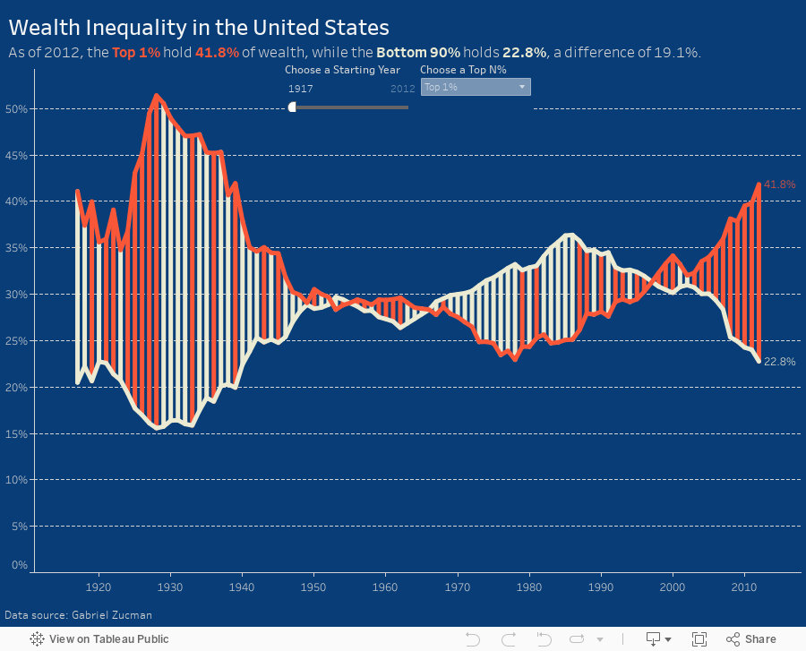
Makeover Monday: Wealth Inequality in the United States


What works well?
- Line chart is an appropriate chart choice as we're comparing two values over time
- Title is clear and simple
- Good sourcing and footnotes
- Tells a simple story effectively
- Only one axis is needed
- Title is a bit misleading as the values aren't actually equivalent
- Color choices imply democrat vs. republican
- Feels like there's a bit of extra visual clutter
- Difference could be accentuated more
This week, I again recorded all of my work along the way. In 45 minutes, I created 175 images. But this doesn't include parameters, filters and all the work done inside the dashboard, otherwise it would probably be twice as many.

You'll see in my final version that I put a lot of focus on the difference between the lines. I also used a parameter so the user can pick their own comparison. I also have a dynamic subtitle that updates based on the values picked in the parameter.
November 2, 2016
Makeagain Monday: Highlighting the Changes in Satisfaction with EU Transport


What would I change?
- The red/green color scale might be tough for color blind folks.
- I'm confused by the colors on the ends of the bar because those don't represent the same thing as the color of the middle bar.
- There are too many controls for me at the top. Might this be better as a static image with a singular story? Pablo chose to make it interactive, which is perfectly fine. I simply might choose to do different. Neither is better.
- There are a LOTS of cities in this. I would show the top and bottom 10 for simplicity. Again, personal preference.
October 4, 2016
Motor Vehicle Occupant Death Rates in the USA

I was reading through feedly this morning and saw this great viz by The Economist.

I really like this simplicity of the viz, yet the detail and insight it provides. In particular, I like the Gantt chart style they used to compare 2000 to 2013. One of the best way to learn is to recreate charts you find and like.
For my version, I used data from the CDC about motor vehicle deaths by state in the US. Overall I went with a similar Gantt bar style to compare the change in the years. I made these additional enhancements:
- Removed the line that makes them look like candlesticks
- Muted the gridlines
- Moved the labels next to the bars
- Colour-coded the bars to show whether each state has increased of decreased
- Moved the United States average to the top to make it easier to compare to
Which version do you prefer? What else would you do differently? You can click on the image below to download the workbook from Tableau Public.

December 14, 2015
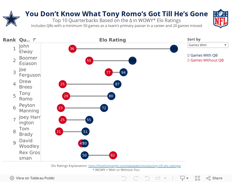
Makeover Monday: You Don’t Know What Tony Romo’s Got Till He’s Gone

Anyone that knows me knows that I despise the Dallas Cowboys and, in particular, their golden boy Tony Romo. As a lifelong Eagles fan, I’ve been indoctrinated into the hatred for anything associated with that ugly blue star. It drives me nuts to hear how much all of the NFL pundits love Tony Romo. He’s never won anything and chokes in the playoffs every time they make them.
So when I saw this article by FiveThirtyEight, it caught my attention. Was I not giving Romo his due? Does that matter anyway? In the article, the author looks at a metric they call WOWY (or With or Without You). In its most basic sense, this metric measures the impact that a particular player has on their team by measuring the Elo rating when that players plays and when they do not. For this piece, they considered quarterbacks that were the primary QB for at least 50 games and missed at least 20 games. They then pared that down to the top 10 based on what they called the WOWY ∆ ELO.
The result is this table:

The table clearly shows Tony Romo as the 3rd most important player to their team based on this metric. Ok fine. But is there more to the story? Can this simple table be made more intuitive for the readers to understand?
I created the barbell chart below. This view makes it much easier to see the difference between the With and Without You metrics. I also added a metric to the view that calculates the difference between the two. I then created a drop down to allow you, the reader, to sort by the metric you find most interesting. In essence, I’ve turned this simple table into four stories:
- WOWY ∆ ELO - This metric shows Romo as the 3rd most missed player in NFL history when he’s out injured.
- Games With - Sorting the chart by the Games With Elo rating, suddenly Romo is only 5th on this list, yet he’s ahead of Peyton Manning. This view also shows just how amazing John Elway was when he played. Elway’s Elo rating is nearly 50% higher than the second best.
- Games Without - Interesting…the teams that Rex Grossman played for actually performed better without him in the lineup. Clearly he was quite terrible as an NFL quarterback. You can also see Romo down in 6th position; the Cowboys are definitely much worse without him.
- Difference - I added this metric to show the variation between the With and Without You values. Now Romo is back in the 3rd position, and look at that gap for John Elway…wow!
Give it a play for yourself. Do you see anything else interesting?
June 25, 2015
Tableau Tip: How to Create DNA Charts

As part of this exercise, we were building a dot plot and Laszlo Zsom asked how to connect two dots on the same row. I hadn't ever done it before, so I used a Gantt chart to connect them. Then Chris Love suggested using lines.
In this week's tip (two days late as it is), I demonstrate both of these methods. Click on the image below to enjoy the video.
May 11, 2015
Makeover Monday: Why Are There so Many More Muslims in U.S. Prisons?


They go on to do an analysis, but never really address the story the data is telling in this table. Clearly what this table is screaming out for is to show the difference between the two populations. I’ve been on a bit of a slope graph kick lately, so that’s what I’m using again this week. Why? Because I find slope graphs to be an excellent way to show variances between two data points.
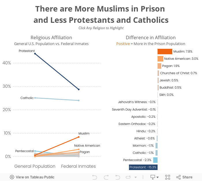
The slope graph clearly makes the differences stand out. One can easily see that there are fewer Protestants and Catholics in prison, and at the same time see that there are way more Muslims in prison. I then like to supplement the slope graph with a bar chart that shows only the differences.
There’s no clear evidence available as to why this is, but representing the data this way leads to more questions and more discussion. Any time you design a viz and it continues the conversation, you’ve probably done something right.
February 9, 2015
Makeover Monday: Beyond the Box Score - Which Teams Outperformed Their Predicted Win %?
@VizWizBI Just read your article on the Cali vax rates and VotD. Would you mind taking this down/offer advice? http://t.co/oCMoCnIiV3
— Kevin Ruprecht (@KevinRuprecht) February 4, 2015
Kevin has been following my Makeover Monday series and wanted some advice/feedback. He and I are going to do a screen share session later today to talk about his viz, my makeover, and my thought process. Thanks for asking Kevin!!Kevin is new to Tableau, so it takes quite a bit of courage to post on a site as large as SBNation.com. We should all be cognizant that there are tons of people learning Tableau every day. We need to be thoughtful with our comments and the words we choose when we respond. Think about how you would feel if you were new to Tableau and someone commented negatively about your first viz. What would you want to hear? How would you feel?
In the end, we should all be kind to everyone we meet. We want to be an encouraging community.
Here's Kevin's original viz. Click on the image to go to the original article.

- Where's the title? What is this about?
- Why don't the stats in the slope graph match the stats in the lollipop chart?
- What is BaseRuns?
- Which font did Kevin choose and why?
- There are some formatting changes that need to be made.
- What does "BR Filter" mean?
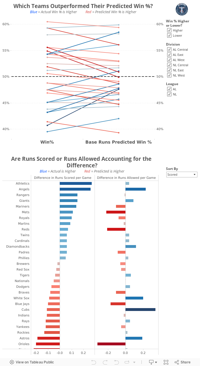
Some of the changes I made:
- Change the overall font to Helvetica Neue
- Added titles that describe what each chart is about
- Updated the "BR Filter" to something more understandable to the average reader
- Reformatted the slope graph, including: adding gridlines, changing the reference line, adding a secondary axis to aid in reading, reversed the colors
- Replaced the lollipop chart with a bar chart that shows details about the stats in the slope graph, making it a two-part story
- There are some other things as well, but those are the biggest changes.
June 9, 2014
Makeover Monday: Label bar charts for easier comprehension

This chart seems innocent enough, yet I found myself having to constantly reference the legend because they didn't bother including the labels directly on the chart. A more understandable alternative might look like this:

- Added labels for the bars
- Removed the legend and the different colors for each Chromebook
- Made the bar horizontal bars so that the labels are easier to read. I also find it easier to compare the length of the bars on horizontal bar charts, but that's a personal preference.
- Added a metric to show how much slower the other Chromebooks are compared to Wirecutter's recommendation (Dell Chromebook) and colored the bars by the % difference. This helps provide more context to the speed comparisons and I don't have to do the math in my head.


