August 29, 2014
Two-way Sorting in Tableau - Sorting Some of the Viz by a Measure and the Rest Alphabetically
airport
,
calculated field
,
continuous
,
crosstab
,
date
,
delay
,
discrete
,
formatting
,
sparklines
,
table calculation
,
tableau
,
tips
,
travel
,
tricks
10 comments
I had an interesting requirement posed to me yesterday that I hadn't ever run into before. I'm using this Airline Delays data to demonstrate the technique. The requirements were along these lines:
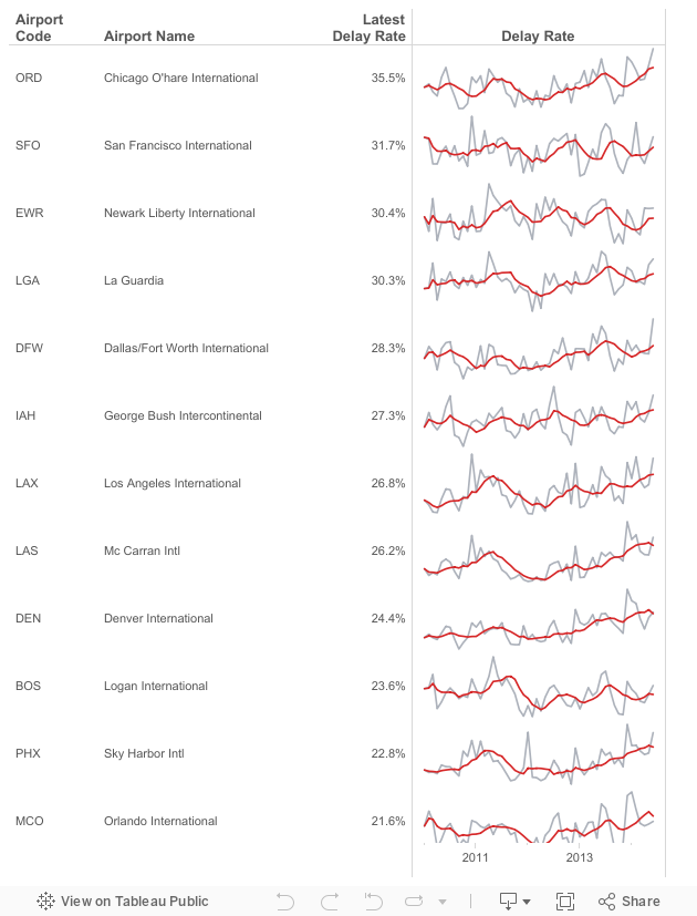
- Given a list of airports, there are a subset that are "targets". Let's assume they are the top 15 with the most flights in 2014: ATL, DFW, ORD, LAX, DEN, IAH, SFO, PHX, LAS, MCO, CLT, EWR, BOS, SLC, LGA
- The airports need to be sorted by the latest delay rate. However, only those in my top 15 list should be sorted by delay rate, the rest should be sorted alphabetically to make them easier to lookup.
- Include sparklines for each airport for 2010 to present.
This is the final product and here's how I went about solving this problem. There could very well be a more efficient method, but this worked for me.
August 25, 2014
Tableau Tip: Month over Month KPI Movers
Brian Bieber
,
calculated fields
,
change
,
KPI
,
last
,
lookup
,
monitor
,
parameters
,
table
,
tableau
,
tips
13 comments
Reader Brian Bieber (no relation to Justin), a Data Analyst at Vanguard, sent me this question:
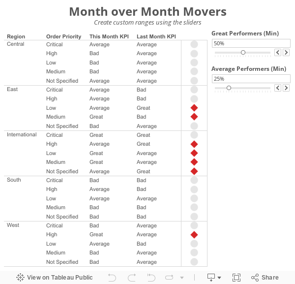 The steps for building a KPI movers viz like this are pretty straight forward. I'm using the Superstore Sales data set that comes with Tableau in this example.
Step 1: On a PC, right-click drag Order Date to the Columns shelf. On a Mac, Option+Drag Order Date. Choose the continuous month option.

Step 2: Right-click on the Order Date pill on the Columns shelf and change it to Discrete.

Step 3: Right-click on the Order Date field on the Column shelf and choose Show Missing Values. This is important because it turns on data densification. Months where data does not exist get displayed.

Step 4: Add the dimensions you would like to slice the data by to the Rows shelf. For this example, I've used Region and Order Priority.

Step 5: Create a calculated field called Last and change the Default Table Calculation to Order Date.


Step 6: Right-click on the Last field you just create in the Measures area of the Data window and choose Convert to Discrete.
Step 7: Drag the Last field to the Filters shelf and choose 0. This will change the view to only show the latest date.

Step 8: Create a calculated field to get the value for the most recent month. Notice that I'm using the LOOKUP function. Change the Default Table Calculation to Order Date.

Step 9: Create a calculated field to get the value for the previous month. The only difference here is we need to offset the LOOKUP by 1. Change the Default Table Calculation to Order Date.

Step 10: Create two parameters: one to determine the lower limit of the top KPI (Great Performers) and one to determine the lower limit of the middle KPI (Average Performers).


Step 11: Create the KPI calculations for the most recent month and the previous month. Notice that I'm using the parameters.


Step 12: It's up to you if you want to follow this step. For this specific example, I wanted to see the KPI for this month and last month in the table, so I've added them to the Rows shelf.

Step 13: Create a calculated field that returns a boolean to compare the values for this month to determine if they are a "Mover". I'm using Brian's definition for this example.

Step 14: Drag the Movers field to the Color shelf. I chose to set the colors to a light gray when True and red when False. This way only the Movers stand out.

Step 15: Optional - Change the Marks type to Shape and drag Movers to the Shape shelf as well, then pick shapes that give the affect your looking for. I chose diamonds for the Movers and circles for everything else.

Lastly I did a few cleanup items before placing the worksheet on the dashboard you see at the top of this post:

This method could easily be changed to accommodate many different scenarios like day over day, week over week or year over year.
Download the sample workbook here.
I'm currently running some monthly data where a list of records is assigned a KPI indicator like G/Y/R. I've been asked to produce a follow-up piece that would show "movers" from the prior month's data, just in a simple text view. So I guess what I need to try and do is figure out how to do a lookback/compare from prior month data to see who went from Y/R to G on the positive change side and who went from G to Y/R on the negative side.What Brian didn't realize was that answer to his question was pretty much in the question itself; he needs to use to LOOKUP() function. I sent Brian a solution, but decided to fancy it up a bit more and add some more functionality using parameters:
Step 1: On a PC, right-click drag Order Date to the Columns shelf. On a Mac, Option+Drag Order Date. Choose the continuous month option.
Step 2: Right-click on the Order Date pill on the Columns shelf and change it to Discrete.
Step 3: Right-click on the Order Date field on the Column shelf and choose Show Missing Values. This is important because it turns on data densification. Months where data does not exist get displayed.
Step 5: Create a calculated field called Last and change the Default Table Calculation to Order Date.
Step 6: Right-click on the Last field you just create in the Measures area of the Data window and choose Convert to Discrete.
Step 7: Drag the Last field to the Filters shelf and choose 0. This will change the view to only show the latest date.
Step 8: Create a calculated field to get the value for the most recent month. Notice that I'm using the LOOKUP function. Change the Default Table Calculation to Order Date.
Step 9: Create a calculated field to get the value for the previous month. The only difference here is we need to offset the LOOKUP by 1. Change the Default Table Calculation to Order Date.
Step 10: Create two parameters: one to determine the lower limit of the top KPI (Great Performers) and one to determine the lower limit of the middle KPI (Average Performers).
Step 11: Create the KPI calculations for the most recent month and the previous month. Notice that I'm using the parameters.
Step 13: Create a calculated field that returns a boolean to compare the values for this month to determine if they are a "Mover". I'm using Brian's definition for this example.
Step 14: Drag the Movers field to the Color shelf. I chose to set the colors to a light gray when True and red when False. This way only the Movers stand out.
Step 15: Optional - Change the Marks type to Shape and drag Movers to the Shape shelf as well, then pick shapes that give the affect your looking for. I chose diamonds for the Movers and circles for everything else.
Lastly I did a few cleanup items before placing the worksheet on the dashboard you see at the top of this post:
- Moved Order Date to the Detail shelf
- Reduced the level of the row divider
- Removed the bold text from Region
- Added a calculated field to the Filters shelf that checks that the value in the Great Performers parameter is larger than the value in the Average Performers parameter.
This method could easily be changed to accommodate many different scenarios like day over day, week over week or year over year.
Download the sample workbook here.
August 22, 2014
Spreading the Gospel of Data Viz & Tableau at Facebook: The VizWiz Tour
Andy Piper
,
ATUG
,
bar chart
,
Ben Sullins
,
BI
,
cincinnati
,
color
,
data viz
,
facebook
,
interactive
,
Jeffrey Schaffer
,
John Hoover
,
Jonathan Pickard
,
line chart
,
map
,
Matt Shoemaker
,
presentation
,
sdtug
,
tableau
,
training
2 comments
My first stop was back at my old stomping grounds at the Atlanta Tableau User Group, where Andy Piper and John Hoover of Norfolk Southern hosted over 100 people. A few days later I was preaching again to a group of about 50 at the San Diego Tableau User Group, where Matt Shoemaker of Interactions Marketing and Ben Sullins of Pluralsight hosted the event.
Tuesday marked the culmination of the mini-tour, with 2014 IronViz contestant Jeffrey Shaffer of Unifund and Jonathan Pickard, the leader of the Cincinnati Business Intelligence & Analytics group, hosting the event at the amazing Linder College of Business at the University of Cincinnati. They really have something special going on at UofC in the business analytics space. If you're looking for great analytical talent, they definitely need to be on your list of places to visit and connect with.
There were about 100 people in attendance, all armed with Tableau Public, data about airline delays, great questions and an incredible appetite to learn.

The format of my talks during this tour generally followed this three-hour agenda:
- Hour 1: Presentation – Building a data viz & Tableau culture; How we did it at Facebook & how you can do the same
- Hour 2: Tableau Training - Fundamentals for analyzing an unfamiliar data set
- Hour 3: Group exercise and viz presentations
One of the things I like to do when giving these talks is to ask the audience why they are there. This way, I can customize the talk along the way to make it more suitable for them and to ensure they get the most value out of it. The drawback of this approach is that the talk tends to go on longer than one hour, which was the case Tuesday.
To accommodate for my long-windedness, we decided as a group to skip the group activity and focus on the Tableau training. The fact that every person in the audience came prepared with Tableau installed was a HUGE help and a big time-saver. When I teach, my goal is to overwhelm the class. I have always felt that when learning Tableau, you should drink from the fire hose. I move very fast in the training, yet I don't leave anyone behind. The class will often feel that I'm moving way too quickly at the start, but I do that intentionally, so that they learn how easy it is to build in Tableau.
The class of 100 was comprised of only a handful of people that had been using Tableau for more than one year, with about 80% of the class getting a taste of Tableau for the very first time. In 90 minutes, we build 17 different worksheets and one interactive dashboard. You can download the workbook here. This training session was really fun because I had to hold a mic the whole time; this meant I was teaching and building vizzes one-handed. We covered a few major areas, while using the Show Me only once (I like to teach people how to build visualizations without it):
- Bar charts: Ranked bars, Small multiples, Stacked bars, Side by side bars, Stacked % of Total, Bar in bar, histograms
- Line charts: Basic line chart, Multiple lines, Year over year, Small multiples, Forecasting, Moving avg, Area chart
- Maps: Dot maps, Colored dot map, Sized dot map, Sized and colored dots
August 18, 2014
Makeover Monday: SEC Football Coaches Get Paid!
Alabama
,
coach
,
college
,
emily kund
,
football
,
forbes
,
Makeover Monday
,
matt francis
,
Nick Saban
,
salaries
,
saturdays down south
,
SEC
,
sports
,
story points
,
tableau
5 comments
College football season is nearly upon us and for those that live in the Southeastern US, college football is king. It dominates EVERYTHING - from sports talk to newspapers to online forums to Facebook posts to coaching salaries. College football = Life to so many people. If you've never been to an SEC football game, add it to your bucket list; it's an experience unlike any other.

Saturday Down South is a website dedicated to all things SEC football. This past Thursday, they published this list of the salaries for each coach in the SEC (except for Vanderbilt who does not publish their coach's salary).

This list is simple enough, yet when I saw it, I felt like there was more of a story in there. You can clearly see, just from the table, that Nick Saban is a huge outlier. He's a winner, and he gets paid to win. Keep in mind that these are only their base salaries too. Bonuses, appearance fees, etc. are not included.
I decided to use Tableau's story points for the first time to answer a couple of key questions:
 Some things I've learned while using Story Points for the first time:

Saturday Down South is a website dedicated to all things SEC football. This past Thursday, they published this list of the salaries for each coach in the SEC (except for Vanderbilt who does not publish their coach's salary).
This list is simple enough, yet when I saw it, I felt like there was more of a story in there. You can clearly see, just from the table, that Nick Saban is a huge outlier. He's a winner, and he gets paid to win. Keep in mind that these are only their base salaries too. Bonuses, appearance fees, etc. are not included.
I decided to use Tableau's story points for the first time to answer a couple of key questions:
- How much of an outlier is Saban compared to his peers in the SEC, to other coaches in other sports and to other college football coaches?
- How widespread is this level of pay for college football coaches and how does the SEC stack up?
- Is Saban worth the money?
- If you want to tell a story, know the questions you want to answer ahead of time. This will help you plan the beginning, middle and end of the story.
- As I answered questions, I was led to more questions, which led to finding more data, which led to a better story. Be prepared to iterate.
- Story Points are pretty inflexible. You can't do any formatting of you viz once you're inside the Story Point. You have to go back to the original worksheet to change anything. I had expected this to work more like editing a viz on a dashboard.
- I feel like I'm not quite using Story Points as they were intended. I feel like I'm missing their intent in this attempt because I could have done all of this same formatting with multiple dashboards and tabs. I need to learn more about the “idea” behind Story Points.
August 12, 2014
Tableau Tip: Creating a Connected Scatterplot
Alberto Cairo
,
connected
,
line
,
Lynn Cherny
,
scatterplot
,
tableau
,
the functional art
,
tips
,
twitter
No comments
Today I had the incredible honor of helping Alberto Cairo create his very first Tableau visualization. Alberto chose to create a connected scatterplot. Shortly thereafter on Twitter, Lynn Cherny asked:

So this post is dedicated to her question. Here you go Lynn:
Step 1: Create the scatterplot

Step 2: Change the Mark type to Line

Step 3: Add a continuous date dimension to the Path shelf

Step 4: Add Markers to the lines via the Color shelf

Step 5: On each axis, uncheck the "Include Zero" option

Step 6: Add a dimension to the Color shelf to create additional lines

That's all there is to it! Super simple! Download the sample workbook here.
Subscribe to:
Posts
(
Atom
)


