August 31, 2021
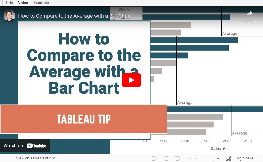
How to Compare to the Average with a Bar Chart

Context is important in data visualization. For every chart you create, consider asking yourself "compared to what?"
In this tip, I show you how to add context to a simple bar chart by showing whether a value is above or below the average.
August 30, 2021
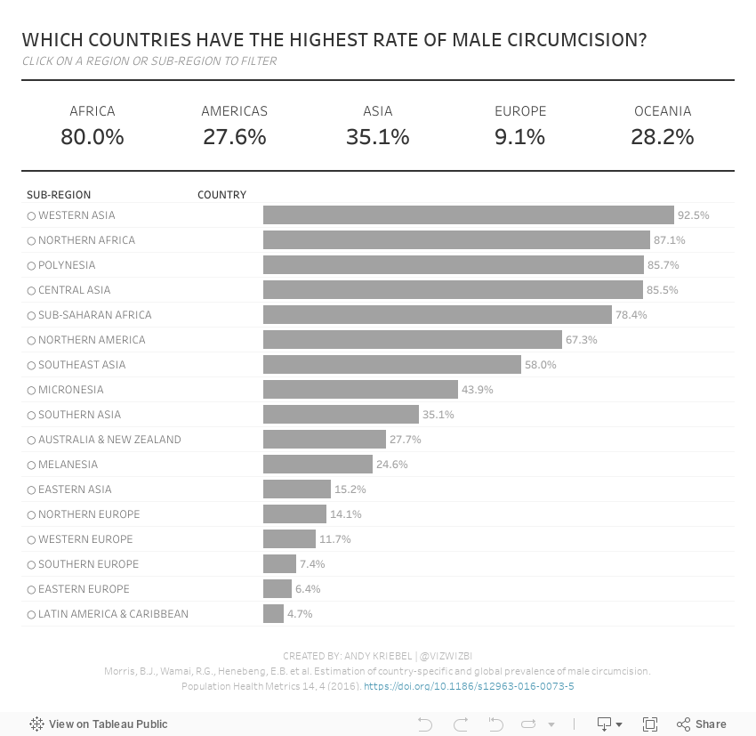
#MakeoverMonday 2021 Week 35 - Male Circumcision Around the World

In this week's Watch Me Viz, I started by showing the original visualization, demonstrated how to make a non-geographical field geographical, and then I spent lots of time working through set action drill down.
I showed how to do drill down to two and three levels of dimensions in a hierarchy. Lastly, while building the dashboard, I also showed how to move fields you select in an action to the top of the view with a sorting calculation.
Enjoy!
August 24, 2021
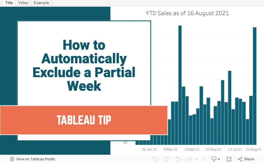
How to Automatically Exclude a Partial Week
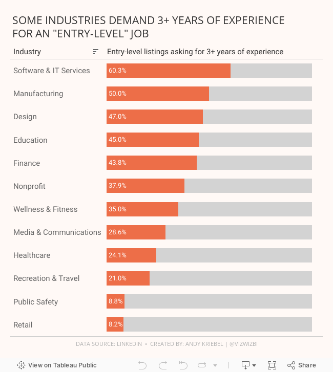
#MakeoverMonday 2021 Week 34 - Entry-Level Jobs on LinkedIn Requiring 3+ Years Of Experience

August 19, 2021
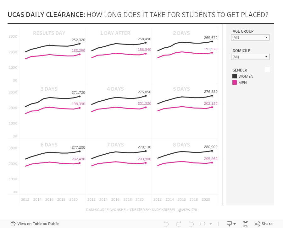
#MakeoverMonday 2021 Week 33 - UCAS Daily Placements

August 9, 2021
#MakeoverMonday 2021 Week 32 - Mortality Rates in England and Wales

I couldn't find too much to do with this week's data set, so I ended up with some simple BANs and line charts that take the original and reorganize them a bit to make them more clear.
Resources:
- Data set - https://data.world/makeovermonday/2021w32
- Chart Guide - https://chart.guide/
- Final Viz - https://bit.ly/mm2021w32
August 4, 2021
#MakeoverMonday Week 31 - Bicycle Collisions in London

- Final Viz - https://bit.ly/mm2021w31
- London Shapefiles - https://data.london.gov.uk/dataset/statistical-gis-boundary-files-london
- Data set - https://data.world/makeovermonday/2021w31
- Original Visualization - https://bikedata.cyclestreets.net/collisions/
- Watch Me Viz - https://youtu.be/ZpuX4TLqBxQ
