VizWiz

Launch, grow, and unlock your career in data
Showing posts with label map layers. Show all posts

May 25, 2026

The Big Beautiful Bar Chart: Build It in Tableau with Map Layers

No comments
In this video, I show you how to build what I call the Big Beautiful Bar Chart in Tableau. It combines colored bars, a budget reference line, donut charts, and clean labels all in one view using Map Layers. It looks stunning and it tells a complete story.

Here's what you'll learn:

- How Map Layers work and why they unlock chart types Tableau can't build any other way
- How to set up your data with a five-point scaffold to draw filled rectangles as bars
- How to use LOD expressions instead of table calculations (and why it matters for Map Layers)
- How to add a dotted budget line, sales labels, region labels, and a percentage label as separate layers
- How to control mark interactivity, opacity, and alignment across multiple layers

By the end, you'll have a chart that looks like it took hours but follows a repeatable process you can apply to any dataset.

If you can build this, you're already operating at a high level. Next Level Tableau is where analysts like you go to push further, work alongside the best in the datafam, and get direct access to live training with me every week.


April 17, 2026

Build a Marginal Histogram with Map Layers in One Sheet

No comments
Most Tableau analysts have never heard of a marginal histogram — and even fewer know how to build one. In this video, I'll show you how to create this advanced visualization from scratch on a single sheet using Tableau's map layers feature.

This technique uses the "Flat Earth" concept to treat your entire canvas as a coordinate system, letting you draw fully custom polygon shapes — no extensions, no workarounds. We'll build a heatmap with bar charts on two axes simultaneously, all driven by calculated fields and LOD expressions.

We're using Trump's Truth Social posting data as the dataset, but the technique works with any time-based data you want to analyze by day and hour.

What you'll learn:
- How Tableau's map layers work and why they unlock charts that don't exist natively
- The Flat Earth coordinate system — how to turn any data into drawable polygons
- Building rectangle polygons using 5-point path calculations
- Creating marginal bar charts (vertical + horizontal) on the same sheet
- LOD expressions to normalize bar lengths across dimensions
- Cleaning up the view: hiding headers, labels, and axes for a polished final result

Download the workbook, data and all of the calculations - https://nlt.kit.com/histogram

-----

Want to go from good to elite in Tableau?
Join Next Level Tableau — 3 live classes per week, office hours, and a community of analysts who take their craft seriously. Use code AUSTIN for $50 off your first month.


September 17, 2025

Tableau Donut Chart with Map Layers (Step-by-Step)

No comments

 Master Tableau Donut Charts with Map Layers in Minutes!

In this tutorial, I’ll show you exactly how to create the perfect donut chart in Tableau using map layers—step by step. 👉 Ready to go deeper? Explore my Tableau courses here: https://www.nextleveltableau.com Whether you’re just starting out or already an experienced Tableau developer, this walkthrough will help you create clean, professional donut charts that impress clients and stakeholders. Download the workbook at the bottom 👇


Check out my other Tableau tutorials: 🎥 Make an AWESOME Tableau Dashboard in Only 10 Minutes 🎥 Create a Perfect Waffle Chart Using Map Layers ----------
To go deeper, check out my courses: → Tableau Starter Kit - A beginner-friendly course designed to help you understand Tableau quickly → Tableau Core Concepts - A comprehensive, self-paced course for Tableau users ready to level up → Join Next-Level Tableau - My most comprehensive Tableau program to help analysts become industry leaders, with the support of a like-minded community, and 1-to-1 help from me 📩 NEWSLETTER Each week, I'll send you Tableau tips, tutorials, and strategies to design better dashboards, have more impactful, and stand out in your career: https://nlt.kit.com/

February 12, 2025

Advanced Calendar Heat Maps in Tableau (No More Workarounds!)

No comments
Tired of clunky calendar heat maps in Tableau? You’re not alone. 

Traditional methods (discrete & continuous headers) just don’t cut it. But what if you could build the perfect calendar heat map—one that’s dynamic, clean, and fully customizable?

In this tutorial, you’ll learn:
✅ The problems with traditional calendar heat maps
✅ How to build the ultimate calendar heat map using map layers
✅ Create a fully interactive dashboard with perfect formatting

Download the workbook (interact below) & data source.

P.S. Want to master Tableau and stand out in your career with Next-Level Tableau

Next-Level Tableau is a community-based membership that gives you exclusive, real-time access to live classes with me, a Tableau Visionary Hall of Fame member. 

These sessions teach you how to:

✅ Master advanced Tableau skills
✅ Solve business problems through visualization
✅ Think like an analyst—so that you can deliver impactful dashboards and confidently demonstrate your value to your boss.

What sets NLT apart is the vibrant, supportive community of like-minded Tableau developers, where you’ll build lasting connections, exchange ideas, and get help when you need it—so that you can stay motivated, continuously improve, and never feel stuck or isolated in your Tableau journey.

📊 Take your Tableau skills to the next level today!

January 22, 2025

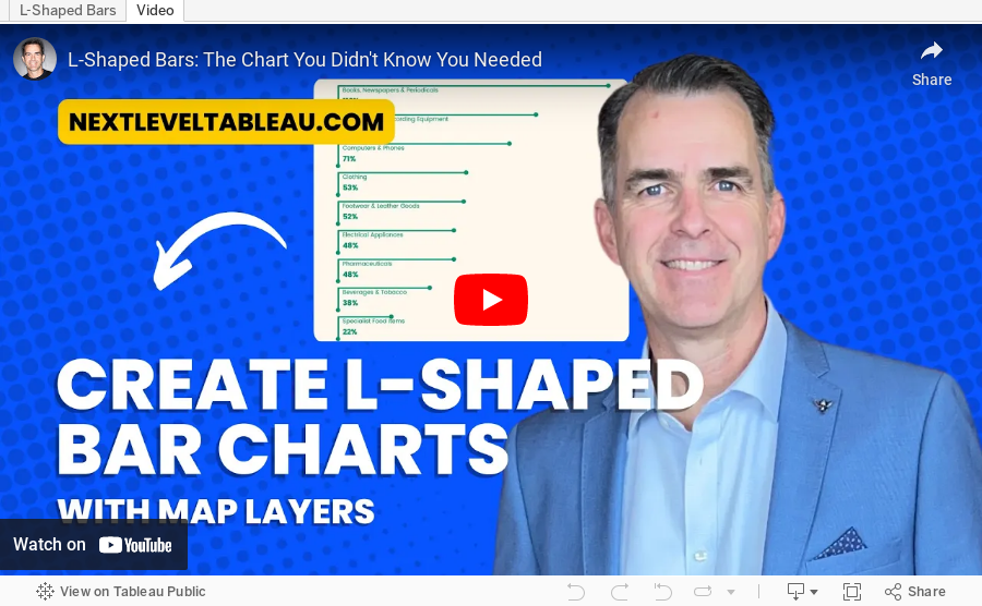
L-Shaped Bars: The Chart You Didn't Know You Needed

No comments
In this Tableau tutorial, I’ll walk you through how to create L-shaped bar charts, a unique and visually way to display your data, perfect for giving your dashboards a fresh, modern look.

You’ll learn:

- How to connect and prepare your data using Superstore and custom point files.
- Creating relationships and calculated fields to build the L-shaped structure.
- Using Tableau’s Map Layers feature to add detail and customization.
- Formatting and finalizing your chart for dashboards.

Whether you’re impressing stakeholders or sharpening your Tableau skills, this step-by-step guide has you covered!

Resources:
🔗 Point data files
🔗 Tableau workbook


P.S. Want to become an advanced Tableau user?

Unlock your full potential with Next-Level Tableau, the ultimate training program for Tableau users. Gain access to expert-led tutorials, live sessions, and a supportive community designed to help you master advanced skills, create stunning dashboards, and achieve your career goals. Learn more and take your Tableau skills to the next level today at nextleveltableau.com.

Unsure? Sign up for my free course at starter.nextleveltableau.com.

December 17, 2024

No comments

Learn how to build a stunning waffle chart in Tableau using map layers and calculations! 

This advanced Tableau tutorial will show you how to simplify the creation of waffle charts while unlocking powerful design and flexibility for your data analysis projects.

You’ll Learn How To:

- Connect Tableau to Superstore and a waffle chart template with Relationships

- Use the MakePoint function to create dynamic map-based charts

- Apply map layers for advanced customization and perfect label placement

Why You Need This:

This method combines advanced Tableau charts with the flexibility of map layers, allowing you to:

1. Create precise grid-based waffle charts.

2. Perfectly center labels without complex workarounds.

 Who Is This For?

- Data analysts looking to enhance their Tableau dashboards

- Advanced Tableau users exploring new chart techniques

🔗 Workbook  |  Data

Become a Next-Level Tableau member and become a Tableau expert


January 30, 2023

#MakeoverMonday 2023 Week 5 - Where can you find a cheap slice of pizza in New York City?

No comments
This week's data set was simple to understand, yet provided me quite the challenge to visualize. The data comes from Liam Quigley and it's a record of prices of slices of pizza he's tried in NY. Quantified self at its best!

Check out the recording below and you will learn how to:

  1. Prepare the data: calculations, joins, spatial intersections, and more
  2. Create maps: hexbin maps, map layers, spatial joins, using maps as shapes
  3. Create line charts and heat maps that are simple and effective (don't overcomplicate things)
  4. Build a dashboard using layout containers

Thanks for watching! There's an image of my viz below the video. Check out the interactive version here.


August 4, 2021

#MakeoverMonday Week 31 - Bicycle Collisions in London

No comments
This week's data set was pretty straightforward. During #WatchMeViz I iterated through some maps, including joining to spatial files for London, and also lots of time series charts. Below are links to the resources, the video, and the final viz.

Resources:


February 22, 2021

#MakeoverMonday Week 8 - Protests Against Limiting Abortion Rights in Poland

No comments
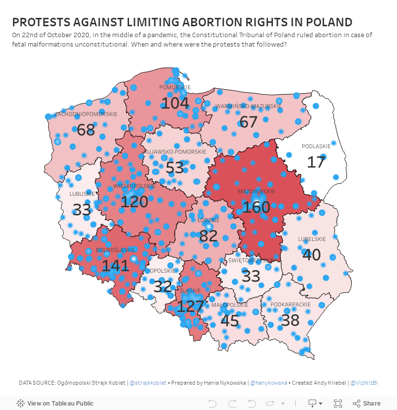
On 22nd of October 2020, in the middle of a pandemic, the Constitutional Tribunal of Poland ruled abortion in case of fetal malformations unconstitutional. In this week's Makeover Monday, I ask where and when were the protests that followed?

Watch Me Viz