February 12, 2025
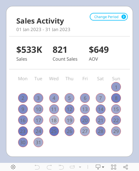
Advanced Calendar Heat Maps in Tableau (No More Workarounds!)

December 20, 2024
Create a Custom Calendar Widget

Thanks Nicholas for providing me with the data set and setting an example of how simple visualization can communicate data effectively.
If you're not already following Nicholas, do so. You're guaranteed to find inspirational designs for your dashboards.
No extensions required. I think you'll love the trick I did with the title so that you can't click on it.
Downloading the workbook so that you can reverse engineer it is one of the best ways to learn.
October 3, 2023
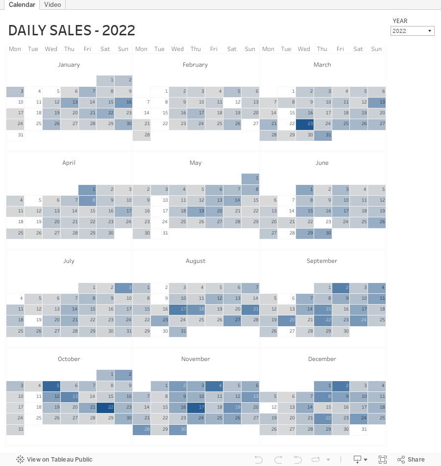
Master Dynamic Zone Visibility in Tableau: Yearly to Monthly Calendar Drill Down

Welcome to this comprehensive tutorial on creating a Yearly to Monthly Calendar Drill Down using Dynamic Zone Visibility in Tableau.
📌 What You Will Learn
In this video, you'll discover how to use Tableau's Dynamic Zone Visibility feature to effortlessly switch between yearly and monthly calendar views. If you've been looking to add more flexibility and dynamism to your Tableau dashboards, this tutorial is designed for you.🔑 Key Takeaways
- Understand the concept of Dynamic Zone Visibility- Set up a yearly calendar view in Tableau
- Implement drill-down functionalities to transition to a monthly calendar view
- Practical tips and tricks for optimizing your Tableau dashboards
🔗 Additional Resources
- Data- Workbook
September 5, 2023
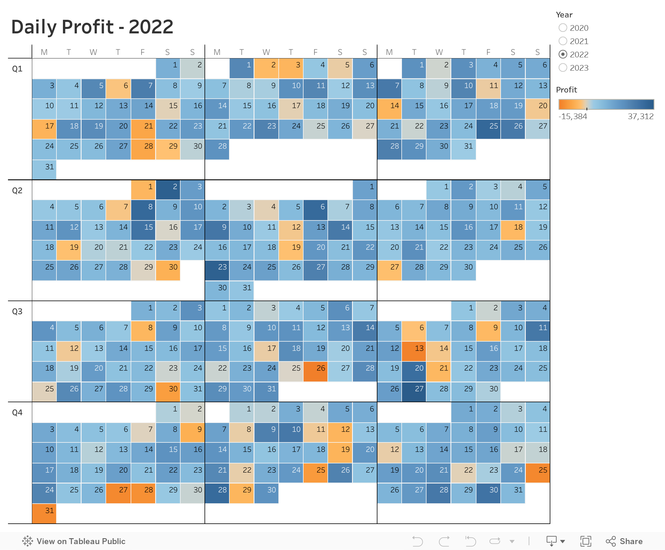
60 Unique Ways to Visualize Time in Tableau

November 22, 2022
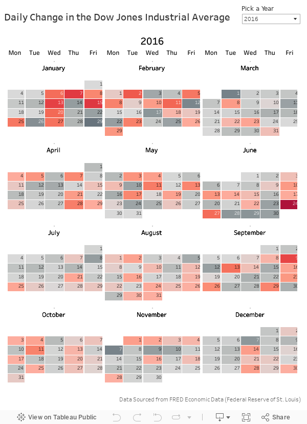
How to Create a Full Year Calendar Heatmap in Tableau

Calendar heatmaps are a great way to visualize time-series data over an entire calendar year. Individual days are shaded on a light-to-dark gradient based on a measure that has been added to the visualization.
Creating a heatmap for a single month in Tableau is pretty straightforward. It gets a bit more complicated when you want to view an entire year at once. In this tip, I going to show you, step-by-step, how to create a full year calendar heatmap in Tableau. The workbook is below this video to download.
January 11, 2022
How to Create a Calendar Widget for Filtering
October 13, 2020
#WorkoutWednesday 2020 Week 42: Can you build a Strava Workout Calendar?
Introduction

Requirements
- Dashboard size: 1680 x 1020
- Max 3 sheets
- Max 1 text box
- Joins are not permitted
- Data model is not permitted
- They MUST be separate data sources.
- No annotations
- No text boxes on the main chart
- No floating objects
- No Level of Detail expressions
- Remove highlighting from anything you can click
- Match formatting and tooltips
- The blue hex code is #0070A0.
- The blue bars on the upper right are the weekly number of hours spent exercising.
- The black bars in the main chart are the daily hours spent exercising.
- Any days when I did not exercise should have zero hours displayed.
- Allow scrolling through the years
Dataset
Attribution

Share
Solution
March 21, 2017
Tableau Tip Tuesday: How to Create a Full Year Heatmap Calendar with Month Labels
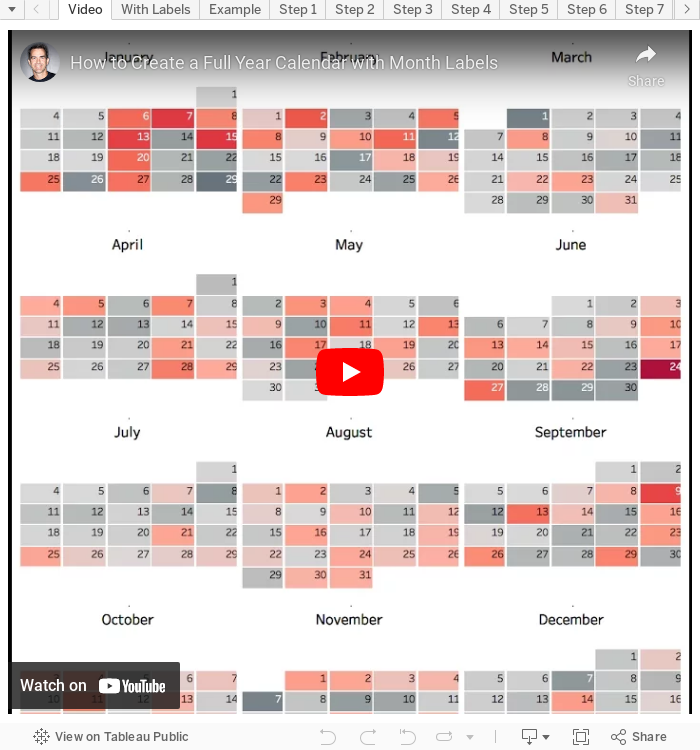
March 15, 2017
Workout Wednesday: Full Year Calendar with Month Labels
I’ve still yet to come across a really good, scalable solution for adding in the month names.Kevin sent this to me several weeks ago and I came up with this solution, which is your challenge for this week. Create a heatmap calendar that includes month names. Download the data for this challenge here. You must match everything: the titles, the colors, the fonts, the filter, all of it. The final dashboard size is 600x800.
TIP: You could start by downloading Kevin's workbook. This will give you the LOD that he used for the weeks. Good luck!
September 2, 2015
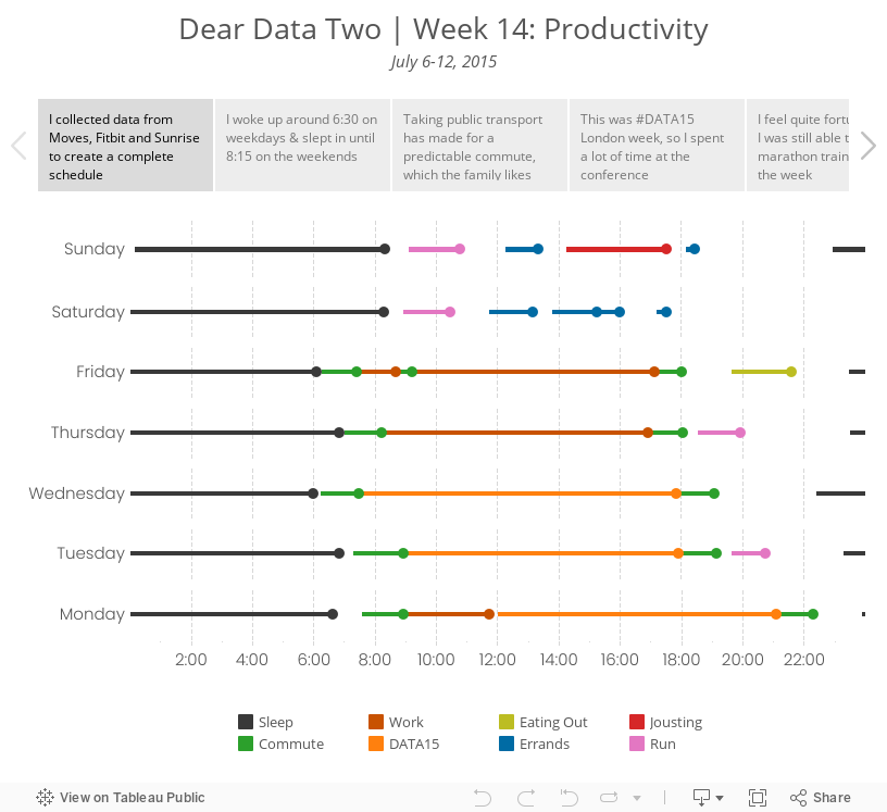
Dear Data Two | Week 14: Productivity

To collect the data for this week, I combined data from Moves (for places and times), Fitbit (for sleeping) and Sunrise (for my calendar). I entered everything manually into Excel and connected it to Tableau.
June 30, 2015
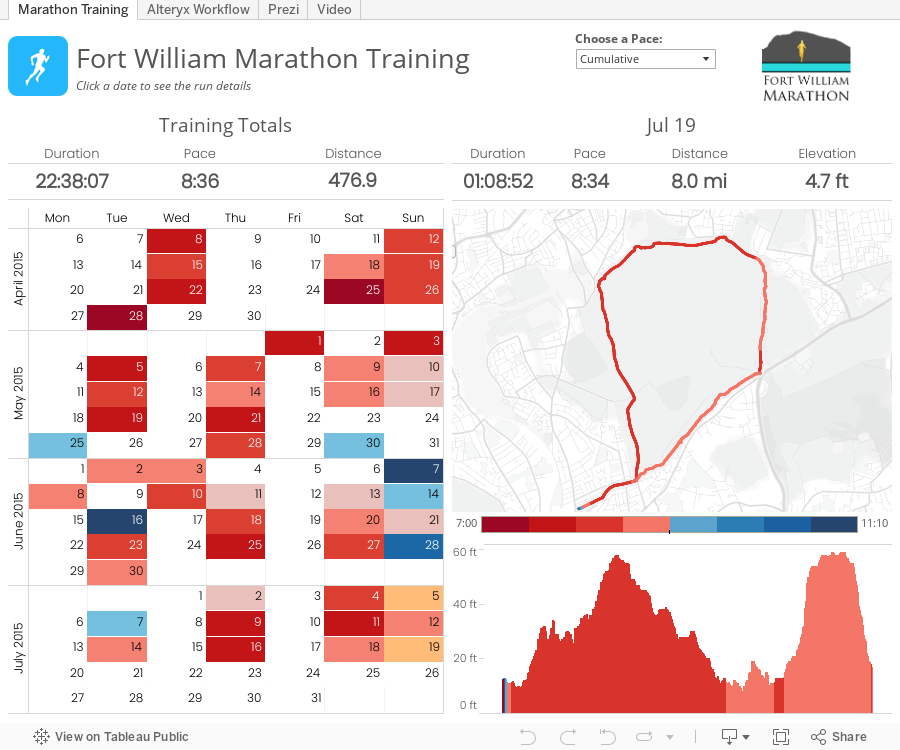
Alteryx + Tableau: Visualising a Simpler RunKeeper Training Plan

The basic reasons behind this project were twofold:
- I was learning Alteryx and wanted a use case to apply what I was learning.
- I'm training for my first marathon and wanted a better way to see all of my runs in one place.
May 3, 2014
#SFBATUG: Using a calendar widget to control your dashboard
Last night at the SFBATUG meet up, I had the pleasure of giving a hands-on demo of how to create an interactive calendar in Tableau. This is a follow up to a post I write in May 2012 detailing how to create the calendar.
This example goes a step farther in that I’m using the calendar like a widget to control what I’m seeing on my dashboard. What’s also cool about this method is that you can multi-select dates, something you can’t currently do with date quick filters.

Note that I also demoed how to hide a reference line behind a bar, which I wrote about here.
Finally, this dashboard is not a stellar example of design. I threw this together quickly so that I could share it with the community promptly.
Download the workbook here.
May 24, 2012
Creating an interactive monthly calendar in Tableau is easier than you might think
Dustin’s post does an excellent job of taking you through creating a calendar viz step-by-step. But I felt it fell a bit short in the end since you didn’t actually see a calendar. Dustin’s end product looks like this:


Ok, let’s get to it.
Step 1 – Create a list of dates in Excel and open the data in Tableau.


Step 4 - Right-click drag the Date field onto the Row shelf and choose the WEEK(Date) discrete format

Your view should look like this:

Step 5 – Clean up the view a bit by right-clicking on the Date label and choosing Hide Field Labels for Columns

Step 6 – Right-click on the WEEK(Date) pill on the Rows shelf and uncheck Show Header

Your view should look like this:

We’re getting close!
Step 7 – Right-click drag the Date field onto the Text shelf and choose DAY(Date)

Step 8 – Align the Text to the top right, center the header for the WEEKDAY(Date (copy) field, re-size the view a bit and we now have a beautiful calendar.

Ok, sweet, we have something that looks exactly like a calendar, but so what? This doesn’t tell us anything.
Consider that you want to see the profit ratio for your sales (or any other metric) displayed on each day as a color. This is where data blending comes in handy.
Step 9 – Connect to the Superstore Sales data source (or any other data you want to use, as long as it has a date field)
Step 10 – Create the data blending relationships. Go to the Data menu and choose Edit Relationships. You will need to create these Custom relationships:

Step 11 – Create a calculation for Profit Ratio by right-clicking on any field and choosing Create Calculated Field

Step 12 – Drag the Profit Ratio measure onto the Color shelf

That’s it! You must admit this is pretty cool.
Note that Tableau defaults positive and negative colors to the Red-Green palette; you might want to change it for those color blind folks out there (and to keep Steve Wexler off your back).
If you want to take it a couple steps farther, you could show the quick filter for the MY(Date) field, create a parameter to allow for any of several metrics to be chosen, and on an on to make it a truly interactive analysis.
In the version embedded below, I changed the color palette to Red-White-Green so that those days without any sales would be white instead of gray.
Try this with your own data. I bet your users will find this incredibly useful, especially as a performance monitoring tool.

March 9, 2011
Facts are friendly. Why the Cobb County School Board should reinstate the balanced calendar.
Today I presented the information below at the monthly Cobb County School Board meeting. As some background, the previous board approved a three-year “balanced” calendar that provides more frequent breaks throughout the year. However, a new board was “elected” (some ran unopposed) and they decided that, despite the overwhelming evidence in support of the balanced calendar, they wanted to go back to the “traditional” calendar.
Naturally, I used Tableau to analyze the data that was provided by the county itself (some board members were using their own data which could neither be validated nor would they share). The key points:
- The Balanced Calendar has resulted in a 26% reduction in teacher absences for a total savings of $987K. Previously when this data has been presented, it has not factored in the additional savings that result from a $10 decrease in daily substitute pay.
- The Balanced Calendar has resulted in a 4.2% reduction of student absences, with over 75% of school reporting a reduction in absences. In the past, analysis has not considered that there were 88 schools days in 2010 compared to 85 in 2011. Another interesting fact is that a school board member reported incorrect information. I corrected him.
- Utility cost trends are in alignment with my costs at home. My assumption, though likely too broad, is that my utility costs are in alignment with other residents of Cobb county.
The board is supposed to vote on the calendar again today or tomorrow, but I’m not holding out hope that the board members that voted against the balanced calendar will be swayed by facts.
I closed my comments with the following from Seth Godin:
Before we invest a lot of time in evidence-based discussions, please tell us what evidence you would need to see in order to change your mind. If the honest answer is, "well, actually, there's nothing you could show me that would change my mind," you've just saved everyone a lot of time. Please don't bother having fact-less discussions.


