January 8, 2024
Step-by-Step Guide to Building a Beautiful Bump Chart in Tableau
We all create charts we know *could* be better.
Here's how to make your next bump chart look like magic 🤯
Tableau is incredible for creating bump charts...
But 99% use shortcuts which don't look great.
Here's my secret:
It all comes down to the small details.
Each step has to be done right to get the view you want.
Most people don't follow these steps.
And even more don't know how to make it look great...
I'm going to show you how.
In this tip, I give you specific step-by-step instructions to get your bump chart to look just right.
👀 Do you want a copy of my viz? 👀
You got it!
Send a DM on LinkedIn saying CHART MAGIC! and I'll send you a PDF of the instructions AND the workbook for you to use for FREE.
September 5, 2023
60 Unique Ways to Visualize Time in Tableau

November 22, 2022
#MakeoverMonday Week 47 - Worldwide Railroad Infrastructure Quality Rankings

- Recreating the original bar chart
- How to create a bump chart
- How to use a diverging color palette and alias country names
- How to create a ranked dot plot
- How to use parameter actions to sort the view
- How to use a filter action to remove the highlighting
August 29, 2022
#MakeoverMonday 2022 Week 35 - The World's Biggest Military Spenders

Makeover Monday is back! Every Monday I'll be running a #WatchMeViz and every Wednesday, Eva will be running #VizReview. Subscribe to my YouTube channel for reminders of the latest events.
https://youtube.com/andykriebel
This week was a makeover of a visualization by Visual Capitalist about the top 10 military spenders. During Watch Me Viz, I iterated through 15 different charts before settling on a bump chart. If you want to learn about sets, parameters, table calculations, containers and more, watch the video below.
Below the video you can see my viz, or click here. Enjoy! If you need clarifications on anything, please comment on the video here.
July 6, 2021
#MakeoverMonday Week 27 - If Only _____ Voted

- To see across each metric in order to identify consistent blue or red patterns for an entire demographic (e.g., early voting or urban).
- To see if individual States always voted for Biden or Trump irrespective of the demographic (e.g., CA, MA, MD for Biden or KS, KY, LA for Trump).
June 22, 2021
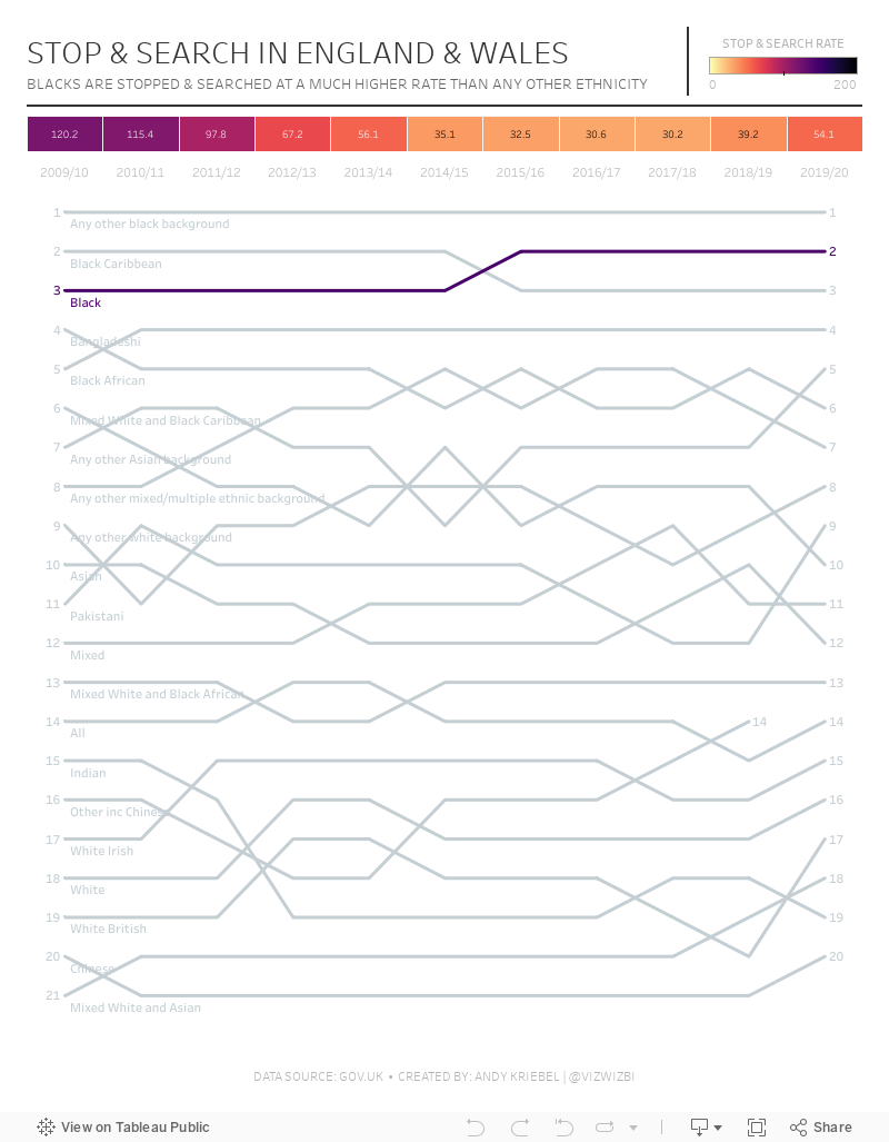
#MakeoverMonday 2021 Week 25 - Stop & Search in England & Wales

May 24, 2021
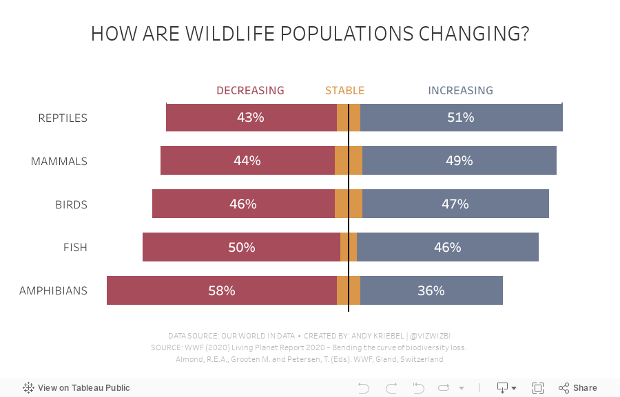
#MakeoverMonday 2021 Week 21 - How are wildlife populations changing?

April 26, 2021
#MakeoverMonday 2021 Week 17 - Price Parity in America
In this week's Watch Me Viz, I covered the following charts:
- Line chart
- Trellis chart
- Slope graph
- Connected scatter plot
- Bar charts with comparisons
- Diverging bar charts
- Heatmap
- Hex map
- Tile map
- Barbell chart
- Peas in a pod chart
- Bump Chart
- Comet chart
In the end, I settled on the bump chart using highlighting and BANs. Other topics covered include:
- Sorting calculations
- Level of detail expressions
- Rank table calculations
- Parameters
- Filter actions
- Padding in dashboards
- Cleaning tooltips
- Divider lines in dashboards

April 12, 2021
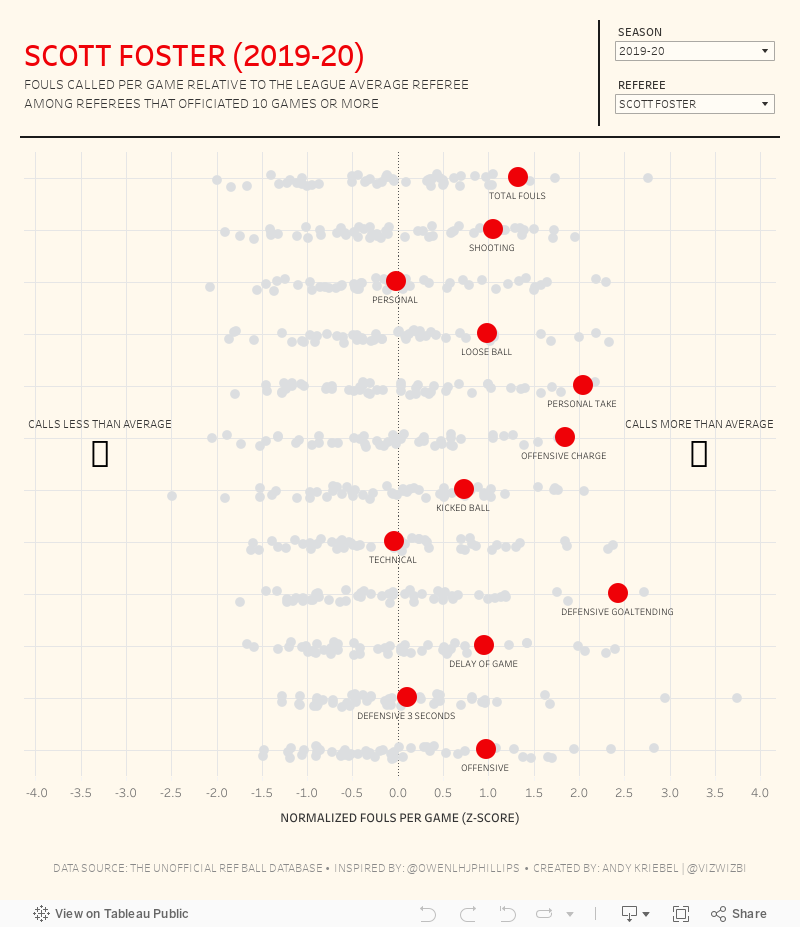
#MakeoverMonday 2021 Week 15 - Fouls Called by NBA Referees
The original viz for this week was so good that I struggled to come up with something different. In the end, I wanted to learn by recreating the original. Check out #WatchMeViz and interact with the viz below.

April 5, 2021
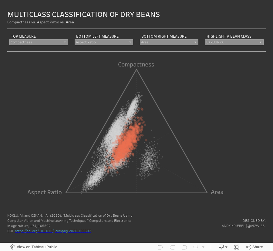
#MakeoverMonday 2021 Week 14 - Multiclass Classification of Dry Beans

March 22, 2021
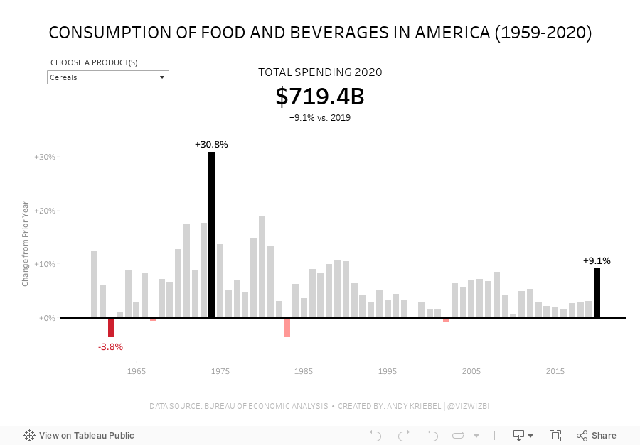
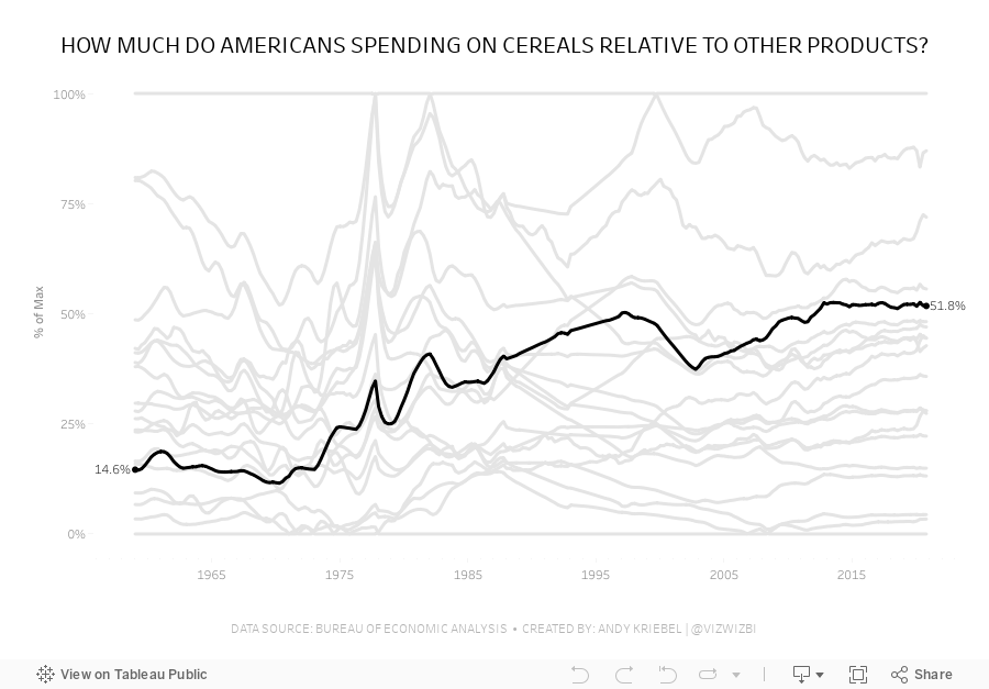
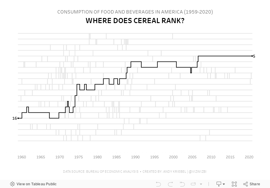
#MakeoverMonday Week 12 - How much do Americans spend on cereals?
Viz 1 - Year over Year Change in Consumption of Food and Beverages in America

Viz 2 - Parallel Coordinates - How much do Americans spend on cereals relative to other products?

Viz 3 - Bump Chart - #MakeoverMonday 2021 Week 12 - How Does Cereal Rank in American Food Spending?

February 8, 2021
#MakeoverMonday Week 6: Why Are Women Perceived to Be Unequal to Men?

Wow! What a fun #WatchMeViz that was! I iterated through 16 charts and then when the idea solidified, there was some great conversation and feedback on the chat to help me get to the end. I find survey responses quite difficult to visualize, so instead of getting frustrated, I thought about all of the ways I can compare data to see if anything would work.
Most importantly, thank you to all of your on the live chat. It makes a huge difference to me and I love getting your feedback and questions along the way. You make me better. You can find the final visualization below the video.

November 26, 2018
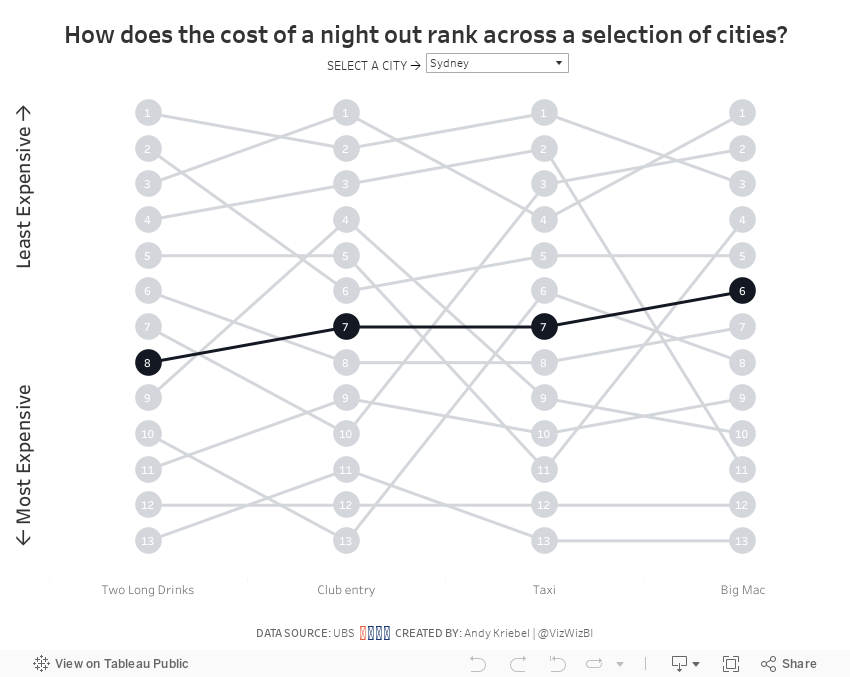
Makeover Monday: The Cost of a Night Out


What works well?
- Choosing a topic that is relatable
- Good title and subtitle
- Sorting the bars from most expensive to least expensive
- Using colors that are easy to distinguish
- Including the labels on the ends to the bars
What could be improved?
- Lose the icons on the lower right
- Remove the gridlines and axis labels (they're not necessary if the ends of the bars are labeled)
- Remove the flags next to each city; First they add no value. Second, the data is about cities not countries.
- The title is a bit misleading; this is only a selection of cities.
- Using a stacked bar chart makes comparisons across the items difficult; maybe if this was interactive and you could choose the item to sort by, it would work better.
What I did
- I wanted to make the comparisons easier, so I chose to create a bump chart.
- I added a highlight selector so the user can focus on a single city, yet keep the others in the view for context.
- I sorted the values from least expensing (top) to most expensive (bottom).
October 16, 2017
Makeover Monday: Ranking Drivers in Formula-E
First, let's look at the table of results.

What works well?
- When looking at results in events, it never hurts to have the results in finishing order.
- Including the pictures of the players helps make it more personal.
- Showing the gap to first place helps provide context on how much the winner won by.
What could be improved?
- There no sense of how the driver has done over time. Are they getting better or worse? You can't tell.
- There's very little detail about what the stats mean. Definitions would be helpful for an audience to which this sport is foreign.
What were my goals?
- Compare drivers in the most recent season
- Only include drivers that completed every race
- Provide season summary stats
- See if any drivers are dominating the circuit
June 5, 2017
Makeover Monday: America's Most Visited National Parks
For week 23, we are looking at the popularity of America's National Parks. As an American, I've learned to cherish the amazing, free natural wonders sprinkled around the country. In particular, when we lived in California, we made it a point to visit Yosemite, Joshua Tree and the Grand Canyon amongst other places. They truly are worth a visit.
The viz that we are making over this week comes from FiveThirtyEight and it really quite fantastic, like most of their vizzes.

What works well?
- Great use of highlighting
- Including gridlines to help guide the eye
- Noting the source
- Nice use of a bump chart
- Shows patterns really well
- Subtitle explains how to interpret the viz
- Colors are distinct enough to follow through the viz
What could be improved?
- The title is very boring.
- Lack of interactivity
- How can I identify a park that's not highlighted? It would be nice to have a way to choose another park to highlight.
- The top 6 parks are highlighted, but why are the others highlighted? It seems pretty random.
- While this shows me the most popular parks, it lacks the context of how many visitors and how that has changed over the years.
What were my goals?
- Focus on the top 25 parks
- Focus on the last 50 years
- Include the visitors to provide more context when comparing parks
- Use a small multiples layout and try to recreate this viz that I highlighted on Data Viz Done Right
- Include the total visitors somewhere so the reader doesn't have to figure it out
- Create the entire viz in a single view (except the footers)
But then I had another question in my head: At State level data, how many States account for 80% of all visitors? For this, I created a simple Pareto chart. Two vizzes for the prices of one! Enjoy! Click on either image for the interactive version.


