Showing posts with label economics. Show all posts
March 22, 2021
#MakeoverMonday Week 12 - How much do Americans spend on cereals?
America
,
BAN
,
bar chart
,
bump chart
,
consumers
,
consumption
,
economics
,
economy
,
KPI
,
Makeover Monday
,
parallel coordinates
,
spending
,
variance
No comments
Time really flew by on today's #WatchMeViz. Before I knew it, an hour had passed, I'd built lots of things, and I hadn't yet decided on my "final" visualization. So instead, I have three this week!
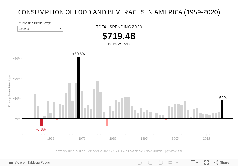

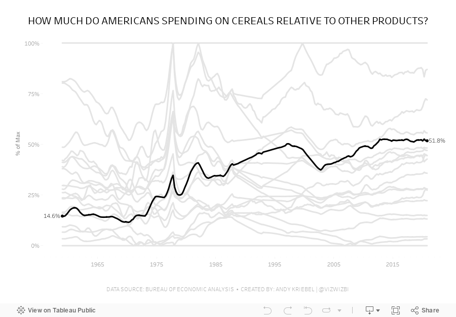

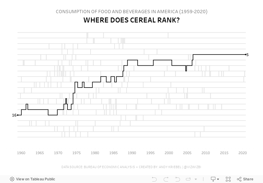

Watch the video here to learn how I built these charts.
Viz 1 - Year over Year Change in Consumption of Food and Beverages in America
Viz 2 - Parallel Coordinates - How much do Americans spend on cereals relative to other products?
Viz 3 - Bump Chart - #MakeoverMonday 2021 Week 12 - How Does Cereal Rank in American Food Spending?
November 3, 2019
#MakeoverMonday: Is Las Vegas Convention Attendance a Recession Indicator?
convention
,
economics
,
economy
,
indicator
,
Las Vegas
,
Makeover Monday
,
recession
,
visitors
No comments

 |
| SOURCE: Calculated Risk |
What works well?
- The time goes from oldest to latest.
- The colors are easy to distinguish.
- The axes are well labeled.
- Including the caveat for 2019 since it's not a complete year in the data.
What could be improved?
- The axes aren't synchronized; I'd like to see how they would look synchronized.
- Without referring back to the color legend, I don't know which axis goes with which metric.
- Using a dual axis chart implies there's a correlation between the two measures. There might be, but it could be displayed other way to make that more evident.
- There no indicator of the data source.
What I did
I started by reading the original blog post. What caught my attention in particular was the last sentence:
Historically, declines in Las Vegas visitor traffic have been associated with economic weakness, so the slight declines over the last two years was concerning.
Super interesting! So this is where my worked started. I first annualized the data to make 2019 comparable to the rest of the years. From there, I created a connected scatterplot, which takes the two metrics in the original chart, plots one on the x-axis and the other on the y-axis, and connect the points by the year. This lead to a swirly look at the end, which made the relationship difficult to understand.
Instead, I chose to focus on the "red" line of the original, i.e., convention visitors. I wanted to see if convention visitors was indeed a recession indicator. The chart was simple to make, then some googling turned up the recession dates. Low and behold, convention visitors to Vegas sure do look like a leading indicator for a recession. If this is true, then we're on the verge of a recession very soon.
Click on the image for the interactive version.
July 30, 2018
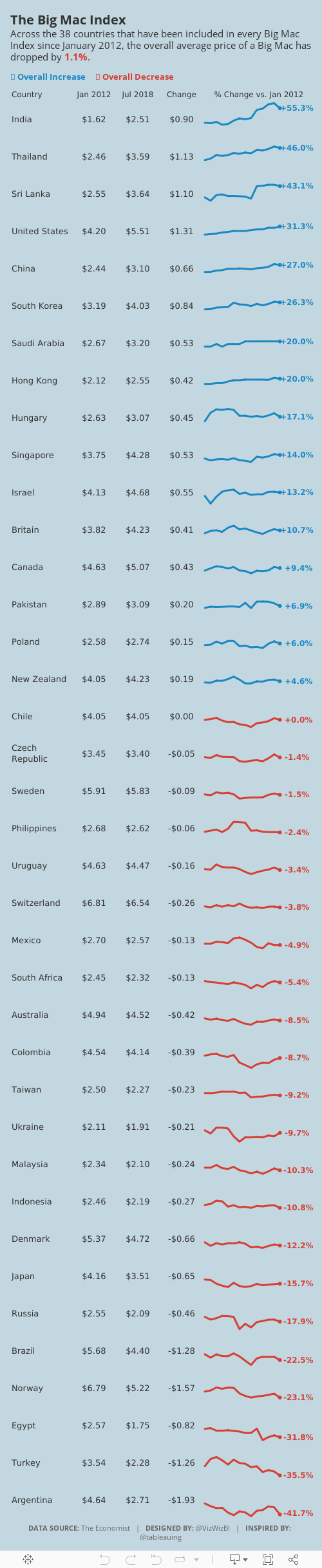
Makeover Monday: How has The Big Mac Index changed since January 2012?
big mac index
,
currency
,
economics
,
economy
,
Makeover Monday
,
pricing
,
The Economist
No comments


What works well?
- Using the footnotes to help describe the caveats in the data
- Including a reference line at zero so that it's easy to see if the country is over- or under-indexed
- Including the latest price to the right for context
- Sorting by the latest price
- Using two colors that are easy to distinguish from each other
- Subtitle explains the metrics in the viz
What could be improved?
- The timeframe is so short that it's hard to see much change at all between the data points.
- I have no idea what happened between these two points.
- There's no explanation as to why this is the selected list of countries.
- Sizing the dots for the most recent price doesn't add much value.
- The white gridlines are too strong for my liking; I find them distracting.
- I would exclude the Euro Zone since not all Euro countries are included in the viz and it's also the only aggregate included. If you look at the chart alone without reading the article, it doesn't make sense to include it.
What I did
- I created some simple sparklines. Right after I thought about it, Rodrigo Calloni posted this viz which was nearly identical to what I wanted to create. The difference for me was that I wanted to look at the change in the price of a Big Mac over time, whereas Rodrigo looked at the change vs. the US price over time.
- I used the colors from the original viz. I liked how they worked together.
- I included some numbers for context.
- I limited the data set to only countries that had been in all of the 14 most recent surveys.
- I create a simplified mobile version that removes some of the BANs in order to fit onto the width of a mobile device.

February 25, 2018
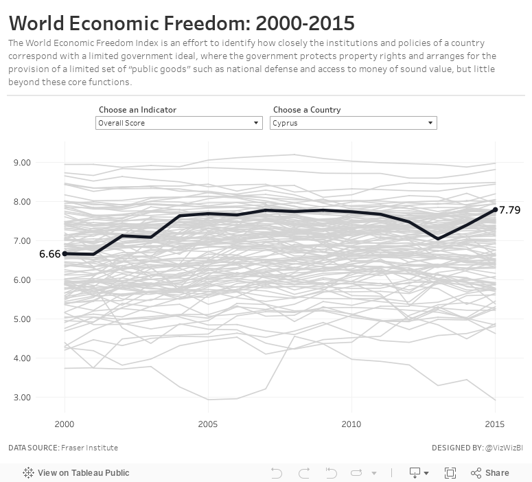
Makeover Monday: World Economic Freedom

What works well?
- Nice search functionality
- Simple colors (though maybe tough for color blind people)
- The table clearly show the top 10 countries
- Being able to "Play" the visualisation and watch the map change
- Really nice tooltips
- Clicking on a country give you specific information about each of the rankings for that country
What could be improved?
- The filled map makes it hard to see small countries and especially to see how they change.
- The up/down arrows next to the numbers clearly show better or worse, but compared to what?
- There's no sense of change because you can't easily compare years.
My Goals
- I knew I didn't want to use a map, so I wanted to focus on other chart types.
- Verify which countries had data for which years
- Limit the data to only years 2000-2015 and to those countries that had data for all of those years
- Provide the user with an option to swap out for a different metric
- Provide context for all countries against each other
- Allow the user to select a country to highlight
April 9, 2017
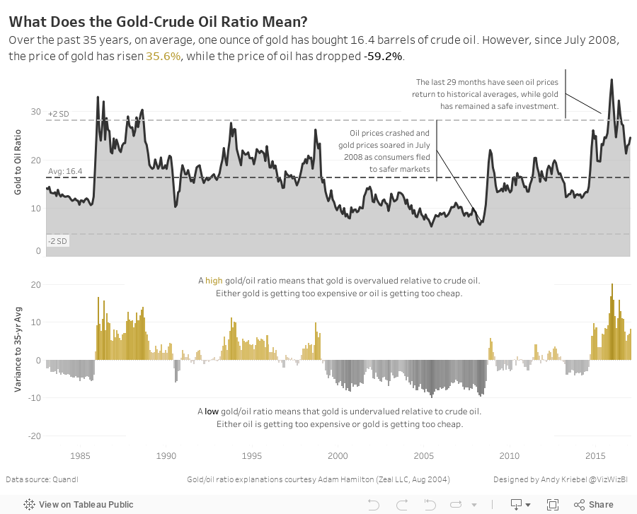
Makeover Monday: What Does the Gold-Crude Oil Ratio Mean?
area chart
,
comparison
,
economics
,
gold
,
index
,
inflation
,
Makeover Monday
,
oil
,
ratio
,
scatter plot
2 comments

An interesting sidebar: I went back to the original blog post, downloaded the workbook, then opened it to see how I had shaped the data. Turns out I build this in Tableau 4.1. How cool is that!?! Dashboards had just been added to Tableau. Ahh, the good old days! People starting to use Tableau now have no idea how good they have it.
Anyway, back to the makeover.
What works well?
- Minimal use of color
- Axes are clearly labeled
- Trend line adds context
- Scatterplot portrays the relationship well
What could be improved?
- The title doesn't tell me much at all.
- What does each dot mean?
- Is there more to the story?
- What does being above or below the trend line actually mean?
Keeping all of these questions in mind, I had an idea. Instead of looking at a scatterplot again, does it make sense to look at the gold price compared to the oil price as a ratio? That is, the price of one ounce of gold divided by the price of one barrel of crude oil. I wasn't really sure if this metric was valid. It made sense in my head, so I ran it by Eva who said it made sense to her too.
Ok great, but what does this ratio actually mean? I turned to Google and found a few great articles, one of which I refer to in my final visualisation. First, I looked at this article from The Telegraph, which included a chart of the gold-oil ratio. Phew! I'm not crazy after all.

Next, I read this article that explained in simple terms with examples, what the gold-oil ratio means. This was incredibly helpful in crafting the story of my viz. Referenced inside of the article was a very detailed research paper on the gold-oil ratio that provided a tremendous amount of context. This bit of research didn't take long and it really helped solidify the ideas that were in my head.
With all this in mind, here's my Makeover Monday week 15 about the gold-oil ratio.
April 5, 2017
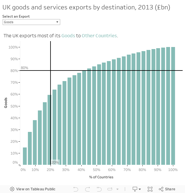
Workout Wednesday: Do UK exports fit the Pareto Principle?
The Pareto principle (also known as the 80/20 rule, the law of the vital few, or the principle of factor sparsity)[1] states that, for many events, roughly 80% of the effects come from 20% of the causes.For Workout Wednesday week 14, Emma decided to look at UK exports and see if they follow the Pareto principle. As an exporter, I imagine it would be really bad if 80% of your exports only went to 20% of countries. I'd think you'd want to spread your exports around the world. I'm not an economist, so I'm just guessing.
What's the answer? No, UK exports do not follow the Pareto principle.
Having done this type of chart countless times, it only took me about 1 minute. The trickiest part for me was getting the first ranked country into the sheet title. I accomplished this through a table calc since I already had country in the view and I knew I needed to compute by country for the calculation.

I used a LOOKUP table calc because it let's me find a specific value in the view no matter which mark I'm on. I then added the IF THEN because the US and Other needed to have special labels. Pretty straightforward.
UPDATE: I just took a peek at how Emma created the title calc and she used an LOD along with a LOOKUP. Overly complex I'd say, but it gets the job done and that's the beauty of Tableau. You can nearly always solve the same problem many ways.
Here's my Workout Wednesday creation:
Subscribe to:
Posts
(
Atom
)






