November 3, 2019
#MakeoverMonday: Is Las Vegas Convention Attendance a Recession Indicator?

 |
| SOURCE: Calculated Risk |
What works well?
- The time goes from oldest to latest.
- The colors are easy to distinguish.
- The axes are well labeled.
- Including the caveat for 2019 since it's not a complete year in the data.
- The axes aren't synchronized; I'd like to see how they would look synchronized.
- Without referring back to the color legend, I don't know which axis goes with which metric.
- Using a dual axis chart implies there's a correlation between the two measures. There might be, but it could be displayed other way to make that more evident.
- There no indicator of the data source.
Historically, declines in Las Vegas visitor traffic have been associated with economic weakness, so the slight declines over the last two years was concerning.
Super interesting! So this is where my worked started. I first annualized the data to make 2019 comparable to the rest of the years. From there, I created a connected scatterplot, which takes the two metrics in the original chart, plots one on the x-axis and the other on the y-axis, and connect the points by the year. This lead to a swirly look at the end, which made the relationship difficult to understand.
Instead, I chose to focus on the "red" line of the original, i.e., convention visitors. I wanted to see if convention visitors was indeed a recession indicator. The chart was simple to make, then some googling turned up the recession dates. Low and behold, convention visitors to Vegas sure do look like a leading indicator for a recession. If this is true, then we're on the verge of a recession very soon.
Click on the image for the interactive version.
September 29, 2017
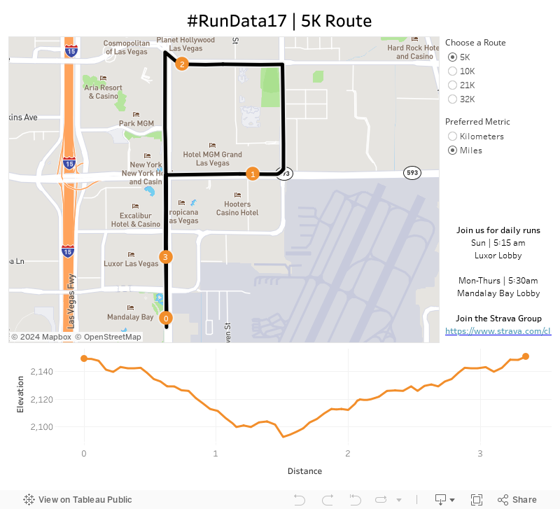
Announcing the #RunData17 routes

Given the conference is significantly larger this year, I bet we can double it! There are 5K, 10K and 21K options and all different paces. Want to go set a land speed record? Go for it! Want to walk? That's fine too! The point is to get out and start your day the right way...with a run!
The run start and end at the Mandalay Bay lobby. We'll start at 5:30am, so get there a few minutes early to sign a waiver and for a group photo.
To help you, I've created this dashboard so you know the routes. It's mobile friendly too!
I hope to see you in Vegas!
June 11, 2017
Viva Las Vegans! An Iron Viz Entry
This also gave me a chance to test the new web data connector from data.world. One of the data sets is a list of over 18,000 restaurants that serve vegetarian or vegan food in the US. I took this list, narrowed it down to Las Vegas, eliminated and closed restaurants and joined it to a Excel files that has the websites for each restaurant.
It's not anything too complicated nor flashy, but here's to hoping that practicality and usefulness is important to the judges as well. I've also designed it for mobile!
Enjoy!

October 14, 2015
Recommended Sessions for the Tableau Conference
My best advice:
- Choose at least 2 sessions per time slot (in case you don’t get in your first choice)
- If a session sucks, get up, walk out and go to another session. Don’t worry about hurting the speaker’s feelings. They’re the reason you’re leaving in the first place. After all, you paid to be there, so you need to get the most out of it.
- All sessions that are led by Tableau employees are recorded, so if there’s a conflict, that could help you decide which one to skip.
- Absolutely DO NOT MISS the IronViz! It’s far and away my favorite session.
- Get to sessions early so you can get a seat, then go out and get a drink and use the facilities.
- Drink lots of water. These will be long, exhausting days (and nights) and the last thing you need is to be dehydrated in the desert.
- Meet as many people as you can. Find the people you follow on Twitter and say hi to them. I love it when I meet new people.
Here are the sessions I plan to attend. Note, the #RunData15 events are early on Tues/Thurs and we’ll leave from the MGM lobby promptly at 5:15am.


October 28, 2011
TCC11 session feedback positive, except for the guy drinking the Pepsi
Wednesday I received the feedback from my session/presentation at the 4th Tableau Customer Conference. I had a blast presenting my case studies (The Holy Grail of Strategic Decision Making) and the interaction from the audience made it a wonderful experience. I presented three case studies:
- Collaborating for Value – An era of winning (this was an interactive analysis of retail prices by store by price point)
- Customer Segmentation – Planning for growth and identifying opportunities
- Penetration & Voids – Growing the business by finding the gaps
As has been my experience with presenting this same material both internally to our customer teams and externally to our buyers, the audience was able to gleam insights by “seeing” the data. It’s a pretty cool experience when the data and the tool tell the story without you having to say a word. Tableau makes it oh so easy.
What surprised me most about many of the customer presentations I attended was the lack of using Tableau live to show off their work. Maybe my material lends itself more to that type of interactivity, but I would highly encourage anyone presenting findings from Tableau to use the tool live; you’ll get immediate feedback and you’ll be able to answer questions on the fly.
So how’d I do? First up is a chart from Tableau that ranks all of the presentations, not only the customer presentations. I’m the circle that the red line points to. According to Tableau, this placed me in the top 3 of the customer presentations.

But how about the feedback on my presentation? The response was overwhelmingly positive. I always get anxious waiting for the feedback!

I asked someone that was drinking a Pepsi to leave, jokingly of course, but I wonder if he gave me the “poor” ranking. I tend to be a bit too directly and sarcastic and sometimes it’s taken the wrong way. Or maybe it was someone that didn’t win the t-shirt I gave away.
Anyway, thanks to all of you that attended my session. It was an awesome dialogue with the 75+ of you. Hopefully we’ll catch up again in Europe.
Gratefully,
Andy
October 15, 2011
Introducing the #TCC11 Excitometer
What’s an Excitometer? It’s a handy little column chart that measures your level of excitement for all Tableau Customer Conferences. It averages all of your results and provides you some feedback if you need a pat on the back or a kick on the tail.
Fill it out for yourself. Maybe the Excitometer has a message for you.






