July 31, 2023
#MakeoverMonday 2023 Week 30 - Drinking Fountains in Milan

You'll learn about:
- Joining spatial data sources
- Parameters
- Hexbin maps
- Custom shapes
- Using mapbox maps
- Dashboard layout containers
- Dynamic Zone Visibility
- Parameter Actions
- Custom colors
- Drill down / drill up actions
Enjoy the video and check out the viz below.
July 25, 2023
The Big Thaw: Exploring the Disappearing Antarctic Sea Ice

- Visualizations from chapter 12 of the Makeover Monday book that showed how to add context to visualizations
- Several of the vizzes from 2018 week 15, each with their own unique take on the data
- The original viz by The Guardian
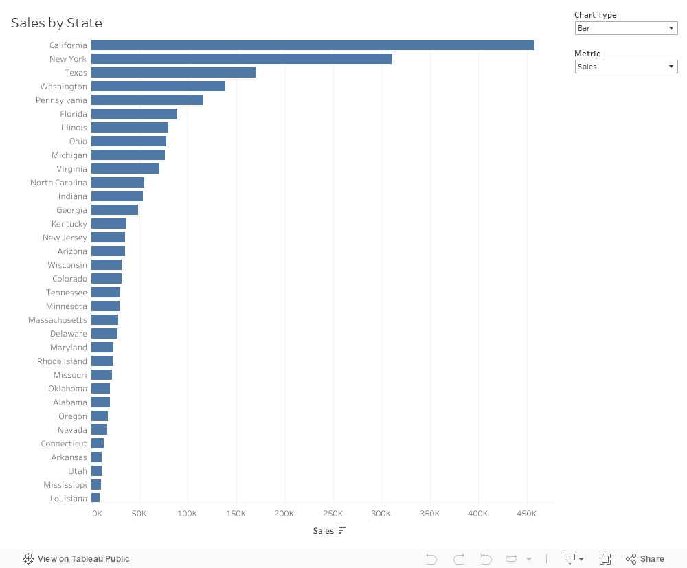
18 Ways to Create Bar Charts in Tableau

In this comprehensive Tableau tutorial, I will explore 18 different ways to create bar charts using Tableau. This video is inspired by Rosa Mariana de Leon-Escribano, my colleague at The Information Lab France.
In this tutorial, I will use various techniques to build bar charts that will help you visualize your data effectively. Whether you are a beginner or an advanced Tableau user, this video is designed to cater to all skill levels.
Throughout the video, I will guide you step-by-step, demonstrating each method so that you can follow along. I will help you understand when to use each type based on your data requirements.
By the end of this tutorial, you will have a solid foundation in creating bar charts in Tableau and be equipped with the knowledge to choose the appropriate bar chart type for your data analysis needs.
Rosa's bar chart catalog - Link | My bar chart catalog - Link
July 18, 2023
UNLIMITED Charts, Metrics, and Number Formats in Tableau with Dynamic Zone Visibility

July 11, 2023
Mastering Tableau: The Power of Context Filters

What are Context Filters?
A context filter in Tableau is a powerful feature that allows you to isolate a specific subset of data and create a temporary data subset
When you apply a context filter to your visualization, Tableau first applies the context filter and then performs calculations and aggregations based on the filtered subset of data.
How do they work?
By creating a context, you can optimize the performance of your visualizations by reducing the amount of data being processed.
When a context filter is applied, Tableau performs the following steps:
- Identifies the data that meets the context filter criteria.
- Performs calculations and aggregations based on the filtered data.
- Evaluates any other filters and calculations based on the context data subset.
A context filter allows you to control the order in which Tableau applies filters and calculations.
Tutorial
In this video, I'll explain:
- The difference between regular filters and context filters
- How context filters can significantly improve Tableau performance
I'll finish up by showing you a couple of the most common use cases for Context filters to drive the concept home.
Newsletter
Sign up for my newsletter. Every week I provide advice, tips, live stream videos, discounts on products I create, and much more.
Launch, grow, and unlock your career in data at andykriebel.com.
#MakeoverMonday 2023 Week 28 - Global Passport Rankings

- Grouped bar chart
- Bar in bar chart
- Grouped bar chart with a gantt bar for the difference
- Diverging bar chart
- Histogram
- Butterfly chart
- Barbell chart
- Scatter plot
- Slope graph
- Trellis chart
- Jittered bar chart
July 4, 2023
Create 10 ACTIONABLE & IMPACTFUL KPIs in Tableau

What is a KPI?
KPIs are measurable values that indicate how well a business is performing in achieving its key objectives and goals. They provide a clear and concise snapshot of critical areas within a business.
KPIs help to:
Monitor progress
Identify areas of improvement
Make data-driven decisions
In order to do this, KPIs must be tailored to specific goals and strategies.
Making KPIs Actionable
Here are 8 suggestions to ensure that KPIs are actionable and impactful.
Align with business objectives
Focus on relevance and simplicity
Set measurable targets
Collect accurate and timely data
Visualize your KPIs
Regularly review and update
Add context
Drill down
Actionable KPIs are vital for measuring performance and achieving results. You can drive your business forward by aligning data with goals and simplifying and visualizing KPIs effectively
Read more about KPIs in my newsletter here. Sign up so you don't miss any future newsletters at andykriebel.com.
⏬ DOWNLOAD the data, and starter and solution workbooks here. I would appreciate your support to continue making videos for you.
