July 24, 2025
How to Add Two Values to One Parameter in Tableau

May 25, 2024
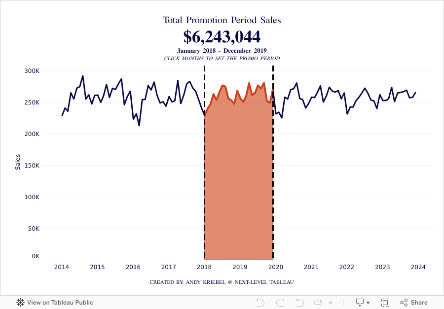
How to Calculate Year over Year Change in Tableau
April 30, 2024
How I Create a Unit Histogram in Tableau

A unit histogram is a chart that shows the distribution of data points across a series of bins of a measure.
Unlike a traditional histogram that uses bars, a unit histogram consists of a set of marks, each representing a member of a dimension.
In this example, our final result is a unit histogram showing the distribution of states by their average sales.
If you like this, you'll love Next-Level Tableau. You get over 175 hours of live training with me, 130+ on-demand videos, workshops, office hours, workbooks, data sets, lots of new videos each year, any new courses I create, and a great Community.
Get more info and sign up today at nextleveltableau.com.
April 13, 2024
25 Example to Help You Master Calculations in Tableau
March 6, 2024
What does Level of Detail mean in Tableau?

If you’re serious about learning Tableau, you must understand the level of detail of the view. Another way to think about it is the level of granularity.
This is essential for ensuring you know the aggregations that Tableau will perform as this will impact your analysis.
Here's a guide to help you:
March 5, 2024
11 Steps to Create KPIs & Sparklines in the Same Sheet in Tableau

Want to cut the number of sheets you need in your KPI dashboard in half? These 11 simple steps will get much closer.
Steal the calcs to speed up your work.
P.S. If you like tips like this, remember to follow me on LinkedIn so you're notified about everyting I post. Content curated just for you, 3 times daily.
February 26, 2024
How I Create a Beeswarm Chart in Tableau

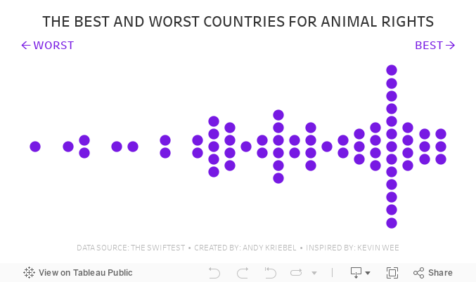
Beeswarm charts a one method of showing distributions in a data set. I show you how to create one in this #MakeoverMonday livestream.
Download the workbook | Download the data
October 17, 2023
Enhancing Tableau Drill-Downs: Use LODs in Hierarchies

Have you ever felt your drill-downs could be more insightful? Dive into this tutorial to see the magic of LOD expressions within hierarchies.
This will help us unlock deeper insights and makes data exploration even more insightful.
Whether you're well-versed in Tableau or just looking to level up your skills, there's something here for everyone.
Get the workbook - Link
August 29, 2023
How to Compare YTD, QTD, MTD, WTD & Daily Sales in Tableau

July 4, 2023
Create 10 ACTIONABLE & IMPACTFUL KPIs in Tableau

What is a KPI?
KPIs are measurable values that indicate how well a business is performing in achieving its key objectives and goals. They provide a clear and concise snapshot of critical areas within a business.
KPIs help to:
Monitor progress
Identify areas of improvement
Make data-driven decisions
In order to do this, KPIs must be tailored to specific goals and strategies.
Making KPIs Actionable
Here are 8 suggestions to ensure that KPIs are actionable and impactful.
Align with business objectives
Focus on relevance and simplicity
Set measurable targets
Collect accurate and timely data
Visualize your KPIs
Regularly review and update
Add context
Drill down
Actionable KPIs are vital for measuring performance and achieving results. You can drive your business forward by aligning data with goals and simplifying and visualizing KPIs effectively
Read more about KPIs in my newsletter here. Sign up so you don't miss any future newsletters at andykriebel.com.
⏬ DOWNLOAD the data, and starter and solution workbooks here. I would appreciate your support to continue making videos for you.
May 30, 2023
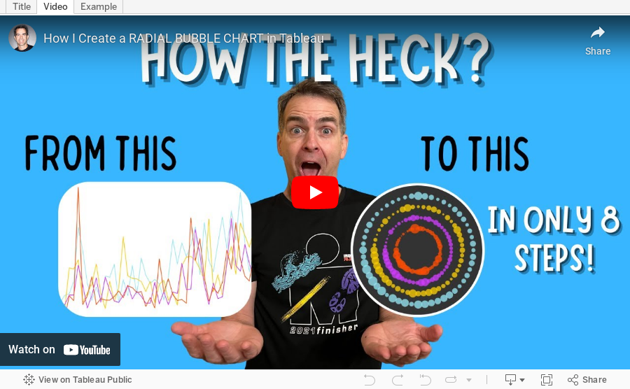
How to Create a Radial Bubble Chart in Tableau

March 16, 2023
How to Dynamically Resize Marks in Tableau

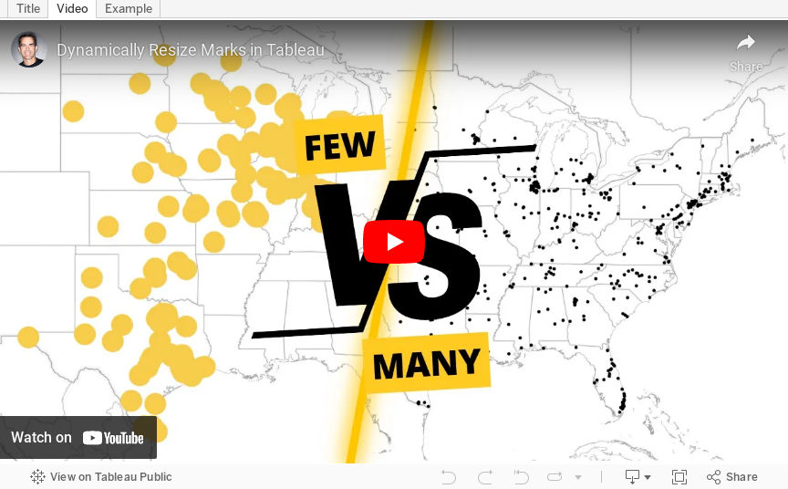
In this video, I show you how to resize marks (in this case circles) dependent on how many marks are in the view. For example, if all possible marks are in the view (100%), the circles should be small. If only 10% of possible marks are in the view, the circles should be large.
I show how to do this on a map, but it can be extended to scatter plots, box plots, dot plots, jittered bar chart, and more.
January 31, 2023
How to Calculate Day over Day Change Excluding Weekends

In a previous tip, I showed you how to calculate day over day change and build 3 KPI cards.
However, this does not cover the case when you need to ignore weekends. In this #Tableau tip, I show you how to calculate daily change excluding the weekends.
You can copy/paste the calculations from below the video. Enjoy and good luck!

Calculations
- Latest Day
{MAX([Order Date])} - Weekday for Latest Day
DATEPART('weekday',[1. Latest Day]) - Sales for Latest Day
INT([Order Date]=[1. Latest Day])*[Sales] - Previous Day
IF [2. Weekday for Latest Day]=2
THEN [1. Latest Day]-3
ELSE [1. Latest Day]-1
END - Sales for Previous Day
INT([Order Date]=[4. Previous Day])*[Sales] - DoD Change
SUM([3. Sales for Latest Day])-SUM([5. Sales for Previous Day]) - DoD Change %
[6. DoD Change]/SUM([5. Sales for Previous Day]) - Positive Change
[7. DoD Change %]>0
January 24, 2023
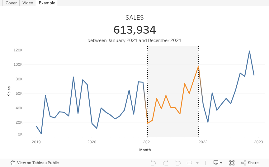
How to Select a Date Range with a Set Action

January 19, 2023
How to Calculate Day Over Day Change
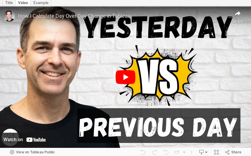
In this tip, I going to show you how to build 3 different KPI cards for measuring day over day change. In just a few steps, I’ll show you how to calculate:
- Sales for the most recent day
- Sales for the previous day
- Difference in sales between those two dates
- Percent difference in sales between those two dates
I'll then show you how to create these 3 different methods for displaying the KPIs so that you can create those that are most useful for your audience.

RESOURCES
- Data - https://data.world/vizwiz/sample-car-sales
- Month over Month Change - https://www.youtube.com/watch?v=ViD3vclgNv8
- Year over Year Change - https://www.youtube.com/watch?v=YuxYr4_l2ww
December 8, 2022
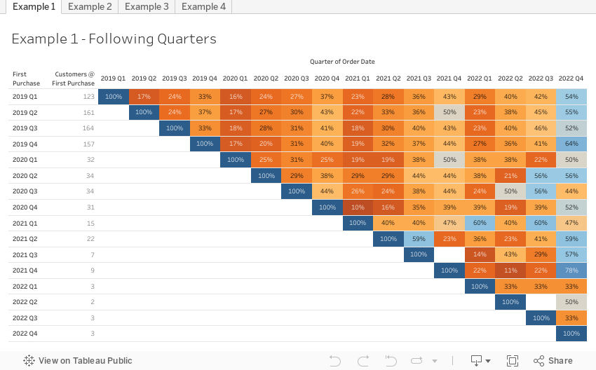
How to Conduct Customer Retention & Cohort Analysis

- First, down the view, the users are divided into cohorts based on when they first installed the app
- Then, across the view, the users are tracked for 10 days after the launch to see who continued to use it.
November 17, 2022
How to Create a 3 Level Scatterplot Drilldown
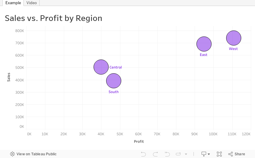
If you want to drilldown multiple levels in a scatterplot, this tip is for you. In this tip, I show you have to create a 3 level drilldown with a scatterplot.
Naturally after I showed how to create a 3 level bar chart drilldown, someone immediately asked how to do it with a scatterplot. Unlike the bar chart drilldown, the scatterplot will only show you marks for the current level.
For example:
- When I’m at the highest level, I see only regions.
- When I drill down one level, I only see States within the Region selected
- When I drill down one more level, I only see postal codes that are within the region and state I selected.
This example shows you how to drill down from Region to State to Postal Code. To use this for yourself:
- Download the workbook
- Copy all of the calculations into your workbook
- Swap out the dimensions
Note that you will need to recreate the sets and set actions. This will work with any combination of 3 dimensions.
October 24, 2022
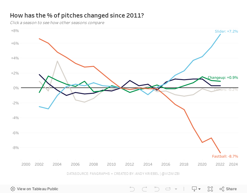
#MakeoverMonday Week 43 - How have Major League Baseball Pitch Types Changed?

This week's data set was pretty simple. We had 21 baseball seasons and a column for each pitch type. Pivoting the metrics made it much easier to work with for me as I could then split the view by pitch type.
During #WatchMeViz (below), I create a trellis view, showed how to create groups, sets, set actions, sparklines, LODs, custom number formatting, creating a mobile view, and more.
Thank you for tuning in. Here's the video and below is my visualization.
October 3, 2022
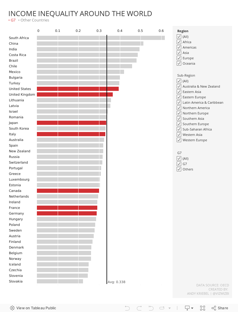
#MakeoverMonday 2022 Week 40 - Income Inequality Around the World