May 25, 2024
How to Calculate Year over Year Change in Tableau
November 4, 2022
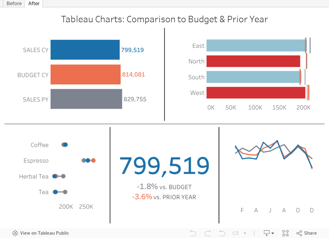
Tableau Charts: Comparison to Budget & Prior Year
Are you looking for ways to improve how you visualize comparisons between 2 to 3 performance measurements in Tableau?
In many performance monitoring dashboards, you need to make comparison of actual values to budget or target. In this video, I will show you effective ways of making these comparisons.
I will also show you how to compare your performance to prior year (PY) to see if performance is improving year over year.
One thing you'll notice in these examples is the consistent use of color. Make sure your metrics use the same colour throughout your dashboards, reports and worksheets. The colors should be easy to differentiate.
I have 4 designs that you can apply to make any comparison look better and easier to understand.
Download the workbook for a bonus 5th chart type that compares these three metrics over time.
September 20, 2022
Comparing Change Between Time Periods with a Scatterplot

April 19, 2022
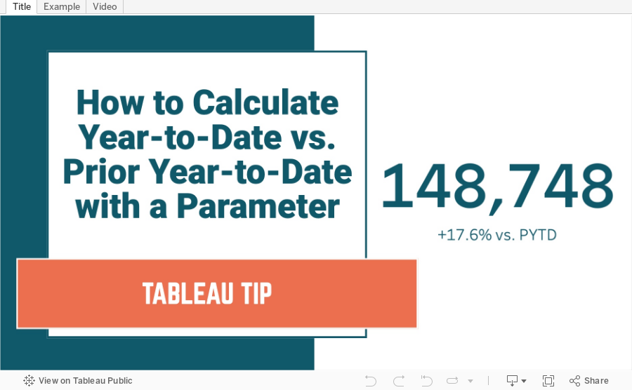
How to Calculate YTD vs. Prior YTD Based on a Selected Date
April 19, 2021
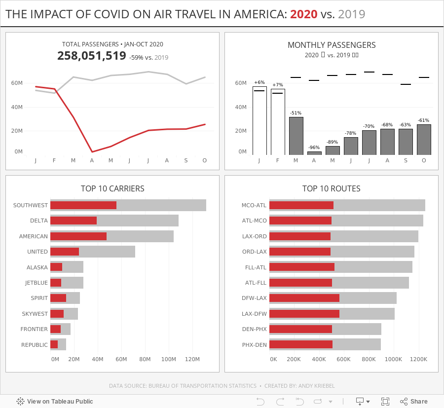
#MakeoverMonday Week 16 - The Impact of Covid on Air Travel in America
I struggled to come up with anything interesting this week, but that's ok. I was still able to explore the data a lot and ended up with a simple dashboard. Check out #WatchMeViz and interact with the viz below.

January 3, 2021
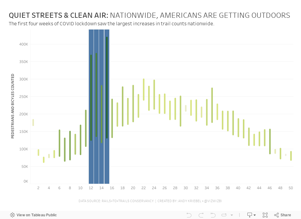
#MakeoverMonday Week 1: Quiet Streets & Clean Air - Americans Are Getting Outdoors

Back in March 2020 when COVID lockdown started in the UK, the streets were amazingly empty, the air got fresher and I saw more and more people outside. You could hear birds chirping on streets you never would have before. And we could ride our bikes right down the middle of the road since there were no cars. The lack of cars was glorious! (COVID isn't of course).
For 2021, #MakeoverMonday gets started with a simple graphic that compares pedestrian and bicycle counter stats for 2019 and 2020 at 31 counters across America. The data is collected by the Rails to Trails Conservancy, and you can learn more about the data here.
ORIGINAL VISUALIZATION

WHAT WORKS WELL?
- A line chart is a good choice for time series data.
- The colors are easy to distinguish.
- The grid lines help guide the eye across the view.
WHAT COULD BE IMPROVED?
- Include a more impactful or descriptive title. What is it about?
- Why are thee weeks missing on the x-axis yet the lines go the full year (or appear to)?
- The lines could be labeled directly so that you don't have to refer to the color legend to know which lines represents which year.
MY MAKEOVER
November 3, 2020
How to Create a Floating Bar Chart

Floating bar charts are similar to Gantt bar charts, except they don't use dates or duration for the length of the bar. In this video, I show you how to use floating bar charts for comparing metrics.
Example 1 - Comparing mental health syndromes between women and men
Example 2 - Comparing year over year sales
Data Sources:
- Mental Health Symptoms - https://data.world/makeovermonday/2020w27-comparing-common-mental-disorder-by-sex
- Superstore 2020.3 - https://data.world/vizwiz/superstore-20203

December 1, 2019
#MakeoverMonday: How have annual wages changed for union vs. non-union employees?

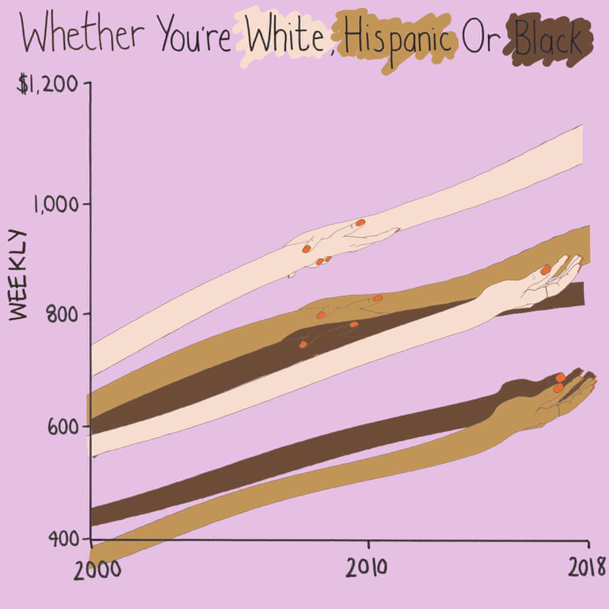
What works well?
- I like the handwriting font. It makes the viz look fun.
- The colors are distinct enough.
- Using shading on the title as a legend
What could be improved?
- Some hands are holding another, some are not. What does that mean? Does two hands mean union? If so, I don't understand why they join where they do.
- Using weekly wages is a tough concept to grasp. Why not convert it to annual wages?
- The viz is clearly not designed for any sort of precision or comparison.
What I did
- I really liked this Viz of the Day recently by Spencer Bauke and thought this was a good data set to try to emulate his work.
- I wanted to use parameter actions to allow the user to change the comparison year.
- I also wanted to use set actions like Spencer did, but this data wasn't structured in a way that made sense to try to do that.
- This turned out to be very good practice for LOD expressions.
- I loved using containers to lay all of this out!! It's a lot of work, but much easier to get everything to line up and all be the same size.
November 28, 2018
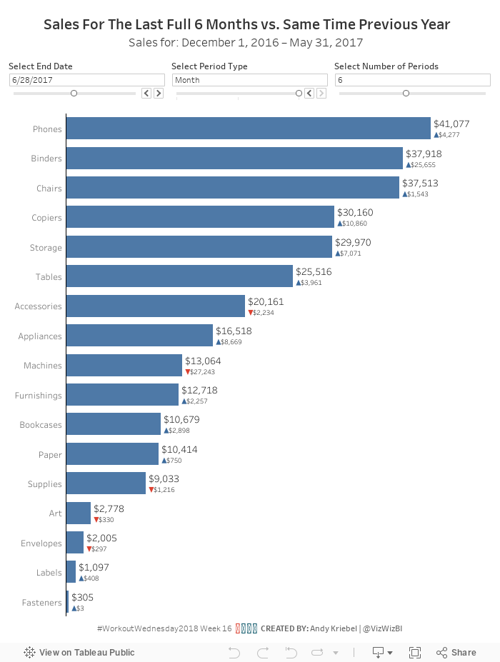
Workout Wednesday: Sales for the Last N Periods vs. Prior Year
This use case is super useful in a business context. I like Workout Wednesday challenges that you can employ later. The most important requirements:
- Use a date parameter to select a select end date, limit it to all days in 2017.
- Use a parameter to select the period type (day, week, or month).
- Use a parameter to select the number of periods to go back (limit from 1 to 12).
- Create a bar chart that show the total sales for the last complete period.
- Add sales for the same period as a label on the end of the bars.
- Compare the selected period to sales over the same period from the prior year.
- Add a blue arrow up if sales are up compared to prior year.
- Add a red arrow down if sales are down compared to prior year.
- Show the difference in sales over these time periods. Make sure to show no negative signs. The arrows will indicate the change.

June 21, 2016
Tableau Tip Tuesday: Using LOD Calcs for Year over Year Comparisons

For this week’s Tableau Tip Tuesday I show you how to use Level of Detail expressions to get the latest year and prior year and then compare then to create visual alerts.
January 18, 2016
Makeover Monday: Are Consumers Bored With Technology?


This chart is so bad, it's tough to know where to start. Let's start with what works well:
- There's a clear title and subtitle that tell us what the chart is about.
- While I don't use icons often, their use of icons for each type of technology might aid some people in understanding, though I suspect they add them more for decoration.
- There's a clear order to the donuts, from highest to lowest based on the 2016 purchase rate.
- The font is consistent throughout the graph.
- They fit a lot of information in a small space.
Let's now consider what could be improved:
- The use of donut charts makes comparing the technologies more difficult than necessary.
- They used sized bubbles for negatives and positives. Really bad idea because this might make people think -1% is the same as +1%.
- Using bubbles to represent 2015 makes comparing 2015 values really difficult as you have to do the math in your head. Quick, which technology ranks third for 2015?
- It's harder than necessary to compare 2015 to 2016 for each technology.
- The red/green bubbles will be challenging for the red/green colour-blind folks.
With these problems in consideration, I've created this alternative version. This took only about 15 minutes to create and 15 minutes to tidy up and organize. Click on the image to view the interactive version and to download the workbook.

November 30, 2015
Makeover Monday: The Budget of A 25-Year-Old

Several months ago, I read this interesting article about a 25-yr old that was tracking his expenses and how he was choosing to budget his money. The author of the article chose to show the breakdown of the budget as two separate pie charts. This wasn't a surprising choice as it's the first way we learn to show parts to whole in school. The problem of choosing a pie is compounded by including a second pie for the next year, to which you are expected to make comparisons.
So, in this week's Makeover Monday, I walk through a better way to show this data. Enjoy!

August 3, 2015
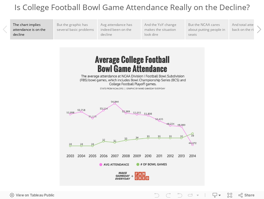
Makeover Monday: Is the Average College Football Bowl Game Attendance Really on the Decline?

February 24, 2015
Makeover Monday: From Sunburst to Story - The State of American Well-Being

The story the designer is trying to tell is really quite simple. The longer the bar, the higher the ranking. The problem, though, is that they are order alphabetically which makes ordering them by rank basically impossible.
I was able to locate the source of the data on the State of American Well-Being website. From there, I had to download the reports for 2013 and 2014 and then I consolidated them into Excel, which you can download here.
At first, I was thinking a simple bar chart would work, but that turned out really boring because the only data to display is the ranking, not the value that makes up the ranking. I decided instead to create this story in Tableau.
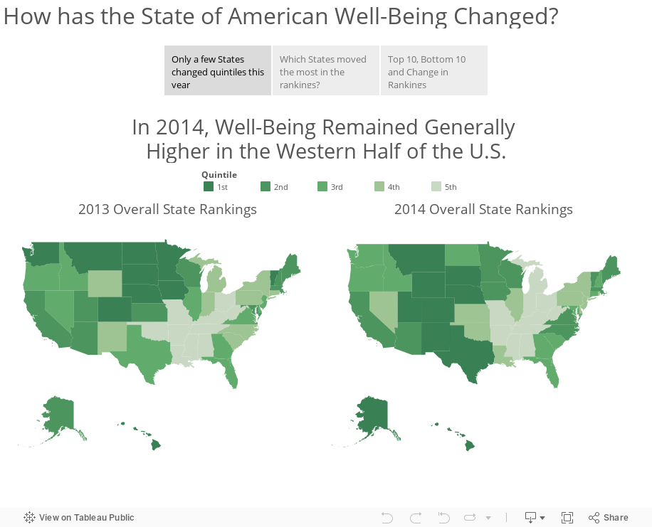
Download the workbook used to create this story here (requires Tableau 9).
April 9, 2014
Tableau Tip: Analyzing Year over Year Trends with Table Calcs
I received some feedback from both Jonathan Drummey and Joe Mako about this blog post and some of its inaccuracies. There are a couple of key notes:
- My intent was to show how you can compare the 7-day averages of two time periods. In this example, I’m calling this a Year over Year calculation, but really it’s a comparison versus 365 days ago. Small, but important distinction.
- The Superstore Sales data set has days that are missing, so unless you turn on domain padding, you won’t be comparing the prior 365 days that you’re expecting to compare. I’ve updated the post below.
- Like most things in Tableau, there are many ways to solve the same problem. Joe pointed out some things he would have done differently with the calculations. While neither of us is wrong, note that you should always look for ways to be more efficient.
April is #TableauTipsMonth, so I thought I would pick something from my backlog and get to it. Today I’ll be writing about a fairly typical scenario:
- Your data is cyclical through the week
- Daily numbers vary wildly, so smoothing is necessary
- You need to compare to the same period from the prior year

This data set looks like it might be cyclical, so let’s apply a 7-day average calculation to it. We could do this via the quick table calculations on the pill, but we will want this calculation for later. Right-click on Sales in the Measures pane and choose Create Calculated field. Build this calculation:

Here’s what the chart looks like if I filter Order Date to 2013 on the Filter shelf (I’ve focused in on January):

Since I have filtered the year of Order Date to 2013 by dragging the Order Date pill onto the Filters shelf, Tableau first ran a query that returns only results for 2013 and then it will do the 7-day average calculation. We don’t want that because the first six days of 2013 will be wrong. They are wrong because they don’t contain a full 7-day date range.
To fix this, we need to change the calculation. Notice that I’m not passing a filter to Order Date inside the calculation. By passing the filter in the table calc, Tableau will return all of the data for all years, then the table calc will running after the database query, which will then provide the full date range for the 7-day average to calculate correctly.

And this is what the chart looks like if filter the data via the table calculation (of course you have to remove Order Date from the Filters shelf):

Quite a different story. The lesson here is that you need to understand how Tableau is filtering the data. Anything on the Filters shelf will filter the data before any table calcs are performed.
One thing to note, though, is that this data set does not include all dates. Therefore, we need to turn domain padding on by right clicking on the Order Date pill and checking the “Show Missing Values” option. Notice how there are now gaps in the line; that’s because Tableau is filling in the missing dates for us.

So that covers our 7-day average. To calculate the 7-day average for the same 7-day period 365 days ago, we only have to make a simple adjustment to the 7-day average calculation we’ve already created.

The only change is the start and end period inside the WINDOW_AVG function. Now drag the new measure onto the same axis as the 7-day average.

So now we can see how the 7-day average on an day compared to the 7-day average 365 days ago. Perfect!
Now that we have these two table calcs, we can easily compute the change between the two dates periods with another calculated field:

Drag this new measure onto the Rows shelf. Clean it up a bit, and we now have a nice view that answers a simple question: How are sales performing compared to last year?

Notice that I used an orange-blue color palette for the comparisons to the prior 365 day values. This is a good practice to employ because the colors corresponding with the colors for each line. If the bar is orange, then last year performed better and vice versa.
Download the workbook used in this example here.
April 29, 2013
Artic Sea Ice Volume: A Radar Graph vs. Line Graphs
UPDATE (May 2, 2013): I have removed 2013 from all charts.
I posted an article on my Facebook page the other day asking if this radar graphs about artic sea ice volume works. The comments were mixed.

I think this radar graph is merely ok. Radar graphs, in general, are hard to read because relationships and trends are not easily discerned. Some of the issues I see with this graph include:
- It’s difficult to see the entire pattern over time. I see the pattern is spiraling in, but does it change year by year. Ask yourself this: How does 1999 compare with 2004? It takes a lot of work.
- It’s very hard to follow the ice volume labels around the chart. I bet you found this as well in the example above.
- The author only included September. Why? The data is available by day. Get the data here.
- Are there any seasonal patterns? You can’t answer this question.
I created a couple of different views for your consideration in Tableau. You can download the workbook here.

In my version, I’ve addressed all of the problems I mentioned above.
- In the upper left graph, you can easily see that the artic sea ice volume is trending down.
- The upper right chart allows you to see two things:
- The seasonal patterns
- Comparisons by year: The comparisons across years can be see because the years get darker as the data gets closer to 2013. You can see the lines get darker as you look down the graph.
- The Daily Volume graph makes the cyclical patterns much, much clearer.
How would you visualize this data? Do you agree that these line graphs work better than the radar graph?
January 16, 2013
The one chart that shows how the sale of Robin van Persie impacted the fortunes two clubs
We were pumped for the game, only to be let down nine minutes into a game by a stupid foul and the subsequent sending off of Laurent Koscielny. Why wasn’t the BFG Per Mertsacker playing in the first place? That’s another rant for another time.
Several Gooners at Maggie’s were talking about Arsenal’s lack of ability to dominate the final third of the pitch, which got me daydreaming back to the days of Robin van Persie. Arsene Wenger sold RVP to Manchester United over the summer, literally telling Sir Alex Ferguson that he was handing him the title. Of course, RVP has continued scoring like the 3rd best striker in the World. I think our manager has lost the plot.
I pulled some data down from the Barclay’s Premier League website to see how teams were performing through 21 fixtures this year compared to last. I created this:

- The order of the clubs
- The specific number of points accumulated by each team in each year
- The slope reveals the change over time and each club’s rate of change compares easily to other teams
- There’s almost zero non-data ink. I say almost because I used red to highlight Arsenal.
- Manchester United have opened on the rest of the league this year and that they were in 2nd place last year.
- The gap between Man U and Arsenal is HUGE this season, which is surely directly correlated the RVP’s transfer.
- Everton and West Brom have had much stronger starts to the season. Don’t be shocked if Everton snatches the last Champions League spot. It sure doesn’t look like Arsenal has the heart to do it.
- Newcastle sucks this year!
- Most importantly, we’re only 5 points behind Spurs, whereas we were 10 points behind at this point last year. If we’re not going to make the Champions League, we could take a bit on consolation in finishing ahead of Spurs.


