Showing posts with label BLS. Show all posts
December 1, 2019
#MakeoverMonday: How have annual wages changed for union vs. non-union employees?
BLS
,
comparison
,
KPI
,
labor
,
level of detail
,
LOD
,
LOD calc
,
Makeover Monday
,
money
,
non-union
,
salary
,
statistics
,
union
,
United States
,
USA
,
wages
,
year over year
No comments

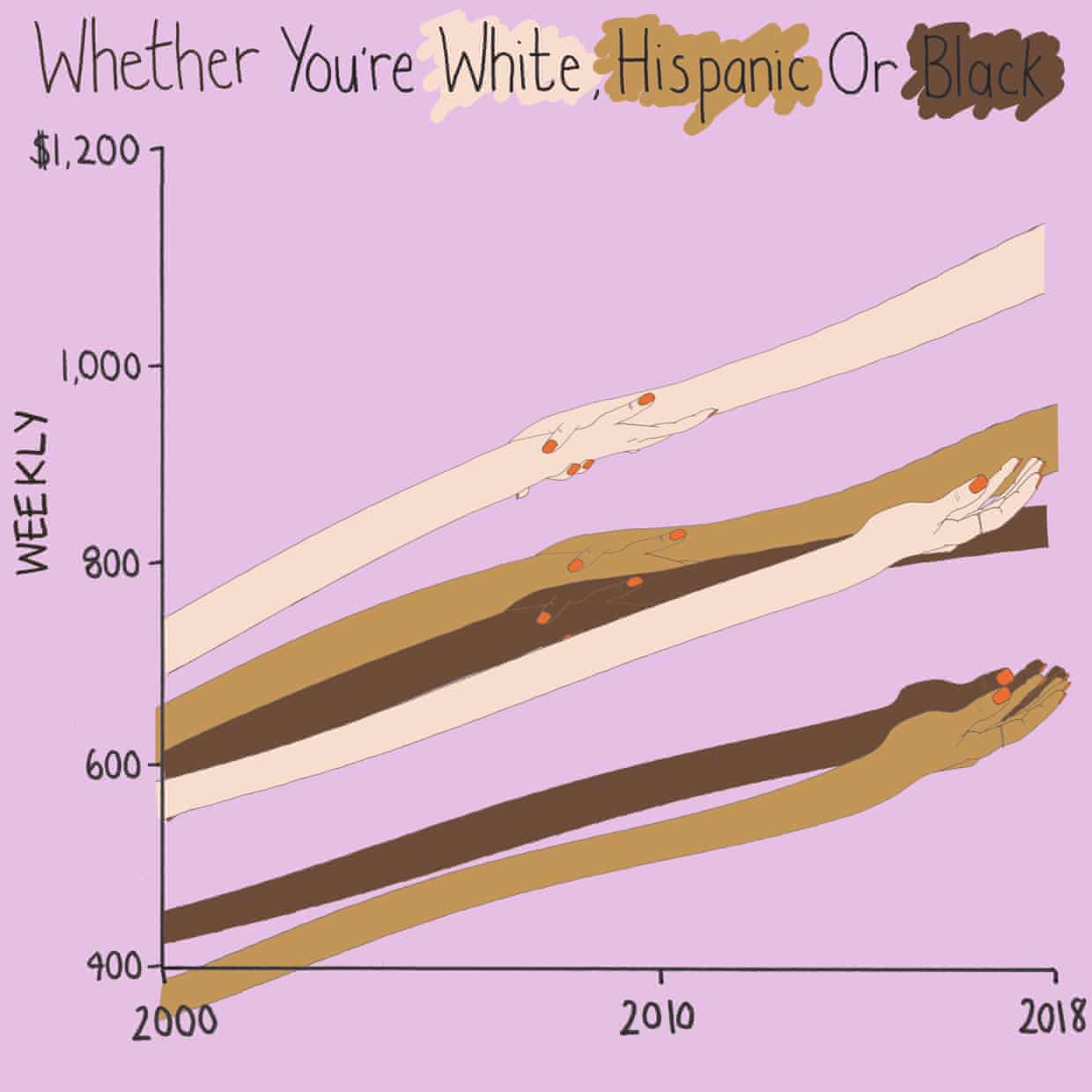
What works well?
- I like the handwriting font. It makes the viz look fun.
- The colors are distinct enough.
- Using shading on the title as a legend
What could be improved?
- Some hands are holding another, some are not. What does that mean? Does two hands mean union? If so, I don't understand why they join where they do.
- Using weekly wages is a tough concept to grasp. Why not convert it to annual wages?
- The viz is clearly not designed for any sort of precision or comparison.
What I did
- I really liked this Viz of the Day recently by Spencer Bauke and thought this was a good data set to try to emulate his work.
- I wanted to use parameter actions to allow the user to change the comparison year.
- I also wanted to use set actions like Spencer did, but this data wasn't structured in a way that made sense to try to do that.
- This turned out to be very good practice for LOD expressions.
- I loved using containers to lay all of this out!! It's a lot of work, but much easier to get everything to line up and all be the same size.
Here's my Makeover Monday week 49. Click on the image for the interactive version.
April 29, 2011
How to tell a completely opposite story with a dual-axis chart (This might make you sick!)
BLS
,
chart junk
,
Chart of the Day
,
dual axis
,
line chart
,
mislead
,
stats
,
unemployment
1 comment
Look at the chart below from Chart of the Day. One question, 5 seconds. How much has the variance changed between the two lines from 2001 and 2011?

I’m going to guess you came up with:
- 2001 – The red line is about 1% lower than the blue line
- 2011 - The red line is about 10% lower than the blue line
- Therefore, the total change is 9%
If that's what you guessed, you’re wrong, completely wrong! Why?
- The axes are not synchronized
- The axis on the left is for the blue line, whereas the axis on the right is for the red line
- How can I be sure? There are gray headers at the top of each axis.
This is incredibly confusing and incredibly misleading!
What’s the real answer?
- 2001 – The red line is at 88%, while the blue line is at 79%. The red line is 9% higher than the blue line, not 1% lower like I thought
- 2011 - The red line and blue line are both at about 114%, not the 10% variance I supposed
- Therefore, the total change is actually 0%, not 9%
This is one of the worst and most misleading dual-axis charts I’ve ever seen. At a glance it looked like blue was slightly ahead of red then the gap got really wide in blue’s favor. However, it’s the complete opposite.
Scary, scary, scary!
Subscribe to:
Posts
(
Atom
)






