December 28, 2015
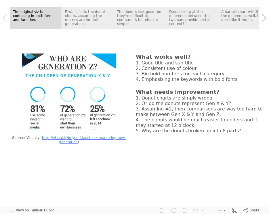
#MakeoverMonday: Who Are Generation Z?


To makeover these charts, I've used Tableau's story points to:
- Discuss what works and what doesn't work
- Take you through my thought process
- Show you alternative visualisations
- Pick a final makeover
How would you do it differently? Download the Tableau workbook and have a crack at it yourself. Leave a comment with a link to your version. Enjoy!
October 12, 2012
Stacked area chart vs. Line chart – The great debate
Let’s start with how area charts and line charts are typically used:
Area chart - Area charts are used to represent cumulated totals using numbers or percentages (stacked area charts in this case) over time.
Line chart - A line chart is often used to visualize a trend in data over intervals of time – a time series – thus the line is often drawn chronologically.
* Source: Wikipedia
After reading these, one might suggest that an area chart provides the best of both worlds. Consider this area chart:

First impressions are often something like: “This is perfect! It shows me both the trends and the contribution.” However, it doesn’t show the trends as well as one might suspect. Why?
- Our eyes tend to focus on the tops of each line, leading to misinterpreting the patterns.
- It’s nearly impossible for us to translate the width of each color (i.e., the actual value) into an accurate trend. This is because the pattern of each color is influenced by the colors below it.
The only values that can be effectively interpreted are the West (gray area) and the total (top of the blue line).
Try this exercise.
Looking at the East and without scrolling down in this blog post, take one minute (using a timer) and try to draw the trend for the East only. In other words, if the chart was only the East, what would the pattern look like? Give it a shot, it’ll prove a point.
Here’s what the East looks like:

If you were able to draw this accurately in under a minute, then you’re likely some incredible genius, and good for you.
In every data visualization class I teach I use this exercise. I have yet to see anyone get close.
So that brings us to another question. What’s the best way to display the pattern for each region AND show the total. I recommend this:

Now you get the best of both worlds:
- You can see the trends for each region.
- You can see the total.
I accomplished this in Tableau with one table calc - TOTAL(SUM([Sales])) – and created a dual-axis chart by placing Total Sales on the secondary axis and synchronizing them. Download the Tableau workbook here.
I can’t recommend enough the exercise I outlined above. Sometimes asking the person you’re working with to draw the second area will prove your point for you.
Hopefully this will give you some ammunition next time you need to argue against stacked area charts.
P.S. If you’re curious to see the two charts together, here you go. Very different stories, wouldn’t you say?

April 29, 2011
How to tell a completely opposite story with a dual-axis chart (This might make you sick!)
Look at the chart below from Chart of the Day. One question, 5 seconds. How much has the variance changed between the two lines from 2001 and 2011?

I’m going to guess you came up with:
- 2001 – The red line is about 1% lower than the blue line
- 2011 - The red line is about 10% lower than the blue line
- Therefore, the total change is 9%
If that's what you guessed, you’re wrong, completely wrong! Why?
- The axes are not synchronized
- The axis on the left is for the blue line, whereas the axis on the right is for the red line
- How can I be sure? There are gray headers at the top of each axis.
This is incredibly confusing and incredibly misleading!
What’s the real answer?
- 2001 – The red line is at 88%, while the blue line is at 79%. The red line is 9% higher than the blue line, not 1% lower like I thought
- 2011 - The red line and blue line are both at about 114%, not the 10% variance I supposed
- Therefore, the total change is actually 0%, not 9%
This is one of the worst and most misleading dual-axis charts I’ve ever seen. At a glance it looked like blue was slightly ahead of red then the gap got really wide in blue’s favor. However, it’s the complete opposite.
Scary, scary, scary!
April 15, 2011
To mislead or not to mislead, that is the question
Have you ever received a chart similar to this? I did and was flabbergasted. What disturbed me most was that it was intentionally misleading. The other people who saw the chart didn’t notice the major problem that the dual-axes are not synchronized (and a dual-axis chart is unnecessary in this case anyway).

I quickly corrected the chart and shared how it should look. They were stunned at the the different stories these charts tell at first glance.

Bottom line: be skeptical when someone sends you a chart and quickly correct the situation if needed. Take Mar-11 as an example:
- In the first chart it looks like Group E is only 2% better than Group Y
- In the second chart you can clearly see the gap is much, much bigger
Now take a quick look at Dec-10 (don’t cheat and look at the data). In the 1st chart you’d think Group Y is killing Group E, when in fact Group E is outperforming Group Y.
It’s a scary world out there when people try to intentionally mislead you in an effort to support their personal agenda. A friend of mine likes to say “Facts are friendly”. Presenting facts needs to be friendly as well.


