November 28, 2018
Workout Wednesday: Sales for the Last N Periods vs. Prior Year
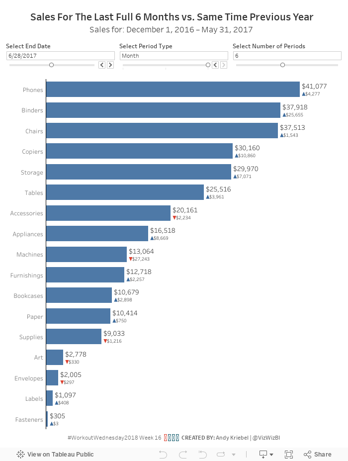
I'm going back to Workout Wednesday week 16. Why? Because I really struggled with it. I was so close for so long, but couldn't quite get my date calculations correct. After writing them down on paper and building tables in Tableau to verify I had them correct, the rest was pretty straightforward.This use case is super useful in a business context. I like Workout Wednesday challenges that you can employ later. The most important requirements:
- Use a date parameter to select a select end date, limit it to all days in 2017.
- Use a parameter to select the period type (day, week, or month).
- Use a parameter to select the number of periods to go back (limit from 1 to 12).
- Create a bar chart that show the total sales for the last complete period.
- Add sales for the same period as a label on the end of the bars.
- Compare the selected period to sales over the same period from the prior year.
- Add a blue arrow up if sales are up compared to prior year.
- Add a red arrow down if sales are down compared to prior year.
- Show the difference in sales over these time periods. Make sure to show no negative signs. The arrows will indicate the change.

November 26, 2018
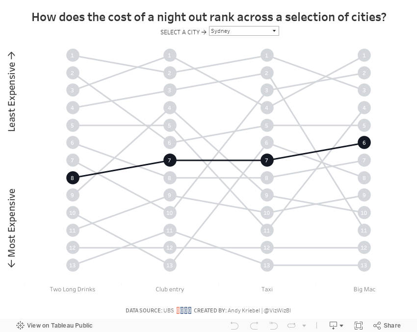
Makeover Monday: The Cost of a Night Out
bump chart
,
cost
,
food
,
Makeover Monday
,
rank
,
stacked bar chart
,
statista
No comments


What works well?
- Choosing a topic that is relatable
- Good title and subtitle
- Sorting the bars from most expensive to least expensive
- Using colors that are easy to distinguish
- Including the labels on the ends to the bars
What could be improved?
- Lose the icons on the lower right
- Remove the gridlines and axis labels (they're not necessary if the ends of the bars are labeled)
- Remove the flags next to each city; First they add no value. Second, the data is about cities not countries.
- The title is a bit misleading; this is only a selection of cities.
- Using a stacked bar chart makes comparisons across the items difficult; maybe if this was interactive and you could choose the item to sort by, it would work better.
What I did
- I wanted to make the comparisons easier, so I chose to create a bump chart.
- I added a highlight selector so the user can focus on a single city, yet keep the others in the view for context.
- I sorted the values from least expensing (top) to most expensive (bottom).
With that, here's my Makeover Monday week 48.
November 20, 2018
Fanalytics: Why I created the FT Visual Vocabulary in Tableau

On the last day of TC18, I had the honor of presenting at Fanalytics, the post-TC wrap up about the Tableau Public Community. The team asked me to present about the FT Visual Vocabulary that I built in Tableau, my motivations for doing so, and my thoughts about learning in general. For those that missed it, here are my slides and the presentation. Enjoy!
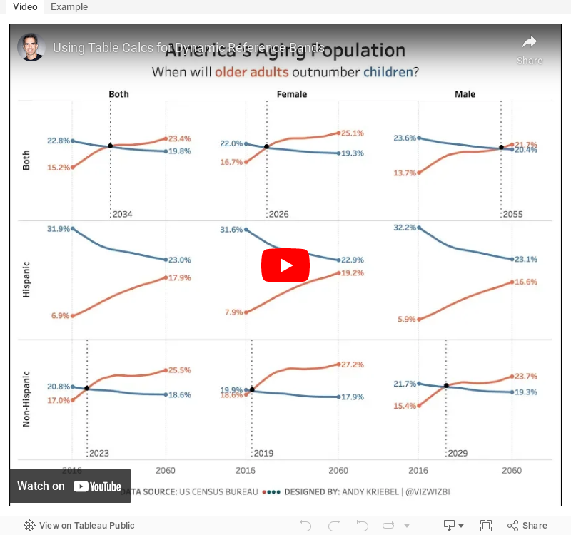
Tableau Tip Tuesday: Using Table Calcs for Dynamic Reference Bands
buffer
,
offset
,
padding
,
parameter
,
reference band
,
reference line
,
table calc
,
Tableau Tip Tuesday
,
Workout Wednesday
No comments
For #WorkoutWednesday2018 week 46, I required people to use table calculations to:- Show the percentage of the total population for each age group for each year
- Show labels on the outside ends of the lines
- Plus some other requirements
This challenged was based on my #MakeoverMonday week 45.
In this video, I show you how to create the calculations for items 1 and 2 above. The calculations are quite simple once you know how to do them. The padding table calc is particularly useful when you will have data that updates and you can't fix the axis.
Apologies in advance for the audio cutting out every now and then.

November 19, 2018
Makeover Monday: Where do you have to work the most hours per month to afford a home?
3D
,
bar chart
,
howmuch.net
,
Makeover Monday
,
map
No comments


What works well?
- Including the data sources
- Labeling each mark, otherwise we'd have no idea what each thing means
What could be improved?
- The title is wrong; it should say hours per month.
- 3-D bars are never a good idea putting them on a map is even worse.
- The color legend doesn't help interpret the chart at all.
- It's overly difficult to find a city; the labels aren't even near most of the cities.
- The whole thing is terrible. Start over!
What I did
- I took the map and turned it into a ranked bar chart.
- I put the bars in descending order by the number of hours per month needed to work to pay afford a home.
- I split the bars into four columns so that they would all fit in one view. I learned this from Workout Wednesday Week 47 2017.
- I added a highlighter on the bottom right (intentionally out of the way) so that you can find a city in the rankings.
- I ignored all of the other metrics.
With that, here's my Makeover Monday for week 47 2018.
November 12, 2018
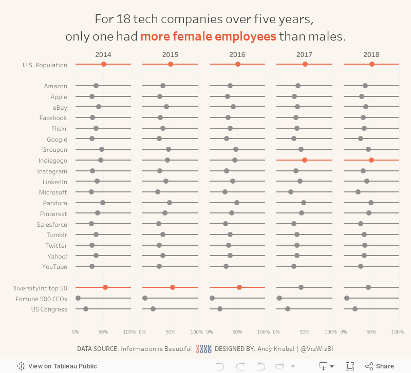
Makeover Monday: The Lack of Diversity in Tech Companies
diversity
,
dot plot
,
equality
,
gender
,
inequality
,
Makeover Monday
,
silicon valley
,
tech
No comments

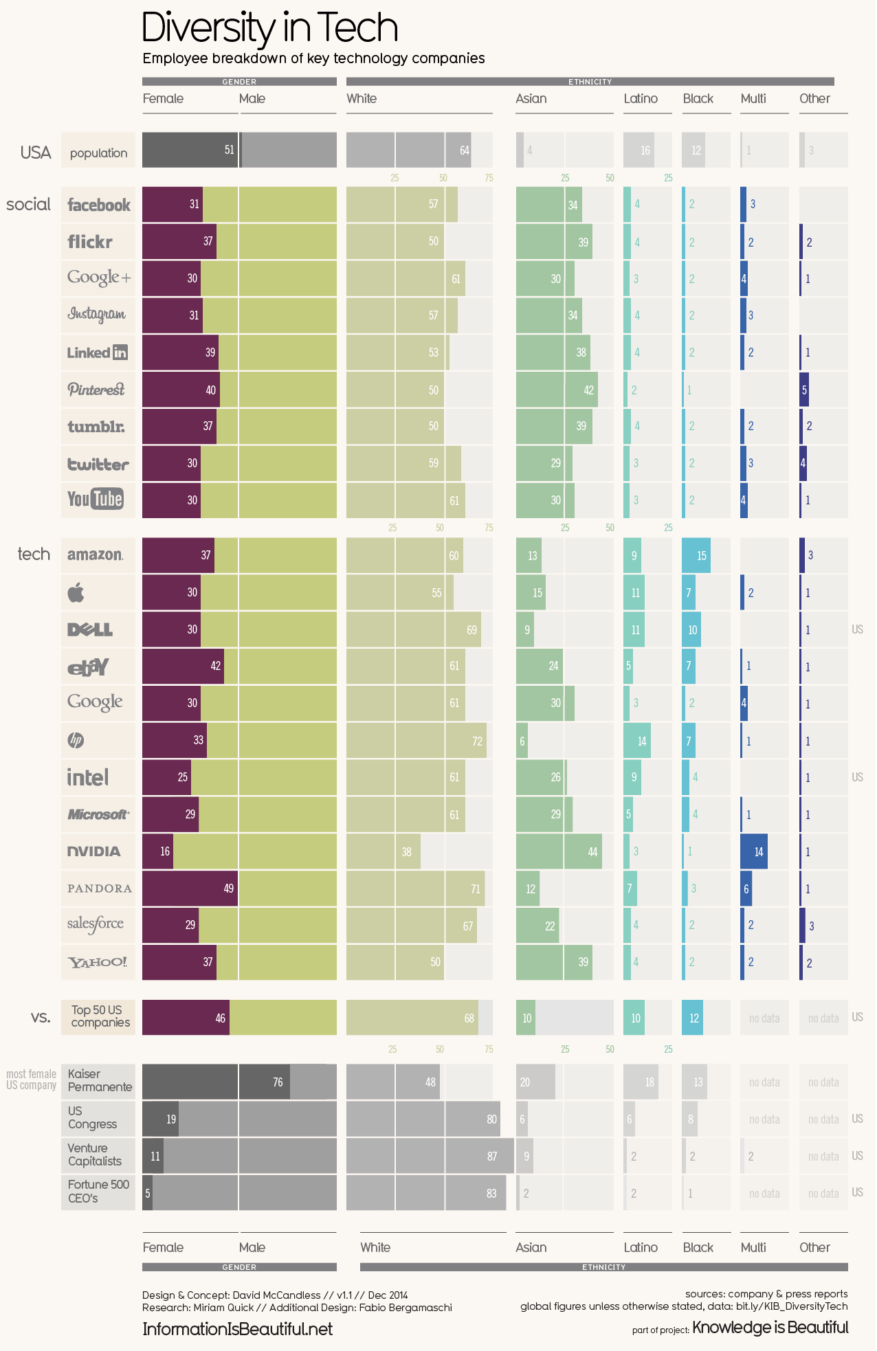
What works well?
- Vertical groupings work well for comparisons
- Using more pronounced colors for the companies and greying out the comparators
- Nice filtering options
- Title and subtitle are simple and tell us what the viz is about
- Good labeling
- Including a white divider line at 50%
- Including sort options
What could be improved?
- Including the gender breakdown as well as the ethnicity breakdown in the same chart makes it feel too cluttered.
- As the years are set as filters, it's overly difficult to see if companies are becoming more or less diverse over time.
- Are the logos necessary?
What I did
- Focused on the gender diversity
- Chose a simple dot plot to make the viz less cluttered
- Included a more impactful title
- Kept their background color, but used a different color for highlighting
November 10, 2018
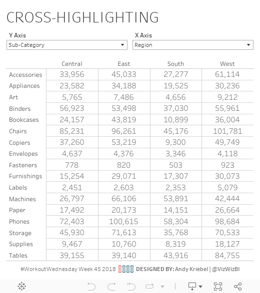
Workout Wednesday: Cross-Highlighting
Week 45 continued the post-2018.3 set actions theme. This week, Rody gave us a fairly simple, yet extremely useful challenge. We had to create a simple table that highlighting the rows and columns for the selected cell that you hover over.The highlighter is very fickle. It seems you have to hover over a very specific spot to get it to work. I was able to make it work by using a boolean calculation, but the highlight set action was going crazy. So I went with Rody's technique of making it a continuous field so that it would actually stick.

November 4, 2018
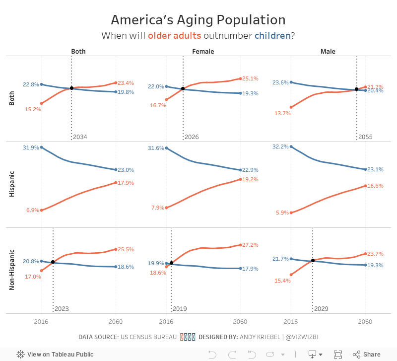
Makeover Monday: America's Aging Population
age
,
census
,
gender
,
hispanic
,
labels
,
line chart
,
Makeover Monday
,
non-hispanic
,
origin
,
population
,
race
,
reference line
,
table calc
,
United States
,
USA
No comments
The original visualization is from the US Census Bureau:

What works well?
- The title above the charts tells us the insights in the data. This is a very effective technique.
- The colors work well together.
- Labels for the ages are well-placed and colored to represent the lines
- Labeling the start and end of the lines
- Hiding the axis but still leaving the axis title
- Including the note about the 2016 data
What could be improved?
- Remove the title at the very top, the entire blue section
- Make the footer less prominent; it's competing with the viz for attention when it should be secondary
- Kill the bar chart; it looks strange have axis labels for every five years, but then only showing the data for a set of years
- Remove the dots on the lines except for the start, end and where the lines cross
- Remove the vignette shading behind the charts
What I did
- I like the idea behind the line chart, so I used that as my starting point.
- I pivoted the data by age, then created age groups that match the original (under 18 and 65+).
- I wanted to compare ages and origins for the two age groups to see if the crossing of the populations is consistent (spoiler, it's not).
- I wanted to add focus to the year the lines cross. I did that by adding a black dot on that year and by including a reference line.
- I kept the labeling of the start and end of each line.
Overall, I find the patterns in the data really interesting.
- While the population in total gradually shifts towards the older generation, the split between hispanic and non-hispanic does not follow the same pattern.
- Older hispanics will likely outnumber hispanic children between 2070 and 2075, whereas non-hispanic older people will outnumber non-hispanic children much sooner.
- The female population is shifting much more quickly to the older generation than males.
With that, here's my Makeover Monday for week 45.
November 3, 2018
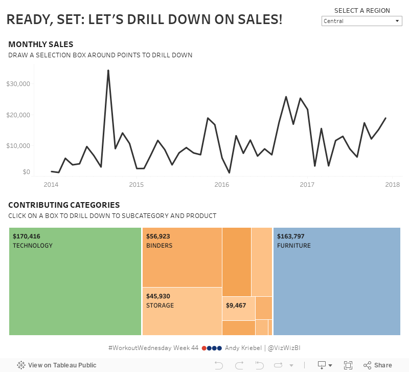
Workout Wednesday: Drill Down with Set Actions
This being the first Workout Wednesday since TC18, Ann Jackson decided to spoil us by letting us test out set actions. Set actions allow the user to dynamically update a set based on actions in a dashboard. They're wickedly powerful and a game changer for Tableau.Here are the basic requirements (full list here):
- Create a line chart of monthly sales that drills into the months you select
- Create a treemap of sales by category that has the ability to drill to sub-category and product name upon clicking
- When selecting months in the line chart, the treemap should also filter.
- Create dynamic labels (and tooltip) for the treemap that display based on the level of detail shown (category/sub-category/product name)
I added in a Viz in Tooltip in the treemap to practice those as well. In my tooltip, I have colored the bars that are unprofitable by the color of the category.

Subscribe to:
Posts
(
Atom
)


