Showing posts with label food. Show all posts
January 30, 2023
#MakeoverMonday 2023 Week 5 - Where can you find a cheap slice of pizza in New York City?
containers
,
dashboard
,
data analysis
,
filter
,
food
,
hex map
,
hexbin
,
layout
,
location
,
Makeover Monday
,
map
,
map layers
,
new york city
,
pizza
,
tableau
,
time series
No comments

Check out the recording below and you will learn how to:
- Prepare the data: calculations, joins, spatial intersections, and more
- Create maps: hexbin maps, map layers, spatial joins, using maps as shapes
- Create line charts and heat maps that are simple and effective (don't overcomplicate things)
- Build a dashboard using layout containers
Thanks for watching! There's an image of my viz below the video. Check out the interactive version here.
March 15, 2021
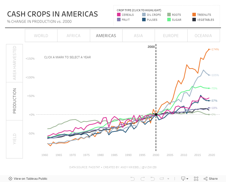
#MakeoverMonday Week 11: The World's Largest Cash Crops
cash crops
,
containers
,
filter action
,
food
,
formatting
,
highlight action
,
Makeover Monday
,
parameter action
,
products
,
region
,
time series
No comments
What a fun dataset! Thank you for your ideas during #WatchMeViz. Here are the video and final visualization.

September 9, 2020
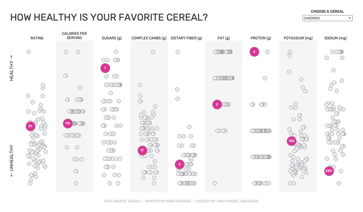
Watch Me Viz - #MakeoverMonday 2020 Week 36 - How Healthy Is Your Favorite Cereal?
breakfast
,
cereal
,
demo
,
food
,
general mills
,
health
,
healthy
,
highlight
,
index
,
jitter
,
kellogg's
,
live
,
Makeover Monday
,
parameter
,
quaker
,
sugar
,
tableau
,
unhealthy
,
WatchMeViz
No comments
Watch from start to finish as I create my Makeover Monday viz. I'll start by reviewing the original viz (what I like and don't like), getting context from the original article, then create charts and graphs to make a better version than the original.
Click on the image below the video to interactive with the workbook. Or download it from Tableau Public here.
April 22, 2019
#MakeoverMonday: Which NBA arena makes Stephen Curry's favorite popcorn?
basketball
,
food
,
Golden State Warriors
,
Makeover Monday
,
NBA
,
new york times
,
popcorn
,
Stephen Curry
No comments

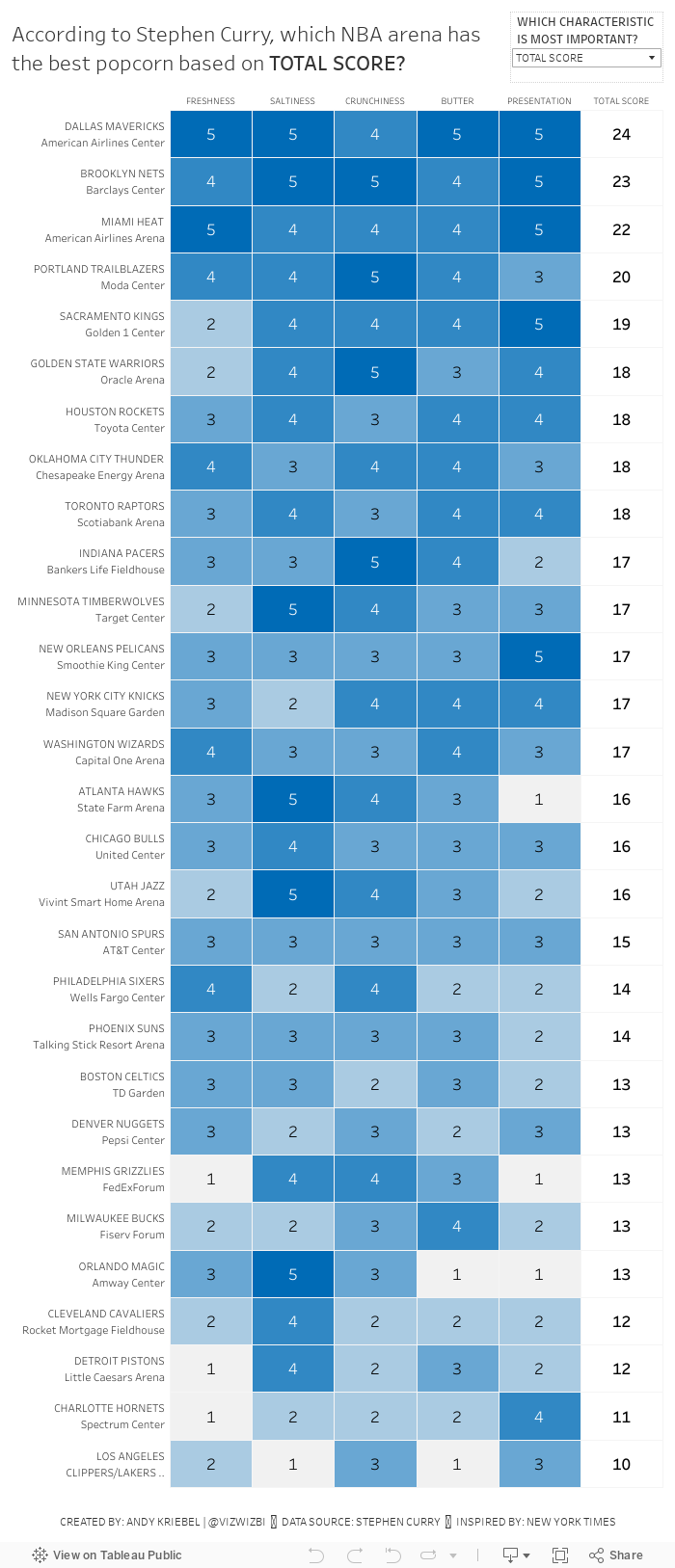
In the NYT article, they included a simple heatmap:

What works well?
- A heatmap is a good chart choice. Because the highest rating is darkest, those pop out more.
- Sorting the teams/arenas by the total score.
- Including borders around each cell helps separate them.
- Have both the team and arena together in a single cell but in multiple rows.
- Including the rating for each field.
- I love the data source!!
What could be improved?
- Needs a better title
- The diagonal rotation of the text makes the categories harder to read than necessary.
What I did
- I really like the original, so I also created a heatmap.
- I change the colors to use the blue from the Golden State Warriors brand colors.
- I made the category headers horizontal.
- I created a calculation to include the team and arena in the same field, but on multiple rows.
- I used viz in tooltip to shows the rating across all categories for each team.
- I included an option to allow the reader to sort by their most important factor.
December 9, 2018
Makeover Monday: How much land is needed to produce our food?
animal products
,
animals
,
food
,
highlight
,
Makeover Monday
,
reference line
,
vegan
,
vegetarian
,
waterfall
No comments

- A 9oz/251g steak contains 62g of protein.
- Multiply that by 1.02m² (the amount of land needed to produce 1g of steak)
- It takes 63.25m² of land to produce ONE STEAK. That's 678ft² for my American friends.
SERIOUSLY! WTF!
That's like a one bedroom apartment for every 10oz steak. That's ridiculous and a major reason why I went vegetarian 18 months ago.
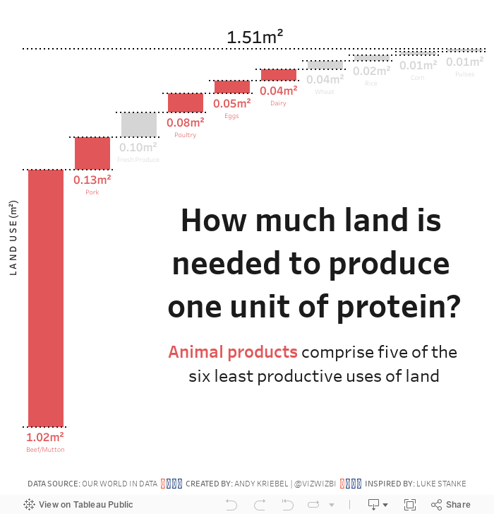
Let's have a look at this week's chart:

What works well?
- Using a descending bar chart for ranking from largest to smallest
- Labeling the ends of the lines for more precision
- Simple title
What could be improved?
- It took me several times to read the subtitle to make sense of it. Something simpler would be helpful.
- Remove the gridlines
- Remove the axis
What I did
- Recreated the waterfall chart that I had to create for Workout Wednesday week 49
- Used color to highlight the food types that come from animals; I used red to represent bad (my opinion)
- Change the title into the form of a question
- Included a BAN to summarize the findings
With that, here's my Makeover Monday week 50.
November 26, 2018
Makeover Monday: The Cost of a Night Out
bump chart
,
cost
,
food
,
Makeover Monday
,
rank
,
stacked bar chart
,
statista
No comments


What works well?
- Choosing a topic that is relatable
- Good title and subtitle
- Sorting the bars from most expensive to least expensive
- Using colors that are easy to distinguish
- Including the labels on the ends to the bars
What could be improved?
- Lose the icons on the lower right
- Remove the gridlines and axis labels (they're not necessary if the ends of the bars are labeled)
- Remove the flags next to each city; First they add no value. Second, the data is about cities not countries.
- The title is a bit misleading; this is only a selection of cities.
- Using a stacked bar chart makes comparisons across the items difficult; maybe if this was interactive and you could choose the item to sort by, it would work better.
What I did
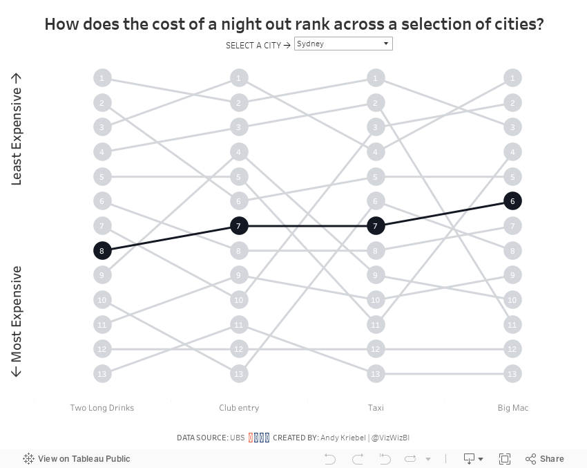
- I wanted to make the comparisons easier, so I chose to create a bump chart.
- I added a highlight selector so the user can focus on a single city, yet keep the others in the view for context.
- I sorted the values from least expensing (top) to most expensive (bottom).
With that, here's my Makeover Monday week 48.
September 30, 2018
Makeover Monday: Historical Avocados Prices
avocado
,
food
,
fruit
,
hass
,
Makeover Monday
,
price
No comments

This week's chart to makeover comes from OverRidge Wealth Advisors:

What works well?
- Using a line chart makes it easy to see the rising price.
- The title, while simple, tells us what the chart is about.
- The subtitle provides context.
What could be improved?
- There's no indication of the currency. The article mentions both US and Mexico as main sources, but the chart doesn't indicate whether it's dollars or pesos.
- The avocado in the background is distracting and completely unnecessary.
- If the avocado is removed, the line could be made black.
- Labeling the ends of the lines would add context.
- The title could be changed to something that tells the story in the data.
- Is this good or bad? Rising prices could be good if you're the produce, but bad for consumers.
- The gridlines could be more subtle.
What I did
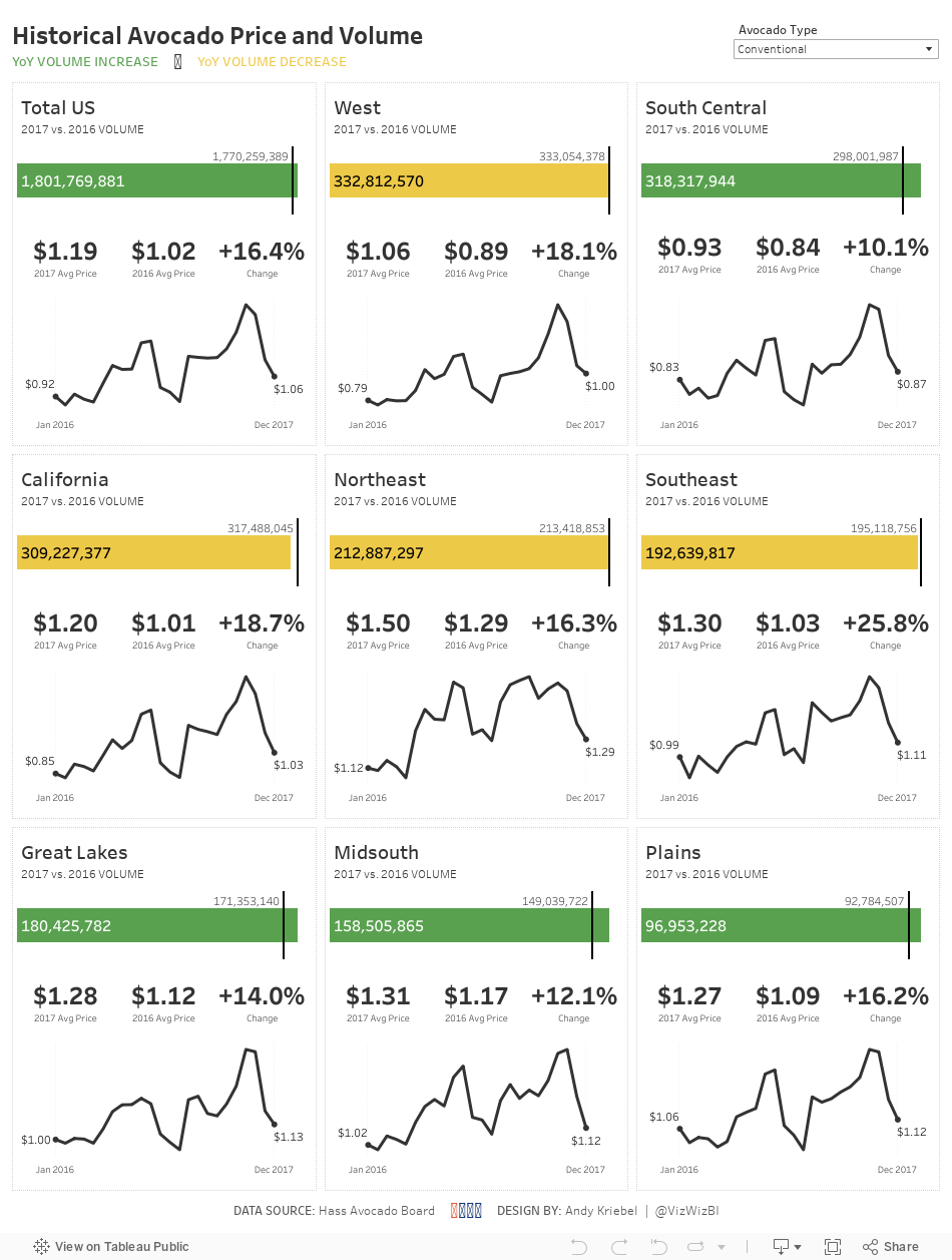
- I wanted to create something that shows the trends for each city plus the overall.
- Simplify the colors.
- Include BANs for the current price and an indicator of the change.
- Create "cards" for each region, similar to the profit and loss statement I created.
- Include a mobile version
December 4, 2017
Makeover Monday: Comparing the cost of food and drinks at Wetherspoons
cost
,
drinks
,
food
,
Makeover Monday
,
quadrant chart
,
restaurants
,
scatter plot
,
strip plot
,
Wetherspoons
2 comments
What works well?
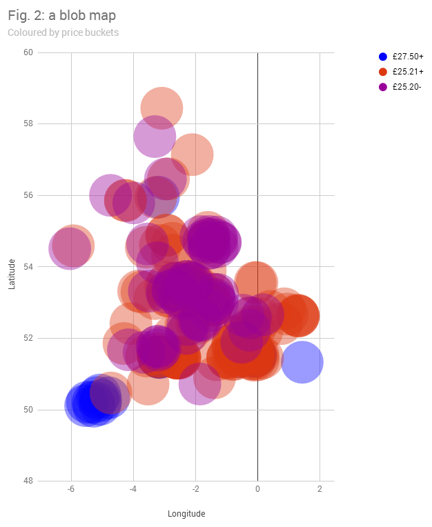
- Binning the prices helps cluster the restaurants
- Distinct enough colors
What could be improved?
- The viz is desperately trying to be a map, but failing miserably.
- The dots are so big that they are causing massive overlapping.
- There's no interactivity, so I have no idea which restaurant is which.
- The title doesn't tell me anything.
- What do the dots represent?
My Goals
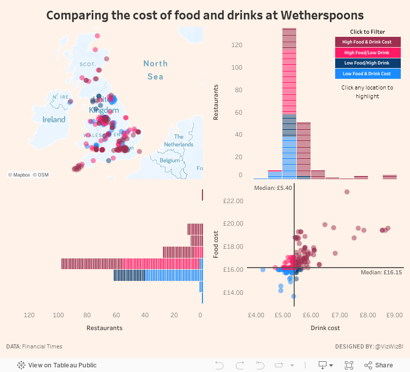
- Explore the data, particularly focusing on price comparisons.
- Are there regional differences?
- Do large metro areas charge more?
- Many restaurants make a lot of their money from drinks. Does Wetherspoons?
- Elaborate on the price buckets idea from the original. How are the prices distributed?
- Use FT-themed colors (which you can find here)
- Practice highlight actions so that a restaurant can be more easily found on the map
- Create a custom Mapbox map based on what I learned from our webinar last week.
With these goals in mind, here's my creation for Makeover Monday week 49.
July 24, 2017
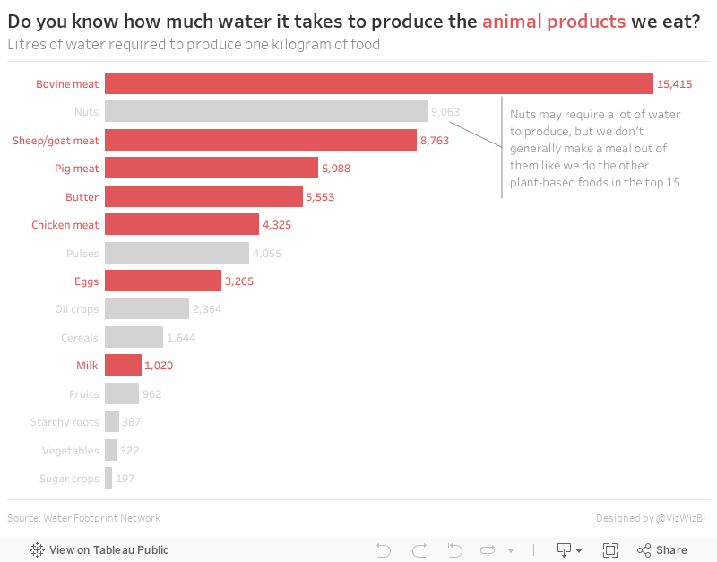
Makeover Monday: Do you know how much water it takes to produce the animal products we eat?

What works well?
- Good title and subtitle
- Sorting the products makes the ranking obvious
- Including the label at the end since the axis is not displayed
- Including the source of the data
What could be improved?
- Using partial icons can be misleading; a simple bar chart would be more accurate
- Shading every other row isn't necessary
- Icons for each food are distracting
- The scale is unnecessary decoration.
- The story in the data, which is referenced in the article, is not alluded to in the viz.
My goals
- Make a simple bar chart
- Use highlighting for the animal products
- Put the title in the form of a question that refers back to the article
With those goals in mind, here's my Makeover Monday week 30.
February 23, 2016
Dear Data Two | Week 43: Trying New Things

I’ve fallen behind…again! I was in quite a good groove, then suddenly burnout hit me. Fortunately I’ve been able to keep up with the data collection. The ebbs and flows of this project can become quite overwhelming and I’d rather hold off on creating a postcard until my head is in it than create something for the sake of staying on track. I’m fairly sure Jeffrey feels the same way.
I feel like I’m in the home stretch now. Currently I’m collecting data for week 47, which means only five more weeks!!!
For week 43, the topic was “trying new things.” Immediately I thought about when I was a kid and never wanted to try new food or go new places. As an adult, I’ve become quite more adventurous, including two massive moves for my family, so I think I’m adapting well to trying new things. You can read through my analysis of the week in the story points below. The simple outcome is this: I liked 81% of the new things I tried, so that should encourage me to try even more new things and to not be afraid.
August 27, 2015
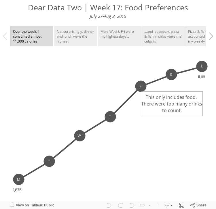
Dear Data Two | Week 17: Food Preferences

I'm heading back to week 17 to catch up on one of the postcards I hadn't yet created. Week 17 was about food preferences. I tracked the food I ate while on holiday in Scotland and counted the calories I consumed. The data is pretty basic, so I decide to try to draw some shapes, which is something I'm not particularly good at and something that I've been wanting to improve through this project.
Subscribe to:
Posts
(
Atom
)






