January 30, 2023
#MakeoverMonday 2023 Week 5 - Where can you find a cheap slice of pizza in New York City?

- Prepare the data: calculations, joins, spatial intersections, and more
- Create maps: hexbin maps, map layers, spatial joins, using maps as shapes
- Create line charts and heat maps that are simple and effective (don't overcomplicate things)
- Build a dashboard using layout containers
November 1, 2022
#MakeoverMonday Week 44 - Fundraising vs. Spending by Members of the 117th Congress

The midterm elections in the US are next week. If you're able to vote, please do. Democracy is at stake.
This week's data was about fundraising, spending and debt by people currently in Congress. If you missed #WatchMeViz, I showed 16 different ways to visualize this data set. Hopefully they give you a bit of inspiration for creating your own.
Catch up with the show below. In the end, I went with a bar chart that compares funds raised vs. spent by State. I also have a gantt bar to show the difference between the two. I have a tutorial of that chart here.
Below this video is an image of the dashboard I created. Click on it to see the interactive version on Tableau Public.
September 19, 2022
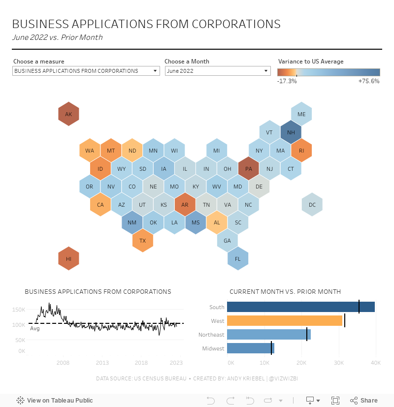
#MakeoverMonday Week 38 - American Business Applications

September 5, 2022
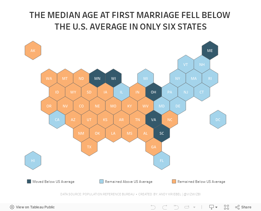
#MakeoverMonday 2022 Week 36 - Median Age at First Marriage in America

This was a relatively simple data set and I was able to build quite a few vizzes during Watch Me Viz. I ended up with something more complex that it needed to be, but it was fun figuring out how to create the calculations.
Here's how it works:
- Compare the median age at first marriage of each state to the US average for 2006-2010
- Compare the median age at first marriage of each state to the US average for 2015-2019
- Check whether the State
- Stayed above the US average in both time periods
- Stayed below the US average in both time periods
- Moved from below the US average to above the US average
- Moved from above the US average to below the US average
June 14, 2021
#MakeoverMonday 2021 Week 24: Which States Have the Highest Average Student Loans?
- Final workbook
- U.S. Hexmap Shapefile (credit: Joshua Milligan)

May 4, 2021
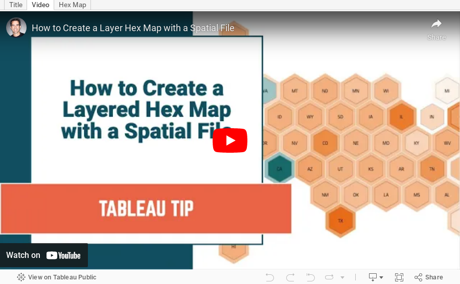
How to Create a Layered Hex Map with a Spatial File

In this tip, I show you how to use a spatial file to overlap hexagons on a map. This technique is much simpler, looks better, and is easier to maintain.
Typically when you want to create an overlapping hex map, you will use a template that has x/y coordinates for the rows and columns, hex shapes, then try to pack them together until they look just right. But then you put them into a dashboard and the sizes need to be adjusted again. What a pain!
Watch this tip to see the simple way to create layered hex maps.
RESOURCE: Hex map template via Joshua Milligan here
October 29, 2020
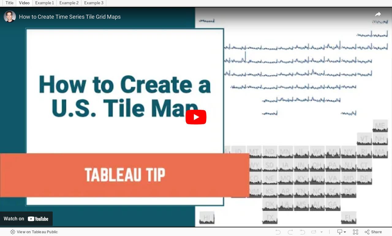
How to Create Time Series Tile Grid Maps

Unlike traditional maps, tile grid maps allow you to allocate equal space to each geographical area. We've probably all seen hex maps of the United States. Tile Grid Maps are similar, except they are squares with each block being the same shape and size.
In this video, I show you first how to create the tile grid map, then how to overlay time series data. I then show you three different visualization types for the time series. You could easily create bar charts as well.
Enjoy!
October 20, 2020
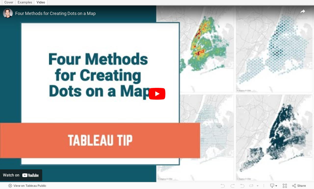
#TableauTipTuesday: Four Methods for Creating Dots on a Map

People love maps. Putting dots on a map gives a sense of precision. There are lots of methods for displaying maps. In this video, I show you four:
- The exact locations
- Density map
- Using the ROUND function to generalize the points
- Using the HEXBIN functions to generalize the points, but at a level controllable by the user
September 21, 2020
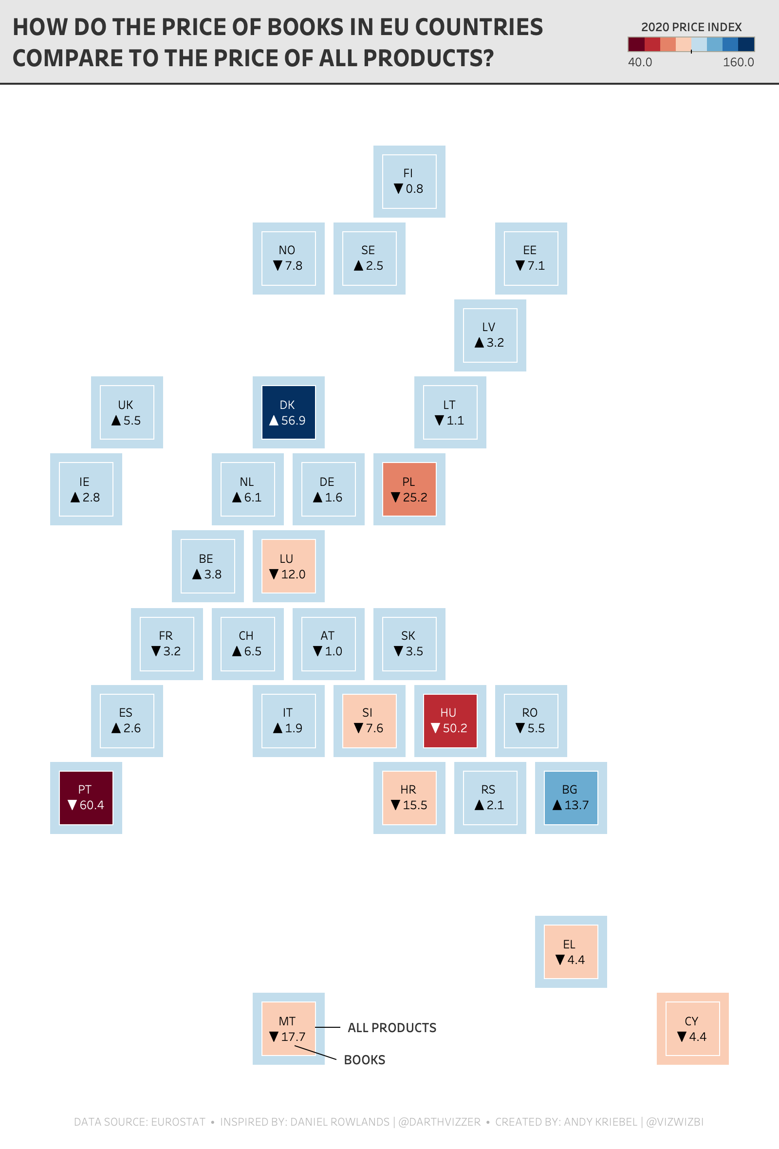
Watch Me Viz - #MakeoverMonday 2020 Week 38 - Pick Up A Book And Read
- Geometrics shapes (for the default number formatting) - LINK
- FIXED Level of Detail Expressions in a Plain English Sentence - LINK
- TABLE CALCULATIONS in a Plain English Sentence - LINK
- Shading between two lines - LINK
- Daniel Rowlands - TWITTER
- Daniel Rowlands (EU hex map template) - LINK
April 30, 2018
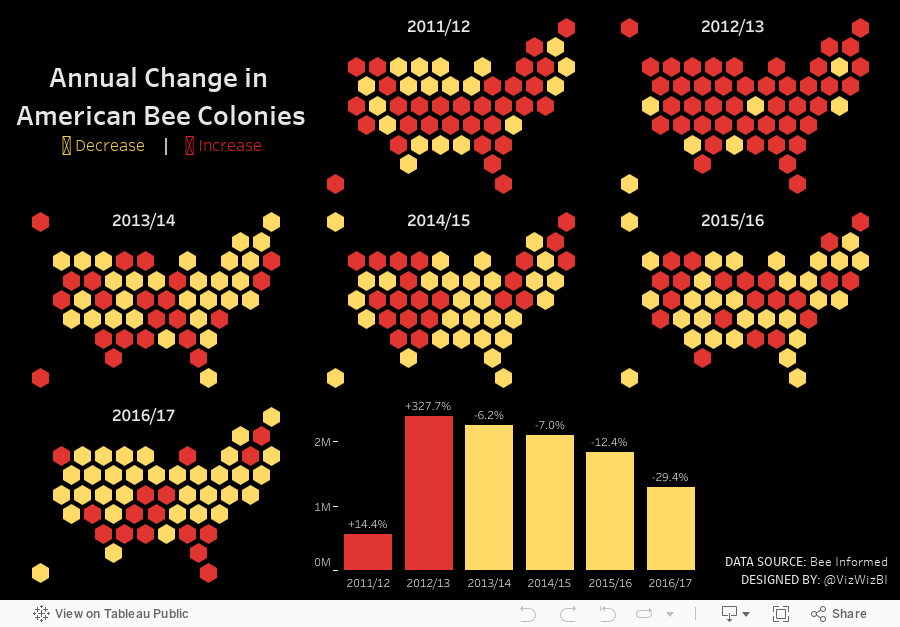
Makeover Monday: Annual Change in American Bee Colonies


What works well?
- When you hover over a state, the value is indicated on the color legend.
- Informative tooltips
- Good filtering capabilities to customize the view
- Very responsive tooltips
- Displaying the states and territories outside the continental US separately
What could be improved?
- A diverging color scale is typically used to indicate positive and negative values. In this case, all values are positive.
- If you do want to use a diverging palette, the colors should merge at the median.
- A filled map makes smaller state difficult to compare to larger states.
- There's no sense of the change over time. Are colonies increasing or decreasing?
My Goals
- Create small multiple maps that show each year
- Make the story about the change, rather than the specific values
- Use highlight actions to make it easy to see a state across all maps
- Incorporate the total annual loss into the tooltip
December 20, 2017
Workout Wednesday: State by State Profit Ratio
For today's challenge, you'll need two data sets: Superstore Sales (the one we always use for WW) and the hex map template.
Requirements
- You are NOT allowed to use blending.
- Create a small multiple hex map showing profit ratio by state.
- Color the hexagons using the Sunrise-Sunset Diverging color palette
- Match the tooltips on all of the charts
- Include a summary heatmap by year and month at the bottom of the map
- Everything in the dashboard needs to be tiled
- Ensure there is no gap between the hex map and the heatmap. The column divider lines must match up.
- Include a sparkline of profit ratio by quarter with labels on the ends of the lines.
- Ensure there is enough space for the labels on the sparkline, but you CANNOT manually fix the axis. Make it dynamic via calculations.
- Clicking on a state should update the sparkline, update the heatmap, and highlight the state in the hex map. Mississippi and West Virginia are good test cases to ensure it's working.
- The dashboard should be 700x700.

October 25, 2017
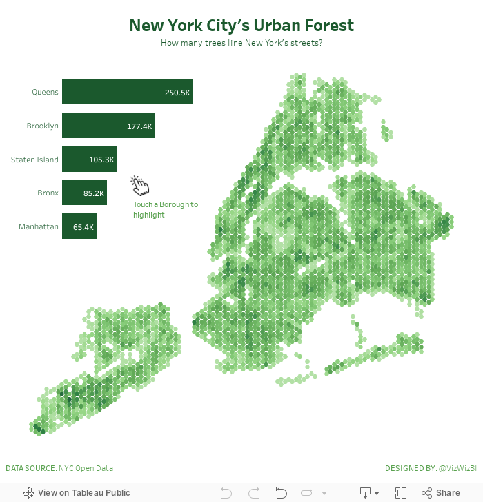
Overcoming Burnout, Hexbin Maps and New York City's Urban Forest
How do I overcome burnout?
New York City's Urban Forest
Binning is a great alternative technique for visualizing density when working with large data sets.
So, burnout temporarily overcome and I got to practice a technique I hadn't used in a while. That's a win win for me! Enjoy!
March 8, 2017
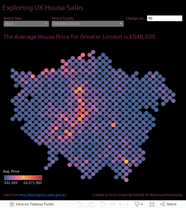
Workout Wednesday: UK House Prices Hexbin Maps
Let's start with Emma's requirements:
- Create the hexbin map based on the District
- Change the size of the hexagon using a parameter
- Match the sunrise-sunset diverging colour palette on the hexagons
- Match the tooltips and titles
- Set the dashboard size to 650 * 700 pixels
Lastly, I floated everything since the color legend had to be floated above the hexmap. I find that Tableau works best when you go either 100% float or 100% tiled.
July 4, 2016
Makeover Monday: Where Are the Best & Worst States to Raise a Child in America?

This week the UK Zens are on Tour and we’re taking Makeover Monday on the road with us. And it’s Independence Day in America so I chose a visualisation about raising children in America. Happy birthday ‘Merica!


What works well?
- Nice big titles make it easy to know what the map is about
- The colors make is easy to see the good and bad concentrations.
- Alaska and Hawaii are neatly brought in under the continental U.S.
What doesn’t work?
- The ranges for the colors are equivalent.
- Using a filled map could lead to visually distortion; poor Rhode Island!
- The separate maps that you have to page through make comparisons too difficult.
- There’s no way to see a State’s ranking in all categories at once.
I iterated through lots of ideas this week and found two that I think work well.
- I changed the filled map to a hex map then put all of the maps side by side.
- I created heat maps and bump charts that show the individual State rankings in each category.
- I added bar charts in the tooltips.
- I included highlighting interactivity.
Both views are shown below. Which one do you prefer?






