Showing posts with label Matt Chambers. Show all posts
October 25, 2017
Overcoming Burnout, Hexbin Maps and New York City's Urban Forest
hex map
,
hexbin
,
Matt Chambers
,
nature
,
new york city
,
trees
3 comments
How do I overcome burnout?
For me, the best way to overcome burnout isn't to stop; that would mean not doing what I love to do. What works for me is to switch to something in my backlog, to work on a project I've been putting off, to learn something new or maybe to practice a technique. This helps re-energize me.
I can't recommend this strategy to everyone; burnout is tough. Sometimes the right decision IS to stop everything, to decompress, to get away from it all. I've done that before and it works as well. More often than not, though, I get sad when I'm not using Tableau. It's a product that has fundamentally changed my life. I'm an addict.
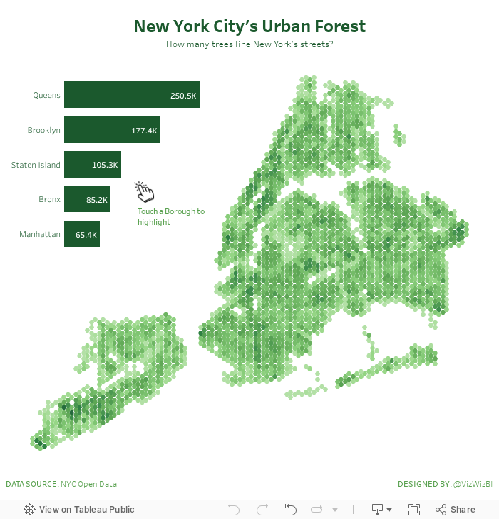
New York City's Urban Forest
Last night while I was preparing for Workout Wednesday, I had an idea to practice hexbin maps. Why that popped into my head I have no idea, but I went with it. I looked for a dataset that would work well as hexbins. I searched my emails and found this visualisation about trees in New York City. Fortunately NYC makes the location of every tree available here.
Why does this dataset work well with hexbin maps? According to Mapbox:
Binning is a great alternative technique for visualizing density when working with large data sets.
So, burnout temporarily overcome and I got to practice a technique I hadn't used in a while. That's a win win for me! Enjoy!
June 22, 2017
Makeover Monday: Tiled Heatmap of U.S. Air Quality Levels
air quality
,
AQI
,
heat map
,
Makeover Monday
,
Matt Chambers
,
ozone
,
tile map
,
tiles
,
United States
,
USA
No comments
I was very interested in looking at state-level air quality and built lots of heatmaps and originally built them in a single worksheet using table calcs to sort out which states go in which columns and rows.
This didn't work for me, though, because it only helped me see the states alphabetically. It's much more intuitive if they are displayed geographically. An idea popped into my head...
I wonder if I can combine a heatmap that looks at daily max reading by state across all years with a tile map.
I quickly went to Matt Chambers' great post for how build tile maps added the secondary data source, blended it by state and replaced my crazy table calcs with a simple tile map view. What a fun exercise! I learned a ton and feel like I created a much more intuitive view. Does anyone recall every seeing a tiled heat map? Have I come up with a new chart type???
Click on the image for the interactive version. Note that the viz might be slow to load as it's displaying about 460,000 marks.
Subscribe to:
Posts
(
Atom
)


