September 30, 2019
#MakeoverMonday: London's Aging Population
forecast
,
London
,
Makeover Monday
,
open data
,
population
,
projection
,
united kingdom
No comments

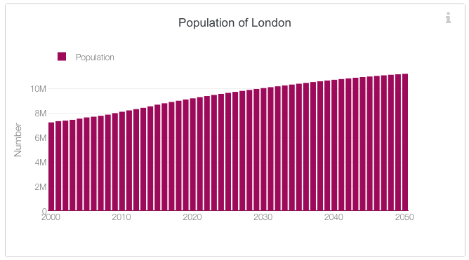 |
| SOURCE: London Datastore |
What works well?
- It's a simple bar chart, which is very easy to read.
- Uses a single color; we often see the bars double encoded with the same value as the length of the bar.
- The axis starts at zero.
- Simple, clear axis labels
What could be improved?
- I think a line chart would be even easier to read.
- The title says "Population of London" but it's really the projected population plus the past population; some clarification would be good.
- The legend isn't needed.
- The y-axis title could either be removed or changed. "Number" doesn't mean a whole lot.
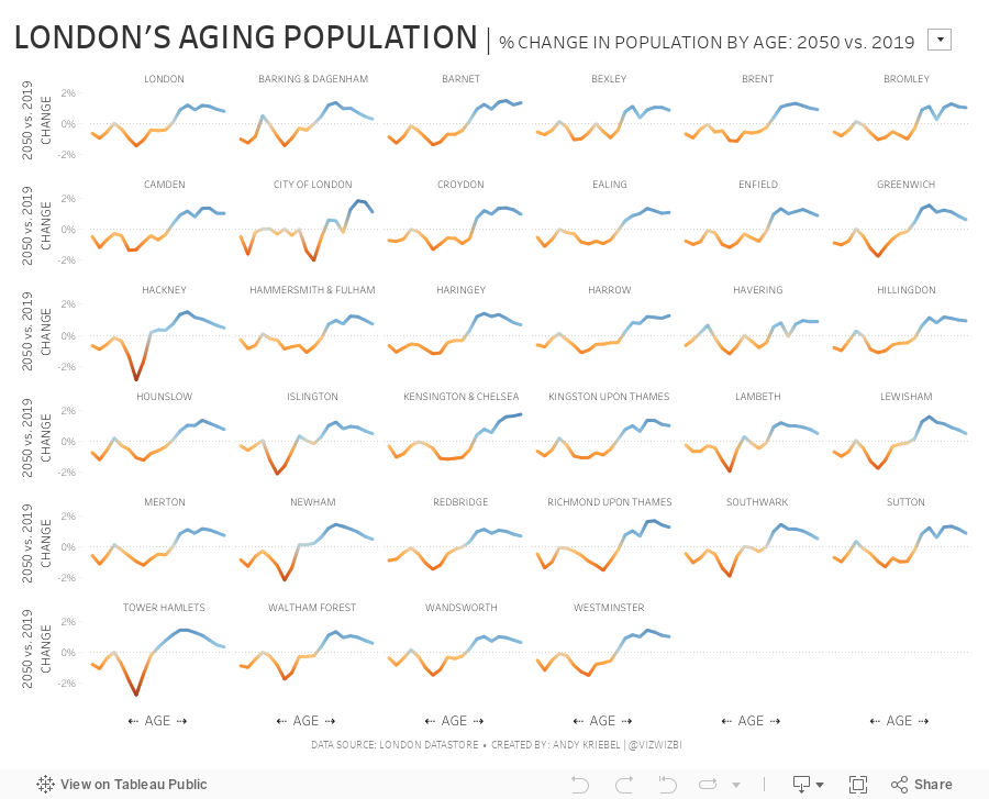
For my makeover, I was interested in comparing the distribution of the population by age for one year compared to the distribution of the population in 2050. For example, what was % of the population for 45 year olds for 2018 and 2050, then compare those two values. This then shows how the population distribution will change.
September 24, 2019
#TableauTipTuesday: How to Use Parameter Action to Drill Down
In this week's tip, I show you a trick the Hesham Eissa showed me...how to use a parameter action instead of a set action for drill down. Parameter actions are much simpler to implement, so give this a try.

September 23, 2019
#MakeoverMonday Week 39 - Are tenants in cool neighborhoods less likely to be evicted?

 |
| SOURCE: Humanistic Data Science |
- The title tells us what each line represents.
- The daily view helps show the major outliers and the dominant neighborhood.
What could be improved?
- The colors are hard to distinguish.
- The data is too granular.
- I'm not sure what the purpose is.
What I did
Watch the video to see everything I did and how I explored the data, then refined my analysis. Along the way I kept notes of things that stuck out to me like the Ellis Act, any outliers, and locations that are dominants.
I started by asking the following questions: When, Where, Why, Who, How. I explored each of these questions by building several charts for each and deciding which one worked the best together. I then built the dashboard, applied all of the formatting, clean up the tooltips, added some interactivity, and published. Done!
And here's where I ended up. Click on the viz for the interactive version.
September 16, 2019
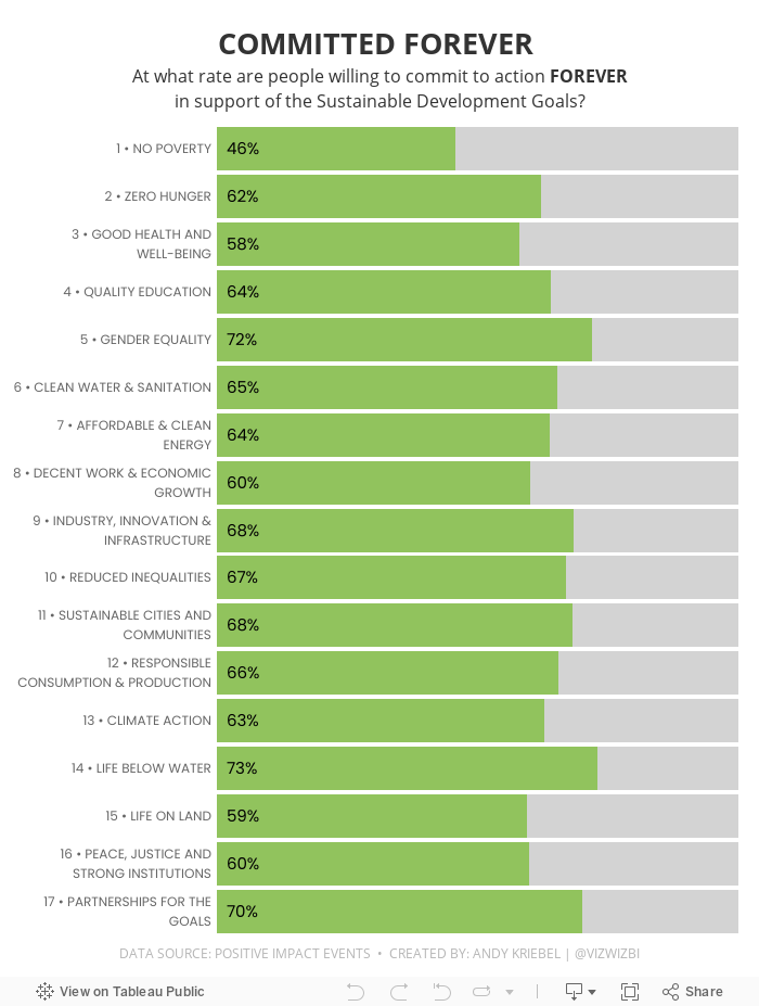
#MakeoverMonday: Committed Forever to Positive Impact Events


What works well?
- Everything looks very crisp, as it always does on Google Data Studio.
- Good filtering capability
- Allows you to explore the data in any way you desire
- Colors of the bar chart are easy to distinguish
What could be improved?
- It's way too long; I know I would never read all of it.
- The stacked bar / treemap charts things don't make sense at all.
- There's no structure to guide the user; like what is most important?
What I did
- I focused on the high-level goals.
- I noticed that there were a lot of people that said they would commit to action forever, so I made that the focus of my viz.
- I had originally split the view up by gender, but that didn't add anything to the analysis, so I took it out.
- I used the colors and fonts from the Positive Impact Events website.
And here's my makeover...
September 10, 2019
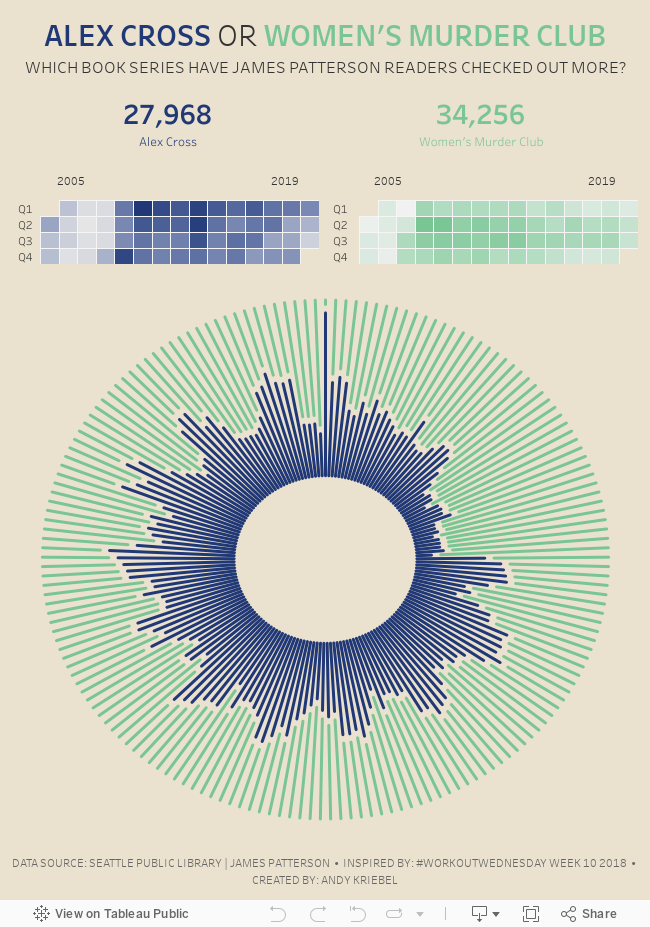
#MakeoverMonday: Alex Cross vs. Women's Murder Club

I thought about James Patterson, an author I used to read quite often and is extremely popular. This has provided something worth vizzing.
Before I get to that, let's look at the original:

What works well?
- The timeline is in sequential order.
- The dark background lets the dots pop out.
- The colors are easy to distinguish.
- Simple title and subtitle.
What could be improved?
- The y-axis is missing.
- The dots are double encoded by size and position on the y-axis.
- Google trends are included for some reason.
- The legend could be simplified.
What I did
I wanted to look at seasonality and trends for each of the books. I got nowhere really quickly. I struggled and struggled with ideas and ended up not having enough time to finish on Monday.
In the end, I decided to take some inspiration from Workout Wednesday week 10 2018. I also chose to focus on only two book series: Alex Cross and Women's Murder Club. Why? Because those are the two series of his books that I read the most. The color theme comes from James Patterson's official website.
In the end, I decided to take some inspiration from Workout Wednesday week 10 2018. I also chose to focus on only two book series: Alex Cross and Women's Murder Club. Why? Because those are the two series of his books that I read the most. The color theme comes from James Patterson's official website.
#TableauTipTuesday: How to Create a Waffle Chart Using Data Densification
In this tip, I show you how to use a calculated join to create a waffle chart. This method of data densification can remove the need for any complex data blending.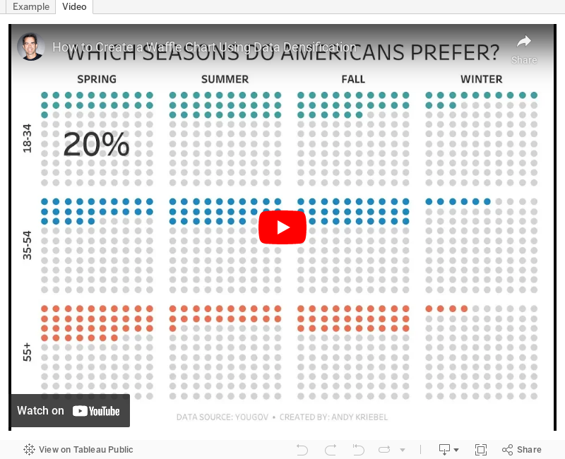

September 1, 2019
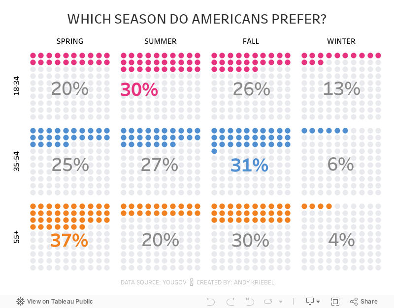
#MakeoverMonday: Which season do Americans prefer?
bar chart
,
comparison
,
fall
,
Makeover Monday
,
season
,
spring
,
summer
,
winter
,
YouGov
No comments

 |
| SOURCE: YouGov |
What works well?
- The seasons are sorted according to when Americans experience them.
- Nice clean design
- Labeling the tops of the bars
- Hiding the axis
- Color are easy to distinguish
What could be improved?
- I keep having to refer back to the legend. Maybe label each bar once?
- This show a comparison of the ages within a season. If the viewer wants to compare the seasons by age, then that become difficult.
And here's my version, which allows you compare both across seasons and across age groups:
Subscribe to:
Posts
(
Atom
)


