January 31, 2016
Makeover Monday: Travel Agents Are a Relic of the Past and Hotels Could Be Next
bar chart
,
color
,
combination chart
,
dual axis
,
line chart
,
Makeover Monday
,
travel
9 comments

The chart that we're reviewing this week for Makeover Monday is from Tech Chart of the Day. The title of the article "Travel Agents Are a Relic of the Past and Hotels Could Be Next" is quite catching, but the accompanying chart leaves a lot to be desired.

What can be improved?
- The title is boring and doesn't capture my attention.
- I'm not exactly sure which axis goes with which colour because neither axis is labeled.
- The colours of the lines are too similar for me.
- For some reason, my eyes want to match the darker blue line with online hotel revenue and the lighter blue line with # of travel agents, but they're actually the opposite.
- A dual-axis chart is often used to show a correlation, but is the correlation explained by this chart.
Ultimately, if I have to work this hard to understand such a simple chart, then it must not be done well.
This week, I'm going to walk you through my step-by-step makeover, ending with my final version. Each step along the way addresses one or more of the problems mentioned above. Let's get started.


A combination chart like this makes our eyes separate the two metrics while still allowing us to see the patterns of both at the same time. For example, it's easy to see that online hotel revenue is steadily increasing and the number of travel agents is decreasing.
However, the story here is the growth of revenue for online hotel services like Airbnb, VRBO, Flipkey, and HomeAway compared to the decline of travel agents. So, with that in consideration, I wanted to see how the respective growth (or decline) rates since 2000.

In this view, notice how I've significantly changed the title to meet the objectives of the story and how I've changed the axis titles. This view clearly shows the significant increase in online hotel revenue since 2000 and the fairly significant decrease in travel agents. Yet I still don't love it.
I'm thinking a connected scatterplot might do the trick. As Ben Jones said:
The connected scatterplot imparts a sense of travelling a pathway through a terrain that has twists and turns, loops and sudden rises and falls that encode how the two different variables changed together.That's exactly what I'm looking for; a method for showing how the two variables move together. So taking the % change since 2000 from above and converting it into a connected scatterplot, I get this:

I really like how this shows how the decrease in travel agents and the increase in online hotel revenue shifts together. I also added annotations to drive the point home even farther. Yet I still feel like this isn't quite done. I like the annotations, but not the axis scales. While the % change gives me nice context, I feel like I'm losing the overall magnitude of the changes.
Lastly, I removed the % change over time from each axis and went back to the raw values. I then made the line dashed because I feel like the dashed lines show the trails through time better.
In particular, I like how the design of this connected scatterplot starts at the upper left and moves down and to the right. I used Cole Nussbaumer's "where are your eyes drawn" test by turning my head away then back and seeing where my eyes go first. They went directly to the upper left dot for the year 2000, just like I had hoped.
You can download this workbook from my Tableau Public profile here.
January 26, 2016
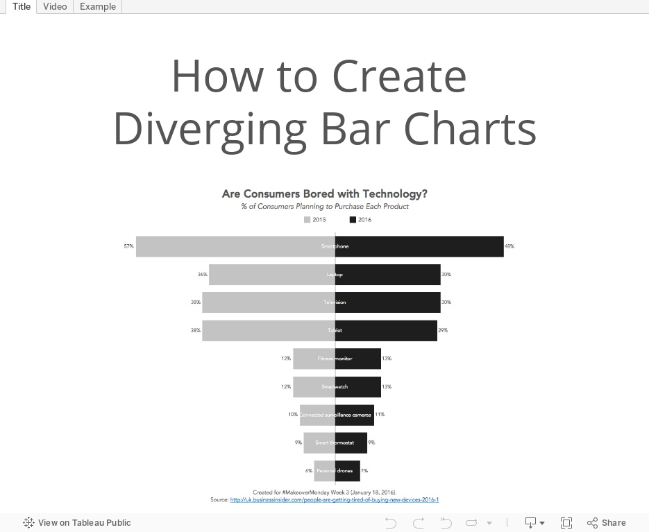
Tableau Tip Tuesday: How to Create Diverging Bar Charts

UPDATE: Some followers have let me know that they've heard these charts called tornado charts or butterfly charts. Basically, the consensus is that this type of chart doesn't have a name. That's ok though!
For this week's tip, I show you how to make diverging bar chart or bikini charts or whatever they are called.
January 25, 2016
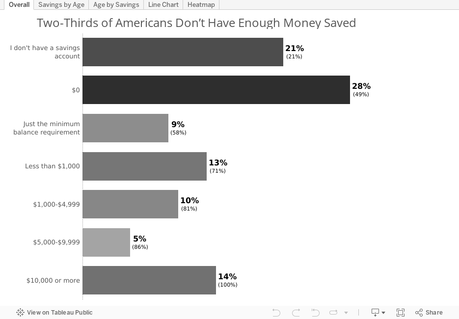
Makeover Monday: Two-Thirds of Americans Don’t Have Enough Money Saved

For this week's Makeover Monday, we look at this article from Go Banking Rates. In the article, there are two charts that need some work. First, there is this exploding donut chart.

What works well?
- The data is sorted clockwise by the savings amount.
- The donut chart starts at 12 o'clock.
- The labels tell us the actual values.
What needs improvement?
- Remove the donut as it's hard to compare slices.
- By adding all of the labels, they've basically created a table.
- The title could be improved.
Here is my initial makeover of this chart:

In this view, I've incorporated a few elements to aid in understanding:
- The title is more meaningful and let's the reader know what they are looking at.
- I colour-coded the bars by the survey response rate.
- I labeled the bars with the response rate and the cumulative response rate.
- I kept the sort order by the savings amount. This makes it easier to see how little savings people have.
Ok, so that's a quick glance at the overall numbers. The article later breaks these down by age groups in this stacked bar chart.

Again, this chart has several issues that hinder comprehension:
- The title is pretty meaningless.
- The stacked bar chart allows you to only easily compare the first and last segments across ages.
- I find the text on the bars to be distracting.
- I have to look back and forth to the colour legend to keep things straight in my head, which slows down comprehension.
To makeover this chart, I iterated through several options, none of which I really love, but I like them all better than the stacked bars.

This view is useful in that it allows me to compare the different savings amounts for each age group. What it lacks, though, is the ability to compare across age groups for the different savings amounts. To do that, I need to flip the chart like this:

Great, but ideally we should be able to compare in both directions. A line chart can help me understand and compare the data across both dimensions.

What I like about the line chart is that it helps me see patterns better. For example, you can clearly see that as people age there are more people with $10,000 or more in savings. At the same time, I can understand the mix within each age band.
One last alternative that works similarly to a line chart, except the patterns aren't as easy to see, is a heat map.
The heat map is great in that it shows me concentrations and I can include to overall values. The downside is that the patterns are not as easy to distinguish as the line chart.
Overall, this exercise showed me that there's no one "best" way to visualise this data set. The chart I would choose to display would depend on the message I want to send and the question my audience needs to answer. Below is the Tableau workbook with all of my iterations.
January 21, 2016
Dear Data Two | Week 41: Music
apple
,
bar chart
,
circles
,
Dear Data Two
,
itunes
,
music
,
pie chart
,
shapes
,
spiral
1 comment

This time, I started my analysis in Vizable and after a few minutes I had a good feeling for the overall patterns in the data.
Having fun today using @VizableApp to understand my music data for #DearDataTwo Week 41 w/ @HighVizAbility pic.twitter.com/z23jE9Mcxl
— Andy Kriebel (@VizWizBI) January 21, 2016
Using Vizable this way definitely helped speed up my analysis in Tableau. I like how Vizable keeps me from overthinking the analysis. It encourages me to play rather than overdiagnose. That being what it is, I was quite surprised to learn how much alternative music I listen to. I suppose that goes back to when I was in college and that genre first became more popular.
I also had a playlist of the songs that are in my primary running playlist, so I used that throughout the analysis as well to help me see if what I listened to in general was the same music I listen to when I run.
For the final visualisation, I accidently created this radial pie chart thingy. I would never create something like this if it weren't for this project. I consider this more "data art" than data visualisation.

Click through the story below to see how I conducted my analysis and to see the postcard I created.

January 19, 2016
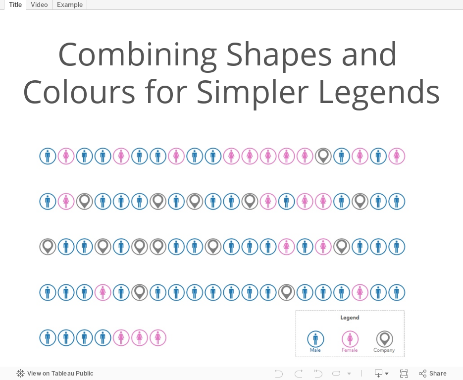
Tableau Tip Tuesday: Combining Shapes and Colours for Simpler Legends

In the week's Tableau Tip Tuesday, I look back to Dear Data Two Week 40 and how I combined the color and shape legends into a single legend.
January 18, 2016
Makeover Monday: Are Consumers Bored With Technology?
bar chart
,
bikini chart
,
Business Insider
,
consumers
,
donut chart
,
Eugene Kim
,
Makeover Monday
,
slope graph
,
technology
,
year over year
4 comments


This chart is so bad, it's tough to know where to start. Let's start with what works well:
- There's a clear title and subtitle that tell us what the chart is about.
- While I don't use icons often, their use of icons for each type of technology might aid some people in understanding, though I suspect they add them more for decoration.
- There's a clear order to the donuts, from highest to lowest based on the 2016 purchase rate.
- The font is consistent throughout the graph.
- They fit a lot of information in a small space.
Let's now consider what could be improved:
- The use of donut charts makes comparing the technologies more difficult than necessary.
- They used sized bubbles for negatives and positives. Really bad idea because this might make people think -1% is the same as +1%.
- Using bubbles to represent 2015 makes comparing 2015 values really difficult as you have to do the math in your head. Quick, which technology ranks third for 2015?
- It's harder than necessary to compare 2015 to 2016 for each technology.
- The red/green bubbles will be challenging for the red/green colour-blind folks.
With these problems in consideration, I've created this alternative version. This took only about 15 minutes to create and 15 minutes to tidy up and organize. Click on the image to view the interactive version and to download the workbook.
In this view, I've focused on the change between 2016 and 2015 in both views. The slope graph on the left helps you see the ranking of each technology in each year and allows you to compare see the year over year change. The bar chart on the right shows only the year over year change, sorted in descending order by the change, whereas the original version ordered them by the purchase intent rate.
Both graphs use the same colour scale: black for an increase, grey for a decrease. I had considered using a diverging scale, but I didn't thought that it made the distinction between positive and negative growth too difficult to understand.
My initial idea was this bikini chart, but it has the major problem of making comparisons between 2016 and 2015 nearly impossible. It also only allows me to sort by one of the years. I wanted to include it in this post, though, so you could get some other ideas.

January 16, 2016
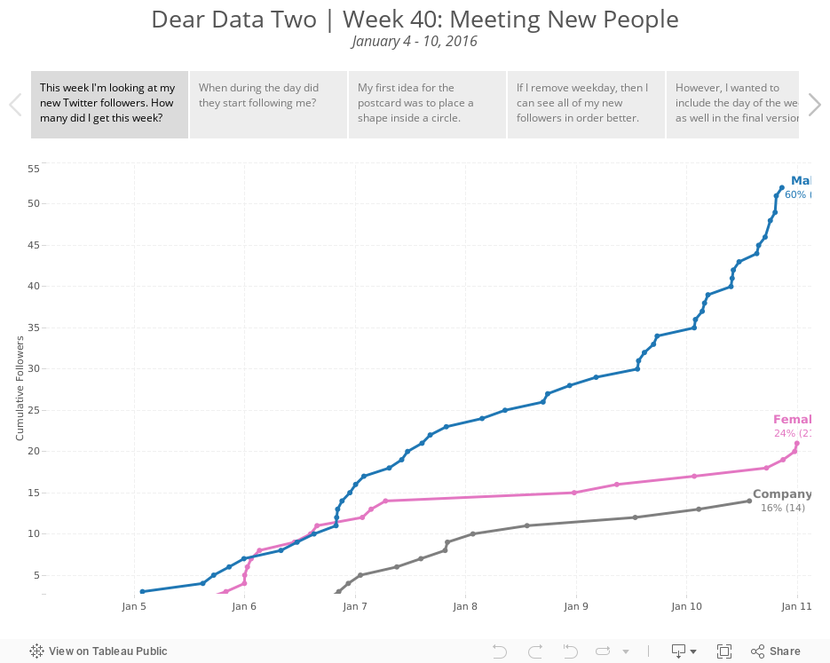
Dear Data Two | Week 40: Meeting New People
barcode
,
Dear Data Two
,
followers
,
gantt
,
line chart
,
shapes
,
twitter
No comments

I reached out to Jeff and told him what was happening and I came up with the idea of looking at my new Twitter followers this week. I believe Jeff is going to do the same. I then set up an IFTTT channel to log new followers to a spreadsheet so that I could start my Tableau analysis.
 |
| Not surprisingly, most of my new followers (60%) were males, as Twitter tends to have more males. |
Next, I looked at when they started following me. The IFTTT channel logs in my local time, which i then broke down by AM/PM.
 |
| 64% of my new followers were after 12pm GMT |
I didn't have very much metadata to work with otherwise this week, so from this points, I focused on different ways I could visualise my postcard in Tableau.
Click through the story points below to see my brief analysis and my different postcard options. The last tab has the actual postcard for Jeff.
January 11, 2016
Makeover Monday: Stephen Curry Hates Mid-Range Jump Shots
background image
,
bar chart
,
barbell
,
basketball
,
Business Insider
,
DNA chart
,
line chart
,
Makeover Monday
,
NBA
,
sports
,
sports chart of the day
,
Stephen Curry
6 comments

This week's Makeover Monday looks at this simple stacked bar chart from Sports Chart of the Day:

What works well:
- Nice labelling on the axes; this makes it clear what we data is displayed
- Nice annotation of the point of the chart
What could be done better:
- Needs a better title
- Needs to incorporate shooting % so that I can better understand the relationship between shots taken and shooting %
- Group together all shots over 30 feet
- Find a better way to compare the number of shots taken on each range. I find the stacked bars hard to compare within in a shot distance.
- Make the different shot ranges more clear, e.g., what defines a long 2?
- Provide a summary
- How are Curry's shot selections changing over time?
With these considerations in mind, here is my my makeover of the chart:
Note: If you'd like to participate in Makeover Monday, check this link for the details.
January 7, 2016
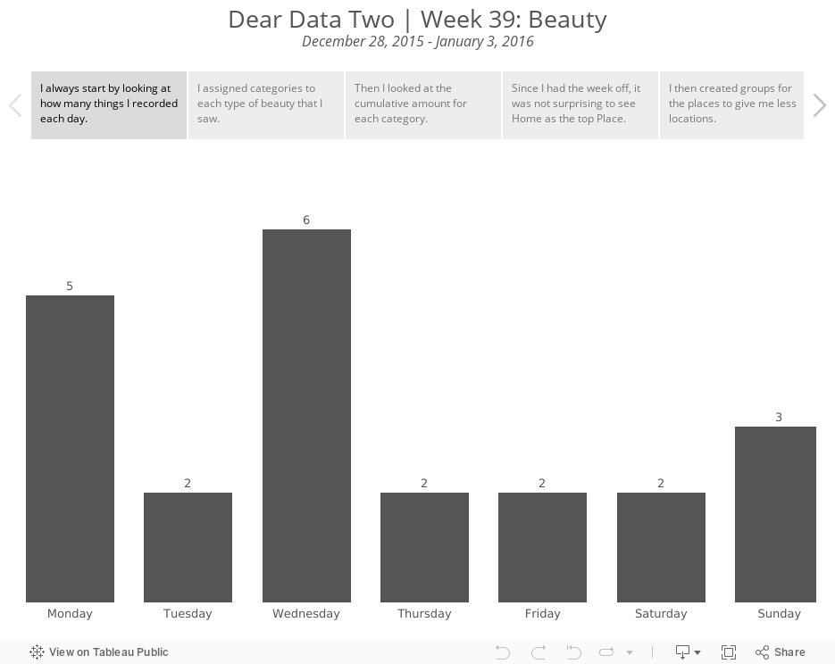
Dear Data Two | Week 39: Beauty
beauty
,
circles
,
color
,
Dear Data Two
,
lines
,
marks
,
shapes
2 comments

This week really helped me appreciate the exceptional beauty that is around me every day, whether it be our wonderful parks, the people I see, or the amazing architecture London offers. I had this week off from work, so I was able to spend a lot of time with my family going on walks, visiting museums, playing games, etc. So the topic, combined with the time I spent with my family, really made for a wonderfully positive week after a rather crappy Christmas week.
My analysis of the data started much like every other week: exploring what each dimension I tracked offered, looking for stories, trying to find patterns. I didn't learn a whole lot about myself, but trying to emulate what Giorgia did in her postcard for this week helped me continue to learn about using Tableau as a drawing canvas.
The trouble I run into time and time again is that I have so many dimensions that I want to put in a single view, but if I add them all in Tableau, the view quickly becomes impossible to comprehend. However, I'm really beginning to appreciate the freedom that drawing on a postcard gives me. I can incorporate as many dimensions as I'd like through the use of symbols and marks in a way that doesn't clutter the visualisation and aids in understanding.
I'm not sure why, but I feel like I'm starting to grow as a data artist, particularly when it comes to pen and paper. My ideas are flowing at the moment. Let's hope I can continue the momentum for the remaining 13 weeks.
Explore my week below by click through the story points. Enjoy!
January 6, 2016
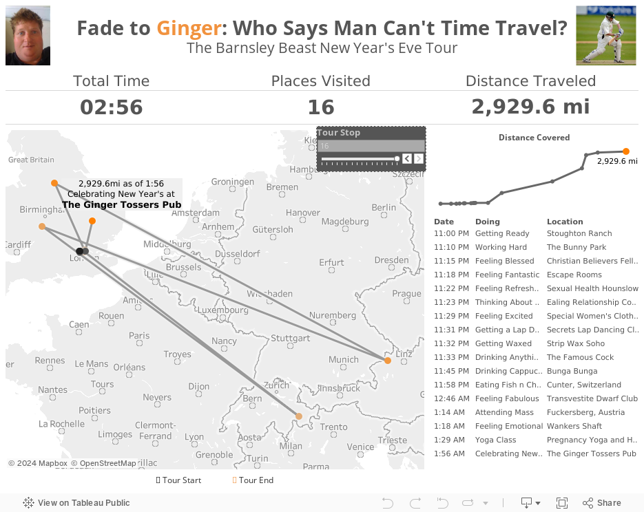
Fade to Ginger: Who Says Man Can't Time Travel?

Well, as I was spending New Year's Eve with my family, I noticed my buddy Luke Stoughton checking-in on Facebook all over the place...and quickly! From 11-11:30pm, he had checked-in to 6 places all over London and covered 28 miles. By midnight, he had already been to Switzerland! By 1:15am, he had come back to England and gone on to Austria. And then back to England again only 14 minutes later!
Either Luke is some sort of superhero (he does have the power to make a deer limp after all) or his buddies were pranking him. Either way, he granted me permission to visualise his amazing night. Click through the Tour Stops to see everywhere Luke visited on his epic New Year's Eve.
January 5, 2016
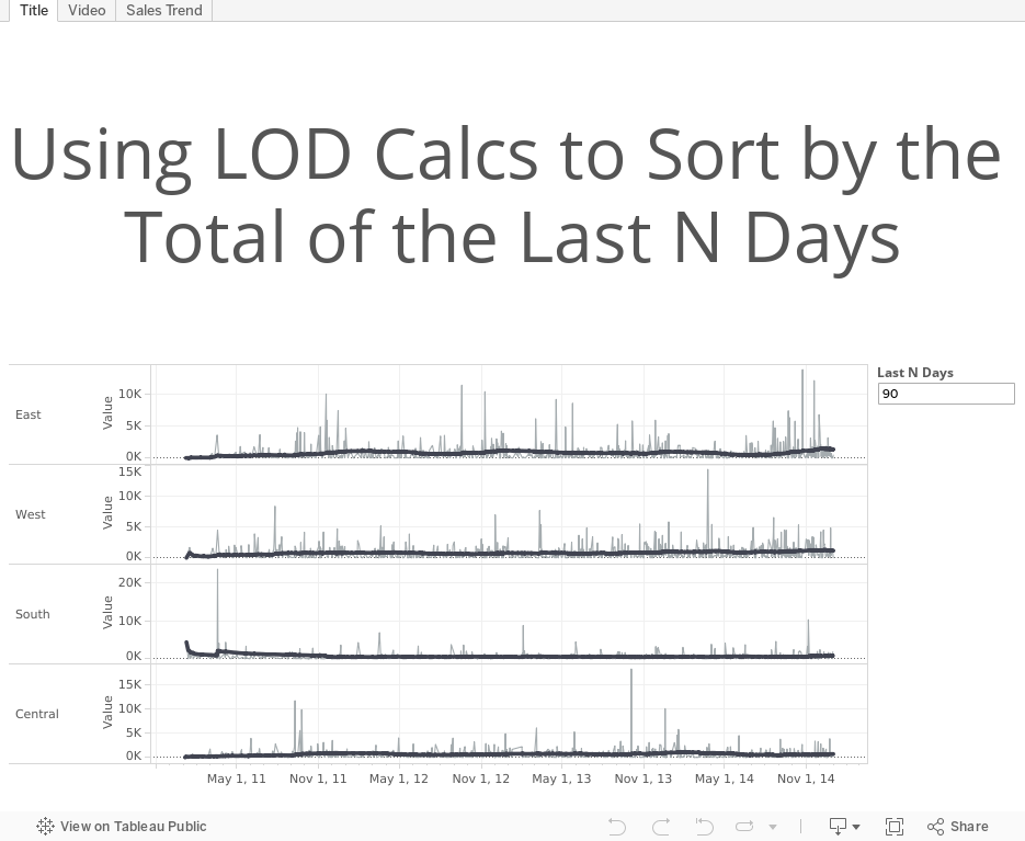
Tableau Tip Tuesday: Using LOD Calcs to Sort by the Total of the Last N Days

If anyone knows a better or more efficient way to do this, please share!
January 4, 2016
Makeover Monday: Bryce Harper Had the “Most Valuable” Season of Any MLB Player Since 2002
bar chart
,
baseball
,
fivethirtyeight
,
Makeover Monday
,
MLB
,
scatter plot
,
slope graph
2 comments

This week we looked at this table from FiveThirtyEight. The main data point in this table and the article is the Surplus Value column. Essentially, FiveThirtyEight uses WAR as a way to calculate a player's value and then compares that to what they were actually paid.

There's nothing particularly terrible about this table. It serves its main purpose: looking up facts. But what is does lack is a simple way to make comparisons between the players and more quickly show the differences between them. Ideally, I want to answer the question: How great was the 2015 season from Bryce Harper?
With this in mind, I created this visualisation. Click on the image to interact, as I have included some highlight actions. However, the view itself can stand alone without the interactivity as well.

January 3, 2016
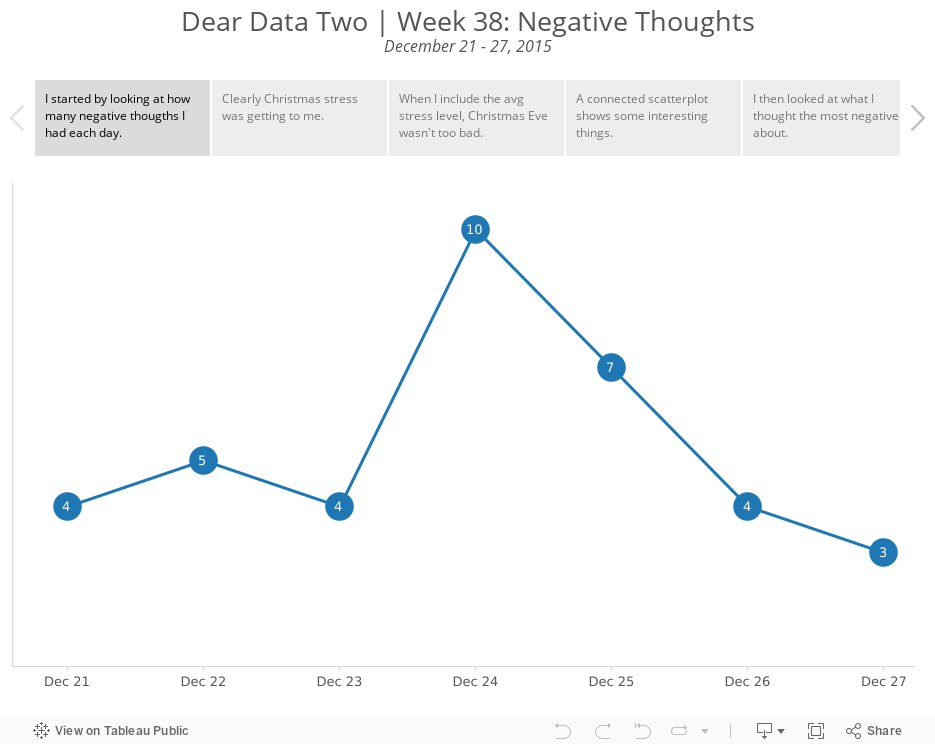
Dear Data Two | Week 38: Negative Thoughts
circles
,
Dear Data Two
,
family
,
locations
,
negative
,
stacks
,
stress
,
thinking
,
thoughts
3 comments

I tracked the date, what was on my mind, the general topic, where I was, who I was with, the stress level and what I was doing.
I tend to always look at what Giorgia and Stefanie produce each week as a way of looking for inspiration. This week, I really liked how Stefanie created piles for her negative thoughts.

Stefanie included a classification of inward/outward for each negative thought then split them up so you could see how much more there was on one side vs. the other. So I went back to my data and added a similar classification. More on this in a minute.
Here are some of the highlights from the data analysis I performed on my data:
- My inward negative thoughts more than doubled my outward negative thoughts. This means that I was keeping my negativity to myself more than expressing it to others. For me, this is good because I have always tended to just say whatever is on my mind. Does this mean I am learning to control myself a bit more?
- Most of the negative thoughts were me by myself. Otherwise, Beth was second most involved. This really isn't surprising given it was Christmas week, we went shopping together, and every year I get stressed about how much we spend on Christmas.
- 75% of my negative thoughts were low stress...phew!!
So back to the postcard. I thought Stefanie missed an opportunity to think about the "weight" of her negative thoughts. How could I represent my data on what looked like a scale? How could I incorporate more of the metadata? I came up with this Tableau viz:

What I tried to do was make the inward negative thoughts appear "heavier" than the outward negative thoughts by adjusting the y-axis. I was also able to include who I was with (inner circle) and the topic (outer circle).
For my postcard, I was able to make it look even more like a scale and I also was able to include where I was. This turned out to be a good example of how you can do way more by hand than you can with any software.
Explore the entire week in the Tableau story below, including my thought process for how I decided which data to put in the final viz.
Subscribe to:
Posts
(
Atom
)


