Showing posts with label consumers. Show all posts
March 22, 2021
#MakeoverMonday Week 12 - How much do Americans spend on cereals?
America
,
BAN
,
bar chart
,
bump chart
,
consumers
,
consumption
,
economics
,
economy
,
KPI
,
Makeover Monday
,
parallel coordinates
,
spending
,
variance
No comments
Time really flew by on today's #WatchMeViz. Before I knew it, an hour had passed, I'd built lots of things, and I hadn't yet decided on my "final" visualization. So instead, I have three this week!
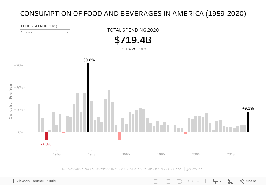

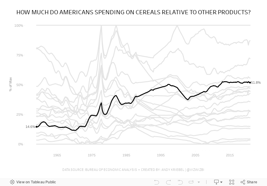

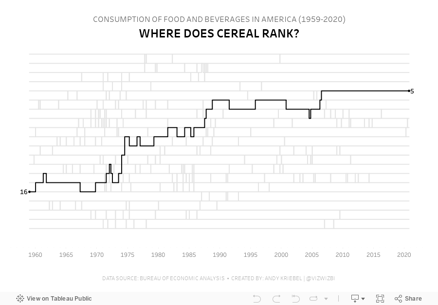

Watch the video here to learn how I built these charts.
Viz 1 - Year over Year Change in Consumption of Food and Beverages in America
Viz 2 - Parallel Coordinates - How much do Americans spend on cereals relative to other products?
Viz 3 - Bump Chart - #MakeoverMonday 2021 Week 12 - How Does Cereal Rank in American Food Spending?
March 25, 2019
#MakeoverMonday: Consumer Spending by Generation

What works well?
- The generations are sorted from youngest to oldest.
- The title is clear.
- The gridlines help guide the eye across the viz.
- It's easy to compare the general/misc category and the restaurants across generations.
- A stacked bar chart is easy to understand.
What could be improved?
- The story in the data, from the article, is about how millennials are spending more on restaurants. It would be good to make that a more obvious focus of the viz.
- There are too many colors.
- While the title is clear, if you don't read the article, you could miss the purpose for the chart.
What I did
I really enjoyed using Google Data Studio last week, so I thought I'd give it another try to continue my learning. Since this was a simple stacked bar chart, I wanted to create a "set" for restaurants vs. all others. I needed to create a calculated field using a case statement that checks the category field. That's it!
From there, it was formatting, which is pretty intuitive as well. I'd highly recommend you give Data Studio a try, especially if you know exactly what you want to build; it's not a data exploration tool.
January 18, 2016
Makeover Monday: Are Consumers Bored With Technology?
bar chart
,
bikini chart
,
Business Insider
,
consumers
,
donut chart
,
Eugene Kim
,
Makeover Monday
,
slope graph
,
technology
,
year over year
4 comments


This chart is so bad, it's tough to know where to start. Let's start with what works well:
- There's a clear title and subtitle that tell us what the chart is about.
- While I don't use icons often, their use of icons for each type of technology might aid some people in understanding, though I suspect they add them more for decoration.
- There's a clear order to the donuts, from highest to lowest based on the 2016 purchase rate.
- The font is consistent throughout the graph.
- They fit a lot of information in a small space.
Let's now consider what could be improved:
- The use of donut charts makes comparing the technologies more difficult than necessary.
- They used sized bubbles for negatives and positives. Really bad idea because this might make people think -1% is the same as +1%.
- Using bubbles to represent 2015 makes comparing 2015 values really difficult as you have to do the math in your head. Quick, which technology ranks third for 2015?
- It's harder than necessary to compare 2015 to 2016 for each technology.
- The red/green bubbles will be challenging for the red/green colour-blind folks.
With these problems in consideration, I've created this alternative version. This took only about 15 minutes to create and 15 minutes to tidy up and organize. Click on the image to view the interactive version and to download the workbook.
In this view, I've focused on the change between 2016 and 2015 in both views. The slope graph on the left helps you see the ranking of each technology in each year and allows you to compare see the year over year change. The bar chart on the right shows only the year over year change, sorted in descending order by the change, whereas the original version ordered them by the purchase intent rate.
Both graphs use the same colour scale: black for an increase, grey for a decrease. I had considered using a diverging scale, but I didn't thought that it made the distinction between positive and negative growth too difficult to understand.
My initial idea was this bikini chart, but it has the major problem of making comparisons between 2016 and 2015 nearly impossible. It also only allows me to sort by one of the years. I wanted to include it in this post, though, so you could get some other ideas.

Subscribe to:
Posts
(
Atom
)






