September 27, 2013
Tableau Tip: Creating a chart that only displays the last day of each year, quarter or month
calculated fields
,
dates
,
finance
,
line chart
,
parameters
,
tableau
,
tips
,
tricks
12 comments
Scenario - You're doing quarterly financial reporting, you have sales by day, you're in the middle of the quarter and you only want to show the last day of each of the previous quarters (assuming your sales are cumulative by day). You also want to allow the user to view the data by Year, Month or Day.


Download the workbook here.
This can all be accomplished through a calculated field.
Step 1: Create a line chart of sales by day. I also changed the format of my time axis to \Qq 'yy and removed the date axis title.
Step 2: Create a parameter to allow the user to choose the level of detailed for the chart. In this example, I'm allow the user to view the data by Year, Quarter, Month or Day.
Step 3: Create a calculated field based on the parameter selection to only return the previous day of each year, quarter or month. I wanted this to return a Boolean that I can add as a filter.
Step 4: Verify the calculation works by adding it to the Filters shelf and keeping only 1.
As I pick each option in the parameter, the chart updates accordingly.
Download the workbook here.
September 18, 2013
Tableau Tip: Sorting an "Other" dimension member at the end of a list
calculated fields
,
sort
,
tableau
,
tips
,
tricks
8 comments
Suppose you have a dimension, Subcategory in this case, and it has a member with the name "Other". "Other" represents the bucket that holds all of the members that you're not interested in breaking out separately.
There are times when you would like to sort the Other member at the bottom of your list. For example, you might have a bar chart of sales by subcategory that you want to sort in descending order, but you want to show the individual subcategories followed by Other at the end. Typically, the bar chart would look like this (I'm highlighting other to make it easier to track for this example):

So how can I get Other to be at the bottom of this list? Simple, create a calculated field that changes "Other" to negative for the measure you want to sort by.

Now, right-click on the dimension you want to sort, choose Sort, then in the Sort by section, choose the calculated field you created in the step above and sort in descending order.

And as easy as that, you have Other sorted at the bottom.

Note: This does not work for groups because Tableau does not allow you to leverage groups in calculated fields.
There are times when you would like to sort the Other member at the bottom of your list. For example, you might have a bar chart of sales by subcategory that you want to sort in descending order, but you want to show the individual subcategories followed by Other at the end. Typically, the bar chart would look like this (I'm highlighting other to make it easier to track for this example):
So how can I get Other to be at the bottom of this list? Simple, create a calculated field that changes "Other" to negative for the measure you want to sort by.
Now, right-click on the dimension you want to sort, choose Sort, then in the Sort by section, choose the calculated field you created in the step above and sort in descending order.
And as easy as that, you have Other sorted at the bottom.
Note: This does not work for groups because Tableau does not allow you to leverage groups in calculated fields.
September 13, 2013
When Arsenal stole Mesut Ozil from Real Madrid, they got a player nearly as good as Xavi and Iniesta combined
arsenal
,
English Premier League
,
EPL
,
football
,
interactive
,
La Liga
,
mesut ozil
,
real madrid
,
soccer
,
tableau
,
transfer
3 comments
Fact: Mesut Ozil is a Gunner
Fact: Across all competitions, Ozil is nearly as good as Xavi and Iniesta COMBINED, merely 0.01 goals + assists per game behind the combined pair. Get your head wrapped around that.
When Arsenal surprised everyone by actually spending some money on transfer deadline day with the club-record signing of Mesut Ozil for $67M, many of the pundits (1) were in shock that Madrid sold him and (2) thought Arsenal had secured THE BEST central midfielder in the world.
Turning to the data, you can easily make such an argument. Using the viz below, you can compare Ozil to many of the other top central midfielders in the World.
Play around with the viz and comment with things you see. You can also download the workbook here.
Fact: Across all competitions, Ozil is nearly as good as Xavi and Iniesta COMBINED, merely 0.01 goals + assists per game behind the combined pair. Get your head wrapped around that.
When Arsenal surprised everyone by actually spending some money on transfer deadline day with the club-record signing of Mesut Ozil for $67M, many of the pundits (1) were in shock that Madrid sold him and (2) thought Arsenal had secured THE BEST central midfielder in the world.
Turning to the data, you can easily make such an argument. Using the viz below, you can compare Ozil to many of the other top central midfielders in the World.
- Despite having played fewer seasons than nearly all of the players on this list, Ozil is the leader in total assists, leader in goals + assists per game, and the runaway leader in assists per game across all competitions.
- Xavi and Iniesta may get all of the plaudits, but they are well down the list of goals + assists per game across all competitions, coming in at 10th and 13th respectively. They are far behind Ozil and just behind Santi Cazorla. This has to bode well for Arsenal.
- Ozil has been the clear leader in assists across all competitions for the past four years. meanwhile Xavi's production has steadily dropped, with a dramatic drop off in the 2009/10 season.
- Ozil consistently performs better for country than club and on the international stage, his performance vs. his peers is even more staggering.
- Barca need to get Cesc on the field more often.
- Frank Lampard, despite playing for the Evil Empire in Chelsea, was astonishingly consistent and dominant from 2003/04 through 2009/10. Frank performs better than Gerrard on the international stage when looking at averages per game, yet you would think, based on what you hear in the press, that Gerrard's performances far exceed those of Lampard. The data shows otherwise. I suppose that's why they call them pundits and not experts.
- Manchester United are desperate for an attaching midfielder to complement Michael Carrick.

September 12, 2013
Visualizing statistical significance in survey results
#tcc13
,
Cyrus Dukart
,
facebook
,
Heather Torres
,
InterWorks
,
Kate Treadwell
,
Mike Roberts
,
stats
,
survey
,
tableau
6 comments
My colleagues and I at Facebook had the honor of presenting at the 2013 Tableau Customer Conference alongside Kate Treadwell of Interworks, who was subbing for Mike Roberts. The topic of our talk was "Data Discovery at Facebook: Why Culture & Flexibility Matter for Modern Analytics". We based the session around four of Facebook's company values:
I need to pause for a moment and thank two Tableau Zen Masters for their help and inspiration.
First, thank you to Jonathan Drummey for his help in getting both the manager and company results into the same view. Jonathan taught me about Data Source Filters, which I had never used before. We ended up aggregating the data so that we didn't have to have multiple data sources, but without his help early on, we wouldn't have gotten there.
Second, we need to thank Steve Wexler for his awesome work in visualizing survey results. We based many of our other reports off of work that he's done.
And now back to our regularly scheduled program...
In order to help aid with understanding, here are some tips for how to read and interpret the results:
The view that Heather showed in our session was the Double Gantt (TM) option. I've provided two other alternatives as well: Candle Gantt (TM) and Dots Gantt (TM).
The Candle Gannt is more or less the same as the Double Gantt, but the company bar is thinner and there are reference lines for the ends. The idea here was to make it look somewhat like a candlestick chart.
The Dots Gantt is nice because it clearly shows the outer ends of the statistical range without concern for the range itself.
I had no idea what to call these types of charts, so the names are simply a combination of the chart types (And they aren't really trademarked. Maybe I should TM them). These are all dual axis charts. Download the workbook and pull the charts apart if you're interested in seeing how they're built.
For those of you that came to our session, we owe you a heartfelt thank you. We appreciated all of the questions, comments and great interaction.

- Move fast
- Be open
- Be bold
- Focus on impact
I need to pause for a moment and thank two Tableau Zen Masters for their help and inspiration.
First, thank you to Jonathan Drummey for his help in getting both the manager and company results into the same view. Jonathan taught me about Data Source Filters, which I had never used before. We ended up aggregating the data so that we didn't have to have multiple data sources, but without his help early on, we wouldn't have gotten there.
Second, we need to thank Steve Wexler for his awesome work in visualizing survey results. We based many of our other reports off of work that he's done.
And now back to our regularly scheduled program...
In order to help aid with understanding, here are some tips for how to read and interpret the results:
- The dark bar represents the company in total.
- The colored bar represent the chosen manager's results.
- The width of the bars represents the statistical variation. The manager bar will always be wider than the company bar because there are less results for a manager, thus more less statistical significance.
- The color of the manager bars represents how statistically significantly different they are vs. the overall company results.
- If you see a gap between the company and manager bars, then the difference is statistically significant.
- You can filter by Manager.
- You have three chart types to choose from (more below about them).
- You have three sorting options, which allow you to answer different questions depending on what you want to compare.
The view that Heather showed in our session was the Double Gantt (TM) option. I've provided two other alternatives as well: Candle Gantt (TM) and Dots Gantt (TM).
The Candle Gannt is more or less the same as the Double Gantt, but the company bar is thinner and there are reference lines for the ends. The idea here was to make it look somewhat like a candlestick chart.
The Dots Gantt is nice because it clearly shows the outer ends of the statistical range without concern for the range itself.
I had no idea what to call these types of charts, so the names are simply a combination of the chart types (And they aren't really trademarked. Maybe I should TM them). These are all dual axis charts. Download the workbook and pull the charts apart if you're interested in seeing how they're built.
For those of you that came to our session, we owe you a heartfelt thank you. We appreciated all of the questions, comments and great interaction.
September 8, 2013
Visualizing 500,000 VizWiz pageviews
Friday was a huge day for the blog, it hit 500,000 pageviews. 1/2 million; it's hard for me to fathom. I'm amazed that this little diary has taken on the life that it has, despite not really having a clear direction. I started this blog as a way to keep track of things I found and things I wanted to practice, and somehow people started reading it. Thanks for that!
I didn't start tracking stats with Google Analytics until much later than I started the blog, so here is a snapshot of the stats via blogger.

Being a viz nerd though, I had to use the new Google Analytics connector that Tableau 8 includes to get into more detail. If this viz looks familiar, it's probably because you follow DataRemixed. I figured, why rebuild something from scratch when Ben did such a great job. So I downloaded his workbook, change the data source to my blog and that was it.
I added two features from Ben's version:

I didn't start tracking stats with Google Analytics until much later than I started the blog, so here is a snapshot of the stats via blogger.
Being a viz nerd though, I had to use the new Google Analytics connector that Tableau 8 includes to get into more detail. If this viz looks familiar, it's probably because you follow DataRemixed. I figured, why rebuild something from scratch when Ben did such a great job. So I downloaded his workbook, change the data source to my blog and that was it.
I added two features from Ben's version:
- I added an option to view by different time dimensions.
- The destinations, sources and social charts filter to the top 10.
If you're wondering what the huge spike is, click on the dot. To spoil the surprise, this viz was picked up by the Huffington Post.
September 5, 2013
Tableau Tip: Default a date filter to the last N days
calculated fields
,
dates
,
default
,
last
,
parameters
,
tableau
,
tips
,
tricks
29 comments
A common question that I see on the forums and on our Facebook group is “How can I default my date quick filter to always show the last N days?” This is a relatively simple problem to address using parameters instead of quick filters. This solution also works because you’re not dependent on leveraging the today() function. This works because it looks at the last date in your view, not your computer’s clock.
If you use quick filters, when you publish your workbook to Tableau Server, the latest view that you see in Desktop is what gets published. So, if you use a date range quick filter like this

and your data source refreshes overnight, the slider does not automatically shift to the right. In addition, the slider also shows dates all the way up to today, even if your latest date is one month ago. Hence, if you filter to the last two weeks you could get no results, leaving your viewers a bit perplexed.
Here’s the method I use that always defaults to the latest N days.
Step 1 – Create a parameter that allows the user to input the last N of days they want to view. Then show the parameter control.

Step 2 – Parameter controls don’t do anything in Tableau unless you created a calculated field to leverage them. In this case, let’s create a calculated field that flags days that are within the range entered in the parameter.

Let’s check if this works by creating a simple table.
![image[66]](https://blogger.googleusercontent.com/img/b/R29vZ2xl/AVvXsEgXS955uCwfwP4FtZwnFMgnFz0HmOXe3tH4AA5OuP0dghDHCW8XeE5Pvz92-QpenAMnku9_UkIvaVhx0qFRrNvOAf3gKqAJ5kjSxSPBjEWbtoMefOIcDBlV2xDVyZ3WvglfZz004v0eeFE/?imgmax=800 "image[66]")
Perfect! We can see that our “Days to Show” field shows false when the date is more than 7 days from the last date.
Step 3 – We don’t need our “Days to Show” field in the view and we only care about the “True” results, so let’s move it to the Filters shelf. Select True, then change the Computing using to Order Date. Yes, I could use Table (Across), but I prefer to have more control.

The filter selection will appear again. Choose True.
Step 4 – Build your visualization. First, let’s build a line chart.
If you use quick filters, when you publish your workbook to Tableau Server, the latest view that you see in Desktop is what gets published. So, if you use a date range quick filter like this

and your data source refreshes overnight, the slider does not automatically shift to the right. In addition, the slider also shows dates all the way up to today, even if your latest date is one month ago. Hence, if you filter to the last two weeks you could get no results, leaving your viewers a bit perplexed.
Here’s the method I use that always defaults to the latest N days.
Step 1 – Create a parameter that allows the user to input the last N of days they want to view. Then show the parameter control.

Step 2 – Parameter controls don’t do anything in Tableau unless you created a calculated field to leverage them. In this case, let’s create a calculated field that flags days that are within the range entered in the parameter.

Let’s check if this works by creating a simple table.
![image[66]](https://blogger.googleusercontent.com/img/b/R29vZ2xl/AVvXsEhPu-SnYUyHn5lT6y6vbB91RKgz92cMoI-G9rttScaxiJo56EFu7EHV9CVU2ah2zvwHNt0YwqkYipFJ6TKrbDxFYVk25IpgCeMG8-rxxfVt4hRN2Jb2Q2ac4eiJXkbIkY8iuo_mITAW1KI/s1600-h/image%25255B66%25255D%25255B12%25255D.png "image[66]")
Perfect! We can see that our “Days to Show” field shows false when the date is more than 7 days from the last date.
Step 3 – We don’t need our “Days to Show” field in the view and we only care about the “True” results, so let’s move it to the Filters shelf. Select True, then change the Computing using to Order Date. Yes, I could use Table (Across), but I prefer to have more control.

The filter selection will appear again. Choose True.
Step 4 – Build your visualization. First, let’s build a line chart.
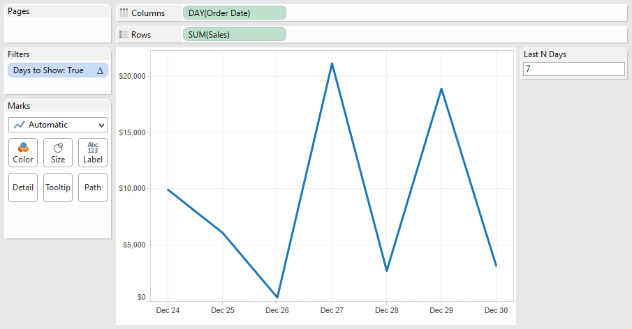
Next, let’s build a bar chart for sales by category and sub-category. This is where it gets a bit trickier. In order for your “Days to Show” filter to work, you must keep your Order Date field in the view. Move it to the level of detail. The result looks like this, with stacked bars for each date. I then sorted sub-category by sales descending.
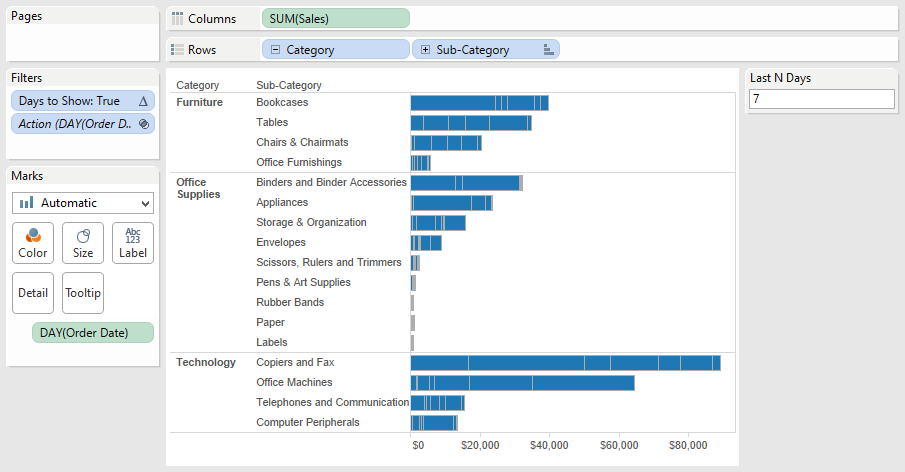
Step 5 – Clean up the bar chart by removing the borders. Click on the Color shelf, then Border and choose None.

Your bar chart now looks like this:

Step 6 – Put it all together on a dashboard and add some interactivity.

Your bar chart now looks like this:

Step 6 – Put it all together on a dashboard and add some interactivity.

One additional cool benefit is that as you use the action filters (e.g., click on Envelopes), you will see the last N days based on that selection.
You can download the workbook used to create this blog post here. My next blog post will take this one step farther…calculating cumulative totals for the last N days.
Subscribe to:
Posts
(
Atom
)


