October 29, 2020
How to Create Time Series Tile Grid Maps

Unlike traditional maps, tile grid maps allow you to allocate equal space to each geographical area. We've probably all seen hex maps of the United States. Tile Grid Maps are similar, except they are squares with each block being the same shape and size.
In this video, I show you first how to create the tile grid map, then how to overlay time series data. I then show you three different visualization types for the time series. You could easily create bar charts as well.
Enjoy!

October 28, 2020
How to Create a Venn Diagram

Venn diagrams (also called Set diagrams or Logic diagrams) use overlapping circles to illustrate the logical relationships between two or more sets of items. They depict how things relate to each other within a particular segment.
For example, how many customers made purchases in the East region, in the West region, and in both regions?
Where the circles overlap, you display text or a value the represents the value associated with the relationship.
I created a Venn diagram for my Visual Vocabulary and while teaching how to create it, I thought of a much simpler way to create them. All of the versions you see online (and the version in the Visual Vocabulary) require you to:
- Create sets
- Evaluate how many things are in each set as an aggregate
- Align the circles according to these values
- Create a calc to display the text for the overlap with a computed set

October 26, 2020
#MakeoverMonday 2020 Week 43 - #WatchMeViz - Apparel Exports to the U.S.
For #MakeoverMonday week 43 we analyzed data about apparel exports to the US during the Coronavirus pandemic. In this session of #WatchMeViz, I showed 28 different ways to visualize time series data (there are way more) before we all settled on a viz that's basically the same as the original and looks nicer.
Subscribe to my YouTube channel here to get all of my latest Tableau Tips and notifications for upcoming live streams.
Show Notes / References:
- Data Set - https://data.world/makeovermonday/2020w43-apparel-exports-to-us
- Tableau Reference Guide (incredible repository of thousands of Tableau tips) by Jeffrey Shaffer - http://www.tableaureferenceguide.com/
- How to Shade Between Two Lines with Polygons by Rody Zakovich - http://www.datatableauandme.com/2017/08/how-to-shade-between-2-lines-in-tableau.html
- Title Capitalization - https://capitalizemytitle.com/

October 20, 2020
#TableauTipTuesday: Four Methods for Creating Dots on a Map

People love maps. Putting dots on a map gives a sense of precision. There are lots of methods for displaying maps. In this video, I show you four:
- The exact locations
- Density map
- Using the ROUND function to generalize the points
- Using the HEXBIN functions to generalize the points, but at a level controllable by the user
October 13, 2020
#WorkoutWednesday 2020 Week 42: Can you build a Strava Workout Calendar?
Introduction

Requirements
- Dashboard size: 1680 x 1020
- Max 3 sheets
- Max 1 text box
- Joins are not permitted
- Data model is not permitted
- They MUST be separate data sources.
- No annotations
- No text boxes on the main chart
- No floating objects
- No Level of Detail expressions
- Remove highlighting from anything you can click
- Match formatting and tooltips
- The blue hex code is #0070A0.
- The blue bars on the upper right are the weekly number of hours spent exercising.
- The black bars in the main chart are the daily hours spent exercising.
- Any days when I did not exercise should have zero hours displayed.
- Allow scrolling through the years
Dataset
Attribution

Share
Solution
October 6, 2020
#TableauTipTuesday: How to Format Numbers as Trillions

During #WatchMeViz this week, I showed how to format numbers as trillions. Trillions isn't an option in Tableau's number formatting. However, you can get around it with a custom format. In this video, I show you how to do that. It's quite simple!
October 1, 2020
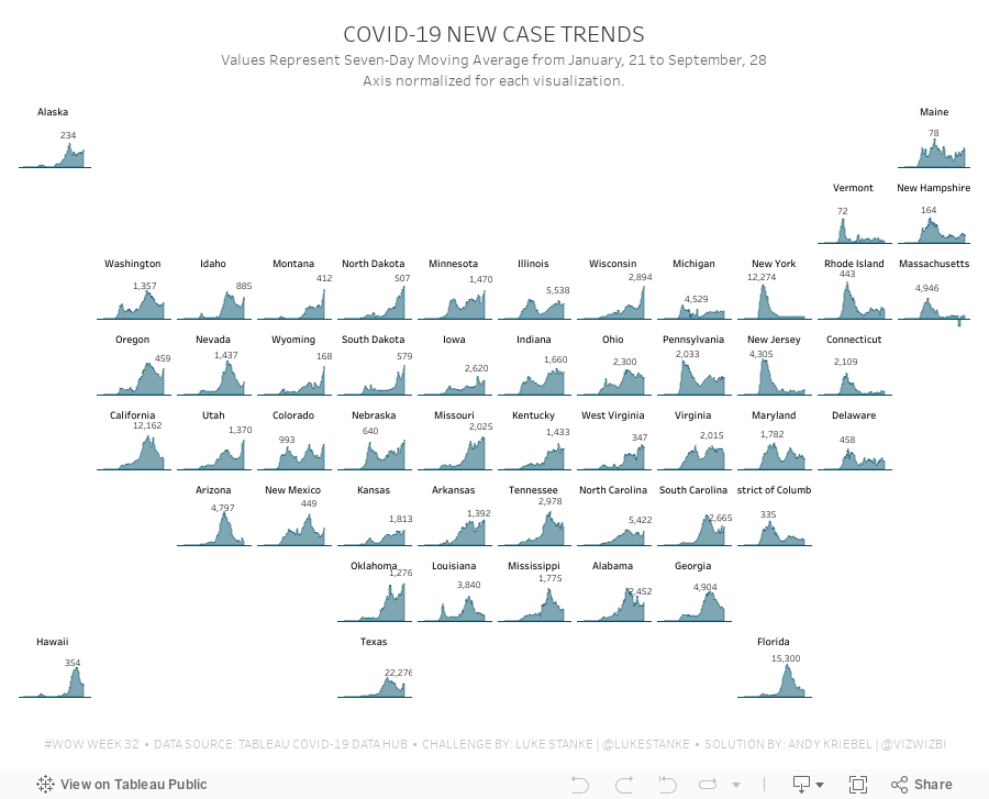
#WorkoutWednesday 2020 Week 32: COVID-19 New Case Trends

As I continue to catch up on Workout Wednesday challenges I've missed, I'm picking and choosing those that looking interesting at first glance (and that I think are doable in a short amount of time). Week 32 was one I knew I could get done quickly since it was very similar to 2017 week 7. Actually, since the columns and rows were provided to use already via a CASE statement, the trellis part of the exercise required no calculations and no work.
The toughest part was normalizing the calculation within each State. The key here is to think about each State individually, find the highest value, and then compare all of the other dates to that value. I did this by putting each State and date into a row, creating a calculation to get the largest value, then computing the necessary ratio. Once I had that, it was simple to turn it into a chart.
To get the State names in the middle of each chart, think about how you can count half of the day in each chart. Then take that value and add it to the first date and you'll get a single date that's halfway across the date range. This solution will be flexible for any new data that would be included.
Some difference between mine and Luke's
- I didn't filter the dates; I decided to use the entire data set, but keep in mind that I did this several weeks after Luke posted the challenge.
- I created a mobile version as well.
And with that, here's my completed #WorkoutWednesday for week 32 2020.