October 29, 2020
How to Create Time Series Tile Grid Maps

Unlike traditional maps, tile grid maps allow you to allocate equal space to each geographical area. We've probably all seen hex maps of the United States. Tile Grid Maps are similar, except they are squares with each block being the same shape and size.
In this video, I show you first how to create the tile grid map, then how to overlay time series data. I then show you three different visualization types for the time series. You could easily create bar charts as well.
Enjoy!

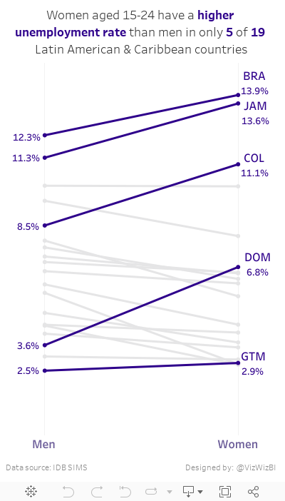
May 16, 2017
Makeover Monday: Female vs Male Youth Employment in Latin America & Caribbean Countries
Today, I had a few spare minutes and knew that Eva really wanted me to create something with the full data set she created for #VizForSocialGood. Also, I was really surprised at the remarkably few slope graphs this week. This is a great data set for slope graphs, whose main purpose is comparing two points.
So, here is my second Makeover Monday this week. Special thanks to Eva for feedback on my iterations. In this viz, I wanted to compare the unemployment percentage for 15-24 year olds by country. Perfect use case for a slope graph...and my 500th Tableau Public viz!! I wonder who has more??
January 18, 2017
Workout Wednesday: The State of U.S. Jobs

Last week on my Data Viz Done Right site, I wrote about a great small multiples visualisation created by Matt Stiles that shows U.S. unemployment compared to the national average for every State. I recreated Matt’s work in Tableau, and your challenge for this week is to do the same. Personally, I find trying to rebuild visualisations a great way to learn.
Below you’ll see an image of what I created. Click on it for the interactive version. I’ve prepared the data for you here (it comes from the Bureau of Labor Statistics). Some things to keep in mind:
- My viz is 875x2150. Your’s doesn’t have to be this size, but I thought I’d provide it for guidance.
- I’m using the Source Sans Pro font, which you can download from Google Fonts. This is the font that Matt used in his version.
- The years should be displayed every 10 years.
- The axis line on for the year should be more distinct than the gridlines.
- The ends of each line should be colour-coded by whether it was an increase or decrease compared to the national average.
- You will need to calculate the national average. The national average needs to include the District of Columbia, but D.C. should not have its own chart.
- Values above the national average should start with a + and and below should start with a -
- The national average is the line you see at 0%.
- This is NOT a trellis chart, but if you think you can make it work as a trellis chart, go for it!
- The area above zero should be shaded. The hex code to use is #F7E6E2 and it should be shaded from 0- to +10%.
- Pay attention to the gaps between each State. I like how this gives it some breathing room.
This will be a very tedious exercise. To provide some context, this took me 2-3 hours to create. Don’t get discouraged and don’t feel like you have to do it all in one sitting. Basically, try to make yours look identical to mine.
Post an image on Twitter when you’re done and hashtag it with #WorkoutWednesday and please tag me so I see it. You can also comment below with a link to your workbook or with any questions you have. Good luck!
February 4, 2013
Improving the WSJ Historical U.S. Unemployment Rates heat map
In chapter 1 of Alberto Cairo’s book, The Functional Art, he presents this chart by the Wall Street Journal as an example of non-figurative graphics.

I was struck at first by the use of a red/green color palette (so many people use this to represent positive and negative situations). Then I realized that it need a bit more to really make it useful. I wanted to be able to:
- Understand the magnitudes of the rates
- Compare years
- Fix the color scheme
- Make the chart wider
Here’s what I created using the Tableau 8 (all of this can be done in 7). Does it answer my questions?

April 29, 2011
How to tell a completely opposite story with a dual-axis chart (This might make you sick!)
Look at the chart below from Chart of the Day. One question, 5 seconds. How much has the variance changed between the two lines from 2001 and 2011?

I’m going to guess you came up with:
- 2001 – The red line is about 1% lower than the blue line
- 2011 - The red line is about 10% lower than the blue line
- Therefore, the total change is 9%
If that's what you guessed, you’re wrong, completely wrong! Why?
- The axes are not synchronized
- The axis on the left is for the blue line, whereas the axis on the right is for the red line
- How can I be sure? There are gray headers at the top of each axis.
This is incredibly confusing and incredibly misleading!
What’s the real answer?
- 2001 – The red line is at 88%, while the blue line is at 79%. The red line is 9% higher than the blue line, not 1% lower like I thought
- 2011 - The red line and blue line are both at about 114%, not the 10% variance I supposed
- Therefore, the total change is actually 0%, not 9%
This is one of the worst and most misleading dual-axis charts I’ve ever seen. At a glance it looked like blue was slightly ahead of red then the gap got really wide in blue’s favor. However, it’s the complete opposite.
Scary, scary, scary!
October 8, 2009
Auto Sales & Unemployment
I received the following message from Congressman Tom Price on Monday (10/5/09): "Last week we received more bad news in the job market. 263,000 jobs were lost during the month of September and the unemployment rate is now at 9.8%. The verdict is in and the economic policies of President Obama and Democrats in Congress have become a massive failure."
I understand Congressman Price's position, but it bothers me that he has taken the lead of talk show hosts to use scare tactics to spread his message. I would, for once, like to hear his opinion. His entire rant can be found here.
In addition, my friend Dan Murray posted a link to a Wall Street Journal article on his Facebook page that essentially said the "Cash For Clunkers" program failed.
I wanted to see if I could draw any sort of correlation, or at least possibly provide the specific details.
Here is my visualization:

First, to Congressman Price's accusations. The rise in unemployment started around January 2007. Obviously President Obama was not yet in office. So what happened that could have sparked the sudden rise? This is precisely when President Bush announced the surge in troops for the Iraq War during his State of the Union address. I can't say that was the exact cause, but I do find the timing neatly coincidental.
Now, onto the WSJ's claims that Cash for Clunkers failed to help the economy. Yes, there was a huge decline in new car sales in September, but this is not unprecedented if you look at historical sales.
Back in October 2001, the "0% interest" programs were introduced by the Big 3. This program was a HUGE boost to sales (35% over prior month), but it resulted in a decline of 18% in November and 25% over the following two months.
The Big 3 introduced the "Employee Pricing" programs in July 2005. This program was another HUGE "success" (sales increased 15% over prior month and 22% over May), but it resulted in a decline of 18% in August, 20% through September, and 28% through October.
The Cash For Clunkers program (August 2009), resulted in a 4.4M units increase in sales over June or 45%. That increase has never been approached in the last 10 years. The results, however, was a decreased in sales in September of 4.9M units or 35%. If this program follows the behavior of the previous two, we should see a decrease of an additional ~7% over the next 1-2 months at which time sales should stabilize.
Now, I want to take a leap to connect the two (auto sales and unemployment). A significant number of people were employed by the Big 3, so when auto sales take a nose dive, you would have to expect that they would begin laying off workers, which would ultimately have a direct impact on the national unemployment rate.
Back to President Bush. I cannot directly correlate his Address to these figures, but the timing sure is suspect.
* All data courtesy of FRED.


