September 29, 2021
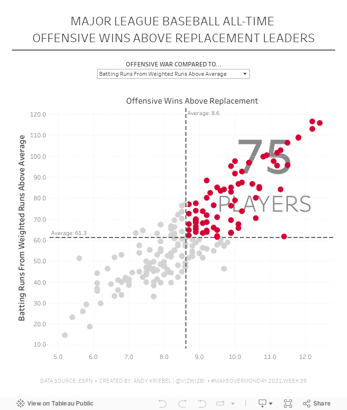
#MakeoverMonday 2021 Week 39 - MLB All-Time Offensive Wins Above Replacement

May 23, 2016
Makeover Monday: The Militarization of the Middle East in a Post-9/11 World

After an epic week 20 for Makeover Monday, I had great expectations for this week. Another great data set, this time looking at global arms imports and exports. But dang it was tough! I really struggled this week making something I was happy with. In the end, time is up and I learned a lot.
Let’s start by looking back at the original visualisation.

What works well?
- The colors clearly distinguish imports and exports.
- The labels provide the needed context.
- Nice small line charts for Europe and the Middle East along with an indicator for the rate of change.
What could be improved?
- The title of the article doesn’t match the chart.
- It’s hard to compare countries.
- Why were the countries that are shown selected? Are they the top N?
- Why is the timeframe 2011-2015? That seems a bit arbitrary.
- Why are there only sparklines for Europe and the Middle East?
- The lower section with the flags has nothing to do with the map.
- In the lower section, why don’t UAE and China show awaiting delivery? It should be consistent.
- Is there a better story that can be told? The data goes back to 1950 after all.
I decided to focus on the title of the article: “The Militarization of the Middle East”. And I focused even farther by looking at the post-9/11 era from 2002-2015. America initiated a war with the Middle East. I wanted to know how that impacted the import of arms to the region.
Once again this was a week of iterations. I started with this small multiple map view, but didn’t think it showed the change through the years very well.
 |
| Click the image for the interactive version |
I then looked at a slope graph comparing the % of total arms imported in the region by country in 2002 compared to 2015. This definitely shows the rate of change better, but I lose the context of the years in between.
 |
| Click the image for the interactive version |
Maybe a DNA chart will work better than the slope graph? Not really, it just flattens it out.
 |
| Click the image for the interactive version |
I was getting frustrated by this point, so I decided to take the opportunity to learn a new technique. I read Matt Chamber’s blog post recently on how to build ranked bump charts and thought this would make a great use case for this type of chart. In this view, I can see how a country moves year by year in the ranking of arms imported into the Middle East. I really like being able to click on a country and see it highlighted.
What the bump chart loses, though, is the context of the overall value of the arms imported. So to take care of that, I included the sparkling which also updates when you click or tap on a country. In the end, I’m satisfied and I learned something new. That’s a bit of what Makeover Monday is about.
January 22, 2011
Guess who’s at #68 of Tableau’s Top 100 Vizes of Q4 2010 ?
Ellie Fields from Tableau contacted me today to tell me that one of my vizes made the top 100 in Q4. I’m not entirely sure what drove traffic to it, but the viz had 1568 visits in Q4 with 19% of those interacting with the dashboard.
Check out Tableau’s list here.
While #68 may not get you too excited, it does humble me to know that people are actually interested in the content I create. That’s the best compliment anyone can ever give and you all help to keep me inspired.
Check out my original blog post here. It was a critique of Many Eyes in which I posted an improvement on their viz. Thanks for visiting!!
August 6, 2010
Tableau Public: Afghanistan War Logs
It's pretty obvious that nearly all of the activity is on the Afghanistan/Pakistan border. At least that has been reported relatively accurately.

October 9, 2009
Afghanistan Troop Deployments
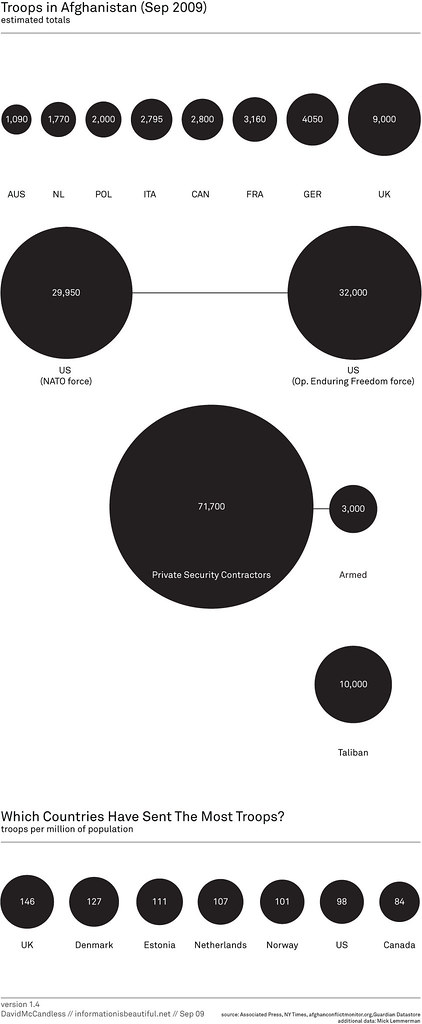
The first message that the bubbles are trying to communicate is simply the number of troops deployed.
I can see why he has the bubbles across the top; they're in a neat ascending order, but then the US is show below all of the other countries? Why aren't they all arranged together?
Also, what is the purpose of having all of the other types of "troops" on the chart? Finally, there is one pretty big issue with the data; where are all of the other countries that have sent troops?
Bubbles are a poor method of showing relative size. A simple bar chart works much better. Unlike the author, I have included "all other" countries.

The second message, which I cannot make heads or tails of, is the number of troops per million of the population. What is the purpose of this data and what insight can you possibly gain from it?
When I first saw this chart, I immediately tried to connect the bubbles at the top to the bubbles at the bottom, but it's impossible.
The title of the second chart is "Which countries have sent the most troops?" Ok, one more time, how could anyone possibly answer that question based on the troops per million of the population?
When I saw the question, I immediately though of a bar chart showing the percent of the total troops that each country has sent. I created this visualization below and added color to emphasize those countries that have more skin in the game.
From my visualization, you can see that the US has sent about 47% of the troops. In the bubble chart, I see the number 98. Which one do you think answers the question more appropriately?

If you really want to get sick, check out the rest of the author's bubble charts on this topic. I don't get the fascination with the bubbles...
* Data courtesy of The Guardian DataBlog
October 8, 2009
Auto Sales & Unemployment
I received the following message from Congressman Tom Price on Monday (10/5/09): "Last week we received more bad news in the job market. 263,000 jobs were lost during the month of September and the unemployment rate is now at 9.8%. The verdict is in and the economic policies of President Obama and Democrats in Congress have become a massive failure."
I understand Congressman Price's position, but it bothers me that he has taken the lead of talk show hosts to use scare tactics to spread his message. I would, for once, like to hear his opinion. His entire rant can be found here.
In addition, my friend Dan Murray posted a link to a Wall Street Journal article on his Facebook page that essentially said the "Cash For Clunkers" program failed.
I wanted to see if I could draw any sort of correlation, or at least possibly provide the specific details.
Here is my visualization:

First, to Congressman Price's accusations. The rise in unemployment started around January 2007. Obviously President Obama was not yet in office. So what happened that could have sparked the sudden rise? This is precisely when President Bush announced the surge in troops for the Iraq War during his State of the Union address. I can't say that was the exact cause, but I do find the timing neatly coincidental.
Now, onto the WSJ's claims that Cash for Clunkers failed to help the economy. Yes, there was a huge decline in new car sales in September, but this is not unprecedented if you look at historical sales.
Back in October 2001, the "0% interest" programs were introduced by the Big 3. This program was a HUGE boost to sales (35% over prior month), but it resulted in a decline of 18% in November and 25% over the following two months.
The Big 3 introduced the "Employee Pricing" programs in July 2005. This program was another HUGE "success" (sales increased 15% over prior month and 22% over May), but it resulted in a decline of 18% in August, 20% through September, and 28% through October.
The Cash For Clunkers program (August 2009), resulted in a 4.4M units increase in sales over June or 45%. That increase has never been approached in the last 10 years. The results, however, was a decreased in sales in September of 4.9M units or 35%. If this program follows the behavior of the previous two, we should see a decrease of an additional ~7% over the next 1-2 months at which time sales should stabilize.
Now, I want to take a leap to connect the two (auto sales and unemployment). A significant number of people were employed by the Big 3, so when auto sales take a nose dive, you would have to expect that they would begin laying off workers, which would ultimately have a direct impact on the national unemployment rate.
Back to President Bush. I cannot directly correlate his Address to these figures, but the timing sure is suspect.
* All data courtesy of FRED.
October 1, 2009
Pop the Afghanistan War Bubbles
The image below caught my eye. It's from a Flickr pool for the Guardian datablog.

The author's says "Latest military casualty figures in proportion to each force's troop numbers. I think this gives a clearer sense of which armies are taking the most flak."
Ok, I get the intent, but why the bubbles? Doesn't a simple bar chart provide a much simpler method for communicating the data?

Here's what I see in the data: the US provides the bulk of the forces, but loses the fewest casualties as a percentage of the total force. It's known across the world that the US military is one of the most prepared, so this shouldn't surprise anyone. I don't see any enlightening information in the author's analysis, other than simply giving us a pretty report.






