October 9, 2009
Afghanistan Troop Deployments
afghanistan
,
barchart
,
bubblechart
,
contribution
,
davidmcandless
,
flickr
,
Guardian
,
military
,
war
No comments
My favorite bubble man uploaded another doozy. This time he's displaying troop deployments to Afghanistan.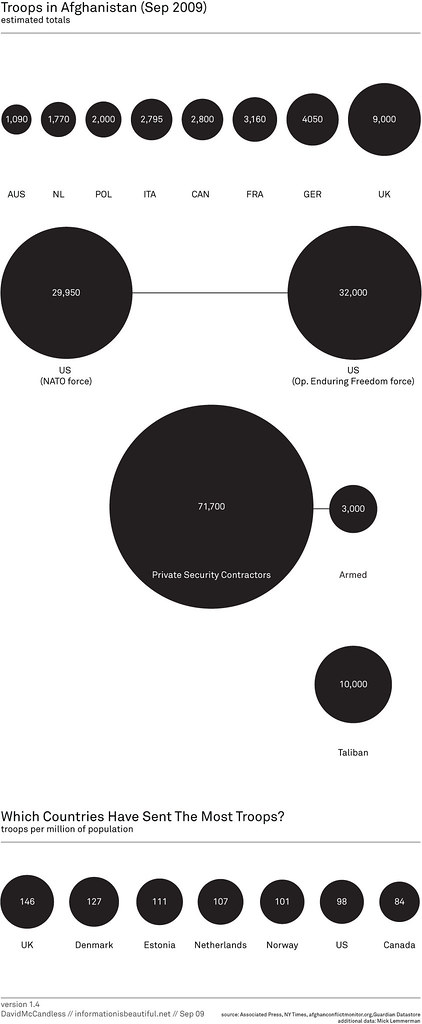
The first message that the bubbles are trying to communicate is simply the number of troops deployed.
I can see why he has the bubbles across the top; they're in a neat ascending order, but then the US is show below all of the other countries? Why aren't they all arranged together?
Also, what is the purpose of having all of the other types of "troops" on the chart? Finally, there is one pretty big issue with the data; where are all of the other countries that have sent troops?
Bubbles are a poor method of showing relative size. A simple bar chart works much better. Unlike the author, I have included "all other" countries.

The second message, which I cannot make heads or tails of, is the number of troops per million of the population. What is the purpose of this data and what insight can you possibly gain from it?
When I first saw this chart, I immediately tried to connect the bubbles at the top to the bubbles at the bottom, but it's impossible.
The title of the second chart is "Which countries have sent the most troops?" Ok, one more time, how could anyone possibly answer that question based on the troops per million of the population?
When I saw the question, I immediately though of a bar chart showing the percent of the total troops that each country has sent. I created this visualization below and added color to emphasize those countries that have more skin in the game.
From my visualization, you can see that the US has sent about 47% of the troops. In the bubble chart, I see the number 98. Which one do you think answers the question more appropriately?

If you really want to get sick, check out the rest of the author's bubble charts on this topic. I don't get the fascination with the bubbles...
* Data courtesy of The Guardian DataBlog
Subscribe to:
Post Comments
(
Atom
)


No comments
Post a Comment