March 27, 2024
8 Reasons Power BI isn't "FREE"
What are joins?
Fundamentals of Joins by Andy Kriebel
March 11, 2024
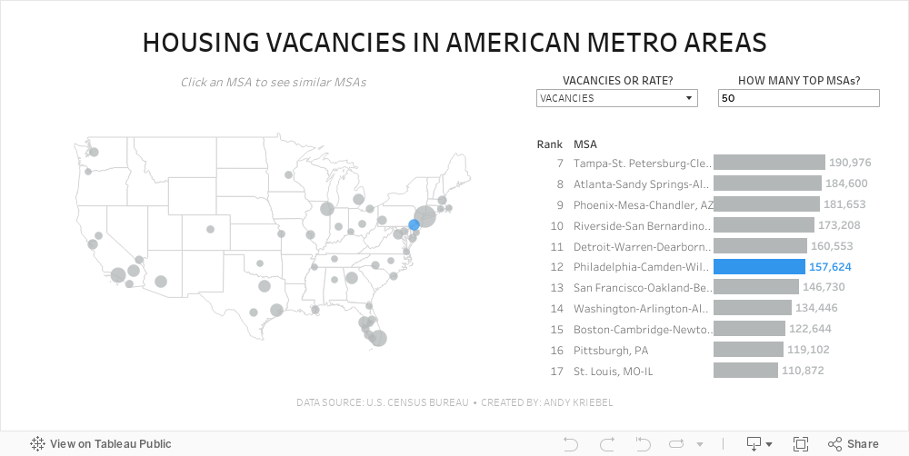
#MakeoverMonday 2024 Week 11 - Housing Vacancies in America

- Size - 1000x475
- Max 4 containers; no tiled containers allowed
- Filter out Alaska, Hawaii and Puerto Rico
- Clicking on a MSA in the map highlights the MSA in the map and bar chart and changes the MSAs that are displayed in the bar chart
- The bar chart shows the rank of the MSA for the metric selected.
- There should always be 11 bars (though I didn't test the lowest rank).
- The label on the end of the bar and in the map reflect the formatting of the measure selected (i.e., either whole numbers or a percentage to one decimaal).
- Include an option to change the measure and to change the number of MSAs on the map.
- Create a mobile view
- NO LODS!
March 8, 2024
Visualizing Time Series Data in Tableau
Last night I was invited to speak at the Chicago Tableau User Group about visualizing time series data. Other than spatial data, time series data is my favorite to visualize.
There seem to be endless methods for making time series data useful for analysis. Check out this video for 60ish ways to visualize time.
I had a 20 minute slot to present and, of course, I ran over time. I seem to do this with every session I run lately. Be it training for Next-Level Tableau, presenting at events, or running a livestream, I get into a groove and don't want to stop.
I was able to create 14 vizzes in 20+ minutes. I added an extra in this workbook to make the dashboard format nicely.
Click on the image below to download the workbook and dissect it. Get the data here to follow along.
Have fun!

March 6, 2024
What does Level of Detail mean in Tableau?

If you’re serious about learning Tableau, you must understand the level of detail of the view. Another way to think about it is the level of granularity.
This is essential for ensuring you know the aggregations that Tableau will perform as this will impact your analysis.
Here's a guide to help you:
March 5, 2024
11 Steps to Create KPIs & Sparklines in the Same Sheet in Tableau

Want to cut the number of sheets you need in your KPI dashboard in half? These 11 simple steps will get much closer.
Steal the calcs to speed up your work.
P.S. If you like tips like this, remember to follow me on LinkedIn so you're notified about everyting I post. Content curated just for you, 3 times daily.


