February 20, 2025
How to Create a Multi Column Dot Plot


May 3, 2024
How to Make Your Cycle Plots Actionable in Tableau

Cycle plots are a fantastic way to identify seasonality in a data set. And you can make them even more useful by adding indicators for whether they are above or below the average.
Here's how you can do that in Tableau in only 2 minutes.
Like this? You'll love Next-Level Tableau. Learn more at nextleveltableau.com.
April 18, 2024
How to Create a Donut Chart in Tableau
April 8, 2024
How to Create an Enclosed Dot Plot in Tableau
An enclosed dot plot is similar to a barbell charts except the line connecting the dots surrounds the dots.
April 7, 2024
How to Create a Barbell Chart in Tableau
A barbell chart is a dot plot that shows two or more points and also connects those points to display the range.
April 3, 2024
April 1, 2024
#WatchMeViz: Can viral infections be cured with antibiotics?
March 8, 2024
Visualizing Time Series Data in Tableau
Last night I was invited to speak at the Chicago Tableau User Group about visualizing time series data. Other than spatial data, time series data is my favorite to visualize.
There seem to be endless methods for making time series data useful for analysis. Check out this video for 60ish ways to visualize time.
I had a 20 minute slot to present and, of course, I ran over time. I seem to do this with every session I run lately. Be it training for Next-Level Tableau, presenting at events, or running a livestream, I get into a groove and don't want to stop.
I was able to create 14 vizzes in 20+ minutes. I added an extra in this workbook to make the dashboard format nicely.
Click on the image below to download the workbook and dissect it. Get the data here to follow along.
Have fun!

January 6, 2023
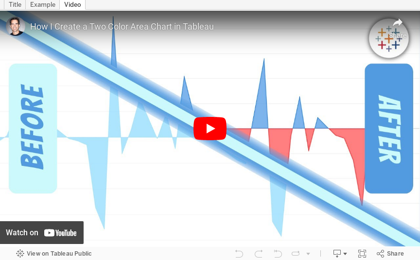
How to Create a Two Color Area Chart in Tableau
In this week's Watch Me Viz, I showed the problem this tip helps solve. An area chart in Tableau only allows a single color. Like this…
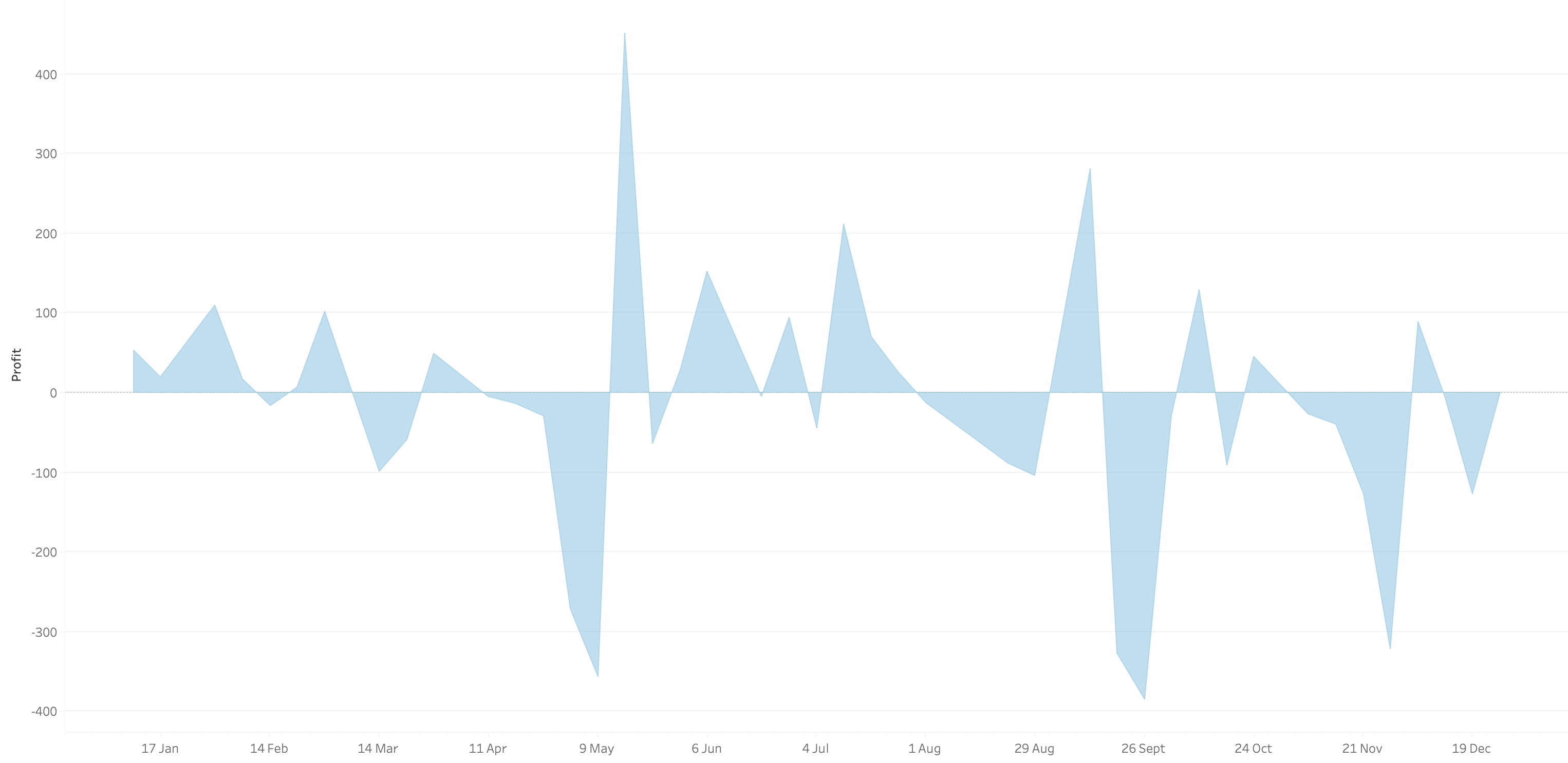
What we want is an area chart like this with two colors.
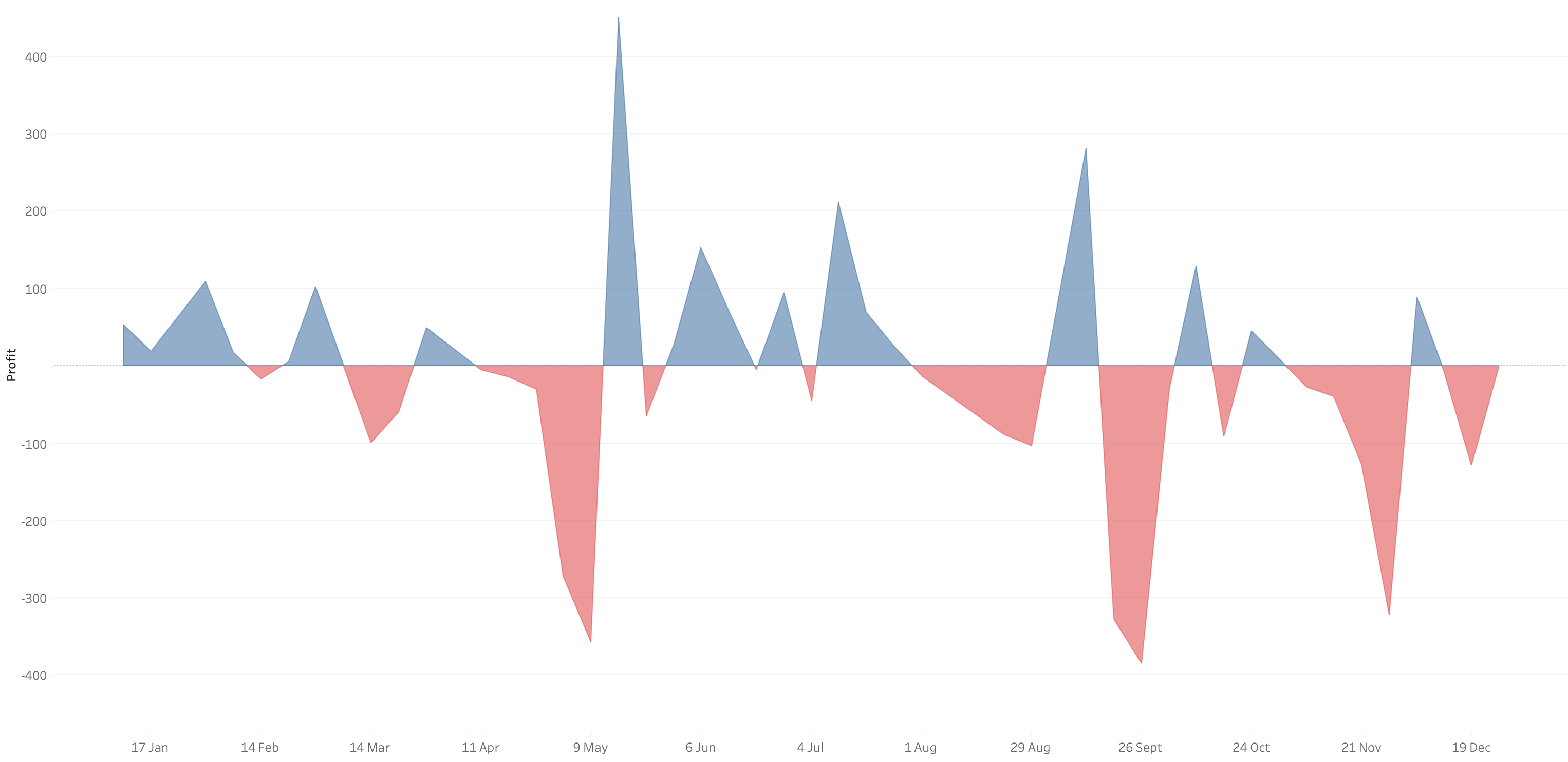
In 9 simple steps, I’ll show you how to build it. Follow along with the video. The 9 steps are listed at the bottom of this post.
STEPS
1. Create the area chart
2. Show what happens when you add a profit to color - you only get one color
3. Duplicate the measure
4. Fix the axes
1. Top axis starts at 0
2. Bottom axis ends at 0
5. Choose a color for each area chart
6. Format the axes to get rid of 0
7. Add reference lines to scale the charts relative to each other
1. WINDOW_MAX(ABS(SUM([Profit])))
8. Duplicate for the negative reference line
9. Formatting
January 3, 2023
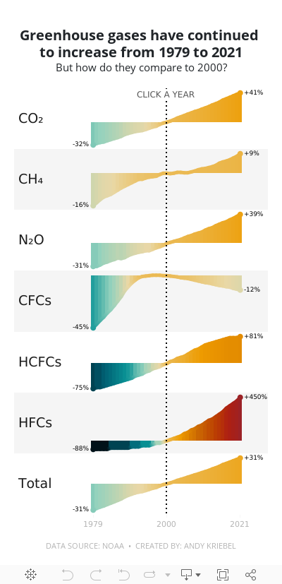
#MakeoverMonday 2023 Week 1 - The Change in Greenhouse Gases in the Atmosphere

2023 is here and #MakeoverMonday will be here the entire you to help you continue to learn and improve. Come on the journey with us each week. Build your portfolio. Showcase your skills. You just might get that job you've been seeking. It's happened, a lot, by participating every week.
For week 1, we were analyzing greenhouse gases in the atmosphere from 1979-2021. The original visualization is quite simple.

We have CO2 and total gases on the left axis and the variance to 1990 on the right. Overall, the chart is pretty easy to read, with the exception of knowing that the red line is always compared to the 1990 value. That definitely needs to be more clear. It's also missing a title, so without the website it is posted on, you wouldn't necessarily know what it's about.
For my viz, I started by reproducing the original, but it doesn't look as good because the data we have starts at 1979. So you miss the big upward curve. From there, I focused primarily on making good looking sparklines that show comparisons with a parameter action. I also showed how to create an "area chart" with multiple colors. I'm going to create a tip video for it; I like how it turned out.
Here's the livestream and below is the visualization for you to interact with. The viz does not render properly on Tableau Public, but hopefully you get the idea.
I hope you continue to join me throughout the year so that we can learn together.
Have a wonderful 2023!
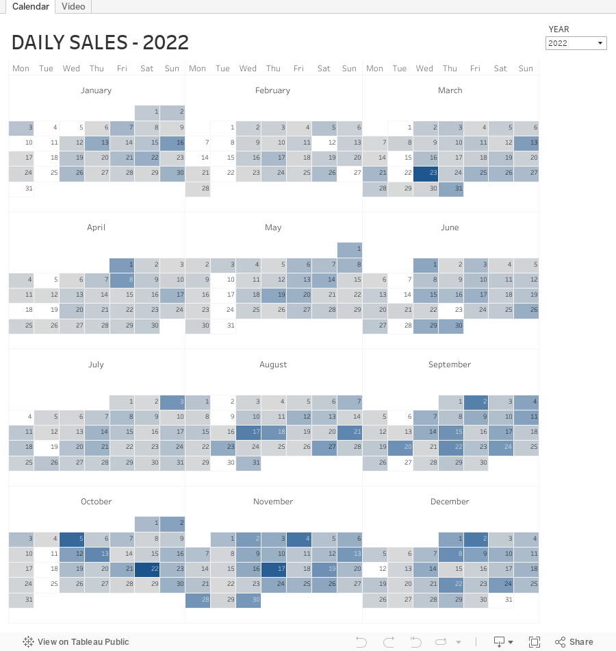
November 22, 2022
How to Create a Full Year Calendar Heatmap in Tableau

Calendar heatmaps are a great way to visualize time-series data over an entire calendar year. Individual days are shaded on a light-to-dark gradient based on a measure that has been added to the visualization.
Creating a heatmap for a single month in Tableau is pretty straightforward. It gets a bit more complicated when you want to view an entire year at once. In this tip, I going to show you, step-by-step, how to create a full year calendar heatmap in Tableau. The workbook is below this video to download.
June 14, 2022
How to Create a Two-Panel Column Chart
May 25, 2022
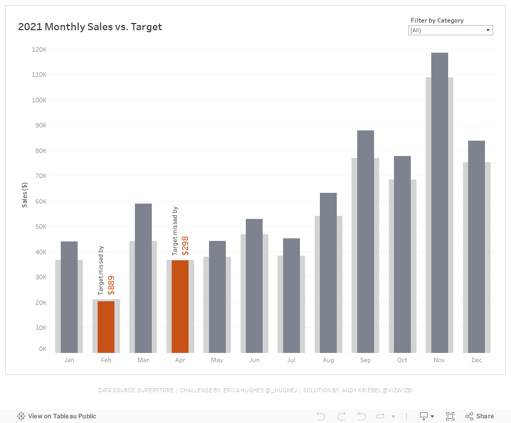
#WOW2022 Week 20 - Monthly Sales vs. Target
Resources
- Week 20 Challenge
- My Solution (image below)

April 21, 2022
#B2VB - 2022/W4 - Design Some KPIs
Resources:
KPI Samples from Tableau Public:

March 1, 2022
How to Create a Dual Axis Chart with One Dimension and One Measure
This tip comes from a comment from a viewer. They wanted to know how they could build a dual-axis chart based on a single dimension (e.g., Order Date) and a single measure (e.g., Sales). In this tip I show you how to compare the monthly sales for the current year (as a line) to the prior year (as a bar).
February 22, 2022
How to Displays Multiple Measures on Multiple Rows
February 15, 2022
How to Create a Barbell Chart
February 8, 2022
How to Create an Enclosed Dot Plot
December 8, 2021
#WOW2021 Week 45: Customer Purchasing Habits (RFM Analysis)

July 12, 2021
#MakeoverMonday 2021 Week 28 - COVID Vaccination Rates by Ethnicity and Age in England


