April 11, 2023
How to Create a Jittered Bar Chart in Tableau

Are you tired of the same old boring bar charts? Add some flair to your data visualization with a jittered bar chart! See more of your data without losing scope of the overall.
To create one, simply add a random amount of noise to the x-axis and y-axis of your bar chart. This will add more granularity to your data, prevent overlapping and give your chart a unique look. Try it out and impress your colleagues with your data viz skills!
Here’s a video to help you create your own.

January 6, 2023
How to Create a Two Color Area Chart in Tableau
In this week's Watch Me Viz, I showed the problem this tip helps solve. An area chart in Tableau only allows a single color. Like this…
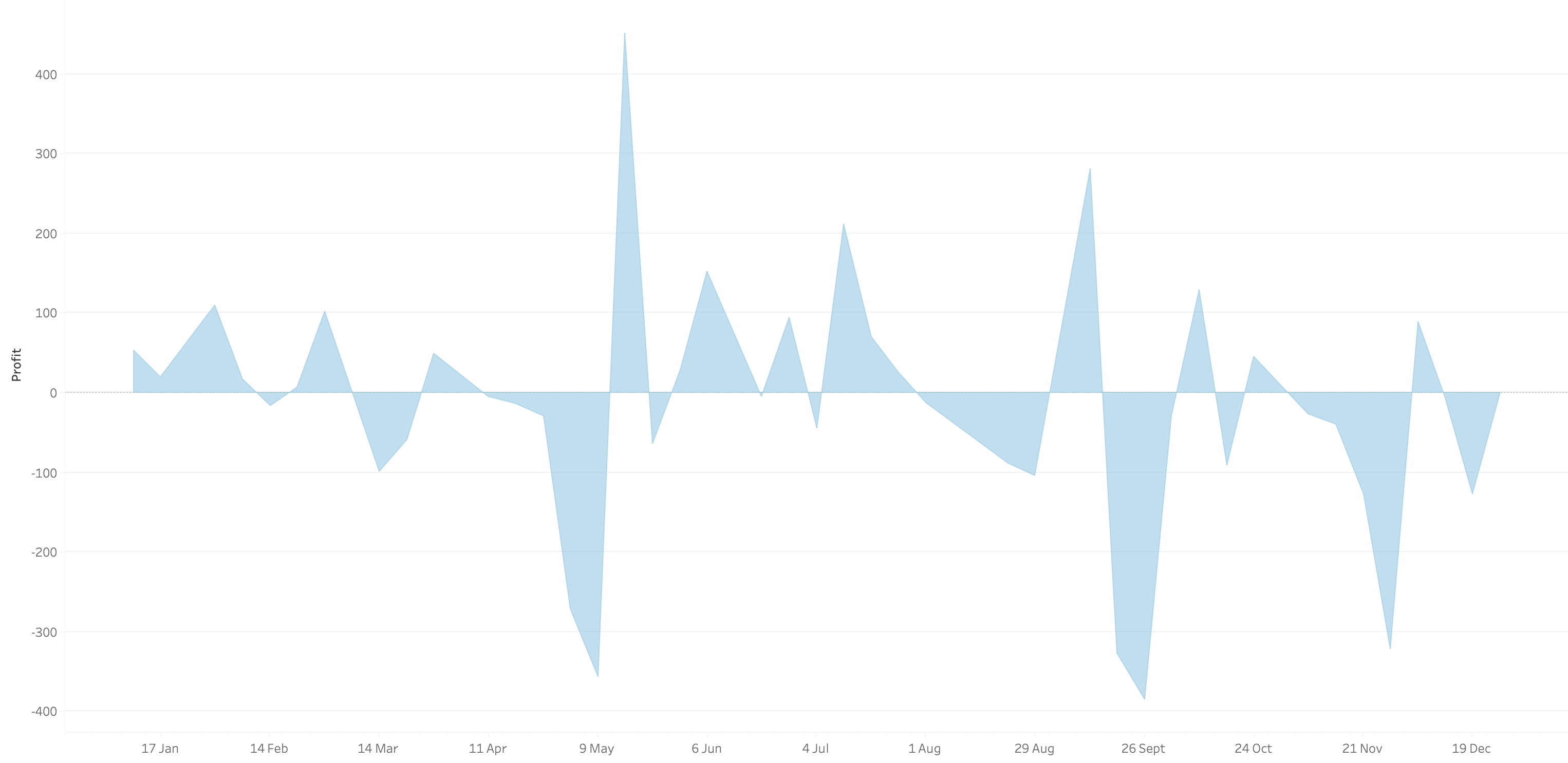
What we want is an area chart like this with two colors.
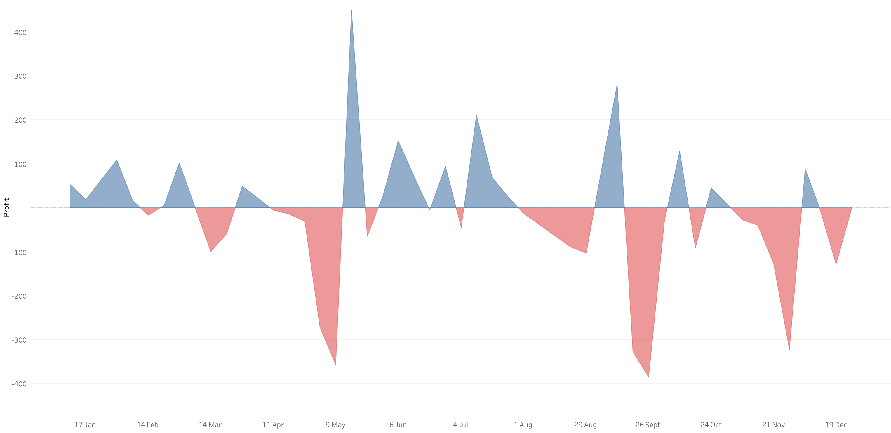
In 9 simple steps, I’ll show you how to build it. Follow along with the video. The 9 steps are listed at the bottom of this post.
STEPS
1. Create the area chart
2. Show what happens when you add a profit to color - you only get one color
3. Duplicate the measure
4. Fix the axes
1. Top axis starts at 0
2. Bottom axis ends at 0
5. Choose a color for each area chart
6. Format the axes to get rid of 0
7. Add reference lines to scale the charts relative to each other
1. WINDOW_MAX(ABS(SUM([Profit])))
8. Duplicate for the negative reference line
9. Formatting
March 11, 2022
How to Include Multiple Dimensions on the Color Shelf
- You can have more than two dimensions on the color shelf. Simply repeat the steps for adding a second color.
- This only works for dimensions, as I show in the video.
- You do not have to use Sets for this to work; I used that in my example for simplicity.






