November 26, 2020
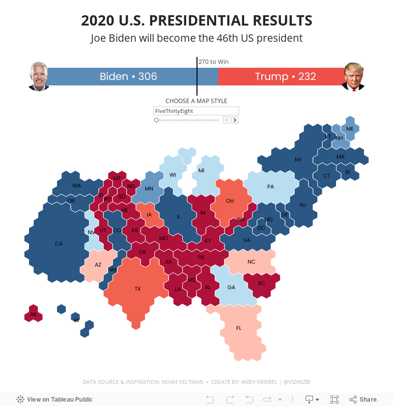
How to Create U.S. Electoral Cartograms

I don't remember how I came across the set of cartograms I'm going to show you how to create. Alas, I wanted to recreate this mesmerising set of cartograms that Noah Veltman created based on election maps from various media outlets.


- X on the Columns
- Y on the Rows (and reverse the axis)
- Set both X and Y to AVG
- Change the mark type to Polygon
- Add the Path field to the Path shelf (this tells table how to connect the edges of the polygon)
- Add the State field to the Detail shelf
November 24, 2020
How to Create a Combination Bar Chart & Candlestick Chart

In a recent Makeover Monday #WatchMeViz, I showed how to create a bar chart to compare two measures and then add a candlestick chart as well to show the difference between the two measures. It's actually quite simple; it requires some knowledge of:
- How Measure Names and Measure Values work together
- How to create a combined axis chart
- How to create a dual axis chart
- How to create a Gantt chart
November 23, 2020
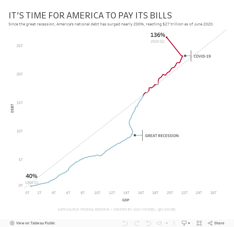
#MakeoverMonday: America Needs to Pay Its Bills

Today's Makeover Monday marked my 1,000th viz published to Tableau Public. I must say that I'm pretty proud of myself. This feels like a pretty big milestone in my career. I wonder how many hours I've spent using Tableau in my life.
Thank you for all of your support and encouragement along the way. Tableau wouldn't be anything without the Community.
Let's get to week 47. The visualization comes from Visual Capitalist.

- The bar/line combination charts work well since they are on the same scale. This also makes them easier to distinguish.
- Choosing colors that match the American flag (I'm assuming that was intentional)
- Making 2020 a slightly different shade of red
- Title is clear
- Text callouts add useful context
- Big numbers to show the most recent values
- The 2020 bars are at the quarterly level, but the remaining bars are by year. Is it the end of the year? The start of the year? That could easily lead to confusion. Keep it as a consistent time scale.
- Compare debt to GDP
- Show the debt to GDP ratio
- Show when the debt to GDP ratio exceeded 100%
- Highlight important milestones that led to the largest increases
November 19, 2020
Pregnancy, Birth, and Abortion Rates in America

With Amy Coney Barrett being sped through the confirmation process of the US Senate before the 2020 Election (as hypocritical as it was) to become the 9th justice on the Supreme Court, there is now a conservative stranglehold on the judicial branch of government.
Justice Barrett deflected all questions about her stance on abortion during the confirmation process and it has raised lots of speculation that Roe v. Wade will be overturned. Yeah, you know, because the government should control a woman's body, yet there is nothing similar for men. Like, why doesn't a man get castrated if he accidentally impregnates a woman? Blasphemy they say; hypocritical I say.
I wonder if any of the anti-abortion Justice or Congresspeople have ever considered their stance if their daughter had an unplanned pregnancy. What is she got raped and pregnant? I bet their tune would change.
Anyway, my political and social views aside, this made me think about abortion rates in America. Since Roe v. Wade, abortion rates in the US have plummeted.

Workout Wednesday 2020 Week 47 Solution Guide - Clustered Histogram

- You can't lump together the $2,000+ orders (bins are fixed sizes).
- You can't use bins in calculations, thus you can't lump them together this way either.
- For each Order ID, return the sum of sales.
- Divided each Order ID sales by 100 and round down to the nearest integer.
- Multiply that result by 100 to get it back up to bins of 100.


This will put the bars that are in the 0-100 bin at 25, 50, and 75. Then those in the 100-200 bin will be 125, 150, and 175. And so on.

Ta da! Magic! Now that we have the correct calculations, it's a matter of building the view.

On the Size shelf, change it to Manual sizing and drag it around until the bars are split up a bit. The tooltip requirement involved a couple more calculations, but none of them are complicated. You can get them from my viz, but only do that if you're REALLY stuck. Give it your best effort first.
November 17, 2020
How to Create a Single Column Hierarchy Drill Down Drill Up with Parameter Actions

Twice recently I've used parameter actions to create a single column drill down and drill up to mimic a hierarchy.
November 16, 2020
#MakeoverMonday Week 46: The Growth of Internet Ad Spend - 2020 vs 2012
Thanks for attending #WatchMeViz (link) for #MakeoverMonday Week 46. I enjoy the commentary and ideas you provide along the way. I hope you're learning something as well.
The topic this week was the switch in advertising revenue to the internet.
In the video, I first reviewed the initial visualization and talked about what works and what does. I then iterated through 17 different methods for visualizing the data, before settling on the one below which was inspired by Ellen Blackburn's viz about eligible free school meals and educational attainment (link)
RESOURCES
- Data Set - https://data.world/makeovermonday/2020w46
- Chart Guide - https://chart.guide/

Visualizing a Profit & Loss Statement with KPI Cards
Data HAS to be consumed quickly to be understood and to make quick decisions. A "typical" profit and loss statement is on a spreadsheet. However, spreadsheets are notorious for (1) errors and (2) being very difficult to spot areas of concern.
That's where dashboards come into play. Back in July 2017 I proposed a new way to visualize a Profit & Loss Statement (P&L). The dashboard has been very well received and put into practice at many organizations. They've reported back to me how useful it has been.
But then I got thinking about an even easier way to visualize the data. I felt like the previous version was a bit chart heavy. So, while I've been creating templates for other areas of a business (HR, Social Media, Customer Service), I decided to also focus on a new version of a P&L statement with KPIs. This dashboard is based on a Finance Dashboard example from Excel Dashboard School.
You can download the data I used to build this template here. Click on the image below to interact with and download the workbook.

November 12, 2020
How I Use Layout Containers (Part 2) - HR Analytics KPI Dashboard


November 10, 2020
How I Use Layout Containers (Part 1) - Social Media KPI Dashboard


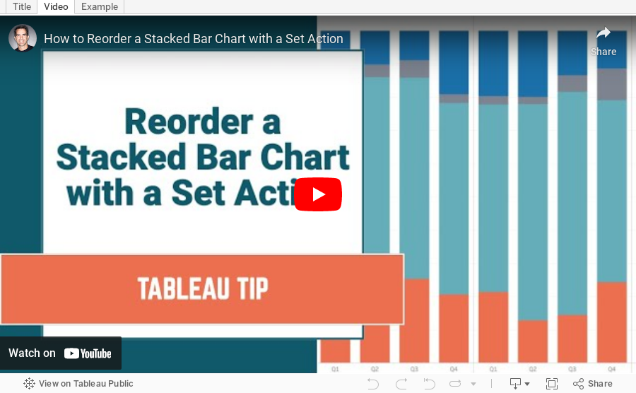
#TableauTipTuesday: How to Reorder a Stacked Bar Chart with Set Actions

November 9, 2020
#MakeoverMonday Week 45 - Global Share of Nintendo Switch Software & Hardware Sales
For #MakeoverMonday week 45, we were analyzing the software and hardware units sold across several regions, as defined by Nintendo itself. The data was pretty simple. I started by doing some basic data prep to simplify the names of the fields and to pivot the data to make it easier to compare the years.
In this video, I will first review the initial visualization and talk about what works and what does. I then iterate through several methods for visualizing the data, hoping to find one that works well with this data set. With feedback from the viewers, I was able to create a bar chart that compares the percentage of global units sold of software vs. hardware for Nintendo.
I showed several methods for visualizing the data:
- Line charts (several versions)
- Stacked bar chart
- Side-by-Side Bar
- Tables
- Scatter plot
- Connected scatterplot
Resources:
- Data Set - https://data.world/makeovermonday/2020w45-dedicated-video-game-sales-units
- Final visualization - https://bit.ly/MM2020W45
- Tableau Color Palette Generator - https://color.tableaumagic.com/
- Colors from Image Tool - https://html-color-codes.info/colors-from-image/
- ASCII character reference - https://jrgraphix.net/r/Unicode/27F0-27FF

Dashboard Templates - Example 1: Customer Service Dashboard
As part of the training at The Data School, we're often tasked by clients to build industry specific dashboards and/or dashboards that can be used as templates for their organization. Of course what the client can ask for is often much more broad. From a dashboarding perspective, we tend to have the freedom to create what we think works best for their data. This them, in turn, helps create a sort of "brand" for their dashboards internally.
That got me thinking about common use cases for dashboards, dashboards that would likely span industries and companies and could serve as templates for others. In this series, I'll be posting templates that I have been building based on the data and sample dashboards from Excel Dashboard School.
Let me make it clear that I am in no way criticizing the work they have created. My intent is to build an alternative method for displaying the data as a template in Tableau. The data and templates they have provided are the starting point for my work. I want to thank them for being so kind and sharing their work.
TOPIC
Customer Service Dashboard
RESOURCES
- Dashboard Overview - https://exceldashboardschool.com/customer-service-dashboard/
- Data and Interactive Dashboard - https://cdnspeed-exceldashboardsc.netdna-ssl.com/wp-content/uploads/2017/08/080_CSD_final.zip
DASHBOARD TEMPLATE

November 3, 2020
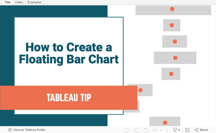
How to Create a Floating Bar Chart

Floating bar charts are similar to Gantt bar charts, except they don't use dates or duration for the length of the bar. In this video, I show you how to use floating bar charts for comparing metrics.
Example 1 - Comparing mental health syndromes between women and men
Example 2 - Comparing year over year sales
Data Sources:
- Mental Health Symptoms - https://data.world/makeovermonday/2020w27-comparing-common-mental-disorder-by-sex
- Superstore 2020.3 - https://data.world/vizwiz/superstore-20203
November 2, 2020
#MakeoverMonday Week 44 - Where do women have more access to the internet and mobile phones than men?
#MakeoverMonday week 44 is another #Viz5 initiative. The topic this week is access to the internet and mobile phones by gender and country.
First, sorry about the video cutting out at the very end. My mistake.
In this video, I first review the initial visualization and talk about what works and what does. In the end, I went with a quadrant chart, which is a scatter plot with broken up into four quadrants. The viz focuses on only two of the quadrants to highlight the significant difference in the number of countries where women have more access to men for both technologies vs. the opposite.
I showed several methods for visualizing the data:
- Side-by-Side Bar
- Bar in bar
- Bar Graph vs. Reference Line
- Barbell
- Peas in a pod
- Floating bar chart
- Slope graph (terrible choice)
- Ranked slope graph (even worse choice)
- Histograms
- Box plot
- Scatter plot
Resources:
- Final workbook - LINK
- Data set - https://data.world/makeovermonday/2020w44
- Country and region information (Be careful joining this as some country names don't match. You'll want to using data blending and alias the country names to match.) - https://data.world/vizwiz/country-region-codes
- Chart Guide - https://chart.guide/
- Interactive chart chooser - https://depictdatastudio.com/charts/


